
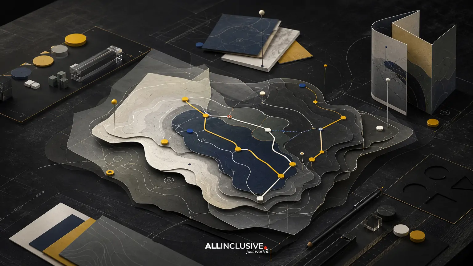
Visitor map design is the process of turning a destination’s geography, services, landmarks, and visitor information into a clear, usable visual guide. The best maps do more than show where things are. They help people decide where to go, understand distances, recognize key landmarks, and feel oriented in an unfamiliar place.
That requires more than accurate cartography. A visitor map must balance navigation, illustration, branding, accessibility, production constraints, and the behavior of the people using it. A map for a resort, campus, downtown district, museum, event, or tourism destination may need to work as a printed handout, a large sign, a downloadable PDF, and a mobile-friendly screen.
This guide explains the main decisions involved, what to provide a designer, and how to evaluate a map before production. For broader questions about selecting a visual partner, see how to choose a map designer.
What makes visitor map design different?
Visitor maps are designed for people who may have limited local knowledge, limited time, or a specific destination goal. Unlike technical site plans, they do not need to display every available detail. They need to display the right details in an order that supports quick decisions.
A useful visitor map typically combines four layers:
- Orientation: the overall shape of the destination, major entrances, surrounding streets, and a clear sense of direction.
- Navigation: paths, roads, intersections, transit stops, accessible routes, and other movement systems.
- Destination information: attractions, buildings, amenities, services, gathering points, and practical visitor facilities.
- Place character: illustration, color, landmarks, typography, and visual cues that make the destination recognizable and appealing.
The trade-off is density. Adding every feature may improve completeness but reduce legibility. Removing too much may make the map attractive but unhelpful. A strong design establishes a clear information hierarchy so users can find the most important answer first.
Start with visitor questions, not available data
Before choosing a style or drawing a route, identify what visitors actually need to know. Common questions include:
- Where am I now?
- What is the main entrance or information point?
- How do I get to a specific attraction, building, or event area?
- How long might the walk take?
- Where are restrooms, food, parking, ticketing, lodging, or first aid?
- Which routes are accessible, covered, shaded, family-friendly, or restricted?
- What can I see or do nearby?
These questions determine the map’s hierarchy. A tourism map may prioritize attractions and neighborhood connections. A campus map may prioritize building names, accessible entrances, and walking routes. An event map may prioritize gates, stages, queues, restrooms, and temporary services. A resort map may need to distinguish guest rooms, pools, restaurants, shuttle stops, and private areas.
Writing a short list of visitor tasks before design begins prevents the map from becoming a decorative inventory of locations.
Define the map’s use cases and outputs
A map that works on a letter-size brochure may fail as a roadside sign or phone screen. Document every intended output before the visual system is finalized.
| Output | Primary design concern | Typical requirement |
|---|---|---|
| Printed handout | Fast scanning and physical handling | Readable type, folding logic, print-safe contrast |
| Large-format sign | Recognition from a distance | Simple labeling, strong hierarchy, viewing-distance testing |
| Downloadable PDF | Zooming and printing flexibility | Vector artwork, sensible page size, accessible structure where possible |
| Mobile or web map | Small-screen interaction | Responsive layouts, concise labels, tap-friendly controls if interactive |
| Directional signage | Decision-making at a specific location | Consistent arrows, destinations, routes, and placement context |
When several formats are required, plan a system rather than simply shrinking one master file. Labels, symbols, line weights, and levels of detail may need to change across scales.
Choose the right map style
Visitor maps generally fall along a spectrum from geographic accuracy to illustrative interpretation. The right position depends on the destination and the decisions visitors must make.
Geographic or diagrammatic maps
These maps preserve a stronger relationship to real streets, buildings, boundaries, and distances. They are useful when visitors need reliable navigation across a complex site or district. A diagrammatic treatment can simplify geometry while retaining the relationships that matter for movement.
Illustrated maps
Illustrated maps use visual character, landmarks, textures, or pictorial elements to make a place memorable. They can be effective for tourism, hospitality, attractions, and destinations where discovery and emotional appeal are part of the experience. They still need a disciplined information structure; illustration should clarify the place, not obscure routes or labels.
Hybrid maps
Hybrid maps combine accurate underlying information with selective illustration. For many visitor experiences, this is the most flexible approach: the base map supports orientation while color, icons, and landmark drawings help users recognize and remember important places.
The choice should be made from user behavior rather than style preference. If a visitor must find a building quickly, legibility and positional accuracy take priority. If the map is also a souvenir or promotional piece, illustration may play a larger role.
Build a clear visual hierarchy
A visitor should be able to identify the map’s purpose within seconds. Establish hierarchy through scale, contrast, color, weight, spacing, and repetition.
Start by ranking content into tiers:
- Primary destinations: the places most visitors are expected to find.
- Orientation anchors: entrances, major roads, bodies of water, central plazas, buildings, or recognizable landmarks.
- Movement information: paths, roads, bridges, transit routes, accessible routes, and directional connections.
- Supporting amenities: restrooms, food, parking, ticketing, lodging, services, and visitor assistance.
- Contextual detail: minor streets, boundaries, terrain, decorative features, or surrounding points of interest.
Not every category needs equal visual emphasis. A muted base, a limited accent palette, and a consistent symbol set can keep the map readable. Typography should also be systematic: use a defined scale for destination names, secondary labels, street names, notes, and legends.
Use landmarks as orientation tools
Landmarks help visitors connect an abstract map to the physical environment. They may include a distinctive building, gate, tower, sculpture, body of water, plaza, trail, or natural feature.
Choose landmarks for recognition value, not simply because they are visually interesting. A landmark should be visible or familiar enough to support the question, “What am I looking for in front of me?” Avoid adding pictorial detail that changes the perceived location or scale of a feature.
Illustrated landmarks should also be used consistently. If one building receives a prominent drawing while equally important destinations are reduced to tiny rectangles, the visual hierarchy may communicate the wrong priority.
Design routes for decisions, not decoration
Routes need to answer practical questions at the moment a visitor is deciding what to do next. Use consistent treatments for walking paths, roads, shuttles, bike routes, accessible routes, boundaries, and restricted areas.
Directional arrows should appear where direction changes or choices occur. A route that is obvious in a studio file may be unclear when printed at a small size or viewed among competing lines. Test intersections, crossings, loops, and entrances at the actual intended output size.
Consider whether the map should show time, distance, or both. “Five-minute walk” can be more useful than a precise measurement for casual visitors, while a campus, park, or district may benefit from a scale bar. If estimates are used, define the basis for them and avoid implying precision the experience cannot support.
Make accessibility part of the map system
Accessibility should influence content, color, symbols, language, and production from the beginning.
- Do not rely on color alone to distinguish routes or categories.
- Use sufficient contrast between labels, lines, symbols, and the background.
- Provide clear symbols and a readable legend.
- Identify accessible entrances, routes, restrooms, elevators, drop-off points, and other relevant facilities when applicable.
- Check small type at the actual print or screen size.
- Use plain language for directions and visitor instructions.
- Consider large-print, tactile, multilingual, or alternate formats where the audience and setting require them.
Accessibility is not only a compliance concern. It improves the map for anyone using it in glare, low light, motion, stress, or a crowded environment.
Coordinate content before visual production
Many map problems originate in incomplete or conflicting source information. Assign one person or team to own the content before final artwork begins. Confirm:
- Official names and spelling for every destination.
- Current entrances, closures, construction zones, and restricted areas.
- Road, path, transit, parking, and service information.
- Operating details that will appear on the map.
- Icon meanings and category names.
- Required legal, safety, sponsor, or partner information.
- Translations and the order in which languages will appear.
Keep a source-of-truth spreadsheet or content document with IDs for locations. This makes revisions easier and reduces the risk of a label changing in one output but not another.
Plan for updates and version control
Destinations change. New buildings open, paths move, businesses change names, events relocate, and temporary closures affect routes. A map should have an ownership and update plan, not just a launch date.
Decide who approves changes, how often information is reviewed, where source files are stored, and how versions are labeled. Separate stable visual assets from frequently changing content where possible. For digital uses, consider whether the map needs a modular structure or a linked directory rather than a single static image.
For print, record the edition date or revision code in a discreet but findable location. This helps staff identify outdated copies and supports future updates.
How to evaluate a visitor map before approval
Do not assess only whether the map looks polished. Test whether an unfamiliar person can use it without explanation.
- Give a user a realistic task, such as finding an entrance, restroom, attraction, or accessible route.
- Observe where they look first and whether they understand the legend.
- Check whether the “you are here” marker is prominent and unambiguous.
- Test the map at its intended physical or digital size.
- Review crowded intersections, small labels, long names, and overlapping symbols.
- Ask whether the map creates an accurate expectation of the physical destination.
- Confirm every operational detail with the responsible stakeholder.
Testing with a small number of people can reveal problems that internal reviewers miss because they already know the destination.
Common visitor map design mistakes
Trying to show everything
Completeness can undermine usability. Use the map’s purpose and visitor tasks to decide what belongs in the primary view and what can move to a legend, directory, second panel, or digital layer.
Using decorative styles without a system
Hand-drawn elements, textures, and custom icons can add character, but inconsistent perspective, scale, or labeling makes the map harder to read.
Ignoring the viewing environment
A map viewed outdoors, behind glass, in a dim lobby, or while walking has different needs from a presentation slide. Test realistic conditions.
Leaving accessibility until the end
Late changes to contrast, type size, symbols, or route categories can disrupt the entire composition. Include these requirements in the initial brief.
Approving geography without field verification
Reference data may not reflect current entrances, informal paths, construction, or visitor behavior. Compare the map with the physical site before final release.
A practical brief for a visitor map project
A concise brief can include:
- Destination type, audience, and visitor goals.
- Geographic area and required level of accuracy.
- Primary and secondary outputs.
- Required locations, routes, landmarks, and amenities.
- Accessibility, language, safety, and regulatory requirements.
- Brand elements and visual references.
- Source data, photographs, plans, GIS files, or existing maps.
- Production specifications, deadlines, approval owners, and update expectations.
For destination-specific considerations, the guide to destination map design explores how place identity and navigation can work together. Hospitality teams may also benefit from the related discussion of hotel and resort map design.
When to involve a broader design system
A visitor map rarely exists alone. It may need to share typography, colors, icons, illustration, and tone with wayfinding signs, brochures, websites, event materials, or campaign graphics. Aligning these elements improves recognition and reduces the need to invent a separate visual language for every visitor touchpoint.
Reviewing the map within a broader design system can clarify which brand rules should remain consistent and where the map needs specialized behavior. If the project includes multiple forms of communication, related graphic design considerations may also affect production, layout, and print coordination.
Making the final decision
Choose a visitor map direction that gives users a reliable answer to their next question while expressing the character of the destination. The strongest solution is not necessarily the most detailed or the most illustrated. It is the one that remains clear across the environments, formats, and situations in which visitors will use it.
For teams ready to define scope, formats, and a map system with a design partner, review the map design service page after establishing your requirements.


