
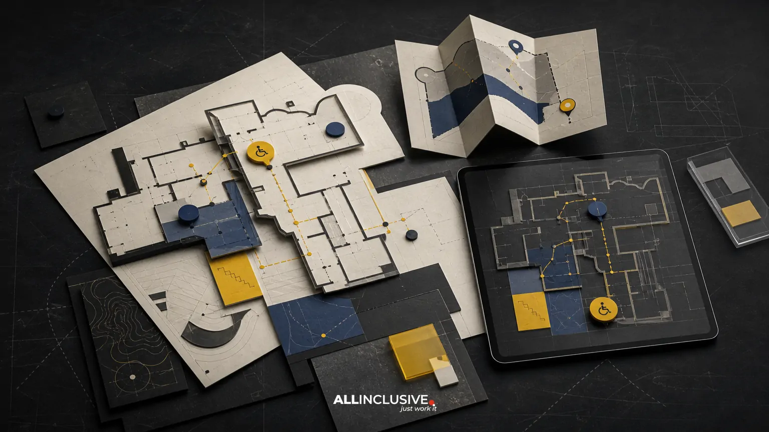
Museum map design is more than placing galleries on a floor plan. A useful museum map helps visitors understand where they are, decide what to see next, find amenities, and move through the building with confidence. It must balance geographic accuracy with visual clarity, institutional identity, accessibility, and the different needs of first-time visitors, members, school groups, families, and staff.
The strongest approach treats the map as a wayfinding system rather than a decorative illustration. Start with visitor behavior and circulation, then build a clear information hierarchy that works in print, on screens, and at key decision points throughout the museum.
What museum map design needs to accomplish
A museum map typically serves several jobs at once:
- Orient visitors at entrances, ticketing areas, elevators, and major intersections.
- Show the relationship between floors, galleries, exhibits, and public amenities.
- Support route planning for a short visit, a full-day visit, or a scheduled program.
- Identify accessible entrances, elevators, ramps, restrooms, seating, nursing rooms, and other essential services.
- Express the museum’s character without reducing legibility.
- Remain accurate as galleries, exhibitions, tenant spaces, and operating conditions change.
These goals can conflict. A detailed illustrated map may communicate place and atmosphere, but too much texture can obscure route choices. A highly technical floor plan may be accurate, but it can overwhelm visitors who need a quick answer. Good design makes deliberate trade-offs based on the map’s audience, format, and location in the visitor journey.
Begin with visitor flow, not graphic style
Before selecting colors, icons, or illustration techniques, document how people actually enter and move through the museum. Review entrances, ticketing, security screening, coat check, restrooms, elevators, stairs, galleries, cafés, shops, exits, and common points of confusion.
Separate the building’s physical circulation from the routes visitors are most likely to take. A central staircase may be architecturally prominent but inaccessible to some visitors. A gallery may be geographically close but difficult to reach because of a controlled entrance or temporary closure. These distinctions should shape the map’s information hierarchy.
Questions to answer during planning
- Where do visitors first need orientation?
- Which destinations are most frequently requested at the information desk?
- Which routes are accessible, step-free, or suitable for mobility devices?
- Where do visitors make a decision between multiple routes?
- Which exhibits or facilities need prominence because they are time-sensitive, popular, or difficult to find?
- What temporary conditions could make a technically accurate map misleading?
Walk the building with a visitor’s perspective. Note sightlines, bottlenecks, confusing transitions between floors, and places where signage or maps compete for attention. If available, visitor-services feedback, accessibility reviews, and maintenance records can add useful evidence without requiring speculative assumptions about behavior.
Build an information hierarchy for exhibits and amenities
A museum map should not give every feature equal visual weight. Establish categories before drawing the final map. A practical hierarchy may include the building outline, visitor position, primary routes, galleries, signature exhibits, amenities, accessibility information, and secondary points of interest.
Use consistent visual rules for each category. Galleries might use numbered or named areas, while restrooms, elevators, cafés, and exits use recognizable symbols. Temporary exhibitions can receive emphasis through color or a distinct marker, but they should not be confused with permanent galleries or building infrastructure.
Use labels strategically
Labels should answer the visitor’s immediate question without creating a dense wall of type. Prioritize names that support decisions: gallery numbers, exhibit titles, floors, entrances, and essential amenities. Short labels are usually easier to scan than full descriptive copy.
When a museum has many galleries, consider a numbered map paired with a directory or exhibition list. This keeps the map readable while preserving access to more detail elsewhere. The directory can also be updated more easily when exhibitions rotate.
Show relationships between floors
Multi-level museums often need more than one floor plan. Use a consistent orientation, visual language, and numbering system across floors so visitors can understand how levels connect. Clearly identify stairs, elevators, ramps, and vertical transitions.
If the building’s geometry makes a shared scale impractical, explain the relationship through strong floor labels and aligned landmarks rather than forcing inaccurate proportions. A simplified diagram can be more useful than a precise plan if it preserves the decisions visitors need to make.
Design for accessible navigation from the beginning
Accessibility should be part of the core map structure, not an afterthought added through a small symbol or separate note. Visitors need to know not only whether a route is accessible, but also where that route begins, how it connects across floors, and whether an alternate entrance or elevator is required.
Consider including:
- Step-free entrances and routes.
- Elevators, ramps, and platform lifts.
- Accessible restrooms and seating areas.
- Quiet spaces or sensory-support resources where applicable.
- Clear indications of stairs and routes that are not step-free.
- Temporary access changes caused by construction, events, or gallery closures.
Use more than color to distinguish accessible routes or categories. Pair color with icons, labels, line patterns, or direct annotations so the map remains understandable for people with color-vision differences and for visitors viewing a low-quality print or screen.
Accessibility also includes cognitive and sensory considerations. Avoid unnecessary visual noise, maintain predictable symbols, use plain language, and provide enough contrast between the background and essential information. The final map should be reviewed at its actual viewing size, not only on a large design monitor.
Balance illustration, identity, and wayfinding
Museum maps often have a valuable place-marketing role. They can communicate architecture, history, atmosphere, and institutional personality. Illustration can make a map feel welcoming and memorable, especially in visitor guides, member communications, or take-home materials.
However, expressive treatment should support navigation rather than compete with it. Keep important routes, labels, entrances, and accessibility markers visually clear. Use illustration selectively for landmarks, building character, or neighborhood context. Avoid decorative elements that resemble actual rooms, corridors, or signs if they could cause confusion.
A useful distinction is between the base map and the narrative layer. The base map establishes reliable spatial information. The narrative layer can add highlights such as “start here,” a suggested first visit, architectural features, or a recommended family route. Keeping these layers conceptually separate makes later updates easier and prevents promotional emphasis from overwhelming core wayfinding.
Choose the right map format
The same museum may need several related outputs rather than one universal map. Each format has different constraints.
| Format | Primary use | Key design priority |
|---|---|---|
| Folded visitor map | Self-guided orientation and take-home reference | Readable at a compact size with an efficient fold sequence |
| Wall or entrance map | Orientation before visitors commit to a route | Fast scanning from a standing distance |
| Mobile or web map | Planning before and during a visit | Responsive detail, accessible controls, and updateability |
| Event or exhibition insert | Short-term route guidance | Clear temporary information and easy revision |
| Staff or operations map | Internal coordination and visitor support | Operational accuracy and fuller detail |
Print maps need careful attention to paper size, folding, ink coverage, contrast, and production tolerances. Digital maps require a different review process, including zoom levels, touch targets, screen-reader considerations where applicable, and a clear method for publishing updates. A map system can share a visual language across formats without treating every output as a simple resize.
Use symbols and color with discipline
Icons should be recognizable, consistent, and tested at the smallest intended size. Establish a compact legend and avoid creating a unique symbol for every minor feature. If a symbol needs a long explanation, it may not be doing enough work visually.
Color can distinguish floors, galleries, routes, or exhibit categories, but a large palette usually reduces clarity. Select colors for contrast and reproduction, then test them in grayscale and under less-than-ideal lighting. Reserve high-attention colors for the most important actions or conditions.
Do not rely on a color key alone. A visitor should be able to identify a restroom, elevator, exit, or accessible route through a combination of iconography, labeling, position, and line treatment.
Plan for temporary exhibitions and operational change
Museums change frequently. Galleries close, exhibitions rotate, construction affects circulation, and events create temporary routes. A map that looks polished at launch can become misleading if its update process is unclear.
Design a system that separates stable information from changeable content. Stable elements may include the building outline, floor structure, restrooms, elevators, and primary entrances. Changeable elements may include exhibition names, gallery assignments, closures, event routes, and opening conditions.
Maintain a source-of-truth document for names, numbers, symbols, and accessibility notes. Assign ownership for approvals and define how quickly print, digital, wall, and staff versions must be updated. Version dates or discreet revision identifiers can help staff confirm that they are using the current map without distracting visitors.
Common museum map design mistakes
Trying to show everything at once
Completeness is not the same as usefulness. Excessive labels, decorative detail, and minor room information can hide the routes and destinations visitors need most. Create a hierarchy and move secondary detail to a directory, guide, or digital layer.
Using an architectural plan without visitor interpretation
A technical plan may preserve walls and measurements but fail to explain entrances, vertical circulation, accessible routes, or visitor priorities. Simplify where necessary and annotate the choices that affect movement.
Making the map beautiful but hard to scan
Illustration, texture, and brand color can add warmth, but they should not reduce contrast or make symbols ambiguous. Review the map in context: folded, posted, held at arm’s length, or viewed quickly while standing in a crowded lobby.
Designing only for the ideal route
Visitors arrive late, skip galleries, travel with children, use mobility devices, or change plans. Provide enough information for alternate routes and make closures or access limitations visible.
Failing to test with real users and staff
Design review alone cannot reveal every wayfinding problem. Ask staff, accessibility advisors, and representative visitors to perform realistic tasks: find an elevator, locate a specific gallery, plan a short visit, or navigate from one floor to another. Record where they hesitate and revise the map accordingly.
A practical museum map design checklist
- Confirm the map’s primary audience, format, and viewing distance.
- Document entrances, exits, galleries, amenities, vertical circulation, and accessible routes.
- Define which information is permanent and which is temporary.
- Create a hierarchy for exhibits, destinations, amenities, and routes.
- Use consistent symbols, labels, orientation, and floor naming.
- Test color, contrast, type size, and icon clarity in actual production conditions.
- Check that accessibility information is complete, prominent, and not color-dependent.
- Review the map with visitor-services staff and people with varied access needs.
- Prepare separate but related print, digital, public-facing, and operational versions where needed.
- Assign responsibility for updates, approvals, and archive control.
How to evaluate a map design partner
If a museum is commissioning a map, evaluate the process as carefully as the portfolio. Ask how the team handles source-plan cleanup, visitor-flow analysis, accessibility requirements, illustration, map simplification, production files, digital adaptation, and future revisions.
Look for evidence that the designer can work across information design and visual communication—not just produce an attractive illustration. A museum map may need to connect with signage, visitor guides, exhibition campaigns, and broader place-based materials. Related examples in park map design and business district map design can help clarify how different audiences and environments change the design problem.
For a broader view of how map systems fit within visual communication, review graphic design and the principles covered in design. When the project requires a coordinated map, wayfinding, or place-based system, the map design service page provides the appropriate commercial next step.
Conclusion
Effective museum map design helps visitors make decisions with less effort. It combines accurate spatial information, purposeful simplification, accessible route planning, exhibit hierarchy, and a visual style that supports the institution without overpowering the wayfinding task. Treat the map as an evolving system, test it in real conditions, and plan its print and digital versions together. The result will be more useful than a decorative floor plan—and more resilient as the museum changes.


