
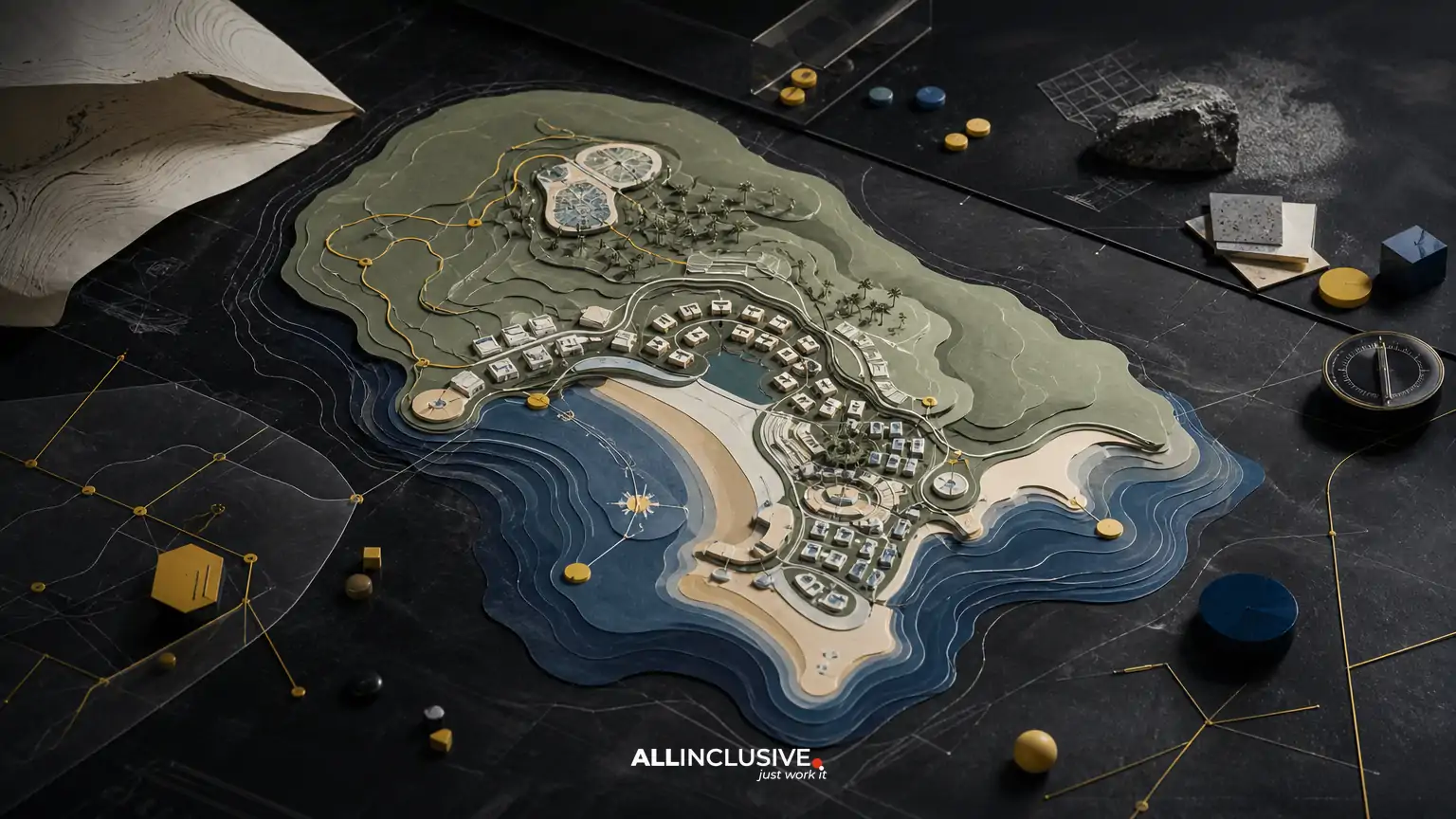
Hotel resort map design has to do more than show where buildings sit. A useful property map helps guests make decisions quickly: which entrance to use, how long a walk may take, where to find dining or recreation, and how to return to their room. At the same time, it can introduce the character of the property before a guest has explored it.
The strongest approach treats the map as both a navigation tool and a carefully structured piece of place communication. That means resolving geography, hierarchy, accessibility, illustration style, production requirements, and updates before visual decoration takes over. This guide explains the main decisions, trade-offs, and review steps involved.
What hotel and resort map design needs to accomplish
A property map serves several audiences and moments. A first-time guest may need orientation from a parking area or lobby. A family may be looking for a pool, kids’ activity, or accessible route. An event attendee may need a meeting venue without being distracted by every leisure amenity. Staff may use the same base information for arrival instructions, guest messaging, or printed collateral.
Because these needs differ, one map rarely performs perfectly in every context without adaptation. The planning question is not simply “What should be included?” It is “Which information matters for this audience, at this moment, at this size?”
- Orient: establish entrances, major buildings, paths, roads, water features, and a clear sense of direction.
- Guide: make destinations, routes, landmarks, and walking relationships easy to find.
- Set expectations: communicate approximate scale, terrain, boundaries, and access conditions honestly.
- Support place identity: use color, line, typography, and illustration to reflect the property without reducing clarity.
- Scale across channels: prepare information for printed handouts, room materials, web pages, mobile viewing, and signage where needed.
Start with the guest journey, not the artwork
Before choosing a visual style, document the situations the map must support. List the questions guests ask repeatedly and the points at which confusion occurs. Common examples include finding the correct check-in area, locating a shuttle stop, understanding beach access, reaching a restaurant after dark, or distinguishing guest-only spaces from public areas.
A simple journey review can reveal that the property needs more than one output. A compact arrival map may prioritize roads, parking, reception, and drop-off. A guest-facing property map may emphasize amenities and walking routes. An event map may use a simplified subset of the same geography. A digital map may need tap-friendly labels and a different crop than a printed version.
Using a shared geographic base helps keep these versions consistent, while separate compositions let each version remain legible. This is usually more effective than shrinking a single, overly detailed map until every label competes for attention.
Build a reliable geographic base
Map design is only as trustworthy as the source information behind it. Gather current site plans, architectural drawings, aerial references, trail or path information, road names, building names, amenity lists, and any operational restrictions. Confirm which features are permanent, seasonal, under construction, or subject to change.
Then identify the map’s visual point of view. A resort map may use a conventional top-down orientation, an illustrated oblique view, or a hybrid that simplifies difficult terrain while preserving useful relationships. Each has advantages:
| Approach | Strength | Trade-off |
|---|---|---|
| Top-down plan | Clear relationships, routes, and orientation | Can feel technical or flatten a distinctive landscape |
| Illustrated oblique view | Inviting, memorable, and effective for landmarks | Can distort distance and make route logic harder to verify |
| Hybrid map | Balances spatial accuracy with character and emphasis | Requires disciplined rules for what is simplified or enlarged |
Whichever approach you choose, establish rules for distortion. If a building is enlarged to receive a label, neighboring paths and landmarks must still make sense. If a route is straightened for clarity, indicate enough context that guests do not mistake the illustration for a literal survey.
Design the information hierarchy
Hierarchy determines whether guests notice the right feature quickly. Start by separating information into levels rather than styling every item independently. A useful hierarchy may include property boundaries and orientation, primary arrival routes, buildings and destinations, pedestrian paths, amenities, service points, and secondary context.
Use a limited set of visual variables to distinguish those levels:
- Position and scale for major destinations and landmarks.
- Line weight for roads, paths, boundaries, and route importance.
- Color families for categories such as lodging, dining, recreation, and services.
- Type size and weight for destination priority.
- Symbols for repeated amenities that benefit from quick recognition.
Do not rely on color alone. Some guests will view the map in poor lighting, print it in grayscale, or have color-vision differences. Pair color with labels, line treatments, shapes, or icons. Check contrast at the smallest intended output size, not only on a large design monitor.
Balance branded illustration with navigational truth
A branded map can use the property’s visual language through typography, palette, illustration, pattern, and tone. But branding should reinforce recognition without turning the map into an advertisement. A guest who cannot find the spa because decorative elements dominate has received a polished but unsuccessful map.
One useful method is to divide the design into functional and expressive layers. The functional layer carries roads, paths, labels, symbols, orientation, and access information. The expressive layer can shape landforms, vegetation, architectural cues, water, and supporting textures. Keeping these layers conceptually separate makes future revisions easier and prevents visual style from obscuring operational information.
Illustration is especially valuable when a property has memorable landmarks or a complex landscape. It can help guests form a mental model of the place. Use it selectively, however. Not every tree, roof, or decorative feature deserves equal detail. Detail should clarify identity, indicate scale, or support orientation.
Plan labels, icons, and legends for real use
Labels are often the first source of failure in a property map. Establish naming conventions early and confirm them with the teams that use those names in guest communications. A restaurant name, building name, room category, or event venue should not vary between the map, website, signs, and front-desk directions.
Label placement should preserve the relationship between text and destination at the map’s smallest practical size. Avoid placing labels over busy textures or paths unless the contrast remains strong. Where space is limited, use a numbered key only when the lookup process is faster than direct labeling.
Icons should be distinctive at small sizes and used consistently. A small icon set can cover common destinations, but unusual amenities may be clearer with words. Include a legend when symbols are not immediately familiar, and test the map with someone who was not involved in making it.
Make walking time and access information useful
Guests often want to know not just where something is, but how demanding or convenient the route may be. If walking times are included, define the assumptions behind them. Terrain, heat, stairs, mobility devices, children, weather, and route closures can all affect the experience.
Consider indicating features such as accessible entrances, elevators, ramps, shuttle stops, steep grades, stairs, boardwalks, restricted areas, and route alternatives. Accessibility information should be verified with property operations rather than inferred from an attractive drawing. When conditions change seasonally, show how that information will be updated.
Walking-time labels can be helpful, but they should not create false precision. Rounded estimates and clear route references are usually more useful than exact-looking numbers that imply a level of certainty the map cannot guarantee.
Design for print, digital, and operational outputs
Different outputs impose different constraints. A folded welcome map can provide a large overview but may be inconvenient to hold. A single-page handout is easy to distribute but has limited room for detail. A website map can support zooming, while a mobile screen demands simplified views and touch-friendly labels. Signage requires distance-appropriate type and strong contrast.
Plan the output system before final illustration. Decide which elements are shared across versions, which are optional, and who owns future updates. A practical system may include:
- A master geographic file with documented source information.
- A full property overview for orientation and planning.
- One or more focused maps for arrival, events, recreation, or specific guest areas.
- A simplified digital composition or responsive map treatment.
- Production-ready files for approved print sizes and finishing methods.
Keep text and symbols editable where possible, and maintain a change log for renamed venues, closed paths, construction zones, and seasonal amenities. Map maintenance is part of the design problem, not an afterthought.
A review checklist for hotel and resort maps
Use a structured review rather than asking only whether the map “looks good.” Include representatives from guest services, operations, accessibility, marketing, events, and facilities when relevant.
- Can a first-time guest identify the main arrival point immediately?
- Are north, orientation cues, or a clear “you are here” reference provided where needed?
- Are the most common destinations visible without searching a dense legend?
- Do paths and roads reflect current conditions?
- Are distances and walking-time statements responsible and understandable?
- Are accessible routes, entrances, elevators, and restrictions represented accurately?
- Does the design remain legible in its smallest print and digital use?
- Does the map work without relying on color alone?
- Are names consistent with the property’s current guest communications?
- Is there a practical process for future changes?
Test the map with realistic tasks. Ask a person unfamiliar with the property to locate a destination, describe a route, and identify what they would do if the direct path were unavailable. Their hesitation often exposes problems that internal reviewers overlook.
How this fits into a broader map design decision
A hotel or resort map is one application of a larger map-design discipline that combines spatial accuracy, information hierarchy, illustration, production, and place communication. When comparing approaches or providers, evaluate portfolios for the kinds of decisions your property requires rather than judging only visual style. Look for evidence of systems that work across formats and can be maintained as the property changes.
For a wider view of map-design capabilities and deliverables, see the map design overview. Related wayfinding considerations also appear in the guides to visitor map design and park map design. If the project includes broader collateral or an integrated visual system, the design services overview can help frame how the map fits within the larger design program.
Conclusion
Effective hotel and resort map design begins with guest questions and operational reality, then turns that information into a clear, distinctive visual system. The key trade-off is not accuracy versus branding; it is how to use illustration and identity without weakening orientation. Define audiences, validate the geographic base, prioritize destinations, test at real sizes, and plan updates before production. When the project needs a wider map-design scope, the map design page is the appropriate next step for evaluating services.


