
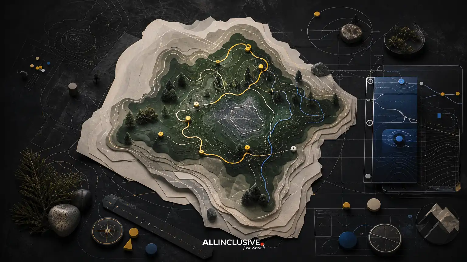
Park map design is the process of turning a landscape into a clear, usable orientation tool. A successful map must do more than show trails and property boundaries: it should help visitors understand where they are, decide where to go next, find amenities, recognize safety information, and form an accurate mental picture of the park.
The central challenge is balancing geographic accuracy with fast comprehension. A technically correct map can still fail if trails blend together, landmarks are hard to find, labels compete with one another, or the map does not work at the size and distance where people will use it. The strongest projects treat the map as both a navigation system and a carefully edited visual representation of place.
This article explains the main planning decisions, trade-offs, production requirements, and review questions involved in park map design. For broader map planning across destinations, facilities, and wayfinding systems, see map design services and planning considerations.
What a park map needs to accomplish
Before choosing a visual style, define the decisions the map must support. A neighborhood park map may need to answer simple questions about entrances, playgrounds, restrooms, and walking loops. A regional park map may need to support longer route planning, elevation awareness, emergency response, and connections to roads or adjacent public land.
Most park maps serve several audiences at once:
- First-time visitors who need immediate orientation and recognizable landmarks.
- Regular users who want efficient route choices, facility locations, or trail updates.
- Families and groups who need restrooms, play areas, picnic zones, accessible routes, and gathering points.
- Hikers, cyclists, and outdoor users who need trail hierarchy, distance, difficulty, surfaces, and connections.
- Staff and emergency personnel who require consistent names, access points, service roads, boundaries, and reference points.
These needs can conflict. A visitor-friendly illustration may simplify terrain, while operations teams need precise infrastructure. The design process should identify what belongs in the primary visual layer, what belongs in a legend or inset, and what should be delivered through a companion digital experience.
Start with a reliable geographic foundation
Visual polish cannot compensate for inaccurate source information. The first phase should establish a dependable base map and a controlled inventory of geographic features. Depending on the park, source material may include GIS data, survey information, aerial imagery, engineering drawings, trail reports, property records, accessibility audits, and staff knowledge.
Organize source data into categories before drawing the map. Typical layers include:
- Park boundary and adjacent streets
- Entrances, gates, parking areas, and transit connections
- Trails, paths, roads, bridges, crossings, and stairs
- Water, terrain, vegetation, and major natural features
- Buildings, restrooms, shelters, playgrounds, fields, courts, and picnic areas
- Accessibility features and route limitations
- Emergency access, help points, ranger stations, and evacuation locations
- Construction zones, seasonal closures, and restricted areas
Establish a single naming reference as well. A trail that has three different names across signage, a website, and the map creates avoidable confusion. Confirm spelling, capitalization, abbreviations, directional terms, and whether names are official, informal, or temporary.
Choose the right level of geographic abstraction
A park map is rarely a literal aerial photograph. It is an edited model of the landscape. The designer must decide which elements to preserve exactly, which to simplify, and which to emphasize for orientation.
Overly literal maps often become dense and difficult to scan. Highly illustrated maps may be attractive but can distort distances, hide route relationships, or imply that minor features are more important than they are. A useful approach is to preserve navigational relationships while simplifying visual noise.
Accuracy that usually matters most
- The relative position of entrances, destinations, and trail junctions
- Connections between trails and roads
- Route continuity and major crossings
- Accessible paths and barriers
- Locations of safety and visitor-service facilities
- Boundaries, closures, and restricted areas
Elements that may be simplified
- Dense vegetation outside the visitor decision path
- Minor contour variation when it does not affect route choice
- Small structures with no visitor relevance
- Complex road geometry that does not help orientation
- Decorative environmental detail that competes with labels
Illustration is most effective when it reinforces the spatial story. A distinctive lake, ridge, bridge, or grove can become a visual anchor, but it should not obscure the route network or create a misleading sense of scale.
Build a hierarchy for trails and routes
Trail information is usually the most demanding part of park map design. A map may need to distinguish paved paths, natural-surface trails, bike routes, equestrian routes, service roads, boardwalks, steep segments, and temporary closures without turning the map into a technical diagram.
Use a consistent visual hierarchy based on how visitors make decisions. Line weight, color, pattern, casing, and labeling can work together to indicate importance and use. For example, primary routes may receive stronger line treatment, while minor connectors use lighter or narrower lines. A dashed treatment may indicate a route condition, but only if the legend makes the meaning unmistakable.
Consider including route information that supports a decision rather than simply documenting the network:
- Approximate distance or loop length
- Typical surface or accessibility condition
- Difficulty or steepness where relevant
- Estimated walking time when assumptions are clear
- Permitted uses, such as walking, cycling, or equestrian travel
- Connections to entrances, facilities, overlooks, and nearby destinations
Do not rely on color alone. Trail colors can disappear in grayscale printing, become difficult for some users to distinguish, or lose contrast over complex backgrounds. Combine color with line patterns, labels, symbols, or casing where the information is important.
Make amenities easy to find
Visitors often open a park map with a specific task: find a restroom, picnic area, playground, parking lot, water source, or accessible entrance. Amenities therefore need a recognizable symbol system and a predictable information structure.
Use icons that are visually distinct at the final output size. A symbol that looks clear on a desktop artboard may become ambiguous on a folded handout or roadside sign. Keep related facilities visually consistent, and avoid using too many custom pictograms when familiar conventions will work better.
Group amenities by visitor need rather than by the order in which they were supplied. A practical legend might separate:
- Arrival and transportation
- Restrooms and water
- Food, picnic, and gathering areas
- Recreation and play
- Information and staff support
- Accessibility features
- Safety and emergency resources
Labels should answer both “what is it?” and “where is it?” Use callouts carefully when an important facility is too small to label directly. Avoid placing labels so close to icons that the relationship becomes unclear, especially in dense facility areas.
Design safety information as an action layer
Safety information should not be treated as decorative content placed in an empty corner. It needs a clear visual priority and plain-language instructions. Depending on the park, relevant information may include emergency phone locations, ranger or visitor centers, evacuation areas, water hazards, steep terrain, wildlife guidance, fire restrictions, road crossings, and seasonal closures.
Separate general guidance from location-specific warnings. A warning such as “steep section” is useful only when its location is clear. Similarly, a general emergency instruction should not be presented in a way that suggests it marks a physical facility.
Review safety layers with the people responsible for operations and visitor communication. Confirm that contact details, facility names, access routes, and closure information can be updated without rebuilding the entire visual system. For parks with changing conditions, a printed map may need a publication date, update notice, or QR code leading to current information—provided the digital destination is maintained and the printed map remains useful without it.
Plan accessibility from the beginning
Accessibility should influence the map structure, not be added as a final symbol pass. Identify accessible entrances, parking, restrooms, routes, crossings, seating, and facilities, while making clear where conditions vary. A route described as accessible may still have surface, slope, width, or weather-related limitations.
Use sufficient contrast between the background and critical information. Check text size at the intended reading distance, test symbols in context, and provide distinctions beyond hue. An accessible map may also require a companion format, such as large print, tactile information, audio guidance, or a digital version compatible with assistive technologies.
Accessibility communication must be precise. Avoid broad claims that a whole park or trail network is accessible when only selected routes or facilities meet the stated criteria. Coordinate terminology with the park owner’s policies and current site conditions.
Design for print, signage, and digital use separately
One map file rarely serves every context equally well. A visitor may encounter the map on a folded brochure, a large orientation sign, a website, a mobile screen, or a downloadable PDF. Each format changes scale, reading distance, available detail, and interaction.
| Format | Primary design concern | Useful adaptation |
|---|---|---|
| Folded handout | Small physical size and limited attention | Prioritize orientation, essential amenities, legend clarity, and fold-safe labels. |
| Large sign or kiosk | Reading distance and glare | Use stronger hierarchy, larger labels, durable contrast, and a clear “you are here” marker. |
| Website or PDF | Variable screen sizes and zoom behavior | Provide a responsive or high-resolution version with searchable, selectable information where practical. |
| Mobile experience | Interaction and changing conditions | Use focused views, current closures, route details, and location-aware orientation when available. |
Shared visual rules are valuable, but the layouts should be adapted rather than mechanically resized. A sign needs fast recognition from a distance; a mobile view can reveal more detail progressively; a printed handout must remain understandable when folded or held in motion.
Use visual landmarks to improve orientation
Orientation improves when visitors can connect the map to what they see around them. A “you are here” marker is essential, but it works best alongside prominent landmarks, arrival points, directional labels, and a clear relationship between the map and the viewer’s position.
At entrances and kiosks, consider whether the map should be aligned to the surrounding landscape or presented with north at the top. A consistent north-up convention supports general reference, while an orientation aligned to the visitor’s viewpoint can be faster for immediate wayfinding. Either choice can work if it is clearly communicated with a compass, orientation cue, or directional language.
Use in-park signs and map labels consistently. If a destination is called “North Meadow” on the map but “Meadow Loop” on the sign system, the visitor has to solve a naming problem before solving a navigation problem.
Review the map through real visitor scenarios
Proofreading names and checking source data are necessary, but they are not enough. Evaluate the map through realistic tasks that reveal whether the hierarchy works.
- Stand at the primary entrance and locate the current position.
- Find the nearest restroom and identify the route to it.
- Plan a short loop suitable for a first-time visitor.
- Locate an accessible route to a specified destination.
- Find a trail connection without following a major road.
- Identify the nearest emergency or staff-supported location.
- Determine whether a seasonal closure changes the planned route.
- Use the map at its actual printed or installed size.
Ask testers to describe what they would do, not just whether they like the map. Hesitation, backtracking, misread symbols, and repeated legend checks are evidence of friction. Test with people who know the park and people who do not; familiarity can hide problems that first-time visitors experience immediately.
Common park map design mistakes
- Starting with decoration instead of information architecture: illustration cannot repair unclear priorities.
- Showing everything at equal weight: visitors need a hierarchy, not an inventory.
- Using color as the only distinction: critical route and facility information should survive different viewing conditions.
- Ignoring the final size: labels and symbols must be judged where the map will actually be used.
- Leaving out operational review: staff often know about closures, access constraints, and naming issues that source files miss.
- Combining current and permanent information without dates: visitors need to know what may change.
- Making the digital version an afterthought: a blurry PDF or unstructured image limits usefulness and accessibility.
- Overpromising accessibility: route conditions and facility limitations should be described accurately.
A practical approval checklist
Before final production, confirm the following:
- All entrances, trails, destinations, amenities, boundaries, and safety locations are current.
- Names match the organization’s approved terminology and physical signage.
- Trail hierarchy is understandable without relying on one visual variable.
- The legend explains every symbol, line, pattern, and important abbreviation.
- “You are here,” north orientation, scale, and major reference points are clear.
- Accessibility information is specific, current, and reviewed by the appropriate stakeholders.
- Seasonal or temporary information is dated or connected to a maintained update process.
- Print, signage, PDF, and digital versions have been tested in their intended contexts.
- Emergency and visitor-service information is prominent, accurate, and actionable.
- Final files include editable source assets and a documented update workflow.
For related decision-making about visual systems, production formats, and supporting collateral, the broader design planning guide can provide useful context. More specialized considerations appear in the guides to visitor map design and museum map design, where audience behavior and interpretive content create different mapping challenges.
Conclusion
Effective park map design combines geographic discipline, information hierarchy, accessibility awareness, illustration, and production planning. The best map is not the one with the most detail; it is the one that helps the right visitor make the right decision quickly and confidently. Define the use cases, validate the geographic foundation, prioritize routes and amenities, design for each output, and test the finished map in real conditions. When the project requires a coordinated map system across print, signage, and digital touchpoints, use the map design pillar as the next step for evaluating scope and deliverables.


