
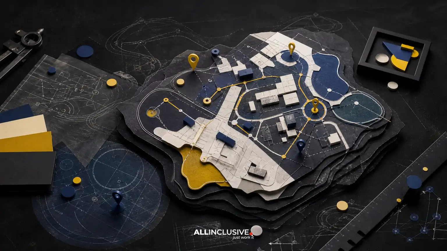
Campus map design is more than placing buildings on a page. A useful campus map turns a complex environment—such as a university, school, medical campus, corporate site or business park—into a navigation system people can understand quickly. It must balance geographic accuracy, clear hierarchy, accessibility, visual identity and the realities of print, digital screens and on-site signage.
The best approach is to treat the map as both an information tool and a place-branding asset. It should help a first-time visitor answer practical questions: Where am I? Where do I need to go? Which route should I take? How long might it take? What landmarks, entrances, parking areas or accessibility features matter along the way?
This guide explains the main decisions involved in planning campus map design, the trade-offs to discuss with a designer, and the materials to prepare before production. For broader project planning, see the map design services overview.
What campus map design needs to accomplish
A campus map usually serves several audiences at once. Students and employees may need a dependable reference throughout the day. Visitors may use it only once, often under time pressure. Parents, conference attendees, delivery drivers, vendors and emergency personnel can have different priorities from regular users.
That means a campus map should be evaluated against specific tasks rather than judged only as an attractive illustration. Common tasks include:
- Finding a destination from a primary entrance, parking area or transit stop.
- Identifying accessible entrances, ramps, elevators and routes.
- Understanding the relationship between buildings, quads, roads, paths and outdoor spaces.
- Locating amenities such as restrooms, dining, visitor services, security and information desks.
- Distinguishing public, restricted, service and pedestrian-only areas.
- Using the same visual language across print, web, mobile and environmental applications.
A strong map reduces uncertainty without overwhelming the reader. It does not need to show every available detail in every version. Instead, it should establish a reliable base system that can be adapted to different audiences and formats.
Start with the map’s users and decisions
Before choosing an illustration style, document who will use the map and what they need to do. This prevents a common problem: designing a visually polished map that does not support the most important journeys.
Identify primary user groups
List the audiences in order of importance for each map application. A university visitor map might prioritize prospective students and families, while an internal operations map might prioritize staff, facilities teams and emergency responders. A business park map may need to serve employees, clients, couriers and event guests.
Define high-priority journeys
Write down the routes users are most likely to take. Examples include parking lot to admissions office, transit stop to classroom building, visitor center to conference venue, or main entrance to an accessible building entrance. These journeys should influence the map’s scale, labeling and emphasis.
Separate information by purpose
Not every location belongs in every version. A public visitor map may need reception, parking and amenities, while a facilities map may need service roads, utility access and restricted zones. Separating these needs helps avoid a single overloaded map.
Core components of an effective campus map
Accurate base information
The base map should reflect current building footprints, roads, paths, entrances, parking areas, landscape features and relevant boundaries. Source materials may include GIS data, architectural plans, site surveys, existing maps and facilities documentation. A designer should clarify which source is authoritative and how conflicts between sources will be resolved.
Accuracy does not mean reproducing every geographic detail. It means preserving the relationships that affect decisions. A simplified path network can work well if destinations, connections and access conditions remain truthful.
Clear visual hierarchy
Readers need to distinguish major destinations from secondary details. Hierarchy can be created through scale, weight, color, contrast, grouping and label treatment. Primary buildings may receive stronger fills and larger labels, while background context uses quieter tones.
Establish hierarchy before adding decorative illustration. If every building, road and landscape feature has equal visual emphasis, the map becomes difficult to scan.
Legible labeling
Labels should be readable at the sizes and distances where the map will be used. This is especially important when one design must support a printed handout, a website image and a large sign. Short names, consistent abbreviations and a well-planned type system can preserve clarity without making the map unnecessarily large.
Landmarks and orientation cues
Landmarks help users connect the graphic representation to the real place. A prominent building, sculpture, courtyard, water feature or gateway may be more useful than a minor topographic detail. Orientation cues can include a north arrow, street names, entrances, major pathways, parking identifiers and a clear “you are here” marker.
Legend and supporting information
A legend should explain symbols that are not immediately obvious. It may include accessible routes, parking types, transit, visitor services, dining, restrooms, security and construction notices. Keep the legend close enough to the map to be useful, but do not allow it to compete with the main navigation content.
Choosing the right level of illustration
Campus maps can range from highly diagrammatic systems to detailed illustrated scenes. The appropriate style depends on the map’s purpose, audience, environment and production formats.
| Approach | Strengths | Trade-offs |
|---|---|---|
| Diagrammatic | Fast scanning, strong route clarity, adaptable to small formats | May feel less place-specific or immersive |
| Geographic | Preserves spatial relationships and real-world orientation | Can become dense when a campus has complex routes |
| Illustrated | Creates warmth, memorability and stronger place identity | Requires disciplined simplification to remain navigable |
| Hybrid | Combines functional navigation with distinctive visual character | Needs careful rules so decoration does not obscure information |
For many institutions, a hybrid approach is effective. Buildings and routes can remain structurally clear while selected landmarks, landscape elements or architectural features receive illustrative treatment. The goal is not to make the map look busy; it is to make the place easier to recognize and remember.
If the map is also intended to promote a destination, coordinate its visual decisions with the broader design system and communication materials. This can include color, typography, icon style and image treatment without forcing the map to behave like a brochure.
Designing for print, digital and environmental use
One of the most important early decisions is whether the project needs one map or a family of related map outputs. A campus map may appear in admissions packets, orientation materials, websites, mobile interfaces, kiosks, digital signs, event programs and permanent wayfinding signs.
Print maps require attention to physical size, folding, paper stock, color reproduction and viewing conditions. A pocket map may need fewer details and stronger contrast than a large visitor guide. Plan for the final print size rather than reviewing only a large working file.
Web and mobile
Digital maps need responsive thinking. Small screens may require simplified views, progressive disclosure or separate destination-focused panels. If the map is supplied as an image, ensure the text remains legible at common display sizes. If it will be interactive, define which layers can be turned on or off and who will maintain the underlying location data.
Signage and environmental graphics
Signage introduces viewing distance, lighting, mounting height, weather exposure and physical obstruction. A sign map may need fewer labels, stronger directional cues and a clear orientation relative to the viewer. Do not assume that a successful brochure map can be enlarged without redesign.
Editable and production-ready files
Ask how the final files will be structured. Useful deliverables may include print-ready artwork, vector source files, web exports, icon assets, a simplified digital version and documentation for future updates. The file format should match the organization’s ability to maintain the map over time.
Accessibility and inclusive navigation
Accessibility should be part of the map’s information architecture, not a final color adjustment. Consider users with low vision, color-vision deficiencies, mobility limitations, cognitive disabilities and different levels of familiarity with the site.
- Use sufficient contrast between important routes, destinations and background areas.
- Do not rely on color alone to distinguish route types or access conditions.
- Use clear symbols supported by labels where ambiguity is possible.
- Identify accessible entrances and routes accurately, including relevant limitations.
- Maintain readable type sizes in every intended physical and digital format.
- Use straightforward language and consistent directional terms.
- Test the map with people who are unfamiliar with the campus.
Accessibility information must be kept current. A map that identifies an entrance as accessible when construction has changed the route can create serious frustration. Establish an owner for reviewing access details and temporary conditions.
Operational details that affect map quality
Many map projects become difficult because the design brief omits operational questions. Resolve these before visual development begins:
- Who owns the source location data?
- How often do buildings, paths, parking areas and access routes change?
- Who approves naming, abbreviations and accessibility information?
- Will construction updates require temporary overlays or frequent revisions?
- Are there privacy or security concerns around showing restricted areas?
- Which destinations must be legally, operationally or institutionally represented?
- What are the required print, digital and signage specifications?
For organizations managing frequent updates, a modular system may be more valuable than a single finished illustration. Standardized symbols, layer structures, naming rules and export procedures can reduce the effort required for future revisions.
A practical campus map design workflow
- Discovery: Confirm audiences, priority journeys, locations, formats, accessibility requirements and approval stakeholders.
- Data review: Compare source maps, site plans, GIS information and current conditions. Identify gaps and conflicting information.
- Information architecture: Establish layers, categories, label priorities, symbols, route conventions and legend content.
- Concept development: Test map style, degree of simplification, color direction and relationship to the organization’s identity.
- Prototype testing: Ask unfamiliar users to locate destinations and follow representative routes without coaching.
- Production adaptation: Prepare versions for intended print sizes, screens, signs and other applications.
- Review and handoff: Confirm accuracy, accessibility, naming, file organization, update responsibilities and approval sign-off.
Testing should focus on observable behavior. Can a visitor find the correct entrance? Do users confuse two buildings with similar names? Does the “you are here” marker make sense from the sign’s physical position? These questions are more useful than asking whether people simply like the design.
How to evaluate a campus map designer
When comparing designers or studios, review more than visual style. Ask for evidence that the team understands information-heavy communication and production constraints.
- How do you validate map data and handle conflicting source materials?
- How do you simplify a site without changing essential relationships?
- Can you produce related versions for print, web, mobile and signage?
- How will accessibility requirements influence symbols, color and labeling?
- What testing or review process do you recommend?
- How will editable files and future revisions be handled?
- Who is responsible for final accuracy approval?
Review relevant examples for clarity, not just artistic detail. A visually impressive map may not demonstrate the ability to support a complex campus, multiple audiences or recurring updates. The broader guide to choosing a map designer can help structure the evaluation.
Common campus map mistakes
Designing from outdated information
A polished map built on old plans will still misdirect people. Begin with a source audit and define who verifies the current condition of the site.
Showing everything at equal emphasis
Overloaded maps make important destinations harder to find. Use layers and hierarchy to distinguish primary navigation content from supporting context.
Optimizing for only one output
A map designed for a large poster may fail as a handout or mobile image. Establish output requirements early and create purposeful adaptations where needed.
Using decorative illustration as a substitute for structure
Illustration can make a place memorable, but it cannot replace readable labels, logical routes and accurate access information.
Leaving maintenance undefined
Buildings, entrances, construction zones and services change. Assign ownership for updates and retain a file system that supports revision.
Campus map design checklist
- Primary users and priority journeys are documented.
- Base information has a named source and approval owner.
- Buildings, entrances, routes, parking and key amenities are current.
- Visual hierarchy distinguishes essential destinations from background detail.
- Labels, symbols and abbreviations are consistent.
- Accessibility information has been verified.
- Color and contrast work across relevant viewing conditions.
- Print, digital and signage outputs have been considered.
- Unfamiliar users have tested representative navigation tasks.
- Editable files, exports and update responsibilities are defined.
Making the decision
Campus map design is best treated as a coordinated information and communication project. The right solution combines accurate source data, clear navigation logic, inclusive access information and a visual language appropriate to the place and its audiences. Illustration and branding can add recognition and warmth, but they should reinforce—not compete with—the map’s wayfinding purpose.
For organizations ready to scope the work, use these criteria to define requirements before requesting proposals, then review the options within Allinclusive’s map design offering. Related examples of use-case planning are available in the guides to tourism map design and event map design.


