
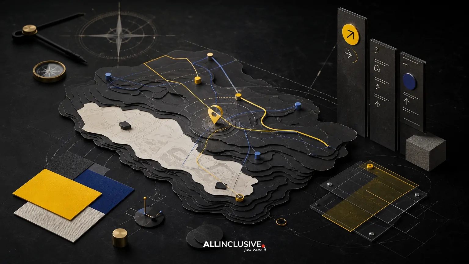
A wayfinding signage and map system is more than a collection of signs or a well-drawn map. It is a coordinated navigation language that helps people understand where they are, where they need to go, which route is appropriate, and when they have arrived. The same logic should carry across site maps, directional signs, directories, printed guides, event materials, and digital interfaces.
The central implementation challenge is consistency. A visitor should not have to reinterpret the destination name, color code, landmark, orientation, or route hierarchy at every touchpoint. When the system is designed as a connected set of decisions, navigation becomes faster, easier to maintain, and more accessible across changing environments.
What a wayfinding signage and map system includes
A complete system usually combines several communication layers:
- Orientation: maps, directories, arrival panels, and “you are here” markers that establish location and context.
- Decision-making: directional signs, route diagrams, arrows, and destination groupings that help users choose a path.
- Identification: building names, room numbers, district labels, trail markers, entrances, and other confirmation points.
- Interpretation: illustrated landmarks, neighborhood information, attractions, amenities, and place-specific visual cues.
- Digital support: mobile maps, QR-linked information, searchable directories, and screen-based navigation.
These layers have different jobs, so they should not all look or behave identically. A campus directory can show broad context and multiple destinations; a directional sign needs a short message that can be read at a distance. The system succeeds when each format performs its role while sharing the same underlying vocabulary.
Start with the navigation model, not the visual style
Illustration, color, and typography make a map recognizable, but they cannot compensate for an unclear navigation model. Before designing assets, document how people move through the place and what information they need at each decision point.
Define destinations and hierarchy
Create a controlled list of destinations and group them by how visitors think about the environment. A hospital may need buildings, departments, entrances, parking areas, and accessible routes. A downtown district may need streets, public spaces, attractions, transit stops, and business zones. Avoid allowing every stakeholder to give equal visual weight to every location.
Use a destination hierarchy that distinguishes primary destinations from supporting amenities. Decide whether names should use official terminology, public-facing language, or both. If a venue has an internal name and a name visitors commonly use, establish a consistent naming rule before production.
Map decision points and arrival sequences
List the moments when users must make a choice: entering a parking area, leaving a transit stop, reaching a fork in a path, entering a building, or moving from an outdoor district to an interior directory. Each decision point may require a different combination of sign, map, arrow, landmark, or confirmation message.
Consider the complete journey rather than isolated sign locations. A map that explains the destination but omits the next transition can create the same confusion as a missing sign. Sequence the information so that each touchpoint prepares the user for the next one.
Build one visual language across maps and signs
Consistency does not mean placing the same artwork everywhere. It means using repeatable rules that users can learn.
Establish a shared graphic vocabulary
Document the visual elements that should remain stable across formats:
- destination naming and capitalization;
- color assignments and contrast requirements;
- icon families and meanings;
- line weights for streets, paths, boundaries, and routes;
- arrow construction and directional behavior;
- map orientation and the treatment of north;
- landmark illustration style;
- typographic hierarchy and minimum legibility sizes.
A compact system guide is often more useful than a large collection of disconnected mockups. It gives fabricators, developers, facility teams, and future designers a reference for extending the system without introducing visual contradictions.
Separate orientation from decoration
Place illustration can make a map memorable, especially for tourism, cultural districts, events, and visitor attractions. However, decorative detail should not compete with routes, labels, entrances, or “you are here” markers. Establish a clear information hierarchy before adding pictorial texture.
For a deeper look at this balance, the map illustration styles guide can help teams compare expressive and functional approaches.
Design maps for the way they will be used
A map is not automatically useful because it is geographically accurate. It must also be readable at its actual size, oriented appropriately, and edited for the decisions users need to make.
Choose an orientation strategy
North-up maps support geographic consistency and can be useful for operational teams or users comparing multiple maps. Heads-up maps rotate the environment to match the viewer’s position and can reduce mental translation at a specific location. Neither approach is universally correct.
For fixed signs, consider the direction a person is facing when reading the map. For printed visitor guides, consider whether the map must work across several arrival points. For digital maps, determine whether the interface rotates with movement or preserves a stable frame. If different orientations are used, make the rule apparent rather than surprising.
Edit for comprehension
Detailed base data may include every road, parcel, service lane, contour, or building edge. That information can be valuable during production but distracting for visitors. Simplify elements that do not support a current decision, while preserving the landmarks and route relationships people rely on.
Use labels sparingly and consistently. A label should answer a likely question, identify a decision point, or confirm that the user is on the correct route. When a map is crowded, reducing nonessential content is usually more effective than shrinking every label.
Test at final viewing conditions
Review maps at the size, distance, lighting, and mounting angle in which they will be encountered. A design that works on a monitor may fail when printed on a narrow panel, viewed through glass, or read while a person is moving. Check labels, line weights, color contrast, symbol recognition, and the visibility of the current-location marker.
Coordinate physical signage with print and digital outputs
Each output has different constraints, but users should not experience them as separate systems.
| Output | Primary job | Important design constraint |
|---|---|---|
| Arrival map or directory | Establish context and available destinations | Must remain legible while presenting broad information |
| Directional sign | Support a specific decision | Needs short messages, clear arrows, and distance-appropriate type |
| Identification sign | Confirm the destination | Must be visible and consistent with the destination naming system |
| Printed map | Support planning and independent exploration | Needs an explanatory legend, folding strategy, and durable production approach |
| Digital map or directory | Provide searchable, updateable guidance | Requires responsive behavior, accessible interaction, and content governance |
Do not force one map file into every format. Instead, maintain a shared source of truth for destinations, symbols, and route logic, then create output-specific compositions. This reduces the risk that a digital update will contradict a printed guide or that a sign will use an outdated destination name.
The comparison of printed maps and digital maps is useful when deciding which information belongs in a durable physical format and which should remain updateable.
Plan accessibility and operational maintenance early
Accessibility should be part of the system architecture, not a final compliance check. Review color contrast, type size, symbol clarity, reading distance, mounting conditions, route continuity, and the needs of people who may approach from different directions or use mobility aids.
Color should reinforce meaning rather than carry it alone. Pair color categories with labels, patterns, line styles, or icons where appropriate. Test the system in grayscale and under varied lighting conditions. For digital outputs, include keyboard access, readable text structure, descriptive labels, and interaction states that do not depend solely on color.
Maintenance is equally important. Assign ownership for destination lists, route changes, construction updates, temporary closures, translations, accessibility reviews, and file approvals. Define which changes require a full design review and which can be handled through controlled content updates. A system without governance will drift even if its initial design is strong.
A practical implementation workflow
- Audit the environment: document entrances, paths, barriers, decision points, sightlines, existing signs, visitor questions, and known confusion points.
- Gather authoritative data: confirm boundaries, destinations, access routes, building names, hours, and operational restrictions with the responsible teams.
- Create the information architecture: establish destination groups, route priorities, naming conventions, icons, and map layers.
- Develop the visual system: define typography, color, symbols, arrows, line styles, orientation rules, and illustration treatment.
- Design representative prototypes: test an arrival map, a directional sign, an identification sign, a printed piece, and a digital state rather than only one format.
- Review in context: inspect prototypes at actual sizes and locations, including day and night conditions where relevant.
- Test journeys: ask representative users to complete realistic tasks without coaching. Record where they hesitate, backtrack, or ask for help.
- Prepare production and governance files: include specifications, source data, templates, installation notes, update procedures, and a clear approval process.
The broader map design brief checklist can help organize the questions stakeholders should answer before visual development begins.
Common implementation mistakes
Designing the sign family before understanding movement
A polished sign family cannot solve missing routes, conflicting destinations, or poorly placed decision points. Map the journey and information requirements first.
Using different names across touchpoints
Small naming differences create unnecessary uncertainty. Maintain one approved destination list and use it across maps, signs, directories, web content, and event materials.
Prioritizing geographic detail over user decisions
Accuracy matters, but an exhaustive map can bury the route a visitor needs. Edit for purpose and preserve enough context to support orientation.
Treating temporary conditions as an exception
Construction, event closures, seasonal paths, and relocated entrances are normal operational conditions. Design a process for temporary messaging instead of improvising a separate visual language.
Assuming a QR code replaces physical guidance
Digital information can extend a system, but it cannot guarantee that every visitor has a compatible device, connectivity, time, or willingness to scan. Physical navigation still needs to work on its own.
How to evaluate a finished system
Use evaluation criteria that reflect real navigation rather than visual preference alone:
- Can a first-time visitor identify their current location?
- Can they distinguish primary destinations from amenities?
- Are routes continuous from arrival through confirmation?
- Do maps and signs use the same names, symbols, and color logic?
- Can users understand the system from multiple approach directions?
- Does the design remain legible at the intended distance and size?
- Can the responsible team update content without rebuilding the entire system?
- Does the system support accessibility needs without creating a separate, confusing experience?
Document observed problems by location and journey stage. This creates a practical improvement backlog and helps teams prioritize changes that remove real navigation friction.
Conclusion
The strongest wayfinding signage and map systems treat navigation as an ecosystem. Maps establish context, signs support decisions, landmarks confirm progress, and digital tools extend information when needed. A shared vocabulary, disciplined information hierarchy, contextual testing, and clear maintenance ownership keep those outputs aligned over time.
For teams defining the overall scope, production requirements, and visual direction of a navigation program, explore the map design services page. Related decisions may also benefit from the broader perspective in design services.


