Brand identity iconography is the structured use of icons to help people recognize, navigate and understand a brand across digital and physical touchpoints. A strong icon system is more than a set of attractive symbols: it defines visual rules, meaning, construction, accessibility, production formats and governance.
The most reliable approach is to design iconography as one component of a broader identity system alongside the logo, typography, color, imagery, motion, templates and guidelines. This keeps icons recognizable without allowing them to compete with the core brand assets. For context on how the pieces fit together, see the brand identity design overview.
What brand iconography includes
A brand iconography system typically includes the following elements:
- Icon purposes: navigation, product features, services, industries, alerts, processes or editorial concepts.
- Visual principles: the level of geometric precision, corner treatment, line quality, perspective and visual weight.
- Construction rules: grid, key shapes, stroke behavior, corner radii, spacing and alignment.
- Usage rules: approved sizes, color combinations, backgrounds, placement and surrounding space.
- Production assets: vector masters, optimized SVGs, raster exports and implementation guidance.
- Governance: a method for requesting, reviewing and adding new icons without weakening consistency.
This scope is distinct from logo design. A logo identifies the organization or product; icons explain content, actions and categories within an experience or communication system. A logo may require a highly specific mark, while a useful icon system must remain legible and expandable across many meanings.
Start with an iconography strategy
Before drawing icons, document where they will appear and what jobs they must perform. A system for a software product may need interface controls, feature illustrations and status indicators. A professional services firm may need icons for capabilities, industries, process stages and reports. The same visual style will not automatically work equally well in every context.
Define the icon inventory
Create an initial inventory from real content rather than abstract categories. Review the website navigation, product interface, sales materials, presentations, reports, packaging or environmental applications where icons may be used. Group requested icons by function and identify repeated concepts.
Then separate essential icons from optional ones. Designing a small, high-priority set first makes it easier to test the system before investing in a large library. It also reveals whether some concepts are better handled by typography, photography, illustration or a simple interface control.
Clarify the communication role
Each icon should have a defined communication role. Ask whether it is meant to:
- Help users find or select something.
- Summarize a service, capability or feature.
- Show sequence, status or change.
- Support a data point or editorial idea.
- Provide a visual signpost in a physical environment.
An icon that performs a functional role should generally prioritize recognition and speed. An icon used in a campaign or editorial layout can carry more personality, but it still needs to belong to the same visual language.
Choose a visual language and construction model
Consistency comes from repeatable decisions. A system can be outlined, filled, geometric, organic, two-dimensional or perspective-based, but its choices should be deliberate and documented.
Key decisions to make
| Decision | Options to evaluate | Primary trade-off |
|---|---|---|
| Rendering | Outline, solid, duotone or hybrid | Personality versus small-size clarity |
| Geometry | Strict grid, optical grid or flexible construction | Uniformity versus expressive forms |
| Stroke | Fixed, scaled or variable weight | Production simplicity versus responsive behavior |
| Corners | Square, rounded or mixed | Technical character versus approachability |
| Perspective | Flat, isometric or dimensional | Speed of recognition versus depth and distinction |
| Color | Monochrome, brand color or controlled palette | Flexibility versus visual consistency |
Do not treat a grid as a substitute for judgment. A mathematically identical stroke can appear heavier in one shape than another, and two icons with matching dimensions may not look optically aligned. Use construction rules to create a dependable starting point, then apply optical corrections where they improve balance and legibility.
Set a grid and keyline shapes
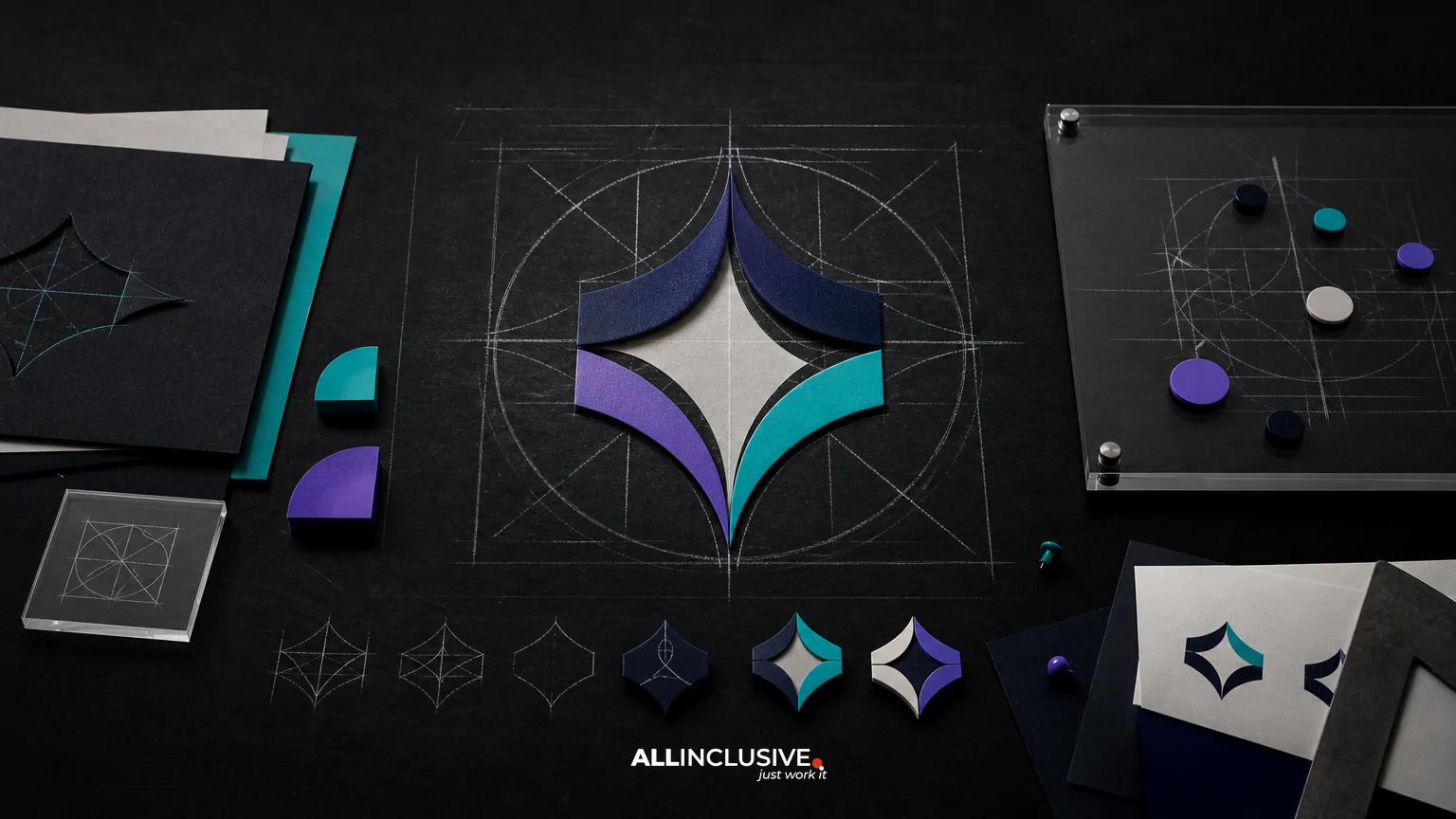
A grid defines the coordinate system for the icon family. It may use a simple square field with internal padding, keyline circles, rounded rectangles and diagonal guides. The exact grid is less important than applying it consistently.
Document the usable drawing area, minimum clear space, baseline behavior and how elements may extend beyond the keyline. Establish rules for circles, diagonals, curves and repeated angles so designers do not make a new interpretation for every icon.
Design for meaning before style
A visually consistent icon can still fail if its meaning is unclear. Start with the concept, identify the most recognizable visual cue and remove unnecessary detail. Avoid combining too many metaphors into one symbol. When a concept is abstract, pair the icon with a label or supporting copy rather than forcing the symbol to communicate everything independently.
Check for cultural and industry-specific interpretations. A symbol that is familiar in one context may be ambiguous or inappropriate in another. For international audiences, validate terminology and test whether the image depends on a local convention.
Build families, not isolated illustrations
Related icons should share visual grammar. For example, a set of process icons might use the same container shape, stroke weight and directional cues. A set of product-feature icons may share a common perspective or internal cutout. Families make relationships visible while allowing each icon to remain distinguishable.
Reserve higher-detail or more expressive forms for larger applications. Small interface icons usually need fewer shapes, stronger silhouettes and fewer intersections. Larger editorial icons can support more nuance, provided the added detail serves the message.
Test the system at real sizes and contexts
Iconography should be tested in the environments where it will actually appear, not only on an artboard. Review icons at their intended interface size, in navigation, beside labels, on light and dark backgrounds, in print and in responsive layouts.
Use a practical test checklist
- Can the icon be recognized at its smallest approved size?
- Does it remain distinct from neighboring icons?
- Does the visual weight match the surrounding type and interface controls?
- Does it work in monochrome when color is unavailable?
- Does it maintain sufficient contrast against every approved background?
- Can it be reproduced cleanly in both vector and raster formats?
- Is its meaning clear with and without a text label?
- Does it remain legible when translated, cropped or placed in a dense layout?
Test groups, not just individual icons. A single symbol may look correct while the family feels uneven because some forms are too dense, too narrow or optically too large. Compare icons side by side and in realistic content blocks.
Account for accessibility and implementation
Icons should support comprehension, not create an accessibility barrier. Do not rely on an icon alone to communicate a critical action, status or error. Pair important symbols with text, use meaningful labels and ensure interactive controls have accessible names in the product implementation.
Color should not be the only way to distinguish states or categories. Confirm contrast in the intended context, including disabled, hover, selected and alert states. For decorative icons, define how assistive technology should treat them. For meaningful icons, provide an equivalent text label or accessible description through the implementation system.
Technical specifications should cover more than export size. Define naming conventions, viewBox behavior, alignment, pixel snapping where relevant, stroke expansion rules and whether icons may be recolored. If the system will be used by developers, include component guidance and examples for common states.
Document iconography in the brand guidelines
A useful guideline makes correct use easier than incorrect use. It should show the principles behind the system and provide enough detail for designers, developers, marketers and vendors to work independently.
Recommended guideline contents
- Purpose and scope: where the icon system applies and what it does not replace.
- Core principles: the qualities that define the visual language.
- Construction: grid, keylines, stroke, corners, spacing and optical adjustments.
- Color: approved fills, strokes, backgrounds and contrast requirements.
- Scale: minimum sizes and behavior across interface, print and environmental uses.
- Composition: alignment, grouping, labels and placement within layouts.
- Accessibility: text pairing, contrast, semantics and state communication.
- Examples: correct and incorrect applications in realistic contexts.
- Asset access: file formats, naming, versioning and request workflow.
Iconography should sit within the same governance structure as the rest of the identity. If you are documenting the wider system, the brand guidelines design resource can help frame the documentation layer. For a broader view of production touchpoints, compare the guidance in brand identity handoff.
Plan for expansion and maintenance
A system is successful when a new icon can be added without looking like an exception. Establish an intake process that records the requested concept, context, required size, proposed metaphor, related icons and accessibility needs. Review the proposal against the existing construction and semantic vocabulary before drawing final artwork.
Maintain a source library and a release library. Source files should preserve editable construction; release files should be optimized for their use. Version the library so teams can identify approved assets and retire outdated variants. A changelog is particularly valuable when icons are embedded in products, templates or customer-facing documentation.
Schedule periodic audits. Look for duplicate concepts, inconsistent metaphors, unused assets, obsolete product language and icons that fail in new interface states. Governance does not mean preventing change; it means making change deliberate.
Common brand iconography mistakes
- Starting with decoration: styling icons before defining their communication role often produces attractive but unclear symbols.
- Mixing visual families: combining outline, filled and dimensional icons without a hierarchy makes the system feel assembled rather than designed.
- Overusing detail: intricate shapes can disappear at small sizes and increase production problems.
- Ignoring context: an icon that works in a presentation may fail in navigation, print or environmental signage.
- Using color as meaning: this can reduce accessibility and create problems in monochrome applications.
- Skipping labels: familiar-looking symbols are not universally understood, especially for abstract actions.
- Documenting too little: without construction and usage rules, every new icon becomes a one-off interpretation.
- Creating a closed library: a system with no expansion process quickly becomes inconsistent as the organization grows.
How iconography fits into a complete identity system
Iconography should reinforce the brand’s broader visual behavior rather than operate as an isolated asset library. Compare its weight and geometry with the logo, typography, color palette, imagery and motion principles. The brand identity imagery direction resource is useful when icons and photography or illustration must share a communication hierarchy, while the brand identity motion design guide addresses how symbols can behave in animated contexts.
At the implementation level, align icon rules with the templates, interface components and production workflows used by the organization. The broader design resource provides additional context for coordinating identity assets across communications.
Final review checklist
Before releasing a brand iconography system, confirm that it:
- Has a clear purpose, audience and set of use cases.
- Uses documented visual and construction principles.
- Communicates meaning without unnecessary complexity.
- Works at approved sizes, backgrounds and output formats.
- Supports accessible implementation and does not rely on color alone.
- Includes examples, source files, release assets and naming rules.
- Defines how new icons are requested, reviewed, approved and retired.
- Fits the logo, typography, color, imagery, motion and template system.
When iconography needs to be developed as part of a larger visual identity rather than as a standalone asset set, use the brand identity page as the appropriate next step. The editorial goal is not to produce the largest icon library; it is to create a clear, durable system that helps people understand and use the brand consistently.