
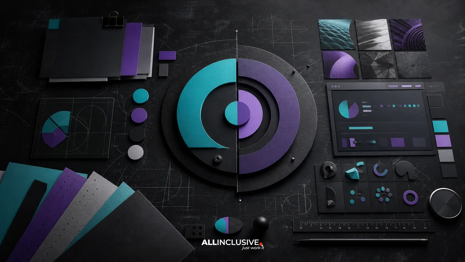
A brand identity system is the coordinated set of visual rules and reusable assets that makes an organization recognizable across every customer touchpoint. The logo is only one component. A complete system typically includes typography, color, imagery, iconography, motion, layouts, templates, guidelines and an implementation plan.
The right scope depends on where the brand appears, who creates its communications and how quickly the organization expects to grow. A small professional-services firm may need a focused core system and a few templates, while a national company may require extensive digital, environmental, packaging or motion standards. The goal is not to collect the most assets; it is to create a system that people can apply consistently without slowing down production.
For broader context, see how visual identity differs from brand identity. This article focuses specifically on the visual system and the decisions required to make it useful.
The core brand identity system components
1. Logo architecture
A logo system defines how the brand is identified, rather than delivering a single isolated mark. It may include a primary logo, a compact or responsive version, a symbol, a wordmark, lockups and rules for light and dark backgrounds.
Important decisions include minimum size, clear space, approved color versions, placement, background control and improper-use examples. A responsive logo may be particularly valuable when the same identity must work in a website header, social avatar, presentation footer, trade-show sign and mobile interface.
Logo work should be scoped according to real applications. A complex identity can be difficult to use at small sizes, while an overly simple system may not provide enough flexibility for a large organization. If the main need is a standalone mark, consult the logo design resource; a broader identity system adds the surrounding rules and assets.
2. Typography
Typography gives the identity a recognizable voice in headlines, body copy, navigation, data displays and long-form documents. A practical type system usually specifies primary and secondary typefaces, hierarchy, weights, sizes, line spacing, alignment and usage examples.
Selection should account for licensing, language support, accessibility, screen performance and the skills of the people who will use the system. Many organizations benefit from a distinctive display face paired with a highly legible text face. Others need a smaller set of readily available fonts so internal teams can work without specialized software or licensing friction.
Typography guidelines should show hierarchy in context, not just list font names. Examples might include a website landing page, proposal cover, presentation slide, email graphic and report page.
3. Color palette
A color system normally includes primary brand colors, supporting colors, neutral tones and functional colors for status, alerts, links or data visualization. Each color should have a defined role rather than appearing as a collection of attractive swatches.
Useful specifications may include digital values, print values, contrast guidance, background combinations and accessibility considerations. A palette that looks strong in a brand presentation can fail in interfaces if text contrast is weak or if color is the only way information is communicated.
Define hierarchy as well as values: which color carries the brand, which supports navigation, which highlights a call to action and which should be reserved for warnings or emphasis. This reduces inconsistent improvisation across teams.
4. Imagery and art direction
Imagery determines what the brand feels like when photography, illustration or generated visuals are used. An imagery system can define subject matter, composition, lighting, cropping, perspective, color treatment and the balance between people, products, environments and detail.
Art direction is more useful than vague instructions such as “use professional photography.” A stronger standard might explain whether images should feel documentary or highly composed, whether people should look directly at the camera, how much negative space layouts require and which visual clichés to avoid.
Illustration, collage, 3D renders and diagrams may need their own rules. If multiple image types are permitted, explain how they coexist so the identity does not become visually fragmented.
5. Iconography and graphic elements
Icons and supporting graphics help translate the identity into interfaces, diagrams, presentations and marketing materials. An icon set should establish stroke or fill treatment, corner style, proportions, grid, optical adjustments and usage scale.
Graphic elements may include patterns, lines, frames, shapes, borders, textures or a distinctive composition device. These elements should reinforce the identity without becoming decoration applied to every surface. Their value is highest when they solve a communication or layout problem while making the brand more recognizable.
6. Layout and composition
Layout rules connect individual assets into a repeatable visual language. They may define grids, margins, alignment, columns, spacing, hierarchy, image ratios and the relationship between text and graphic elements.
This component is often overlooked because it is less tangible than a logo or color palette. Yet layout determines whether the identity feels orderly and recognizable in proposals, web pages, social graphics, packaging, reports and signage.
Documenting a few representative compositions is usually more effective than attempting to prescribe every possible layout. Show how the system behaves in both constrained and spacious formats.
7. Motion and digital behavior
Digital brands may need rules for animation, transitions, loading states, video graphics, scrolling behavior and responsive changes. Motion can express energy, precision, warmth or restraint, but it should also support comprehension and performance.
Define when motion appears, how quickly it moves, which elements lead or follow, and what happens when motion is reduced or disabled. A motion system may be lightweight for a B2B organization: a transition style, a small set of timing principles and a few examples can be enough to create consistency.
8. Templates and production assets
Templates turn identity decisions into usable tools. Depending on the organization, these may include presentation decks, proposal documents, social layouts, email banners, case-study pages, sales sheets, report covers, event signage and digital ad formats.
Prioritize templates by frequency, business importance and risk of inconsistency. A rarely used asset should not receive the same production effort as a proposal or presentation used every week.
Templates also need ownership rules. Clarify which files are editable, which software is required, where approved assets live and who is responsible for updates.
9. Guidelines and governance
Guidelines explain how the system works. They can be a concise digital reference, a detailed brand book or a combination of documentation and templates. Effective guidance covers decisions that users regularly face, including logo selection, color combinations, type hierarchy, imagery, accessibility and common mistakes.
Good guidelines are operational rather than ceremonial. They include examples, annotations and ready-to-use files. They also distinguish firm requirements from flexible recommendations, which prevents teams from treating every visual choice as equally restrictive.
For a deeper look at this deliverable, review the brand guidelines resource.
How the components work together
A brand identity system is stronger when its parts reinforce one another. Typography can establish the same tone as the imagery. Color can guide hierarchy rather than merely decorate a layout. Graphic elements can create recognition when a logo is absent. Templates can make the intended behavior easy to reproduce.
Evaluate the system through common scenarios instead of reviewing each component in isolation. For example, test a website page, sales presentation, social post, proposal, event banner and mobile view. Ask whether the brand remains recognizable, readable and appropriately flexible in each environment.
| Component | Primary job | Key decision |
|---|---|---|
| Logo system | Identification | How does it adapt across sizes and backgrounds? |
| Typography | Voice and hierarchy | Can teams apply it consistently in every channel? |
| Color | Recognition and emphasis | Does it support contrast, accessibility and clear roles? |
| Imagery | Emotion and context | What subjects, treatments and compositions are distinctive? |
| Iconography and graphics | Support and recognition | Do the forms belong to one coherent visual language? |
| Templates | Repeatable production | Which high-frequency tasks need the most support? |
| Guidelines | Adoption and governance | Can users make correct decisions without constant review? |
How to decide what belongs in scope
Use the organization’s actual communication environment to set priorities. Start with four questions:
- Where does the brand appear? List owned digital channels, sales materials, physical environments, events, products, packaging and internal communications.
- Who produces the work? Consider internal marketers, sales teams, executives, outside partners and specialized production vendors.
- Where is inconsistency costly? Identify customer-facing moments where confusion, rework or weak recognition creates a business problem.
- What must change soon? A website launch, fundraising effort, acquisition, new product or expansion may affect the order of priorities.
A useful first release often includes a logo architecture, core typography, color palette, imagery direction, basic graphic language, priority templates and practical guidelines. Additional motion, environmental, packaging or campaign systems can follow when the relevant needs are clear.
Common mistakes in identity system planning
Building a logo before understanding applications
A logo developed without testing real contexts may look strong in a presentation but fail in navigation, documents, small-scale digital spaces or signage. Define the application set early.
Choosing aesthetics without operating rules
A mood board can establish direction, but it does not tell a team how to select a type size, crop an image or use a secondary color. Convert the intended feeling into observable rules and examples.
Over-specifying the system
Excessive rules can make ordinary production slow and encourage people to ignore the guidelines. Reserve strict controls for decisions that materially affect recognition, accessibility or quality.
Under-specifying templates
When a system has no practical production assets, teams recreate materials from scratch. Prioritize the formats that are used most often and document how they should be maintained.
Ignoring accessibility and technical constraints
Color contrast, readable type, responsive behavior, file formats and licensing are part of a usable system. Treat them as design requirements rather than post-launch corrections.
A practical review checklist
Before approving a brand identity system, review whether it can answer “yes” to most of these questions:
- Can the logo adapt to small, wide, square, light and dark applications?
- Are type hierarchy and font usage clear enough for non-designers?
- Do colors have defined roles and accessible combinations?
- Can a team select imagery without relying on subjective taste alone?
- Do icons and graphic elements share a consistent construction logic?
- Are the most frequent communication formats represented by usable templates?
- Can people find approved assets and understand which version to use?
- Does the system allow flexibility without losing recognition?
- Has the identity been tested in realistic digital and physical contexts?
- Is there an owner for future updates, exceptions and new applications?
From identity components to implementation
Launch is part of the identity system, not an administrative afterthought. Prepare the asset library, name files consistently, define permissions, brief internal teams and identify the first high-visibility applications. A staged rollout can reduce disruption and reveal gaps before every channel is updated.
It is also useful to distinguish brand identity from the wider brand strategy. Positioning, messaging, audience decisions and customer experience influence the visual system, but they are not replaced by a logo or a set of templates. For a process-oriented view, read the brand identity design process guide, and compare identity scope with logo-only work in brand identity versus logo design.
If you are defining a complete identity and need to determine the right scope, priorities and deliverables, explore brand identity design. For adjacent communication needs, the broader design resource can help place identity work within an overall design program.


