
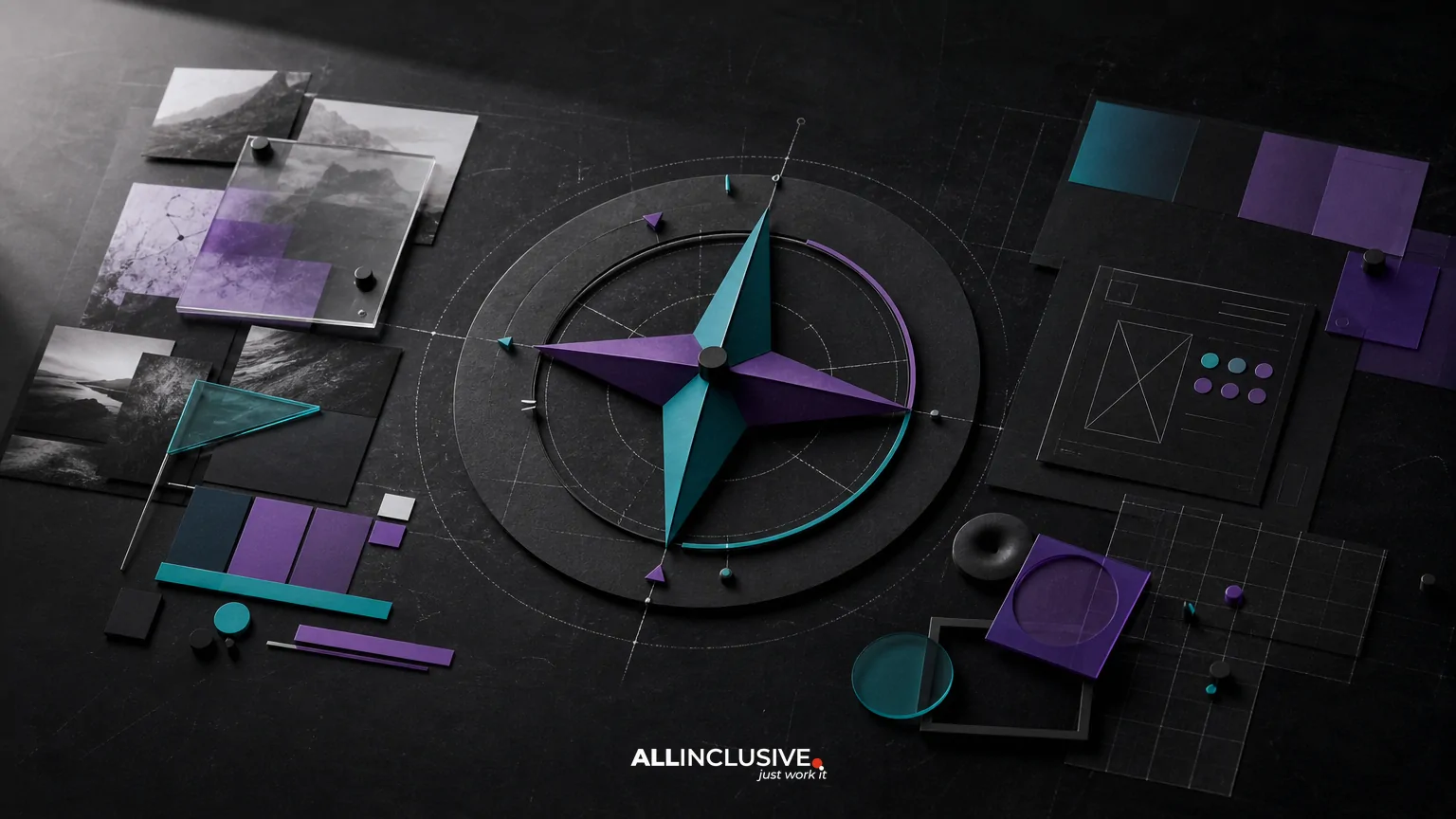
Brand imagery direction is the system that determines how a brand looks beyond its logo. It covers photography, illustration, graphics, image treatment, composition, cropping, motion and usage rules so that different teams can create recognizable work across websites, campaigns, presentations, social channels and sales materials. For the broader context, explore our design services.
The goal is not to make every image identical. The goal is to make varied images feel like they belong to the same brand. A useful imagery direction balances three needs: strategic relevance, practical production and visual consistency. It should give creators enough guidance to make confident decisions without turning every asset into a rigid template.
For context, imagery is one component of a broader brand identity system, alongside logo behavior, typography, color, iconography, motion and applications. This article focuses specifically on how to design and implement the imagery layer.
What brand imagery direction includes
A complete imagery direction usually defines the following:
- Subject matter: what people, products, environments, details or ideas should appear.
- Point of view: the distance, angle, framing and visual relationship between the viewer and subject.
- Lighting and atmosphere: whether imagery feels bright, natural, dramatic, technical, quiet or tactile.
- Composition: how space, scale, contrast, layering and focal points are handled.
- Color treatment: how image color relates to the brand palette, including saturation, temperature and contrast.
- Image sources: when to use commissioned photography, existing libraries, stock, illustration, 3D, generated imagery or editorial content.
- Post-production: cropping, retouching, overlays, grain, gradients, duotone treatment and accessibility considerations.
- Channel behavior: how the system adapts to websites, paid media, email, print, presentations and social formats.
These decisions should be documented as a repeatable system rather than expressed only through a mood board. A mood board can establish a direction, but it rarely tells a marketing team what to do when the exact reference image is unavailable.
Start with a strategic imagery brief
Before selecting visual styles, define the communication problem imagery needs to solve. A financial software company may need to make complex products feel understandable and credible. A hospitality brand may need to communicate atmosphere and place. A manufacturing company may need to show precision without relying on generic factory photography.
A practical brief should answer:
- Who needs to recognize or trust the brand?
- What should the audience understand, feel or do?
- Which brand attributes should imagery reinforce?
- What kinds of proof need to be shown?
- Where will the imagery be used most often?
- What production resources, permissions and timelines are available?
Translate abstract attributes into visible behavior. Instead of writing “premium and innovative,” define what that means in images: controlled composition, restrained color, considered materials, useful detail and a forward-looking but credible subject selection. This translation prevents subjective feedback from dominating the process.
Choose the right imagery model
Most brands use a combination of visual sources. The best choice depends on the role of the asset, not on a universal preference for custom photography or stock.
| Imagery model | Best used for | Primary trade-off |
|---|---|---|
| Commissioned photography | Distinctive people, products, environments and proof points | Higher production effort and coordination |
| Stock photography | Flexible editorial support, broad topics and fast-turn content | Lower distinctiveness and possible overuse |
| Illustration | Abstract ideas, complex processes and concepts that are difficult to photograph | Requires a clear illustration language to remain consistent |
| 3D or rendered imagery | Products, systems, technical concepts and controlled compositions | Can feel artificial if material, lighting or detail choices are weak |
| Customer or documentary content | Authenticity, evidence and real-world context | Less control over framing, quality and visual uniformity |
| Generated imagery | Conceptual exploration or carefully governed visual experimentation | Requires review for accuracy, rights, representation and consistency |
A resilient system often establishes a primary mode and approved supporting modes. For example, documentary photography might lead, while diagrams and restrained illustration explain complex services. The hierarchy matters: if every mode has equal status, the identity can become visually fragmented.
Define the photography direction
Photography direction should be specific enough for a photographer, designer or content team to interpret consistently. Describe observable decisions rather than vague adjectives.
Subject and behavior
Specify whether people are shown in action, in conversation, at work or in portrait. Clarify whether products are presented in use, isolated, partially cropped or surrounded by contextual materials. For organizations, decide whether the emphasis is on customers, employees, process, place or outcome.
Camera and composition
Set expectations for camera height, lens feel, depth of field, negative space and cropping. A brand may favor close, tactile details; wide environmental views; symmetrical compositions; or an intentionally imperfect documentary perspective. These choices become especially important when several photographers contribute over time.
Light and color
Define whether light should feel natural, directional, diffused, high contrast or softly controlled. State how highlights, shadows and background tones should behave. If brand colors appear in the imagery, explain whether they should be literal, found in the environment or introduced through layout treatment.
Authenticity and representation
A visual system should not treat people as decorative symbols. Establish expectations for realistic settings, inclusive casting, consent, privacy and respectful representation. Avoid staging that creates a misleading impression of how a product, workplace or service is actually used.
Use art direction to connect different visual sources
Art direction is the decision-making layer that makes a collection of assets feel intentional. It connects subject selection, styling, location, props, composition and post-production before design begins.
For a campaign or photo shoot, an art direction plan might include:
- A defined communication objective for each image group.
- A shortlist of settings, subjects, materials and actions.
- Reference frames showing composition and atmosphere, not images to copy.
- A shot list covering hero, detail, horizontal, vertical and flexible crops.
- Requirements for negative space where headlines or interface elements may appear.
- Rules for retouching, color correction and image selection.
Art direction also applies when using stock. Search terms, selection criteria, cropping behavior and treatment rules can turn a generic library into a more coherent source. A useful stock standard may reject overly staged gestures, artificial expressions, irrelevant environments, excessive lens effects or imagery that conflicts with the brand’s representation principles.
Create a usable imagery specification
Imagery guidance is most effective when it includes both positive and negative examples. Show what the brand should do, then explain what to avoid and why. A usable specification may contain:
- Core principles: three to five memorable rules that summarize the direction.
- Subject guidance: preferred and discouraged people, objects, settings and moments.
- Composition rules: framing, scale, focal point, negative space and crop behavior.
- Color and treatment: contrast, temperature, overlays, gradients, texture and retouching.
- Channel examples: representative layouts for website, email, social, presentation and print.
- Selection checklist: a short review tool for internal teams and vendors.
Keep the guidance operational. “Use confident, human imagery” is a starting principle, not an implementation rule. A stronger version might say: “Prioritize real interaction, visible context and relaxed body language; avoid isolated posed portraits unless the communication goal is identification or expertise.”
Imagery rules should live alongside, not apart from, the broader brand guidelines. That makes it easier for teams to understand how images interact with logo placement, typography, color contrast and layout.
Design for consistency across channels
Consistency does not mean using the same crop everywhere. Each channel has different proportions, reading distances and content demands. Define how the system adapts.
| Channel | Key imagery decisions |
|---|---|
| Website | Responsive crops, subject-safe areas, page hierarchy, load performance and accessibility text |
| Social media | Fast recognition, mobile-first framing, recurring series patterns and platform-specific crops |
| Small-screen clarity, image blocking contingencies and a balance between image and live text | |
| Presentations | Readable composition at distance, flexible widescreen crops and support for narrative sequencing |
| Resolution, color conversion, bleed, paper behavior and permission documentation | |
| Paid media | Rapid comprehension, safe space for copy and variations that meet platform requirements |
Build a small set of tested crops and layout examples. This is more useful than assuming one master image will work unchanged in every placement. Consider whether focal subjects remain visible when images are cropped automatically, whether text overlays meet contrast requirements and whether the system still works when images are unavailable.
Coordinate imagery with typography, iconography and motion
Imagery rarely appears alone. Its character can change significantly depending on the surrounding type, icons, graphic devices and animation.
For example, a restrained photographic system may need more expressive typography or graphic framing to create energy. A highly detailed illustration style may require quieter typography and generous spacing. Motion can introduce camera movement, transitions or layered depth that is not present in static assets.
When documenting the system, define relationships rather than isolated rules: how headlines sit over images, when icons clarify versus decorate, how graphic shapes crop photography, and whether motion amplifies a focal point or simply adds movement. Related guidance on the brand identity typography system and brand identity iconography can help teams coordinate these layers.
Common brand imagery mistakes
- Starting with style instead of purpose: attractive references do not explain what the imagery needs to communicate.
- Using only adjectives: words such as “bold,” “authentic” and “modern” are open to conflicting interpretations.
- Relying on a single source: one photographer, stock library or visual technique may not cover every business need.
- Ignoring production reality: guidance that requires a custom shoot for every post will not survive normal marketing workflows.
- Showing only hero examples: teams also need rules for ordinary, fast-turn and low-budget content.
- Over-treating images: filters, overlays and effects can obscure subjects and reduce accessibility.
- Separating imagery from the identity system: photography that conflicts with typography, color or layout will still feel inconsistent.
- Forgetting rights and records: usage permissions, model releases and source documentation should be managed before publication.
A practical implementation checklist
Use this checklist when building or reviewing a brand imagery direction:
- Define the audience, communication goals and brand attributes.
- Choose a primary imagery mode and approved supporting modes.
- Document subject, composition, light, color and treatment decisions.
- Create positive and negative examples using realistic production scenarios.
- Specify responsive crops, negative space and text-overlay behavior.
- Include accessibility, representation, permissions and file-management requirements.
- Test the system across website, social, email, presentations and print.
- Provide templates, sample assets or a searchable library where appropriate.
- Assign an owner who can answer questions and approve exceptions.
- Review the system after major campaigns, channel changes or brand updates.
Implementation is easier when imagery direction is treated as a working tool instead of a static presentation. Teams should be able to find approved examples, understand the decision behind them and adapt the system without requesting a new interpretation for every asset. Broader rollout considerations are also covered in the brand identity motion design discussion, particularly where static and moving imagery need to work together.
How to evaluate whether the direction is working
Evaluate imagery on both strategic and operational criteria. Strategically, ask whether the work communicates the intended attributes, represents the audience responsibly and distinguishes the organization from category conventions. Operationally, ask whether internal teams can source, create, crop, approve and reuse assets without excessive friction.
A useful review session compares a range of ordinary outputs rather than only polished campaign images. Place website modules, sales slides, social posts and editorial graphics side by side. Look for recognizable patterns in subject choice, composition, treatment and tone. Also identify where the system is too narrow, because consistency that cannot accommodate real business requirements will eventually be ignored.
Final takeaway
Effective brand imagery direction gives a brand a recognizable visual point of view while preserving enough flexibility for real communication needs. Define the role of imagery, choose a practical source model, make art direction observable, document channel behavior and connect the rules to the wider identity system. When the visual decisions need to be coordinated with logo, typography, color, templates and rollout, explore the broader brand identity design framework rather than treating imagery as an isolated deliverable.


