An ecommerce brand identity is more than a logo placed on a website. It is the coordinated visual system customers experience across a storefront, product pages, paid ads, email, social content, shipping materials, inserts, and post-purchase communications. For video acquisition, the same identity system must translate into YouTube creative that supports product demand and measurable response.
The strongest systems make an online business recognizable while helping customers navigate, evaluate, buy, and remember the brand. That requires decisions about typography, color, imagery, iconography, motion, layouts, templates, packaging, and usage rules—not just a mark.
This guide explains what an ecommerce brand identity should include, how to connect storefront, advertising, and packaging, and which trade-offs to evaluate before investing in a broader brand identity system.
What ecommerce brand identity includes
A useful ecommerce identity connects brand expression with the practical needs of digital commerce. Its components should work independently in small placements and together across a complete customer journey.
| Identity component | Where it appears | What it should solve |
|---|---|---|
| Logo system | Header, favicon, ads, packaging, inserts | Recognition across different sizes and contexts |
| Typography | Navigation, product descriptions, campaigns, email | Hierarchy, readability, and a consistent voice |
| Color system | Buttons, backgrounds, product storytelling, cartons | Distinctiveness, emphasis, and accessibility |
| Imagery direction | Product photography, lifestyle content, paid media | A repeatable visual point of view |
| Iconography and graphics | Feature callouts, education, packaging, social posts | Fast communication and visual continuity |
| Motion principles | Short-form video, website transitions, ads | Energy and consistency in moving formats |
| Templates and guidelines | Campaigns, marketplaces, email, print production | Reliable execution as the business scales |
The scope should reflect the number of channels, products, contributors, and customer decisions involved. A small catalog may need a leaner system than a multi-category retailer with multiple ad teams and fulfillment partners.
Why storefront, ads, and packaging must connect
Each touchpoint answers a different customer need, but customers experience them as one brand. An ad creates an expectation, the storefront confirms or challenges it, and the package delivers the physical proof of the purchase.
Storefront: clarity and confidence
The ecommerce storefront carries the heaviest information load. It must balance brand character with product discovery, comparison, trust signals, pricing, shipping details, and conversion-focused interaction.
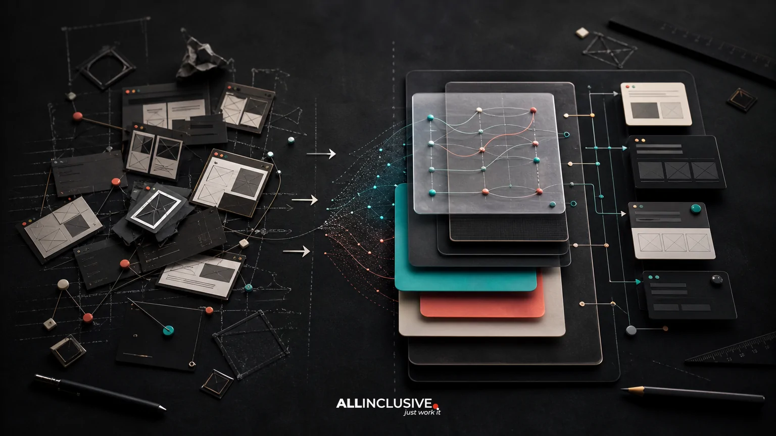
Identity decisions should define more than the homepage appearance. They should guide product-card layouts, heading hierarchy, buttons, badges, photography crops, promotional modules, and mobile behavior. A visually distinctive system that makes product information difficult to scan is not serving the business.
Advertising: recognition under constraints
Ads often appear briefly, at small sizes, and beside competing messages. The identity needs recognizable cues that survive limited space: a consistent color relationship, typographic treatment, image style, product framing, or graphic device.
Advertising templates should accommodate different objectives, including prospecting, retargeting, seasonal promotions, product launches, and educational content. A system that only works for polished campaign art may fail when a team needs to build a fast promotional variant.
Packaging: the physical confirmation
Packaging extends the identity beyond the screen. It can reinforce quality, explain use, support unboxing, and create a memorable moment without turning every package into an expensive production exercise.
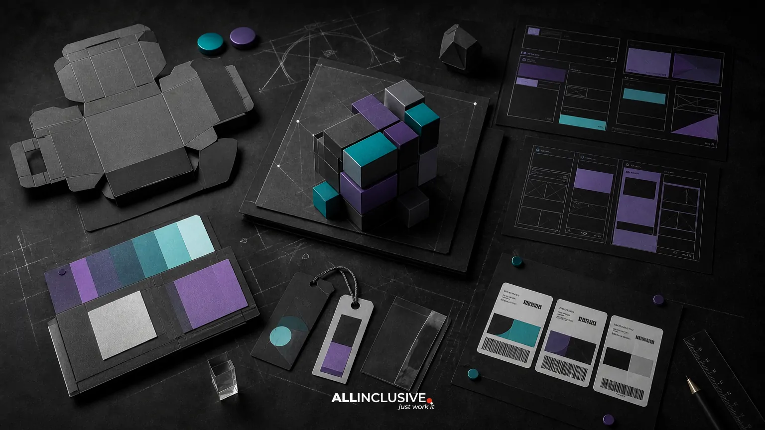
Packaging decisions should account for substrate, printing limitations, label dimensions, shipping protection, regulatory information, returns, and fulfillment workflows. The visual system must remain coherent when translated from pixels to ink, paper, corrugated board, labels, tape, or inserts.
How to build the system step by step
1. Map the customer and operational touchpoints
Begin with an inventory of where the brand appears before, during, and after purchase. Include paid and organic social, search ads, marketplace listings, landing pages, product detail pages, checkout, order confirmation, shipping notifications, boxes, labels, inserts, customer support, and retention email.
Then identify who creates each asset and which constraints apply. A system used by an internal marketing team has different documentation needs from one shared with freelancers, agencies, manufacturers, and marketplace operators.
2. Define the brand’s visual and commercial priorities
Translate positioning into observable design behavior. For example, a premium product may require restrained composition, precise typography, and controlled photography, while a playful consumer brand may rely on expressive color, illustration, and flexible motion.
Do not treat these descriptors as a mood board alone. Define how they affect spacing, product emphasis, contrast, copy hierarchy, image selection, promotional graphics, and packaging materials.
3. Create a flexible logo system
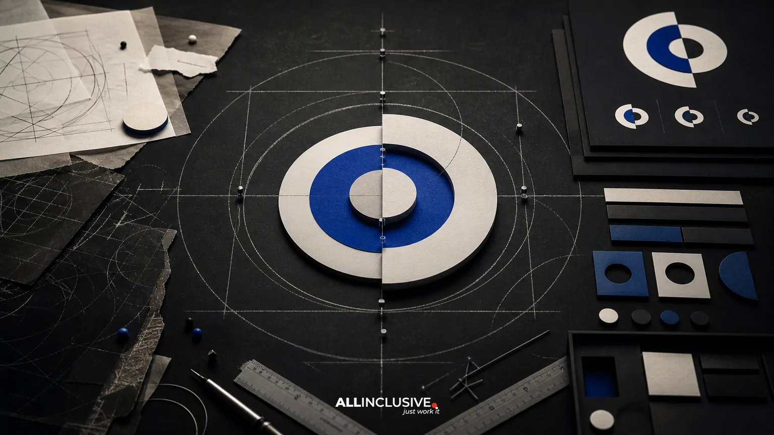
An ecommerce identity may need a primary logo, compact mark, wordmark treatment, social avatar, favicon, packaging lockup, and one-color version. Establish clear rules for scale, spacing, contrast, and use on photography.
Logo design is one part of the system rather than its entire definition. If the mark is the only recognizable asset, the brand may become difficult to identify when the logo is cropped, minimized, or absent from an ad.
4. Build a color and typography architecture
Choose colors for roles, not just appearance. Define primary, supporting, accent, surface, text, feedback, and promotional uses. Check contrast in navigation, buttons, product information, and packaging details.
Typography should establish a clear hierarchy for product names, prices, descriptions, promotional claims, and supporting information. Consider web performance, licensing, language support, available weights, and how the type behaves in print.
5. Establish imagery and graphic behavior
Document the difference between product photography, lifestyle photography, user-generated content, illustration, texture, and promotional graphics. Specify framing, lighting, backgrounds, cropping, retouching, subject placement, and acceptable variation.
Graphic elements such as shapes, lines, patterns, stickers, badges, or icons should have a purpose. They can support navigation or recognition, but too many competing devices make templates difficult to use and reduce visual hierarchy.
6. Design reusable templates
Templates convert identity decisions into repeatable production. Useful ecommerce templates may include:
- Homepage and campaign modules
- Product detail page components
- Paid social and display ad formats
- Email headers and promotional modules
- Organic social posts and short-form video frames
- Marketplace image sets
- Shipping inserts and product education cards
- Labels, cartons, mailers, and packing tape
Each template should show what can change and what should remain fixed. Include guidance for product photography, promotional copy length, legal or required information, and common aspect ratios.
7. Document rules and rollout priorities
Guidelines should be operational rather than inspirational. Show correct and incorrect examples, minimum logo sizes, color values, type styles, image treatments, component behavior, and production specifications.
Roll out the highest-impact surfaces first. A practical sequence may begin with the storefront and core ad templates, then extend to email, social, packaging, inserts, and lower-frequency materials. This reduces the risk of launching a polished identity that remains inconsistent in everyday production.
Key trade-offs to evaluate
Distinctiveness versus usability
A highly unusual typeface, color combination, or layout can help a brand stand out, but it may reduce readability or limit production flexibility. Test expressive elements in real product pages, mobile ads, and printed materials before making them foundational.
Consistency versus channel adaptation
Every channel should feel related, but identical assets do not belong everywhere. A storefront requires information density, an ad requires immediate recognition, and packaging must work at physical scale. Define the shared ingredients while allowing each format to perform its job.
Premium detail versus production efficiency
Custom photography, finishes, illustrations, and packaging structures can increase perceived value, but they also add time, cost, and coordination. Decide which details customers will notice and which can be simplified without weakening the experience.
Flexibility versus governance
Rigid templates protect consistency but may encourage repetitive creative. Loose rules support experimentation but can quickly produce fragmentation. A strong system identifies non-negotiables and gives teams controlled freedom around composition, content, and campaign expression.
Common ecommerce identity mistakes
- Starting with the logo alone: A logo cannot define photography, hierarchy, packaging behavior, or campaign production.
- Designing desktop-first: Mobile storefronts and small ad placements often expose weak hierarchy and insufficient contrast.
- Using one image style everywhere: Product, lifestyle, educational, and promotional content need related but distinct treatments.
- Ignoring fulfillment realities: Packaging concepts must account for materials, print methods, labels, shipping, and assembly.
- Creating guidelines no one can use: A document without templates, examples, and production specifications will not control day-to-day output.
- Overusing promotional elements: Constant badges, discount colors, and urgency treatments can weaken trust and make important information harder to find.
- Launching without an asset audit: Old ads, emails, marketplace listings, and packaging may continue circulating after the new identity appears.
Ecommerce brand identity checklist
Before approving an identity system, ask:
- Can customers recognize the brand when the logo is small or absent?
- Do storefront, advertising, email, and packaging share clear visual cues?
- Are product information and promotional messages easy to scan?
- Does the color system meet accessibility and production requirements?
- Can the identity work across mobile, desktop, print, and physical packaging?
- Are there templates for recurring formats and campaign needs?
- Can internal teams and outside partners apply the rules without constant interpretation?
- Is there a prioritized rollout plan for existing assets?
- Have the most important customer and operational touchpoints been tested?
When to extend or refresh the identity
An ecommerce identity may need attention when the product range expands, the brand enters new markets, packaging changes, acquisition channels multiply, or several teams produce visibly inconsistent work. A refresh can also be appropriate when the existing system works in one channel but fails in mobile, marketplace, advertising, or physical fulfillment contexts.
Not every problem requires a complete rebrand. An audit may reveal that the core identity is sound but needs better templates, clearer hierarchy, updated photography direction, or more practical guidelines. Separating strategic identity decisions from production fixes helps control scope and preserves useful equity.
For a broader view of how visual systems are structured across business needs, see Allinclusive’s design resource. Industry-specific considerations can also be compared in the guides to hospitality brand identity and professional services brand identity.
Making the decision
The right ecommerce brand identity is a connected operating system for customer-facing design. It should make the storefront easier to understand, advertising easier to recognize, packaging easier to produce, and future assets easier to create consistently.
If your team needs to define that broader system—from visual strategy and logo architecture through templates, guidelines, and rollout—the brand identity service page is the appropriate next step. Use this article’s touchpoint map and checklist to clarify what the system must support before evaluating scope.