
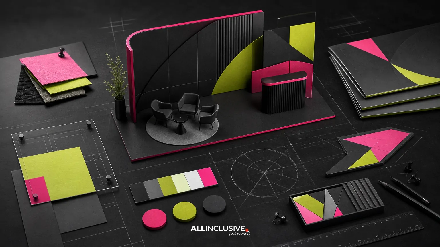
Trade show graphic design works best when the booth, signage, handouts and follow-up materials are planned as one communication system—not as unrelated pieces produced at different times. The goal is to help the right visitors understand who you are, what you offer and what to do next, whether they see a large back wall from the aisle or a product sheet during a conversation.
This approach is different from simply making attractive event graphics. It requires decisions about audience, message hierarchy, viewing distance, production constraints, sales conversations and post-event follow-up. The strongest system is recognizable at a distance, useful up close and consistent after the show ends.
What trade show graphic design should include
Trade show design commonly spans several connected touchpoints:
- Booth environment: back walls, side walls, counters, kiosks, hanging signs and architectural graphics.
- Directional and informational signage: entry markers, product labels, meeting-area signs and calls to action.
- Conversation support: one-sheets, brochures, comparison guides, sell sheets and leave-behinds.
- Presentation assets: monitor slides, demonstration screens, looping motion graphics and presentation templates.
- Lead-capture materials: QR destinations, forms, appointment prompts and follow-up references.
- Post-event continuity: email graphics, sales decks and digital assets that continue the same visual and verbal story.
Not every event needs every item. The right scope depends on booth size, event rules, visitor behavior, sales process and the number of products or audiences represented.
Start with the visitor journey, not the booth wall
A practical planning model follows the visitor from aisle to follow-up. At each stage, ask what the person needs to understand and what action should be available.
| Stage | Visitor need | Useful design asset |
|---|---|---|
| Approach | Recognize relevance quickly | High-level message, category cue and readable brand presence |
| First conversation | Understand the problem you solve | Short explanation, visual proof point or product grouping |
| Evaluation | Compare options and remember details | Sell sheet, use-case guide, demo screen or comparison piece |
| Next step | Know how to continue | Clear call to action, QR path, meeting prompt or contact exchange |
| After the event | Reconnect the conversation to the offer | Follow-up email, deck, proposal or resource with matching design |
This journey prevents a common mistake: placing every available message on the largest surface. A booth wall should attract and orient. A handout can explain. A sales conversation can qualify. Follow-up materials can provide depth.
Build a message hierarchy for three viewing distances
Trade show visitors encounter graphics at different distances and speeds. Design decisions should account for at least three viewing conditions:
Long distance: recognition
From the aisle, people need to identify the company or category and decide whether to slow down. Use a concise headline, a strong visual cue and enough contrast to read quickly. Avoid long paragraphs, dense feature lists and low-contrast photography.
Conversation distance: orientation
Once someone enters the booth, the design should clarify the offer and support the representative’s opening conversation. Group related products or services, make the next question obvious and use visual structure to guide attention.
Close distance: evidence
At a counter or meeting table, visitors can engage with detail. This is where a one-sheet, diagram, case example, specification summary or comparison chart can do useful work. Detail belongs here because the visitor has chosen to spend more time.
A simple test is to review every message and classify it as recognition, orientation or evidence. If a detailed claim is competing with the main aisle message, move it to a closer-view asset.
Coordinate booth graphics and sales collateral
The booth and collateral should not duplicate one another word for word. They should share a system while performing different jobs.
- Shared elements: color palette, typography, imagery style, icon treatment, terminology and core value proposition.
- Booth role: attract attention, establish relevance and create a reason to start a conversation.
- Collateral role: explain the offer, answer common questions and give the visitor something useful to retain or share.
- Sales role: adapt the message to the prospect’s needs without breaking the visual or verbal system.
For example, a booth might communicate a concise business outcome, while a handout organizes the supporting capabilities, implementation steps and qualification questions. The visitor should feel that both came from the same source, but neither should feel like a wall-sized brochure.
Related production considerations also apply to other physical communication assets. A guide to signage design can help teams think through hierarchy, legibility and environmental context beyond the trade show floor.
Design for production before final artwork
Trade show graphics are not only visual compositions; they are manufactured and installed objects. Production planning should begin before the design is finalized.
Confirm the display system
Obtain the exact dimensions, safe areas, bleed requirements, seams, lighting conditions, mounting method and file specifications. A graphic that looks correct on a screen can fail when a support post, monitor or structural edge covers important content.
Check venue and event requirements
Review rules for hanging signs, rigging, electrical access, fire ratings, installation windows, union labor, shipping labels and approved materials. These requirements can affect both budget and layout.
Plan for viewing conditions
Test contrast, type size and image clarity under realistic lighting. Glossy surfaces, shadows, reflective flooring and bright exhibit halls can change how colors and small text appear.
Separate visual zones
Reserve clear areas for brand recognition, headline messaging, product explanation, staff interaction and storage. A beautiful composition can become ineffective when furniture, people or equipment block the intended focal point.
Prepare usable files
Establish a controlled handoff package with production-ready artwork, linked assets, fonts or outlined type where appropriate, color specifications and a reviewed proof. Keep editable source files organized so event variations can be made without rebuilding the system.
Make signage useful instead of decorative
Signage should answer a visitor question or guide a behavior. Before adding a sign, identify its job:
- Where is the entrance or meeting area?
- What does this product or service do?
- Who is this solution for?
- What should the visitor ask about?
- How can the visitor schedule, scan, download or continue?
Use short labels when a sign is directional, and reserve explanatory language for surfaces where people can pause. Consistent naming matters too. If the booth calls an offer one thing and the handout uses another term, representatives must spend valuable conversation time resolving avoidable confusion.
Use diagrams and comparisons to support selling
Trade show conversations often involve complex offers, multiple stakeholders or unfamiliar processes. A well-structured diagram can communicate relationships faster than a paragraph, provided it remains readable at the intended distance.
Useful formats include:
- Before-and-after workflow diagrams
- Product or service architecture maps
- Three-step process illustrations
- Role-based use-case panels
- Feature comparisons with clearly defined criteria
- Simple ecosystem or integration views
Do not turn every visual into an infographic. If the audience needs a detailed explanation, a focused infographic design approach may help structure the information, but the trade show version should still prioritize scanning and conversation.
Connect the physical experience to digital follow-up
A QR code or URL is not automatically a strategy. The destination should match the promise made on the sign or handout, load well on a mobile device and give the visitor a clear next step.
Before launch, test:
- Whether the code scans from the intended distance and angle
- Whether the destination reflects the event-specific message
- Whether the page requires unnecessary navigation
- Whether sales representatives know what happens after a scan
- Whether the follow-up email uses matching language and visuals
Design the handoff between event and digital channels deliberately. A visitor who scans a product guide should not receive a generic message that appears unrelated to the conversation. Consistency across email, presentation and collateral is part of the event experience, not an afterthought.
Common trade show graphic design mistakes
Trying to say everything on the back wall
More copy rarely creates more understanding. Keep the primary surface focused and move supporting information to handouts, screens or conversations.
Designing each item separately
Individually attractive assets can still create a fragmented experience. Define the message hierarchy, visual rules and terminology before producing the full set.
Using unreadable type
Type that works on a laptop may disappear across an aisle. Review the design at realistic size and distance, not only at 100 percent zoom.
Ignoring installation and obstruction
Furniture, seams, lighting and hardware can hide key content. Request a production or installation review before approval.
Making the call to action vague
“Learn more” is often weaker than a specific next step such as scheduling a product discussion, reviewing an implementation guide or requesting a sample.
Leaving sales teams out of the process
Representatives know the questions visitors ask and the objections that slow progress. Include that knowledge without allowing the booth to become a list of every sales talking point.
A practical approval checklist
Use this checklist before sending files to production:
- Is the primary audience defined?
- Can an aisle visitor identify the category and relevance quickly?
- Does each major surface have one clear job?
- Are headlines, product names and calls to action consistent?
- Can the design be read under expected lighting and viewing conditions?
- Have dimensions, seams, safe areas and mounting constraints been confirmed?
- Are diagrams and comparisons accurate and easy to explain?
- Do handouts support conversations rather than repeat the wall?
- Have QR codes, URLs and mobile destinations been tested?
- Does the follow-up experience continue the same message?
- Has the sales team reviewed the system and received the current files?
How to decide the right scope
Scope should follow the event’s commercial objective. A small tabletop presence may need a focused backdrop, counter sign and one leave-behind. A larger exhibit with demonstrations may require environmental graphics, product zones, monitor content, presentation templates, comparison sheets and a structured follow-up kit.
Ask these questions before commissioning work:
- Which audience or buying stage matters most at this event?
- What must visitors understand without staff assistance?
- What information belongs in a conversation rather than on a sign?
- Which assets will be reused at other events or in ongoing campaigns?
- Who owns updates when products, claims or calls to action change?
- What must be ready for design, review, production, shipping and installation?
For broader ongoing collateral planning, the graphic design services overview provides a useful commercial context. Teams evaluating the larger role of design across campaigns can also review the broader design offering. For event-related follow-up, an email graphic design workflow can help preserve continuity after the show.
Conclusion
Effective trade show graphic design is a coordinated decision system: the booth earns attention, signage creates orientation, collateral supports evaluation and follow-up carries the conversation forward. Plan the pieces together, assign each surface a clear job and validate the design against real production conditions. When the event requires a broader, repeatable collateral program, use the graphic design page as the next step for evaluating scope.


