
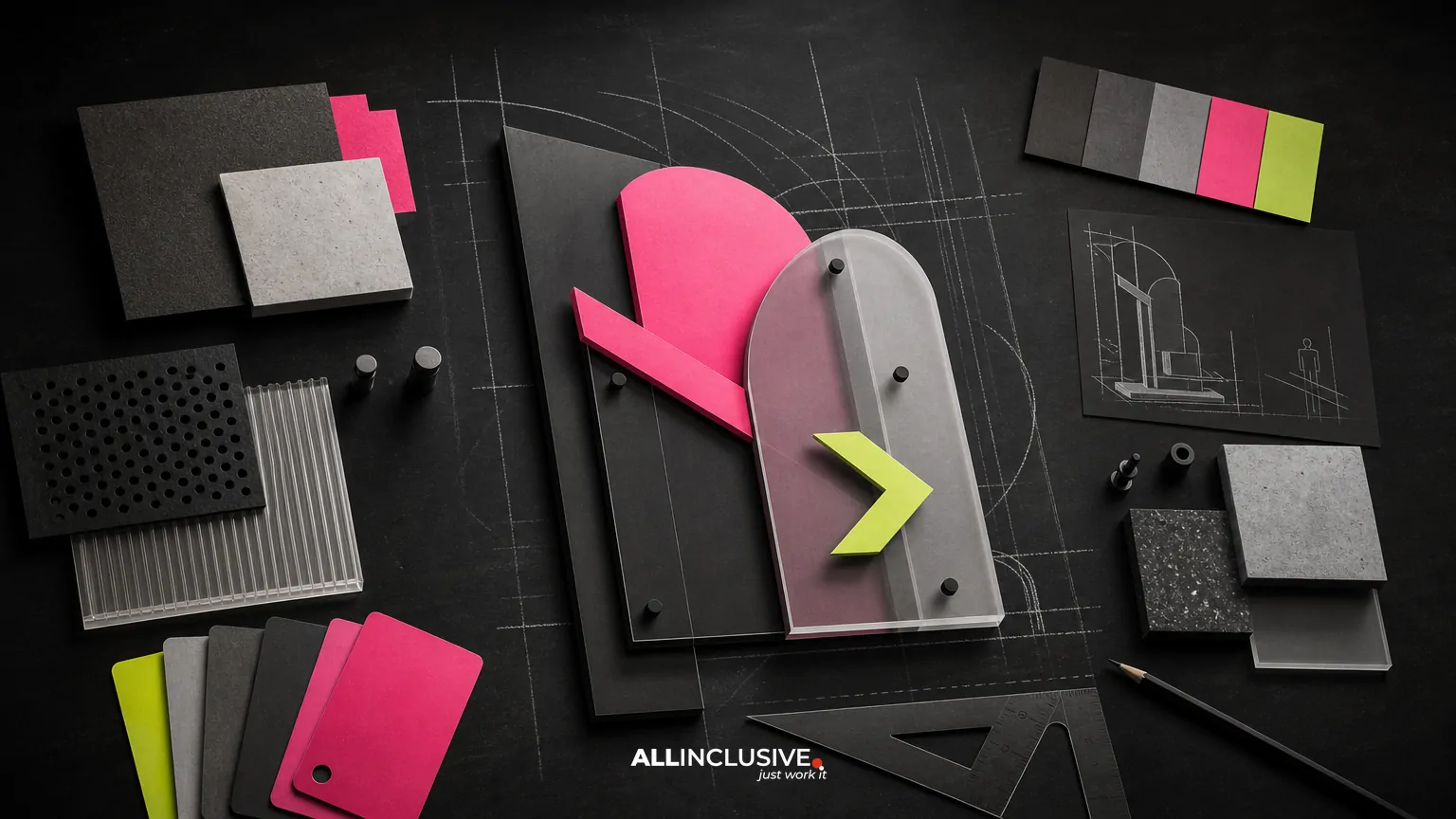
Effective signage design does more than place a logo on a large surface. It must communicate quickly, remain legible at the intended viewing distance, survive its production environment and fit the broader brand system. A sign can look polished on a screen yet fail when viewed from a roadway, printed at scale, installed in poor lighting or adapted across multiple locations.
For most organizations, the right approach is to treat signage as a system of decisions rather than a single artwork file. Start with audience, location and message hierarchy; then resolve typography, contrast, materials, fabrication and installation. This guide explains the main trade-offs so you can review signage work with greater confidence and coordinate it with ongoing graphic design production.
What signage design includes
Signage design is the planning and visual development of signs used to identify, direct, inform, promote or support a physical environment. Depending on the project, the scope may include:
- Exterior building signs, storefront signs and entrance identification
- Directional, parking and wayfinding signs
- Interior environmental graphics, room identification and directories
- Retail displays, point-of-sale graphics and promotional signs
- Trade show panels, event graphics and temporary installations
- Window graphics, banners, decals and vehicle graphics
The design scope is separate from fabrication and installation, although the three must be coordinated. A designer may create the visual system and production-ready files while a fabricator confirms materials, dimensions, mounting methods and site requirements. Clarifying that division early helps prevent attractive concepts that cannot be manufactured or installed as shown.
The four tests of effective signage
1. Can people understand it quickly?
Most signs are encountered while people are walking, driving, searching for an entrance or navigating an unfamiliar space. The viewer often has only a few seconds to identify the message and decide what to do next. Prioritize one primary action or piece of information instead of treating every available surface as a place for copy.
A useful hierarchy typically includes a dominant message, a supporting detail and optional identification such as a logo or department name. If every element has equal visual weight, the sign becomes slower to scan. Shorter wording, stronger grouping and deliberate empty space usually improve comprehension more than adding decorative elements.
2. Can it be read at the intended distance?
Legibility is contextual. Letterforms that work on a reception sign may not work on a roadside panel, and a high-resolution proof does not show exactly how type will behave when viewed across a parking lot. Review typography at the real sign size and consider viewing distance, angle, motion and illumination.
Important variables include:
- Letter height and weight relative to viewing distance
- Typeface proportions, counters and spacing
- Contrast between text, symbols and background
- Line length and the number of words per line
- Viewing angle, obstruction risk and surrounding visual noise
- Daytime and nighttime conditions
Avoid relying on thin weights, tightly tracked capitals or low-contrast color combinations when the sign must be understood quickly. A simple message with generous spacing is often more effective than a highly stylized treatment.
3. Can it be produced and maintained?
Production requirements should shape the design before final artwork is approved. Material, finish, substrate, mounting method and fabrication technique all affect color, scale, edge quality and long-term maintenance. A design that depends on subtle gradients or fine details may need to be adapted for dimensional lettering, cut vinyl, painted surfaces or illuminated applications.
Ask the production team to confirm:
- Final dimensions, bleed, safe areas and file specifications
- Material and substrate limitations
- Color matching expectations and acceptable tolerances
- How small details will be fabricated or reproduced
- Lighting, electrical and installation requirements
- Cleaning, replacement and repair considerations
Production-ready signage files should be organized and clearly labeled. Include the correct scale, vector artwork where appropriate, linked or embedded assets, color information and notes for fabrication. If multiple signs share a system, a schedule or sign matrix can reduce confusion during quoting and installation.
4. Does it belong to the brand?
Brand consistency does not mean placing the same layout on every sign. It means carrying recognizable principles across different sizes, locations and functions. These may include typography, color relationships, logo handling, icon style, photography or illustration, tone of voice and spacing rules.
At the same time, signage should not be forced to behave like a brochure or digital ad. Environmental context may require larger type, fewer words, stronger contrast and more durable materials. The brand should guide the system while the location determines the execution.
Designing for location and context
Before developing layouts, document where each sign will be encountered and what the viewer needs at that moment. A site survey or photo walk can reveal sightlines, competing signs, lighting changes, columns, doors, landscaping and accessibility constraints that are not visible in a floor plan.
Useful questions include:
- Is the viewer stationary, walking or moving in a vehicle?
- What information is needed before the viewer reaches this point?
- Where will the viewer approach from?
- What backgrounds or objects may reduce contrast?
- Will the sign be viewed from one direction or several?
- Does the location receive direct sun, shade, glare or artificial lighting?
- Will the sign be temporary, seasonal or permanent?
Wayfinding deserves particular care. Directional signs should appear where decisions are made, not only where destinations are located. Consistent arrows, symbols, naming conventions and confirmation points help people build a mental map. For a broader look at navigation-related visual systems, see this guide to trade show graphic design, where movement, attention and environmental context also influence design decisions.
Accessibility and inclusive readability
Accessible signage is both a practical responsibility and a design quality issue. Requirements vary by building type, location and jurisdiction, so coordinate with the appropriate architect, accessibility professional, facility manager or code authority. Do not assume that a visually attractive sign automatically meets applicable requirements.
Review signs for clear contrast, appropriate text sizing, tactile or braille requirements where applicable, consistent placement and unobstructed access. Also consider users with color-vision differences, low vision, limited literacy in the primary language and visitors who may not know the organization’s internal terminology.
Symbols can reduce reading time, but only when they are familiar, consistently used and supported by context. If a symbol is ambiguous, pair it with concise wording. Multilingual signage may require a different hierarchy and more space rather than simply shrinking the type to fit.
Choosing a signage system instead of isolated signs
Organizations with multiple locations or frequent campaigns benefit from a signage system. The system should define what remains consistent and what can change. A useful documentation set may include:
| System element | What to define |
|---|---|
| Typography | Approved typefaces, weights, sizing logic and spacing |
| Color | Primary and secondary colors, contrast rules and production notes |
| Logo use | Clear space, minimum size, placement and approved variations |
| Icons | Stroke, corner, proportion and meaning conventions |
| Layouts | Margins, alignment, hierarchy and flexible templates |
| Materials | Recommended substrates, finishes and durability considerations |
| Content | Naming, capitalization, abbreviations and translation rules |
Templates should be flexible enough to accommodate different messages and dimensions without encouraging uncontrolled improvisation. A shared library of approved components can make updates faster while protecting brand recognition. This is where signage connects to a wider design system and production workflow, rather than operating as a one-off print task.
Common signage design mistakes
Designing from a flat mockup only
A front-facing rendering can hide scale, glare, shadows, obstructions and installation conditions. Review work in photographs, simple environmental mockups or physical samples whenever possible.
Using too much information
Signs often accumulate phone numbers, URLs, secondary messages and legal copy. Separate essential wayfinding or identification from information that belongs on a website, handout or follow-up communication.
Prioritizing brand expression over comprehension
Distinctive typography, unusual layouts and subtle color treatments can support a brand, but not when they slow recognition. Preserve the brand’s character through controlled details while keeping the primary message direct.
Ignoring production tolerances
Small gaps, fine lines, tiny cut details and exact color expectations may change during fabrication. Ask the production partner to identify technical limits before the concept is finalized.
Failing to plan updates
Departments change, tenants move, campaigns end and regulations evolve. Design access panels, replaceable inserts, modular components or update procedures into the system where appropriate.
A practical signage design review checklist
Use this checklist before approving a concept or releasing files:
- Is the sign’s purpose clear in one sentence?
- Is the primary message visible from the intended approach and distance?
- Does the information hierarchy reflect what the viewer needs first?
- Are type, symbols and colors legible in realistic conditions?
- Has the design been reviewed at final size rather than only on screen?
- Are accessibility and local requirements being checked by the right parties?
- Do materials, finishes and mounting methods match the environment?
- Are files correctly scaled, labeled and prepared for the selected production method?
- Can the system adapt to future messages, locations or translations?
- Does the result feel connected to the brand without copying a digital layout literally?
How signage fits into ongoing marketing production
Signage is often one part of a larger campaign or brand rollout. A new location may require exterior identification, printed collateral, digital ads, social assets, presentation materials and paid media to launch together. Coordinating these pieces helps preserve message hierarchy and visual consistency without forcing every format into the same composition.
When planning a broader production program, document the campaign objective, audience, required formats, deadlines, approval owners and production dependencies. Keep a source-of-truth file for logos, colors, typography and approved imagery, then adapt each deliverable for its real context. Related production needs may also include infographic design for explanatory content or icon design for navigational and informational systems.
When to bring in a design partner
External design support can be useful when signage spans multiple locations, must coordinate with a brand refresh, involves complex wayfinding or needs to move quickly across print and digital channels. The most useful brief includes site photos or plans, dimensions, viewing conditions, audience details, required messages, brand assets, production contacts, deadlines and approval constraints.
Evaluate proposed work by asking for evidence of process: how the team will test legibility, account for fabrication, organize variants, handle accessibility review and prepare files for production. A strong partner should be able to explain trade-offs, not merely present attractive mockups.
For organizations managing signage alongside collateral, campaigns and other marketing assets, the broader graphic design services page is the appropriate next step for evaluating ongoing production support. The article’s focus remains decision-making: clear signage succeeds when communication, environment, production and brand consistency are resolved together.


