
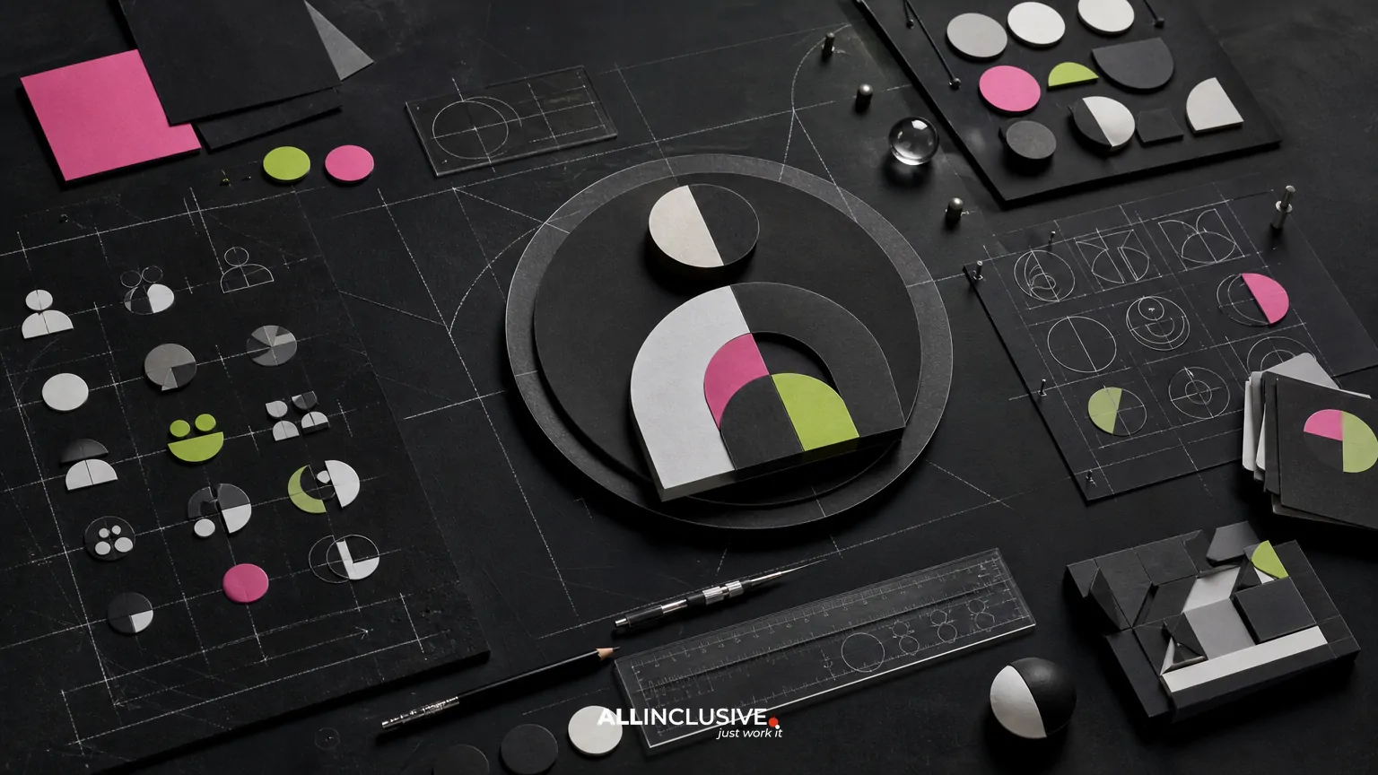
Icon design services can help a company turn scattered symbols into a clear, reusable visual system. The right engagement is not simply a request for attractive individual icons. It defines how icons behave as a set: their visual language, proportions, stroke or shape logic, level of detail, accessibility, file formats, and use across marketing materials or digital experiences.
For most B2B teams, the key decision is whether they need a small batch of campaign graphics, a flexible library for ongoing production, or a more formal icon system connected to an existing brand identity. Clarifying that scope early makes it easier to compare designers, control revisions, and avoid a set that looks inconsistent when it expands.
If icon creation is part of a broader marketing production need, review graphic design services for context on how iconography can fit alongside collateral, campaigns, presentations, and other brand assets.
What icon design services typically include
Icon projects vary considerably, so the phrase “icon design services” should not be treated as a fixed deliverable. A provider may offer one or more of the following:
- Custom icon concepts: Original symbols created for a specific brand, product, campaign, or content series.
- Icon set development: A coordinated collection with shared rules for geometry, visual weight, corner treatment, perspective, and detail.
- Icon library expansion: New icons designed to match an established set without introducing visual drift.
- Illustrative or editorial icons: More expressive assets for reports, infographics, landing pages, and campaigns.
- Interface icons: Compact, functional symbols intended for navigation, controls, status indicators, or product workflows.
- Production and export: Files prepared for print, web, presentations, social media, or design-system use.
These categories can overlap, but they involve different priorities. A dashboard icon must communicate quickly at a small size. An icon used in a thought-leadership report may have more room for personality and visual nuance. A procurement brief should state the intended environments rather than assuming one style will work equally well everywhere.
Start with the use case, not the visual style
Before selecting a designer, document where the icons will appear and what job they need to perform. This prevents a common mistake: choosing a style because it looks appealing in a presentation, then discovering that it fails in production.
Questions to answer before briefing a provider
- Will the icons support navigation, explanation, categorization, decoration, or all four?
- What sizes and viewing distances matter most?
- Will they appear on light backgrounds, dark backgrounds, photographs, or colored surfaces?
- Are they intended for websites, software interfaces, presentations, print collateral, signage, or paid media?
- Does the brand already define typography, color, illustration, or logo-use rules?
- Will internal teams need to create or commission additional icons later?
- Are there accessibility, localization, or cultural interpretation concerns?
A useful brief connects each icon to a communication task. For example, “security” may need to distinguish identity protection from physical access control, while “analytics” may need to separate reporting from forecasting. A designer can then test whether the concept communicates the intended meaning without relying on labels.
How to build a consistent custom icon set
Consistency comes from decisions made before every individual icon is drawn. A professional set should have a visible system behind it, even when the final symbols are simple.
1. Establish the visual grammar
Define the foundational choices first: outline versus filled forms, stroke thickness, corner radius, grid structure, perspective, level of abstraction, and use of negative space. These choices create the set’s visual grammar. Without them, each icon may become a separate illustration.
2. Set a proportional framework
An icon grid helps control alignment, optical balance, and scaling. The grid does not need to make every symbol mechanically identical; optical adjustments are often necessary. However, shared proportions give the set a dependable rhythm and make future additions easier.
3. Define complexity and detail
Decide how much information an icon can carry at its smallest intended size. Excessive detail can disappear when an asset is reduced, while overly generic geometry may make related concepts difficult to distinguish. Testing representative icons at actual use sizes is more informative than reviewing only large artboards.
4. Create rules for color
Color may identify categories, signal states, reinforce hierarchy, or simply express the brand. Document whether icons use one color, a restricted palette, duotone treatment, or independent fills. Also test contrast and grayscale reproduction where relevant.
5. Test the set as a system
Review icons side by side, in realistic layouts, and next to nearby text or interface controls. Look for inconsistent visual weight, crowded silhouettes, ambiguous metaphors, and symbols that attract more attention than their importance warrants. System-level review often reveals issues that are invisible when icons are assessed one at a time.
Icon styles and their trade-offs
There is no universally best icon style. The appropriate direction depends on the audience, context, brand personality, and production environment.
| Style direction | Strengths | Potential trade-offs |
|---|---|---|
| Monoline outline | Clean, flexible, and often effective for interfaces and navigation | Can lose clarity at small sizes or become visually weak beside heavy typography |
| Filled or solid | Strong silhouettes and good visibility in compact spaces | May feel heavier and can reduce room for internal distinctions |
| Duotone | Creates hierarchy and adds brand expression without requiring complex illustration | Needs careful color and contrast control across backgrounds |
| Geometric | Feels systematic and can align well with technical or modern brands | Literal concepts may become overly abstract or repetitive |
| Illustrative | Supports storytelling and editorial differentiation | Usually requires more production time and may not scale well for functional controls |
| Isometric or dimensional | Can communicate environments, systems, and spatial relationships | Perspective rules add complexity and may limit simple, fast recognition |
Many organizations use more than one related style, but the relationship should be intentional. Functional interface icons and expressive campaign illustrations can coexist when their roles, proportions, and brand cues are clearly separated.
Deliverables to clarify before approving a proposal
Two icon design proposals may appear comparable while offering very different levels of production readiness. Ask for a deliverables list that addresses both creative development and practical use.
- Number of initial concepts and final icons
- Whether related states, variations, or alternate orientations are included
- Grid, spacing, stroke, color, and construction guidance
- Editable source files and ownership or licensing terms
- Vector formats such as SVG, EPS, or AI where appropriate
- Raster exports for presentations, documents, or content platforms
- Light and dark background versions if needed
- File naming, folder structure, and usage documentation
- Revision rounds and approval milestones
- Support for future additions to the library
For an internal design team, documentation can be as valuable as the initial artwork. A concise specification helps future contributors match the original logic instead of guessing at stroke widths, spacing, or color behavior.
Questions to ask when evaluating icon design services
Portfolio quality matters, but the evaluation should focus on fit and process as well as visual taste. Ask prospective providers:
- Can you show a complete icon set rather than only selected examples?
- How do you test recognition and legibility at the intended sizes?
- How do you handle concepts that are abstract, technical, or culturally specific?
- What happens when a new icon must be added six months later?
- Which source and export formats are included?
- How are accessibility and contrast requirements considered?
- Who reviews naming, meaning, and functional accuracy on the client side?
- How are revisions organized so the set remains coherent?
Requesting a small representative exercise can be useful when the project is complex, but it should be clearly scoped and evaluated against agreed criteria. A single attractive icon is not evidence that a provider can build a durable system.
Common mistakes that weaken icon systems
Designing each icon independently
When every symbol begins from a blank canvas, the set often develops inconsistent angles, weights, and levels of detail. Shared construction rules reduce this risk.
Using metaphor without audience testing
A symbol that seems obvious to an internal team may be unclear to customers or international audiences. Test meaning with people who were not involved in the project, especially when icons represent specialized services or abstract ideas.
Optimizing only for large presentations
Icons that look polished on a review slide may fail in a mobile interface, chart legend, document footer, or small advertisement. Evaluate them in their actual environments.
Ignoring the production workflow
A library becomes difficult to use when files have unclear names, inconsistent dimensions, missing variants, or undocumented colors. Delivery structure is part of the design solution.
Adding detail instead of improving distinction
When two concepts are too similar, extra decoration rarely solves the problem. Revisit the underlying metaphor, silhouette, or categorization rather than adding more visual noise.
How icon sets fit into broader marketing production
Icons rarely live alone. They may appear in sales decks, one-page PDFs, report graphics, landing pages, email campaigns, advertisements, signage, or social content. A set is more useful when its rules are compatible with the rest of the organization’s visual system.
For example, an icon library may need to work alongside an infographic system. The guide to infographic design services can help teams think about hierarchy, explanatory graphics, and how supporting symbols function within a larger composition. If the organization needs recurring production rather than a one-time set, ongoing design support offers a useful framework for considering intake, priorities, and repeatable workflows.
Physical applications introduce additional constraints. Icons used in environmental graphics or wayfinding need to be legible at distance and may require different simplification rules. Teams considering that context can also review the practical considerations in signage design.
A practical icon project checklist
Use this checklist before kickoff and again before final approval:
- Audience and communication goals are documented.
- Primary and secondary use environments are listed.
- Required icon concepts and priority tiers are defined.
- Visual style, grid, proportions, and complexity rules are agreed.
- Color and contrast requirements are identified.
- Representative icons are tested at real sizes.
- Ambiguous concepts receive audience or stakeholder review.
- File formats, variants, naming, and source files are specified.
- Future expansion and maintenance responsibilities are clear.
- Final artwork is reviewed in realistic layouts, not only on presentation boards.
Choosing the right scope
A small, focused set may be appropriate for a campaign or a single report. A broader library makes more sense when several teams need recurring access to shared symbols. If icons are part of a wider rework of marketing assets, consider how the project connects to the organization’s overall design approach, including collateral, presentation, digital, and campaign needs.
The goal is not to maximize the number of icons. It is to create a manageable system that communicates clearly, supports the brand, and can be used consistently by the people responsible for future content.
Next step
Once the use cases, style direction, and production requirements are defined, compare icon design providers against the same brief. For broader support across iconography and marketing collateral, the graphic design services page is the appropriate next point of reference.


