
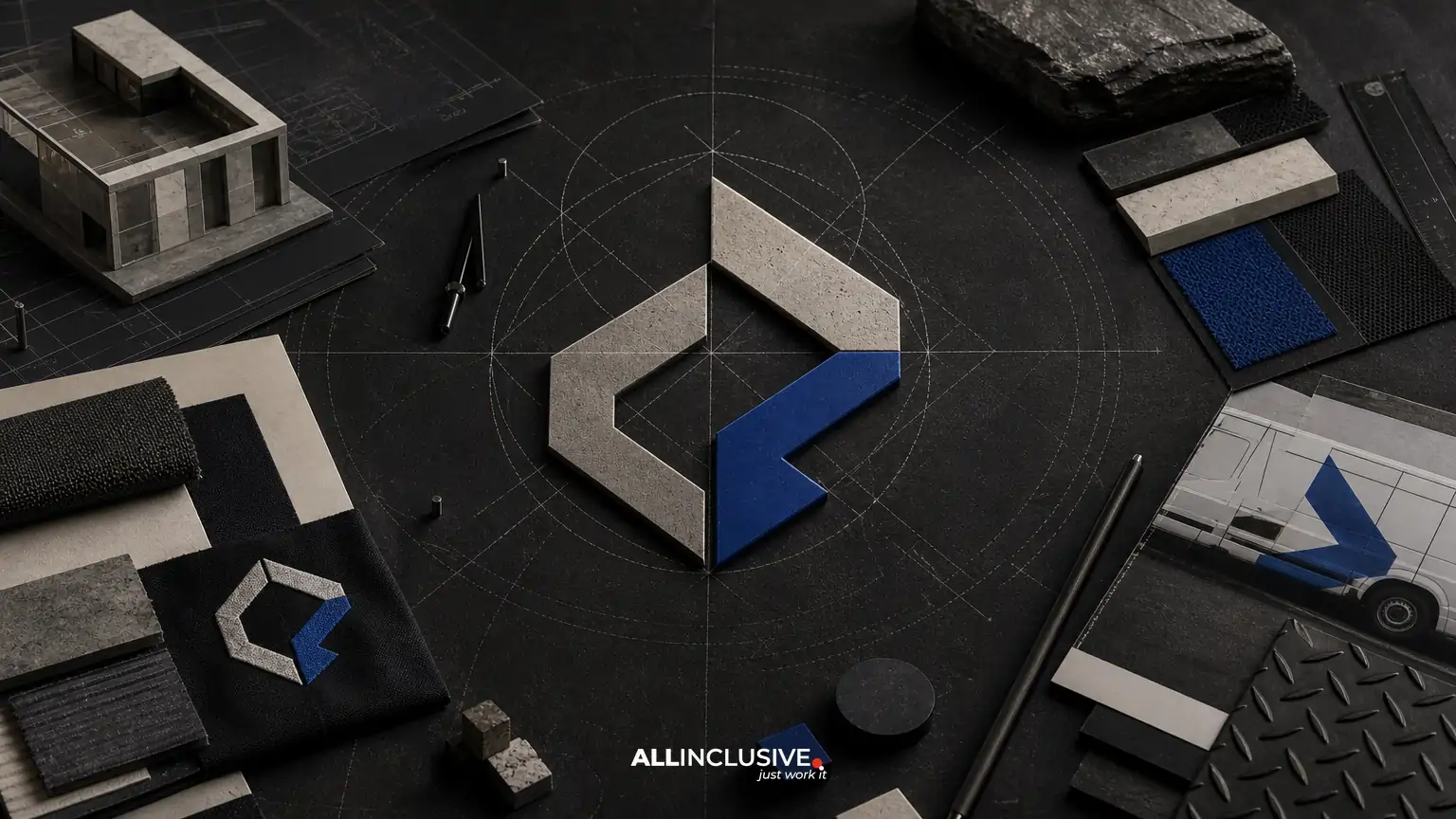
A construction company logo has to do more than look professional on a website. It may appear on trailers, hard hats, jobsite signs, uniforms, equipment, proposals, invoices, social profiles, and embroidered apparel. That range makes construction company logo design a system-building exercise, not simply the creation of one attractive symbol.
The strongest approach begins with business and audience context, translates that context into a flexible visual direction, and tests the resulting marks across real operating conditions. The decision is not only whether a logo looks good in a presentation. It is whether employees, clients, subcontractors, and prospective customers can recognize it quickly and use it consistently.
This guide explains what to evaluate, which deliverables to request, and where common trade-offs appear. For a broader view of the work involved in a professional logo project, see the logo design overview.
What construction company logo design should accomplish
Construction firms often need an identity that communicates capability, reliability, safety, and practical expertise. Those signals can support trust, but they should not force every company into the same visual formula. A residential builder, commercial general contractor, civil engineering firm, specialty subcontractor, and design-build company may share an industry while serving very different audiences.
A useful construction logo should:
- Remain identifiable at both large and small sizes.
- Reproduce clearly in one color, grayscale, and limited-color applications.
- Work across vehicles, signs, apparel, documents, digital profiles, and equipment.
- Reflect the company’s actual positioning rather than relying on generic construction symbols.
- Allow enough flexibility for future services, markets, or geographic expansion.
- Be supported by organized files and practical usage guidance.
These requirements distinguish a working identity system from a decorative mark designed for one mockup.
Start with strategy and discovery
Before sketches begin, clarify what the logo needs to signal and where it will be used. Discovery should cover the company’s services, customer types, sales process, geographic footprint, competitive context, and growth plans. It should also identify the people who approve and use the identity, from owners and marketing teams to project managers and field crews.
Questions worth answering early
- Is the firm focused on residential, commercial, industrial, infrastructure, or specialty work?
- Does the company win work through referrals, bidding, developer relationships, online searches, or a combination?
- Should the identity feel established and institutional, modern and technical, rugged and hands-on, or premium and design-led?
- Will the company add new services that a narrowly literal logo could make harder to represent?
- Which applications matter most during the next 12 to 24 months?
- Are there existing colors, names, symbols, or legacy assets that must be retained or retired?
This phase helps prevent a familiar problem: selecting a visual direction because it resembles other contractors instead of because it supports the company’s distinct business position.
Choose a visual direction without defaulting to clichés
Construction identities frequently use rooftops, buildings, tools, shields, hard hats, cranes, and geometric initials. These references can be useful when simplified and made specific, but they become weak when they are interchangeable with dozens of competitors.
A more durable direction may come from the company’s operating character rather than from an obvious object. For example, precision could be expressed through measured geometry; durability through weight, proportion, or material-inspired forms; regional knowledge through restrained environmental references; and technical capability through a controlled grid or engineered construction.
The goal is not to avoid recognizable industry associations at all costs. It is to make sure the identity has enough distinction to be remembered and enough flexibility to survive beyond a single service or visual trend. A short creative rationale should explain why the selected direction fits the company and how it will function in practice.
Design the logo as a responsive system
One primary logo rarely performs equally well everywhere. A construction company may need a full lockup for proposals, a compact symbol for social avatars, a horizontal version for vehicle graphics, and a one-color version for invoices or stamped materials.
Core logo variations to consider
- Primary lockup: the preferred combination of symbol and name for standard communications.
- Secondary or horizontal lockup: useful for headers, trailers, signs, and wide spaces.
- Compact mark: a symbol, monogram, or abbreviated form for small or square applications.
- One-color versions: light and dark options for production methods with limited ink or contrast.
- Small-size configuration: an arrangement with simplified detail or improved spacing when viewed at reduced dimensions.
These are not extra versions for presentation value. They solve different communication problems. A detailed emblem may work on a proposal cover but collapse when embroidered on a shirt or reduced to a social avatar.
Test the identity on real construction surfaces
Mockups are most valuable when they represent actual use rather than idealized brand scenes. Review the logo on the surfaces and materials that affect day-to-day visibility.
| Application | What to evaluate |
|---|---|
| Vehicle or trailer graphics | Distance legibility, layout scale, viewing angle, and contrast against the vehicle color. |
| Jobsite signage | Recognition from the road, hierarchy between logo and contact information, and production limitations. |
| Hard hats and uniforms | Embroidery, heat transfer, patch construction, durability, and reduced-size clarity. |
| Proposals and estimates | Print quality, information hierarchy, and compatibility with office templates. |
| Website and social profiles | Responsive behavior, thumbnail recognition, accessibility, and dark- or light-background performance. |
| Equipment and labels | Adhesive or stencil constraints, available color count, and wear visibility. |
Ask reviewers to assess the system at realistic distances and sizes. A logo that appears polished on a large monitor may lose its name or internal detail when printed on a two-inch patch. Testing should also include backgrounds that are common in the field, such as white vehicles, dark apparel, reflective materials, concrete, asphalt, and safety colors.
Balance color, contrast, and production reality
Color can help an identity stand out, but construction applications often impose practical limits. Certain colors may be difficult to reproduce consistently across paint, vinyl, embroidery thread, digital screens, and inexpensive office printing. Bright colors can also compete with safety equipment or become less legible against common field environments.
Define a dependable core palette and specify how it behaves in common conditions. At minimum, review:
- Full-color use on light and dark backgrounds.
- Black, white, and one-color reproduction.
- Contrast for small text and key logo elements.
- Color relationships with vehicles, uniforms, and safety gear.
- Approximate production equivalents for digital and print workflows.
Do not treat a color specification as a substitute for testing. The actual substrate, finish, lighting, and production method can change the result.
Decide whether the name should lead
For many contractors, the company name is a valuable trust asset. A wordmark-led identity can support recognition in proposals, bid documents, signage, and referrals. A symbol may add flexibility, but it should not become so dominant that viewers cannot identify the business.
Consider a name-forward approach when:
- The company is building recognition in a local or regional market.
- Referrals and reputation are important sources of work.
- The name is distinctive, pronounceable, and likely to remain stable.
- The logo will frequently appear where context is limited.
A symbol-led or abbreviated configuration may be more useful when the company has an established name, operates across multiple markets, or needs strong compact applications. The best solution often combines both rather than choosing one permanently.
Request a complete, usable handoff
A successful logo project ends with files that people can actually use. Request a clear inventory rather than a single exported image.
Useful delivery components
- Vector master files for scalable production.
- Transparent-background raster files for everyday digital use.
- Primary, alternate, compact, reversed, grayscale, and one-color versions as needed.
- Color specifications for the relevant digital and print workflows.
- Recommended clear space and minimum-size guidance.
- File names that identify the configuration, color treatment, and format.
- A short usage guide explaining approved and prohibited treatments.
- Written clarification of usage rights, ownership, and any third-party typeface or asset restrictions.
Ownership and licensing should be settled in writing before the files are distributed. Confirm what the business may modify, reproduce, register, sublicense, or provide to printers and vendors. If the logo includes a font, stock element, or other licensed component, verify that the license supports the intended use.
Common construction logo mistakes
Using an interchangeable industry icon
A roofline, hammer, or building outline may communicate the category but fail to distinguish the company. If a familiar symbol is used, its shape, relationship to the name, and overall system should contribute something specific.
Designing only for a presentation board
Large mockups can hide problems with small text, thin lines, low contrast, and excessive detail. Always review the logo at the smallest important application and in production-like conditions.
Creating too many colors or effects
Gradients, shadows, and complex textures can restrict embroidery, vinyl cutting, painting, copying, and low-cost printing. Effects may have a role in digital environments, but the core identity should remain strong without them.
Ignoring future business changes
A logo tied too tightly to one narrow service can create friction if the company expands into related work. Design for the current business while considering credible next steps.
Leaving the handoff vague
Missing vector files, unclear rights, or poorly labeled variations can create avoidable production costs. Delivery is part of the identity system, not administrative cleanup.
A practical evaluation checklist
Before approving a construction identity, ask:
- Can the company name be read quickly at common viewing distances?
- Does the design remain recognizable in one color?
- Are there useful configurations for wide, square, narrow, and small spaces?
- Does the logo look appropriate on vehicles, signage, apparel, documents, and digital channels?
- Does it distinguish the company without depending on a generic construction cliché?
- Can vendors reproduce it using realistic production methods?
- Are files, naming conventions, usage guidance, and rights clearly documented?
- Will the system still make sense if the company adds a related service or enters a nearby market?
For comparison, industry-specific considerations also appear in guides such as restaurant logo design and law firm logo design. The applications differ, but the broader lesson is similar: context should shape the system, while usability should govern the final decision.
How the logo fits into the broader identity
A logo is one component of a company’s visual identity. Supporting choices—typography, color use, photography, layout, iconography, document templates, vehicle graphics, and signage—determine whether the brand feels consistent after the logo is approved. If those elements need to be developed together, review the distinction between brand identity and a standalone mark.
Practical implementation also benefits from a repeatable design workflow. The broader design resource can help frame how identity decisions connect to other business touchpoints.
Final decision: approve a system, not just a symbol
The right construction company logo should be recognizable, adaptable, producible, and appropriate to the company’s actual market position. Evaluate the strategy behind it, the responsive configurations, real-world applications, file package, and ownership terms together. A logo that survives jobsite conditions and routine business use will create more value than one that only succeeds in a polished presentation.
When the project scope calls for professional logo strategy, exploration, production files, and handoff, the logo design service page is the appropriate next resource. This article’s checklist can help stakeholders define requirements and compare options before making that decision.


