
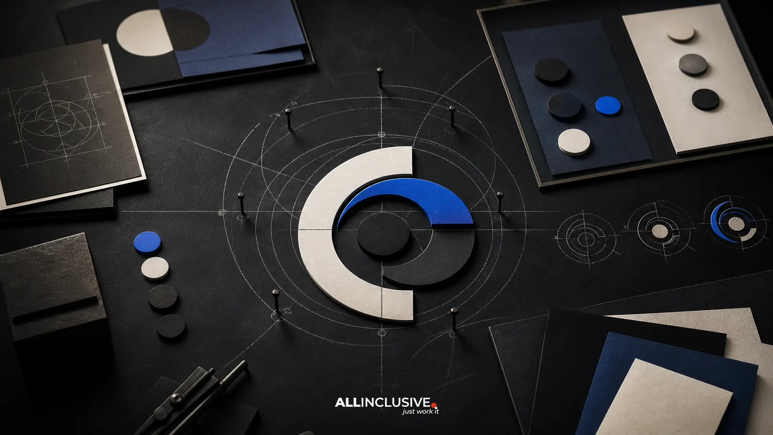
SaaS logo design works best when it is treated as a flexible brand system rather than a single decorative mark. A software company’s identity must perform across a website header, product interface, browser tab, sales deck, social profile, documentation, app marketplace, and sometimes a mobile app icon. The strongest approach connects strategy, visual differentiation, responsive variants, implementation rules, and organized delivery.
This guide explains what to evaluate, what the process should include, and which trade-offs matter before approving a logo direction. It is intended for founders, marketing leaders, and product teams comparing options for a new SaaS brand or preparing a more mature product for growth. For broader context on professional logo projects, see B2B logo design.
What makes SaaS logo design different?
SaaS brands operate in environments where attention is brief and available space is often limited. A logo may appear beside navigation, inside a dashboard, in an email notification, or as a small favicon. It also needs to coexist with product UI, integration partners, marketplace listings, and a growing family of features or products.
That creates several design requirements:
- Recognition at small sizes: the core shape should remain identifiable when reduced.
- Digital flexibility: files must work across responsive layouts, light and dark interfaces, and common screen densities.
- Category distinction: the identity should avoid blending into familiar technology clichés.
- System compatibility: typography, color, icon behavior, and spacing should support the wider brand.
- Operational clarity: marketing, product, sales, and outside partners need usable files and simple rules.
A logo can be attractive in a presentation and still fail in production. SaaS logo design should therefore be judged by repeated use across real touchpoints, not only by a large, polished mockup.
Start with brand strategy, not visual trends
Before sketching symbols or selecting type, define what the logo needs to communicate and what it should avoid. This does not require a long abstract exercise. A focused discovery phase can establish the company’s audience, product promise, competitive context, personality, and growth direction.
Useful discovery questions
- Who makes or influences the purchase decision?
- What problem does the product solve, and how quickly should that benefit be understood?
- Is the brand intended to feel analytical, approachable, premium, energetic, secure, or something else?
- Which category conventions help recognition, and which ones make the brand interchangeable?
- Will the company expand into adjacent products, industries, or geographic markets?
- Does the identity need to work for a founder-led product now and a larger organization later?
The goal is not to force every brand attribute into a symbol. It is to give design decisions a clear basis. A simple wordmark may be more durable than a complicated metaphor if the product needs strong name recognition. Conversely, a distinct symbol may be valuable when the name is long, difficult to read at small sizes, or likely to appear in app-focused contexts.
Choose the right logo architecture
Most SaaS identities use one or more of three basic components: a wordmark, a symbol, and a combined lockup. The right structure depends on the name, product environment, and expected applications.
| Architecture | Strengths | Potential trade-offs |
|---|---|---|
| Wordmark | Builds recognition around the company name and can feel direct and confident. | May lose clarity when the name is long or displayed at very small sizes. |
| Symbol | Useful for app icons, avatars, favicons, and compact product interfaces. | Can be generic or ambiguous without consistent exposure to the name. |
| Combination mark | Provides flexibility by pairing name recognition with a distinct visual cue. | Requires clear rules for when the elements appear together or separately. |
Many SaaS companies benefit from a primary combination mark plus approved standalone versions. This is not a requirement to create multiple unrelated logos. It is a way to preserve recognition as the available space changes.
Design responsive variants for real surfaces
Responsive logo design adapts the identity to context while preserving its essential character. A practical system may include a full lockup, a horizontal version, a stacked version, a wordmark, and a symbol. The exact set should be based on actual use cases rather than an arbitrary list of deliverables.
Test the system in context
- Website header: confirm legibility alongside navigation and calls to action.
- Product interface: check whether the mark competes with controls, menus, and status indicators.
- Favicon and browser tab: test recognition at tiny dimensions.
- Mobile app icon: consider silhouette, padding, platform conventions, and background behavior.
- Social avatar: evaluate whether the symbol remains distinctive inside a circular or square crop.
- Sales and investor materials: check reproduction on presentation slides, documents, and exported PDFs.
- Dark interface: verify contrast and whether color adjustments preserve the intended personality.
Designers should establish minimum sizes, clear space, and approved backgrounds through testing. These rules are more useful when they explain the reason behind a restriction instead of simply presenting a collection of prohibitions.
Balance category familiarity with distinctiveness
Technology branding often gravitates toward gradients, abstract nodes, geometric networks, shields, clouds, and circular or orbital forms. Familiar visual language can help audiences understand a category, but overused cues make companies difficult to distinguish.
A better decision is to identify which conventions are strategically useful and then introduce difference through form, proportion, typography, composition, or behavior. For example, a brand might use a restrained technical palette while creating distinction through an unusual wordmark rhythm. Another might use a geometric symbol but give it a highly specific silhouette and spacing system.
Ask whether the proposed identity would still be recognizable if its color were removed and its presentation mockup disappeared. If the answer is no, the concept may be relying too heavily on effects rather than on a durable form.
Build a color and typography system around the mark
The logo should not be designed in isolation from the rest of the SaaS brand. Color and typography determine how the identity behaves across marketing and product environments.
Color decisions should account for contrast, accessibility, reproduction, and interface states. A logo color that looks strong on a white landing page may fail on a dark dashboard or a muted documentation theme. Define primary and alternate treatments, including one-color versions, rather than assuming the full-color version will work everywhere.
Typography also deserves operational attention. Confirm the licensing and availability of selected fonts, especially if the logo uses a customized or modified type treatment. If the wordmark is converted to outlines, document the underlying typographic reference for future teams. For the broader relationship between logo, voice, and visual consistency, a brand identity system may be needed beyond the logo itself.
Evaluate concepts with a decision framework
Stakeholder feedback becomes less subjective when each concept is evaluated against agreed criteria. A review should consider:
- Distinctiveness: Does the identity separate the company from direct and adjacent competitors?
- Relevance: Does it support the product’s positioning without illustrating the category too literally?
- Scalability: Does it work from a small icon to a large presentation cover?
- Durability: Is the concept likely to remain useful as the product and market evolve?
- Usability: Can internal teams apply it correctly without constant design intervention?
- Technical readiness: Are the color, contrast, file, and export requirements manageable?
Review concepts in a consistent set of applications. Compare them at the same scale and in the same contexts. A logo that wins only in an oversized showcase may not be the strongest choice for daily product use.
What a complete SaaS logo handoff should include
A finished logo project should provide more than one image file. The handoff should help a marketing or product team use the identity correctly months after the design review.
Recommended deliverables
- Primary logo lockup and approved responsive variants.
- Standalone symbol and wordmark files where relevant.
- Light, dark, full-color, and one-color treatments as required.
- Vector master files such as SVG, PDF, or EPS, where appropriate.
- Raster exports such as PNG at useful sizes and transparent backgrounds.
- Color specifications for digital and print applications when needed.
- Clear-space, minimum-size, placement, and background guidance.
- Basic misuse examples that address likely internal mistakes.
- Notes on font licensing, outlined artwork, and ownership or usage rights.
- A practical file structure with descriptive names and version control.
Ownership and usage terms should be explicit in the project agreement. Teams should also know which files are production-ready and which are editable source materials. Clear handoff reduces accidental variation across campaigns, product releases, and partner communications.
Common SaaS logo design mistakes
- Designing for a pitch deck only: a logo may look impressive in a large mockup but fail in navigation or an app icon.
- Using a generic technology metaphor: familiar imagery can make a brand difficult to remember or defend.
- Creating variants without a system: uncontrolled alternates produce inconsistent usage.
- Ignoring dark mode: digital products often require light and dark applications from the beginning.
- Overloading the symbol: fine details and literal illustrations disappear at small sizes.
- Skipping legal and file checks: missing rights information, fonts, or vector masters can create avoidable production problems.
- Letting every stakeholder redesign the concept: feedback should be tied to strategy and use cases, not personal preference.
These issues are preventable when the project defines success before visual exploration begins. Teams planning a smaller or leaner engagement can also review the decision criteria in this guide to small business logo design.
When a logo project should expand into a wider identity system
A logo may expose a broader brand problem rather than solve it alone. If the company has inconsistent messaging, unclear product naming, competing color palettes, or no rules for marketing and product teams, a logo-only deliverable may have limited impact.
Consider expanding the scope when:
- Multiple products need to feel related without becoming indistinguishable.
- The company is entering a new market or changing its positioning.
- Marketing and product teams use conflicting visual conventions.
- Partners and contractors need repeatable rules for producing materials.
- The logo must be introduced alongside a broader naming, messaging, or website change.
In those cases, supporting work may include a visual identity, brand guidelines, or a broader design system. The right scope depends on the operational problem—not on how many logo files can be added to a package. For related considerations in other digital commerce contexts, see ecommerce logo design.
A practical approval checklist
Before approving a SaaS logo system, confirm that the team can answer yes to the following:
- Is the intended audience and positioning documented?
- Does the mark remain recognizable at the smallest important size?
- Are the primary and responsive versions clearly defined?
- Has the identity been tested in the website, product, app, social, and presentation contexts that matter?
- Do light, dark, full-color, and one-color treatments exist where needed?
- Are the typography and color choices practical for the product and marketing environments?
- Are ownership, licensing, and usage rights clear?
- Can an internal team find and use the correct files without guesswork?
- Does the identity remain distinctive without depending on a trend or visual effect?
Final perspective
Effective SaaS logo design is a decision about recognition, flexibility, and long-term use. The finished mark should support a growing digital product while giving teams a reliable way to apply the brand across surfaces. Evaluate the work as a system: strategy, architecture, responsive behavior, testing, files, and handoff all matter.
If you are comparing scopes or planning a professional logo engagement, review the logo design service page for the commercial next step. For broader design planning across brand, product, and marketing needs, the design services overview provides additional context.


