
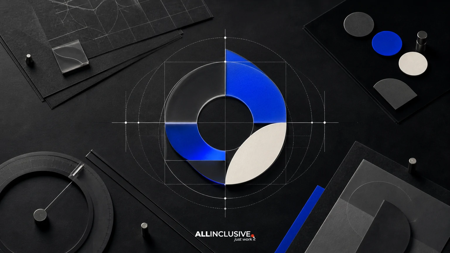
Tech company logo design is not just the creation of a recognizable symbol. It is the design of a flexible identity system that can explain a product, work across digital environments, and remain usable as the company grows. The strongest work connects the product story to a distinctive mark, then defines how that mark behaves in real situations.
That distinction matters when comparing designers, agencies, or proposals. A deliverable that includes one polished logo file may look complete but still leave important decisions unresolved: how the mark works in an app icon, whether it remains legible at small sizes, which version belongs on a dark interface, and who owns the editable source files.
This guide explains what to evaluate in tech company logo design, what a credible process should include, and how to distinguish a scalable logo system from a presentation-only concept. For broader context on selecting a design partner, see Allinclusive’s design services perspective.
What makes technology logo design different?
Technology companies often operate across more surfaces than a traditional local business. A logo may appear in a browser header, software dashboard, mobile app, investor presentation, documentation portal, social profile, email signature, sales proposal, and product marketplace listing. Each environment imposes different constraints.
Technology products also tend to evolve quickly. A company may change its product category, add features, enter a new market, or shift from a founder-led story to a broader platform narrative. A mark built around a narrow metaphor can become limiting if the business outgrows that interpretation.
These realities create several design requirements:
- Recognition: the mark should be distinguishable from familiar technology symbols and category clichés.
- Clarity: its visual logic should support the company’s positioning without requiring a long explanation.
- Scalability: the identity should work at both small interface sizes and large presentation formats.
- Flexibility: the system should accommodate product, corporate, recruiting, and campaign contexts.
- Operational usefulness: internal teams should know which files and variants to use.
Start with the product story, not the symbol
A useful discovery phase turns business information into design criteria. It should clarify what the company does, who needs to trust it, what makes its offer different, and how the brand should feel in relation to competitors.
For a technology company, the product story can include more than a feature set. It may involve the complexity the product removes, the risk it reduces, the speed it enables, or the network it connects. A cybersecurity company may need to communicate confidence without appearing aggressive. An infrastructure platform may need to feel dependable without becoming visually static. A developer tool may benefit from precision and clarity rather than generic futuristic imagery.
Questions worth answering before design begins
- What problem does the product solve, and for whom?
- Which words should customers associate with the company?
- What should the brand avoid looking like?
- Will the logo represent a company, a product, or both?
- Where will the mark first appear and where must it work later?
- Are there naming, legal, technical, or accessibility constraints?
The goal is not to turn strategy into a rigid formula. It is to give design decisions a defensible basis. A clear brief helps prevent subjective review from becoming a sequence of unrelated requests such as “make it more modern” or “make it feel more innovative.”
Evaluate the logo as a system
A professional technology identity usually contains multiple coordinated elements rather than one isolated drawing. The exact scope varies by company, but a practical system may include a primary lockup, a symbol or monogram, responsive arrangements, color versions, and usage guidance.
| System element | What it solves | What to review |
|---|---|---|
| Primary logo | Core corporate or product identification | Proportion, legibility, distinctiveness, and spacing |
| Responsive variants | Constrained layouts and small screens | Whether details simplify without losing recognition |
| Symbol or icon | App icons, avatars, favicons, and compact placements | Clarity at small sizes and independence from the wordmark |
| Color versions | Light, dark, monochrome, and limited-production contexts | Contrast, consistency, and practical background behavior |
| Usage guidance | Consistent internal implementation | Clear rules, examples, and manageable file organization |
Not every company needs an elaborate brand book. However, a growing technology organization should not have to improvise basic logo decisions each time a new channel appears. The scope should match the company’s stage, team structure, and number of applications.
Responsive logo design for digital surfaces
Responsive logo design is the practice of adapting an identity to different sizes and contexts while preserving its recognizable characteristics. It is especially important for products that appear inside interfaces, where available space can change from a desktop navigation bar to a mobile toolbar or an account avatar.
A responsive system may move through several levels of reduction:
- A full logo with symbol and wordmark for spacious layouts.
- A compact arrangement for navigation, headers, or narrow cards.
- A symbol-only version for app icons, avatars, and favicons.
- A simplified small-size version if fine details disappear at reduced scale.
The best variant is not always the most minimal one. Removing too much can turn a distinctive mark into a generic geometric shape. Testing should determine where simplification improves performance and where it damages recognition.
Small-size testing questions
- Can the symbol be identified when displayed at typical interface dimensions?
- Do counters, gaps, and internal spaces remain open?
- Does the wordmark retain acceptable legibility in navigation?
- Does the mark survive compression, pixel density changes, and common background colors?
- Can developers implement the correct variant without guessing?
Cross-surface testing before approval
A logo should be reviewed in context, not only on a large white artboard. Request mockups or prototypes that represent the company’s actual use cases. These might include a product login screen, dashboard header, mobile app tile, browser tab, sales deck cover, documentation page, social avatar, and event signage.
Context testing reveals problems that isolated presentation can hide. A symbol may look balanced at poster size but become muddy in a favicon. A wordmark may have excellent proportions but consume too much space in a product header. A color palette may look polished in a brand presentation yet fail against a dark interface or a neutral background used by the website.
Testing should include both expected and uncomfortable conditions. Review the mark in one-color form, at reduced size, on light and dark surfaces, beside product UI, and alongside competitor marks without relying on a carefully controlled presentation environment.
Distinctiveness and category conventions
Technology branding often draws from a limited visual vocabulary: connected nodes, gradients, orbiting forms, abstract cubes, brackets, circuits, and arrows. These references are not automatically wrong, but they become weak when they are interchangeable with dozens of category marks.
Evaluate distinctiveness at two levels. First, ask whether the overall silhouette and wordmark are memorable. Second, ask whether the concept has a credible connection to the company without depending on a literal illustration. A distinctive mark can suggest a product principle, but it should not require a verbal explanation every time it appears.
Competitive review is useful when it identifies visual territory that is crowded or overused. It should inform differentiation rather than encourage imitation. The objective is a mark that belongs in the technology category while giving the company a recognizable position within it.
Files, ownership, and handoff
Operational details are part of logo quality. A logo system that cannot be implemented reliably creates avoidable friction for marketing, product, sales, recruiting, and external partners.
Before approving a project, clarify:
- Which file formats are included for print, web, presentation, and product use?
- Are vector source files supplied, and in which applications?
- Are color values documented for digital and print workflows?
- Are spacing, minimum-size, background, and misuse rules included?
- Who owns the final artwork and editable source files after payment?
- Are fonts licensed, embedded, converted, or subject to separate licensing?
- How are revisions, exports, and final approvals documented?
Common production formats may include SVG, PDF, EPS, and PNG, but the right package depends on how the company works. Ask for clearly named files, organized folders, and practical usage examples rather than a large unstructured archive.
For companies building a broader visual system, logo work may need to connect with brand identity design and later be formalized through brand guidelines. Those are related scopes, not automatic substitutes for a well-defined logo project.
How to compare proposals
When reviewing proposals, compare the decision-making process as carefully as the visual samples. A lower fee may reflect a narrower scope, fewer rounds, or no responsive system. A higher fee may be justified by strategic discovery, stakeholder workshops, testing, production support, and a more complete handoff—but only if those deliverables are clearly described.
| Evaluation area | Questions to ask |
|---|---|
| Strategic fit | How will the team understand the product, audience, and competitive context? |
| Exploration | Will the process test multiple directions or present a single predetermined concept? |
| System scope | Are responsive, symbol-only, monochrome, and background variants included? |
| Testing | Will the logo be reviewed across the company’s actual digital and physical surfaces? |
| Governance | Will internal teams receive usable guidance and organized files? |
| Rights | Are ownership, licensing, and source-file terms explicit? |
A proposal should also identify who provides feedback, how many review stages are planned, and what happens if the chosen direction needs substantial revision. Clear governance protects both the client and the design team from an open-ended approval cycle.
Common mistakes in technology logo projects
Designing for a pitch deck instead of the product
A mark can look impressive in a large presentation while failing in the interface where customers encounter it most. Product surfaces should be part of the review process from the beginning.
Confusing novelty with differentiation
An unusual visual trick is not necessarily memorable or appropriate. Distinctiveness should support recognition and positioning, not exist only to create a dramatic reveal.
Leaving responsive behavior until the end
If the identity is designed as one fixed lockup, later adaptations may feel improvised. Define likely small-space uses early enough to influence the core form.
Ignoring implementation ownership
Unclear file rights, missing vectors, or undocumented color values can delay launches and create inconsistent versions. Handoff requirements belong in the project scope.
Expanding the scope without a decision need
Some companies commission a full identity architecture when their immediate problem is an unclear or unusable logo. Match the system to current operational needs, then plan future layers deliberately.
A practical approval checklist
Before final approval, confirm that the logo system can answer yes to most of these questions:
- Does the mark reflect the company’s product story without being overly literal?
- Is it visually distinct within the relevant technology category?
- Does the primary lockup work in the company’s most important applications?
- Is there a credible small-space or symbol-only version?
- Have light, dark, monochrome, and reduced-size conditions been tested?
- Can internal teams tell which version to use?
- Are final files organized for product, web, presentations, and production?
- Are ownership and font or asset licensing terms documented?
- Does the system leave room for product growth without becoming vague?
Related industry considerations
The principles above apply broadly, but sector expectations affect the balance between warmth, authority, technical precision, and approachability. For comparison, see the considerations in professional services logo design and financial services logo design. A technology company serving regulated buyers may need some of the trust cues common in financial services, while a consumer app may require a more expressive and compact system.
Use cases matter as well. A platform sold through enterprise procurement may prioritize clarity in presentations and documentation. A developer-facing product may need exceptional performance in command-line communities, repositories, and compact product interfaces. The logo should be evaluated against the actual buying and usage journey rather than an abstract idea of what technology “should” look like.
Final takeaway
The right technology logo is not simply a polished mark. It is a tested, documented, and usable system that connects a product story to the many places a growing company needs to show up. Evaluate the strategic reasoning, responsive behavior, cross-surface performance, and handoff terms before judging the final artwork alone.
When the project requires a defined logo system and a clear path from concept to production, review the scope of Allinclusive’s logo design services alongside your requirements. The article’s purpose is to help you make a better-informed decision about that work—not to replace the service page or its commercial scope.


