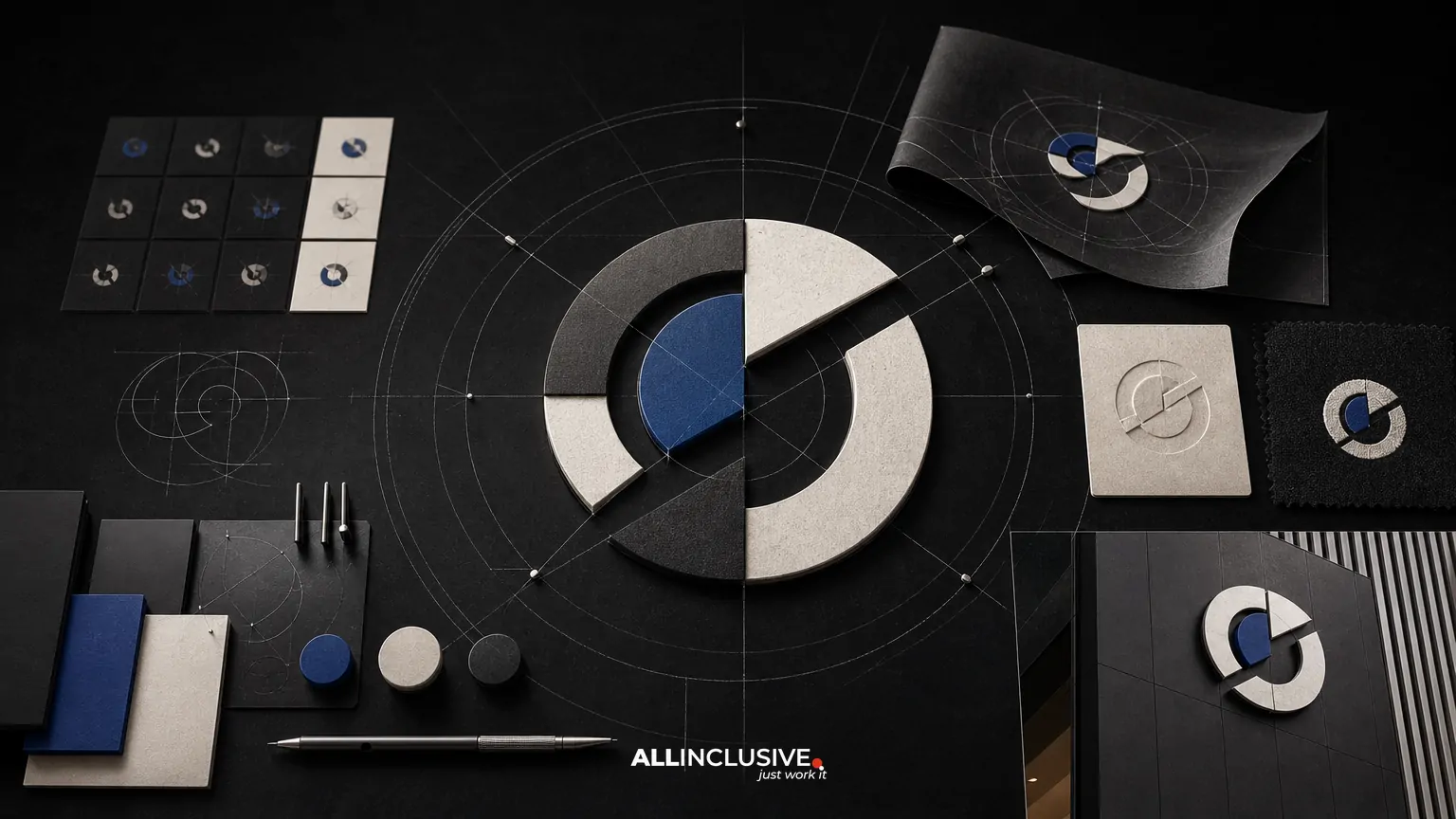
Responsive logo design is the practice of creating a coordinated set of logo variations that adapt to different sizes, layouts, and usage conditions. Instead of forcing one detailed mark into every context, a responsive system preserves recognition while adjusting its proportions, detail, and supporting elements for the space available.
A strong system may include a full lockup for spacious layouts, a simplified horizontal or stacked version for medium spaces, and a compact symbol or wordmark for very small applications. The goal is not to create unrelated logos. It is to define controlled changes that remain recognizably part of the same identity.
This distinction matters because logos appear across more environments than a typical brand presentation shows: navigation bars, mobile apps, browser tabs, social avatars, invoices, signage, packaging, trade-show materials, and embroidered or screen-printed items. Each surface imposes different limits on scale, contrast, file format, and surrounding space.
What makes a logo responsive?
A responsive logo system changes deliberately as the available space changes. Common adjustments include:
- Removing a tagline or descriptor when the mark becomes too small.
- Changing from a horizontal lockup to a stacked composition.
- Separating an icon from a wordmark for compact placements.
- Reducing internal detail in an illustration or emblem.
- Adjusting stroke weights, spacing, or counters for reproduction.
- Switching between color, one-color, reversed, and grayscale versions.
These variations should share a visual logic. Consistent geometry, typography, color relationships, and proportions help audiences understand that each version represents the same organization.
Responsive logo design is a system, not a single file
The primary logo is only one part of a usable identity system. Before drawing variants, define the role each version will play. A practical system often includes the following levels:
| Variant | Best use | Typical design decision |
|---|---|---|
| Primary lockup | Websites, presentations, documents, and spacious layouts | Includes the complete logo arrangement and supporting descriptor when appropriate |
| Alternate lockup | Headers, banners, and constrained horizontal or vertical spaces | Rearranges elements without changing the core identity |
| Compact mark | App icons, social avatars, favicons, and small promotional placements | Removes secondary elements and prioritizes the strongest recognition cue |
| Production variants | Embroidery, engraving, signage, and one-color applications | Uses simplified shapes, suitable contrast, and reproduction-safe details |
Not every organization needs every variant. The right number depends on the brand architecture, channels, audience, and production requirements. Creating too many options can cause inconsistent usage, while creating too few can force teams to improvise.
Start with context before creating variants
Responsive decisions should follow real use cases rather than arbitrary size categories. Build an inventory of where the logo will appear and what constraints each environment creates.
Digital surfaces
- Desktop and mobile website headers
- Mobile application launch screens and icons
- Browser tabs and bookmarks
- Email signatures and digital documents
- Social profile images and post templates
- Video title cards, overlays, and presentation software
Physical and production surfaces
- Business cards and stationery
- Trade-show graphics and building signage
- Apparel, embroidery, and promotional products
- Packaging labels and printed inserts
- Vehicle graphics and environmental applications
Record the approximate display size, background, viewing distance, production method, and color limitations for each important application. A logo that works on a large website hero may fail as a one-inch embroidered mark, even if both files are technically vector artwork.
How to decide what disappears first
Responsive design requires a hierarchy of recognition. Identify which elements communicate the organization most effectively and protect those elements as space decreases.
- Define the recognition anchor. This may be a symbol, distinctive letterform, wordmark, or combination of shape and color.
- Rank supporting elements. Taglines, descriptors, secondary icons, decorative details, and fine internal lines are often less essential at small sizes.
- Remove in stages. Do not jump directly from a full lockup to a tiny symbol. Establish intermediate versions so the change feels intentional.
- Check the remaining composition. Removing an element can create awkward gaps, weak balance, or ambiguous meaning. Rebuild spacing rather than simply deleting objects.
- Document the thresholds. Specify when each version should be used, while allowing for judgment in unusual applications.
A tagline may be valuable in a sales presentation but unreadable in a navigation bar. A detailed symbol may work on signage but become a visual blur in a social avatar. Responsive variants should solve those problems without treating the smallest version as an afterthought.
Designing for legibility at small sizes
Small-scale performance depends on more than reducing dimensions. Details that are clear in a large vector file can collapse when rasterized or reproduced physically.
Protect counters and gaps
Interior openings in letters and symbols need enough space to remain open after scaling. Tight counters can fill in on screens, while narrow gaps may disappear in print or embroidery.
Control line weight
Very thin strokes are vulnerable to antialiasing, low-resolution displays, and production tolerances. A compact variant may need a different stroke treatment from the primary version.
Use optical, not only mathematical, alignment
Two variants can share a measured grid but appear to sit at different visual positions. Adjust baselines, side bearings, and icon-to-wordmark relationships by eye after checking the underlying geometry.
Reduce complexity with purpose
Simplification should preserve the distinctive idea of the mark. Removing every detail can make a symbol generic, while retaining too much detail can make it illegible. Test the smallest meaningful form instead of assuming that more information always creates more recognition.
Test the system across real surfaces
Responsive logo design is not finished when the variants look correct on an artboard. Test them in representative environments and at the actual approximate size.
- Place each version in a desktop and mobile header.
- Preview the compact mark as a social avatar and app icon.
- View the logo on light, dark, textured, and photographic backgrounds.
- Print it at common document and stationery sizes.
- Test one-color and reversed versions.
- Review low-resolution exports and compressed images.
- Simulate embroidery, engraving, vinyl cutting, or other relevant production methods.
- Ask viewers who did not design the mark what they notice first.
Evaluate recognition, legibility, balance, contrast, and consistency. Also check the space around the mark. A compact logo can be technically readable but still feel crowded if its clear space is not adapted to the application.
Useful test question: if the logo is visible for only a moment, which element should a viewer remember, and does the smallest approved version preserve it?
File preparation and handoff requirements
A responsive system needs clear production files and clear instructions. Without both, teams may select the wrong variant, recreate artwork, or export a raster image that fails in use.
Recommended file structure
- Organize files by variant, color treatment, orientation, and file format.
- Provide editable vector files for professional production.
- Include transparent-background raster exports for routine digital use.
- Supply appropriate RGB files for screens and CMYK or spot-color guidance where print requires it.
- Include one-color, reversed, and grayscale options when they are part of the system.
- Use descriptive filenames that identify the variant and color treatment.
Document usage rules
- Show which variant belongs to which context.
- State minimum display sizes where testing supports a clear threshold.
- Define clear-space rules and background requirements.
- Explain when a tagline or descriptor should be removed.
- Specify approved colors and acceptable contrast relationships.
- Identify prohibited modifications such as stretching, recoloring, outlining, or rearranging elements.
These details belong in a broader brand guidelines system when multiple teams, vendors, or locations will use the identity. For a useful comparison of what a logo package may contain, see logo design deliverables.
Common responsive logo mistakes
Using one logo everywhere
A single lockup may appear consistent, but it often becomes unreadable or poorly balanced in constrained spaces. Consistency comes from a governed system, not from refusing to adapt.
Creating variants that are too different
A compact mark should not look like an unrelated icon. Preserve recognizable attributes and explain the relationship between versions.
Scaling down without simplifying
Blind reduction preserves technical artwork but ignores optical performance. Small applications often need spacing, stroke, and detail changes.
Designing only for screens
Digital previews do not reveal every issue in embroidery, engraving, photocopying, signage, or low-ink printing. Include production scenarios early.
Delivering files without decision rules
A folder of assets is not a system if users cannot tell which file to choose. Naming, previews, and usage guidance reduce improvisation.
Adding too many breakpoints
Every additional version introduces another choice and another opportunity for inconsistency. Create only the variants that solve documented use cases.
How responsive logos fit into a larger identity
A logo cannot compensate for an unclear brand strategy, weak typography, or inconsistent visual language. Before refining variants, confirm that the underlying mark has a clear role and that its relationship to the broader identity is understood.
For organizations reviewing the complete visual system, brand identity design can encompass the logo, typography, color, imagery, layout, and other recognition assets. If the project involves multiple design needs beyond identity, the broader design resource provides additional context.
Responsive behavior should also reflect the practical needs of the organization. A startup using a digital-first identity may prioritize app icons, product interfaces, and social profiles. A manufacturer, professional-services firm, or nonprofit may need stronger support for documents, signage, trade shows, and printed materials. The system should be shaped by the places where the brand must operate.
A practical review checklist
Before approving a responsive logo system, confirm that:
- The primary, alternate, compact, and production variants have defined purposes.
- Each variant remains recognizably connected to the same identity.
- Taglines and secondary details disappear at an intentional point.
- Small-size versions preserve legibility and the recognition anchor.
- Light, dark, color, one-color, and reversed uses have been tested as needed.
- Digital and physical production conditions have been considered.
- Clear space, minimum size, background, and misuse rules are documented.
- Files are organized for both everyday users and professional vendors.
- Ownership and editable source-file expectations are settled before handoff.
- The system has enough flexibility for real applications without creating unnecessary choices.
Final takeaway
Responsive logo design creates a controlled family of marks that maintains recognition across changing spaces and production conditions. The strongest approach starts with actual use cases, protects the identity’s most distinctive elements, tests variants at realistic sizes, and delivers both files and decision rules.
If you are evaluating a logo project that needs a complete set of variants, production-ready assets, and a clear handoff, review the scope of logo design services alongside your application requirements. For project planning context, the guide to logo design timelines can help you account for discovery, design development, testing, revisions, and final preparation.