
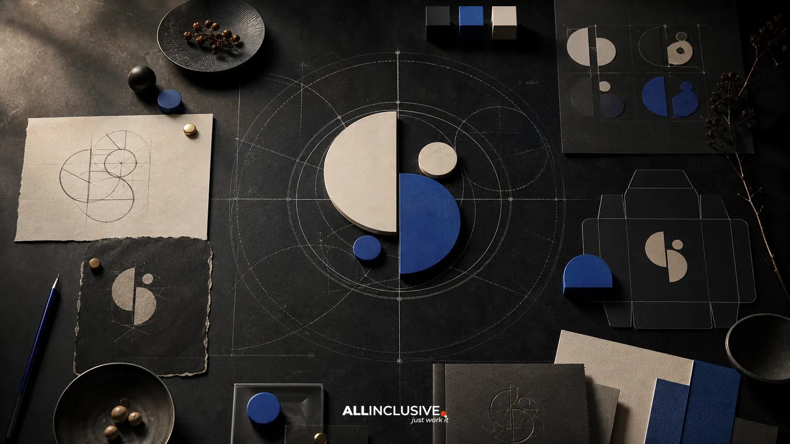
Restaurant logo design has to work in more places than a storefront sign. The identity may appear on a roadside sign, menu, takeout bag, delivery-app thumbnail, social profile, loyalty card, uniform, receipt and digital ordering interface. A logo that looks excellent at one size can become unreadable, cramped or inconsistent elsewhere.
The strongest approach is to treat the logo as a small visual system. That system should include a primary mark, simplified responsive versions, clear color and spacing rules, and practical files for the people and platforms that will use it. The goal is not to create every possible variation. It is to make the restaurant recognizable and usable wherever customers encounter it.
This guide explains what to evaluate, which trade-offs matter, and what a complete handoff should include. For broader professional logo design considerations, see the logo design service overview; this article focuses on restaurant-specific decision-making rather than presenting a service page.
What restaurant logo design needs to solve
A restaurant logo has a demanding job: signal the concept quickly while remaining legible in environments controlled by landlords, printers, delivery platforms and social networks. It should support recognition without relying on a single large-format application.
Before sketching, define the business and operating context:
- Concept: Is the restaurant casual, fast-casual, fine dining, neighborhood-focused, regional, mobile or delivery-led?
- Audience: What expectations do guests bring about price, speed, ingredients, service and atmosphere?
- Location: Will the mark compete with roadside signage, a dense retail corridor, a food hall or a digital-first ordering journey?
- Growth plan: Could the restaurant add locations, packaged products, catering or multiple concepts?
- Production reality: Which uses require embroidery, one-color printing, vinyl cutting, laser engraving or small digital artwork?
These questions prevent a common mistake: designing for an imagined hero application instead of the real set of customer and operational touchpoints.
Build the strategy before the mark
Restaurant identities often become overly literal. A burger illustration, chef hat or fork may communicate the category, but it can also make the brand feel interchangeable. A better strategy identifies the restaurant’s distinctive idea before choosing visual symbols.
Clarify the positioning
Write a short internal statement describing what the restaurant offers, who it serves and why it should be remembered. This is not necessarily public-facing copy. It is a decision filter for the identity.
For example, a coastal seafood counter, a modern neighborhood bakery and a premium steakhouse may all need a food-related identity, but their signals should differ in tone, structure, typography, color and level of detail. The logo should support the intended experience rather than merely announce the food category.
Separate recognition from decoration
A useful restaurant mark can have personality without depending on ornamental detail. Ask whether the core idea remains recognizable when reduced to a small square, printed in one color or viewed briefly in a crowded delivery interface.
Decorative elements can still be valuable in menus, packaging and environmental graphics. They do not all need to be part of the smallest logo configuration.
Choose a logo structure that fits the operating model
There is no universally correct logo format. The right structure depends on the name, audience, applications and future needs.
| Structure | Strengths | Trade-offs |
|---|---|---|
| Wordmark | Builds recognition around the restaurant name and works well where the name must be read immediately. | Long or low-contrast names may become difficult to use at small sizes. |
| Symbol plus wordmark | Provides a complete primary lockup and a separate symbol for compact applications. | Requires clear rules so the symbol does not become disconnected from the name too early. |
| Badge or seal | Can express heritage, craft or a neighborhood feel and suit packaging or signage. | Dense circular arrangements often lose legibility in small digital placements. |
| Monogram | Useful for short names, premium positioning and compact applications. | Initial-based marks can feel generic unless the construction has a distinctive rationale. |
| Illustrative mark | Can create warmth and a memorable character for a specific concept. | Fine detail, facial expressions and complex silhouettes may fail in production or at thumbnail size. |
Comparing a wordmark and symbol logo can help clarify whether the restaurant should prioritize name visibility, flexible recognition or both. A monogram may also be worth considering for an established or premium concept; the practical considerations are covered in monogram versus wordmark logos.
Design responsive versions, not random variations
Responsive logo design means creating intentional versions for different available spaces. It is not simply shrinking the primary logo until it becomes unreadable.
A restaurant logo system may include:
- Primary lockup: The full mark for storefronts, menus, presentations and other applications with sufficient space.
- Horizontal or stacked lockup: An alternate arrangement for different sign proportions or layout needs.
- Compact mark: A symbol, monogram or simplified identifier for profile images, app icons and small labels.
- One-color version: A reliable option for stamps, receipts, embroidery, engraving and low-cost production.
- Reversed version: A light mark designed for dark backgrounds, with tested contrast rather than an automatic color inversion.
Each version should have a defined role. If a symbol is intended for app icons but has never appeared without the wordmark, customers may not recognize it. If a badge contains too much type, it may need a simplified small-size configuration instead of being used everywhere.
Test the identity across restaurant touchpoints
Mockups are useful when they represent real decisions, not just attractive scenes. Test the logo in the environments that affect recognition, production and customer choice.
Physical applications
- Exterior sign viewed from the expected distance
- Window vinyl and door decals
- Menu cover, menu interior and table card
- Takeout bag, cup, box and sticker
- Staff shirt, apron and hat
- Receipt, loyalty card and gift card
- Vehicle or catering display, if applicable
Digital applications
- Delivery-app thumbnail and restaurant listing
- Website header and online ordering flow
- Social profile image and post template
- Email header and digital gift card
- Map listing and review-platform profile
Pay particular attention to small digital contexts. Delivery platforms may crop artwork, place it inside a circular frame or display it beside many competing restaurant images. The compact mark must remain clear without relying on a large wordmark.
Production tests
Print a one-color version at the smallest expected size. View it from a distance. Test embroidery or vinyl cutting if those applications are planned. Check whether thin lines close up, counters disappear or type becomes too tight. A logo can be visually compelling on screen yet impractical when reproduced by a local sign vendor or packaging printer.
Balance distinctiveness with operational clarity
Restaurant owners often face a tension between personality and usability. An identity that is highly distinctive may be harder to reproduce; an identity optimized only for clarity may feel generic.
Use the following questions to find a workable balance:
- Does the logo have a memorable feature that is not dependent on tiny detail?
- Can a customer identify the name or symbol quickly in a crowded listing?
- Does the typography match the service experience without becoming difficult to read?
- Will the colors reproduce consistently on coated paper, uncoated paper, fabric and screens?
- Can staff and vendors use the identity correctly without a designer present?
Color is especially important in food environments. A palette should support appetite, atmosphere and differentiation, but it should also account for contrast, lighting and production limitations. Do not evaluate color only on a calibrated presentation screen.
Define the handoff before approving the logo
A finished restaurant logo is more than a preview image. The handoff should give the restaurant, printer, sign vendor, web developer and marketing team the assets needed to use the identity consistently.
A practical handoff commonly includes:
- Primary, alternate, compact, one-color and reversed logo versions
- Vector files such as AI, EPS or SVG, when appropriate for the production workflow
- Raster files such as PNG for everyday digital use
- Color specifications for screen and print workflows
- Recommended clear space and minimum-size guidance
- Font information, licensing notes or outlined production files as needed
- Examples of incorrect use, such as stretching, recoloring or adding effects
- File naming and folder structure that non-designers can understand
Ownership and usage rights should also be documented in the project agreement. Clarify what is being delivered, whether editable source files are included, and how third-party fonts or illustrations may be used. These details matter when the restaurant changes vendors, opens a second location or updates its ordering platform.
Connect the logo to the broader identity
The logo should not be expected to carry the entire brand experience. Photography, menu hierarchy, packaging materials, signage, tone of voice, interior details and digital interface choices also shape recognition.
For a larger identity decision, review the principles in brand identity design. If the restaurant already has an identity but inconsistent applications, a brand guidelines system can define how the logo, colors, typography and supporting elements work together.
Restaurants with multiple concepts or locations should be especially careful about architecture. Decide whether each location needs a shared parent identity, a standardized system with local variations or a distinct identity. The answer affects naming, logo structure, signage and future production costs.
Restaurant logo design evaluation checklist
Before approving a direction, review the identity against this checklist:
- Strategy: Does the concept reflect the restaurant’s positioning and intended guest experience?
- Recognition: Is there a memorable feature beyond generic food imagery?
- Legibility: Can the name or symbol be understood at small and large sizes?
- Responsiveness: Are there intentional configurations for narrow, square, small and one-color uses?
- Contrast: Does the mark remain clear on light, dark, textured and photographic backgrounds?
- Production: Can vendors reproduce it through the planned printing, signage, embroidery and digital methods?
- Consistency: Can a staff member or marketing partner identify which file to use?
- Future fit: Will the system support catering, packaged goods, additional locations or new digital channels?
- Handoff: Are file formats, usage rules and ownership terms clear?
Common mistakes to avoid
Designing only for the storefront
A large sign can hide problems that become obvious on a delivery-app thumbnail or printed sticker. Test compact use before final approval.
Using a detailed illustration as the only mark
Illustration can add character, but a detailed image should usually have a simplified companion version for small applications.
Relying on a trendy typeface
Typography should support the concept and remain usable across menus, signage and digital channels. Trend sensitivity is less valuable than legibility and a coherent point of view.
Approving colors without production testing
Screen color, printed color, fabric color and illuminated signage can differ significantly. Test the important applications before committing to a palette.
Leaving vendor instructions implicit
Even a strong logo can be distorted when files are unclear. A concise usage guide reduces unnecessary revisions and protects consistency.
Making the decision
Restaurant logo design should be judged as an operating tool as much as a visual expression. The best system gives the concept a recognizable point of view, adapts to real restaurant surfaces and remains easy for partners to reproduce.
Use the evaluation criteria above to compare concepts, test the likely applications and identify unresolved production issues. When the scope expands from the mark into a coordinated identity system, the broader design capabilities overview provides useful context, while the dedicated logo design page is the appropriate next step for organizations evaluating professional support.


