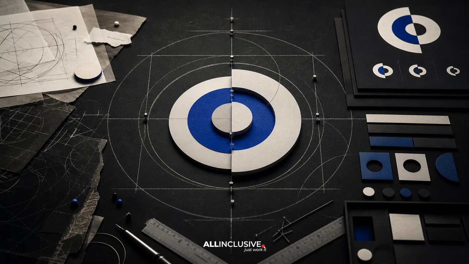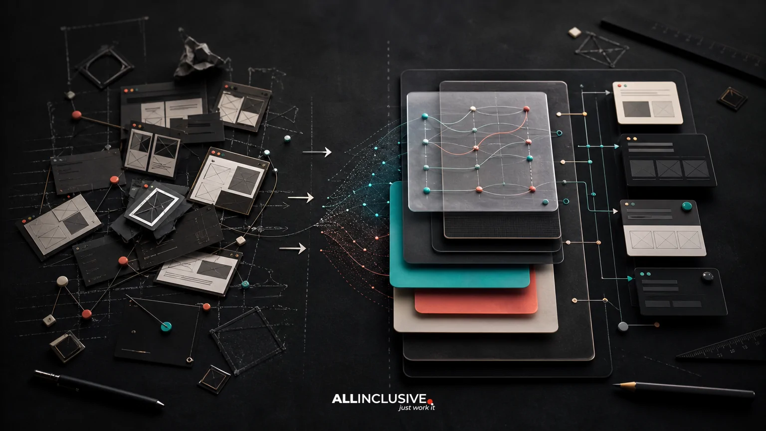
Hospitality logo design is not only the creation of a distinctive mark. It is the development of a flexible recognition system that can perform across property signage, booking platforms, menus, room materials, social profiles, staff apparel, mobile screens and printed guest communications. A related planning guide is Healthcare Logo Design: Clarity, Trust and Accessibility.
That distinction matters because hospitality brands are encountered in many sizes, environments and states of attention. A logo may need to identify a hotel from the road, remain legible on a phone, reproduce cleanly on a key card and feel appropriate beside a restaurant partner or parent group. The strongest evaluation process therefore considers strategy, responsive behavior, real-world surfaces, file delivery and ownership—not just whether the primary concept looks attractive in a presentation.
If you are comparing providers or defining a project scope, use the criteria below to determine whether the proposed work is a complete logo system or simply a single logo file. For broader service scope and deliverables, see logo design services.
What makes hospitality logo design different?
Hospitality organizations often manage a portfolio of experiences rather than one isolated customer interaction. A property can have a parent brand, hotel name, restaurant, bar, spa, event space and seasonal programs. Each may need a clear relationship to the others without becoming visually interchangeable.
The logo also operates in unusually varied conditions. It may appear on stone, glass, fabric, metal, paper, digital interfaces and third-party booking environments. Some applications allow generous space; others reduce the mark to a small avatar or favicon. A successful system balances atmosphere and practicality: it should express the intended experience while remaining identifiable when color, size or production method changes.
Start with the guest and business context
Before sketching, define how recognition is expected to work. A boutique property competing on personality may need a more expressive identity than a multi-property operator seeking consistency across locations. A resort may need a symbol that supports wayfinding and amenities, while a restaurant within a hotel may require enough distinction to feel like its own destination.
Useful discovery questions
- Who makes the first recognition decision: a guest browsing online, a driver approaching the property, a meeting planner or a returning customer?
- Which touchpoints carry the most business value, such as direct booking, signage, dining reservations or event sales?
- Does the organization need one master brand, a property family or a branded-house and sub-brand relationship?
- What existing associations should be preserved, and what perceptions need to change?
- Which production constraints are known, including embroidery, engraving, exterior signage, small digital placements or low-cost print?
- Who approves future uses after launch, and how much internal design capability will be available?
These answers help prevent a common mistake: selecting a visually impressive mark that does not support the operating model. A logo is only one part of the broader identity system, so decisions should also align with the organization’s brand identity, naming structure, typography, color and guest experience.
Evaluate the logo as a responsive system
Hospitality applications rarely provide a consistent canvas. Ask to see how the identity behaves at multiple scales and in different formats. The goal is not to create arbitrary variations; it is to define predictable versions for known use cases.
Core components to review
- Primary lockup: The main relationship between symbol, wordmark and any descriptor.
- Compact or stacked lockup: A version for narrower spaces, vertical signage or constrained layouts.
- Symbol or monogram: A reduced identifier for avatars, app icons, favicons or small merchandise.
- One-color versions: Positive and reversed treatments for engraving, embossing, photocopying, embroidery and dark backgrounds.
- Minimum-size guidance: Practical limits that protect legibility rather than theoretical measurements alone.
- Clear-space rules: Consistent protection around the mark so nearby text, imagery or architectural details do not crowd it.
Responsive versions should retain the same recognizable logic. If every reduction becomes a different illustration, staff and vendors may apply the system inconsistently. Conversely, forcing a detailed primary lockup into every small space can make the brand disappear into illegible shapes.
Test the system across hospitality touchpoints
Mockups are useful for discussion, but they should represent actual decisions the business will make. A concept that works on a clean presentation slide may fail when placed on a busy sign, a dark booking interface or a textured material.
High-value applications to test
| Touchpoint | What to assess |
|---|---|
| Exterior and entrance signage | Distance legibility, contrast, nighttime visibility, fabrication constraints and relationship to architecture. |
| Website and booking flow | Recognition in headers, responsive layouts, browser icons, accessibility considerations and use beside booking controls. |
| Menus and in-room materials | Reproduction at common print sizes, hierarchy with practical information and suitability for frequent updates. |
| Social and review profiles | Recognition in square crops, small avatars and environments where the surrounding interface controls the layout. |
| Staff apparel and amenities | Embroidery, screen printing, single-color production and legibility at chest or sleeve scale. |
| Events and partnerships | Co-branding, sponsor lockups, temporary programs and clear distinction between the property and third parties. |
Testing should include both expected and unfavorable conditions: reduced size, limited contrast, one-color production, crowded backgrounds and quick exposure. The purpose is not to approve every possible mockup. It is to discover where the system requires a variant, a background treatment or a usage rule.
Balance atmosphere with recognition
Hospitality brands often want to communicate mood—quiet luxury, energetic nightlife, regional character, family ease or design-led sophistication. Those qualities can inform shape, proportion, typography and color, but atmosphere should not come at the expense of recognition.
Overly literal symbols can narrow future use or resemble familiar category clichés. A generic roofline, cocktail glass, palm tree or bed may communicate the category quickly but provide little distinction. Highly decorative lettering may feel appropriate in a large sign yet become difficult to read in a confirmation email or search result.
Ask whether the concept has a memorable organizing idea and whether that idea survives simplification. The best option is not necessarily the most ornate or unconventional. It is the one that gives the property a defensible visual cue while remaining usable in the places guests actually encounter it.
Consider architecture, location and portfolio structure
A hospitality mark must coexist with its physical setting. Materials, sightlines, lighting, historic restrictions, landlord requirements and neighboring signage can influence the practical result. Before approval, identify whether the mark will be applied directly to a façade, mounted on a sign panel, etched into glass or used temporarily for events.
Location can also influence the identity without requiring a literal geographic symbol. Regional references may be expressed through proportion, pattern, color or tone. If a company operates multiple properties, establish the relationship between shared elements and local expression early. A system that gives every location identical treatment may weaken individuality; a system with no shared structure may sacrifice portfolio recognition.
For adjacent identity decisions, a comparison with real estate logo design considerations can be useful when properties, developments or management companies overlap. The hospitality context typically adds more guest-facing environments and service sub-brands.
Clarify deliverables, file formats and ownership
A polished presentation is not a production handoff. Before approving a proposal, confirm what the final package includes and how the organization can use it after launch.
A practical handoff checklist
- Vector master files in appropriate editable formats.
- Web-ready raster exports in useful sizes and transparent-background options.
- Full-color, black, white and reversed versions.
- Horizontal, stacked, compact and symbol-only variants where justified.
- Color values for digital and print workflows, with documented usage limits where necessary.
- Font information, licensing responsibilities and any outlined production files.
- Clear-space, minimum-size and background guidance.
- Examples or rules for co-branding, sub-brands and temporary applications.
- Written confirmation of usage rights, ownership and access to final files.
Ownership language should be reviewed before work begins, not after launch. Confirm whether the business receives rights to use the final approved artwork, whether working files are included, and whether any third-party fonts or assets carry separate restrictions. If the logo will be used across properties or franchise relationships, define that scope explicitly.
Connect the logo to usable guidelines
Guidelines should help busy teams make correct decisions without needing the original designer for every application. They do not need to be excessively long, but they should address the situations most likely to create inconsistency.
At minimum, document approved versions, spacing, scale, color combinations, backgrounds, misuse examples and file selection. If the brand includes property-level variations, show how names and descriptors align. If vendors will produce signage, menus or uniforms, include enough practical direction to reduce interpretation errors.
For a deeper look at what makes a usable rule set, see brand guidelines design considerations. The goal is operational clarity: a front desk team, marketing coordinator or outside printer should be able to select the right asset confidently.
Compare proposals without comparing only concepts
When reviewing designers or studios, score the process as well as the visual work. A useful comparison may include:
- Strategic fit: Does the proposal address audience, property positioning, portfolio structure and business goals?
- System thinking: Are responsive variants and production conditions part of the planned work?
- Application testing: Will the team assess real guest touchpoints rather than relying only on generic mockups?
- Collaboration: Is there a clear process for feedback, approvals and stakeholder alignment?
- Handoff quality: Are formats, usage guidance, licensing and ownership documented?
- Future usability: Can internal teams and vendors apply the system without repeated interpretation?
Ask each provider to distinguish included deliverables from optional additions. Signage production, naming, photography, environmental graphics, web implementation and full brand strategy may belong to related but separate scopes. Keeping those boundaries clear makes proposals easier to compare and prevents important operational requirements from being assumed.
Common hospitality logo mistakes
- Designing for one hero application: A façade mockup cannot demonstrate mobile, print or small-scale performance.
- Using a generic category symbol: Immediate category recognition may come at the cost of distinctiveness.
- Ignoring portfolio relationships: Property, restaurant and parent-brand naming can become confusing without a defined hierarchy.
- Approving before production testing: Materials, lighting and fabrication can change the appearance materially.
- Delivering only a PNG: A single raster file is not a flexible identity system.
- Leaving ownership vague: Ambiguity can limit future vendors, locations or applications.
- Writing guidelines no one uses: Excessive theory without practical examples does not improve consistency.
A decision-ready hospitality logo checklist
Before final approval, confirm that you can answer yes to the following questions:
- Can the mark be recognized at the sizes and distances that matter most?
- Are primary, compact, symbol-only and one-color versions defined where needed?
- Has the system been tested on actual digital, print, signage and merchandise applications?
- Does it work with the property’s architecture, materials and lighting conditions?
- Is the relationship between parent brand, property and amenities clear?
- Are final files, formats, licensing responsibilities and usage rights documented?
- Can internal teams and vendors apply the system without guessing?
Hospitality logo design is best judged as an operating system for recognition, not as an isolated graphic. A thoughtful process connects strategic positioning to responsive variants, real-world testing and a handoff that remains useful after launch. If you are defining the broader project scope, use this checklist alongside the decision criteria on the design services page and then evaluate the appropriate logo design engagement.