
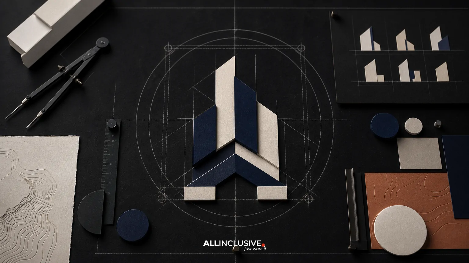
Real estate logo design has a difficult brief: the identity must feel credible enough for a high-trust transaction, distinctive enough to stand out in a crowded market, and flexible enough to work across property listings, signage, social media, presentations, and digital products. The strongest solution is not simply an attractive mark. It is a usable identity system built around a clear market position.
That distinction matters because generic property branding often relies on the same visual shortcuts: rooflines, keys, buildings, skylines, roof peaks, and initials placed inside a geometric shape. These devices are not automatically wrong, but they rarely explain why one brokerage, developer, property manager, or commercial real estate firm is different from another.
When evaluating a real estate logo project, look for evidence of strategic discovery, responsive logo variants, cross-surface testing, organized files, clear usage rights, and a practical handoff. The goal is a recognizable system that supports business decisions—not a mark that only looks good in a presentation mockup.
What makes real estate logo design effective?
Effective real estate logo design connects the visual identity to the company’s actual role in the market. A residential brokerage serving first-time buyers may need to communicate approachability and guidance. A commercial developer may need greater emphasis on scale, precision, and investment confidence. A property management company may prioritize reliability and operational clarity, while a luxury firm may require restraint and a more editorial visual language.
Before reviewing concepts, define four factors:
- Audience: Identify who makes the decision and who encounters the brand during the buying, leasing, financing, or management process.
- Market position: Clarify whether the business competes through local expertise, specialization, speed, service, portfolio quality, data, or another meaningful advantage.
- Brand personality: Choose a deliberate balance of traits such as established, modern, warm, technical, selective, practical, or premium.
- Primary contexts: List the environments where the logo must work, including listing portals, websites, signs, property brochures, email signatures, social avatars, apparel, presentations, and legal documents.
This foundation helps prevent the common mistake of choosing a symbol first and trying to attach a strategy afterward. A broader brand identity system can then define how the logo relates to color, typography, imagery, layouts, and messaging.
Why familiar property symbols often produce generic branding
Visual shorthand is useful when it is specific, but real estate categories are full of overused symbols. A roofline can suggest property, yet it does not distinguish a neighborhood specialist from a national commercial firm. A skyline may imply development, but it can also feel interchangeable with banks, construction companies, architecture practices, and city institutions.
The problem is not the individual icon. It is the lack of a reason for that icon to belong to one company. Generic branding tends to share several characteristics:
- The symbol could be exchanged with a competitor’s mark without changing the meaning.
- The concept describes the industry but not the company’s point of view.
- The logo depends on fine detail that disappears at small sizes.
- The visual language is based on category clichés rather than audience needs.
- The wordmark, symbol, typography, and color palette do not operate as a coherent system.
A more useful approach is to begin with the company’s distinctive evidence. That might include a specific geographic relationship, a specialized property type, a unique service model, a measurable operational strength, or a particular philosophy of stewardship. The identity does not need to illustrate that idea literally. It needs to make the business feel intentional and recognizable.
Evaluate the logo as a system, not a single mark
A real estate logo will appear in spaces with different proportions, resolutions, distances, and background conditions. A single primary lockup is rarely enough. Ask whether the proposed identity includes a practical family of assets, such as:
- Primary lockup: The preferred combination of symbol and wordmark for websites, proposals, and prominent applications.
- Horizontal or compact lockup: A version for headers, signage, navigation bars, and narrow layouts.
- Symbol or monogram: A simplified asset for social avatars, app icons, favicons, and small digital placements.
- One-color versions: Light and dark options for stamps, documents, embroidery, and constrained production methods.
- Minimum-size guidance: A documented threshold that protects legibility.
- Clear-space guidance: A defined area that prevents nearby text, images, or graphic elements from crowding the mark.
Responsive variants should not feel like unrelated logos. They should preserve the essential recognition cues while removing detail or rearranging components when space is limited. This is especially important for firms that use the same identity across property signs, mobile screens, listing graphics, investor materials, and office environments.
Test the identity across real estate touchpoints
Concept presentations can make almost any logo feel successful because they usually show the mark at a generous size and in a controlled setting. Evaluation should move quickly into realistic conditions.
| Touchpoint | What to evaluate |
|---|---|
| Property signage | Distance legibility, contrast, viewing angle, production limits, and neighborhood context. |
| Listing graphics | Recognition at thumbnail size and compatibility with photography, listing information, and platform constraints. |
| Website header | Horizontal fit, navigation balance, responsive behavior, and performance on light and dark backgrounds. |
| Social profile | Whether the symbol or compact mark remains identifiable inside a small circular or square crop. |
| Presentation or offering memorandum | How the identity behaves alongside dense information, charts, maps, and photography. |
| Print and production | Color conversion, one-color reproduction, embroidery, vinyl cutting, foil, and low-cost printing. |
Cross-surface testing is not merely a final quality check. It can reveal strategic weaknesses. A mark that works on a sign but disappears in a digital profile may need a stronger symbol system. A refined identity that fails in one-color production may be too dependent on color contrast. A logo that looks clear alone but competes with property photography may need a more restrained supporting palette.
For broader implementation considerations, use a practical design process that accounts for the environments in which the identity will actually be used.
Balance trust, distinction, and category recognition
Real estate brands operate in a high-trust category, so unfamiliarity should not be confused with strategic originality. The identity still needs to feel credible and easy to understand. The useful question is not, “Does this look like real estate?” but, “Does this feel appropriate for the company while remaining distinguishable from its alternatives?”
Consider the trade-offs:
- Literal versus abstract: A literal house or building can communicate quickly, while an abstract form may offer more distinctiveness. The right choice depends on how much category explanation the brand needs.
- Traditional versus contemporary: Serif typography, established colors, and formal composition can signal longevity. Modern type and simplified forms can suggest agility or innovation. Either direction becomes weak when it is selected only because it is fashionable.
- Local versus scalable: A geographic reference may build local relevance but can limit expansion or create visual clichés. Use local cues when they support a meaningful positioning rather than simply naming the market.
- Premium versus accessible: Restrained design can feel selective, but excessive minimalism may reduce warmth or clarity. A residential service brand may need more approachability than an investment platform.
A strong concept makes these choices deliberately and explains how the logo supports the business. It should not depend on subjective claims such as “modern” or “professional” without showing what those qualities mean in use.
Questions to ask during concept review
Whether the work is being reviewed internally or with a design partner, structured questions produce better decisions than personal preference alone.
- What specific business or audience insight does this concept express?
- Could a direct competitor use the same symbol without changing its meaning?
- What remains recognizable when the logo is reduced to a small icon?
- Does the wordmark remain readable at the smallest expected size?
- How does the system behave over property photography, maps, charts, and video?
- Does the color palette reproduce reliably in digital, print, signage, and one-color applications?
- Are the visual decisions appropriate for the company’s property segment and price point?
- What compromises were made to achieve simplicity, and are they acceptable?
- Can an internal team use the assets without specialized software or repeated design intervention?
These questions help separate strategic fit from personal taste. They also make stakeholder feedback more actionable. “I do not like it” is difficult to use; “the symbol loses its silhouette at social-avatar size” identifies a solvable issue.
Confirm deliverables, ownership, and handoff
A logo project is incomplete if the organization cannot use the resulting assets confidently. Before approval, document the expected deliverables and the conditions attached to them.
File formats
For most teams, the handoff should include vector files for scalable production and raster exports for everyday digital use. Common needs include editable vector formats, web-ready transparent PNG files, and appropriately sized assets for social profiles or presentations. Ask whether the files are organized by use case and whether color modes are labeled clearly.
Color and typography
Record the approved color values for digital and print contexts, along with font names, licensing requirements, and fallback guidance. If a typeface requires a commercial license, clarify who is responsible for purchasing and maintaining it.
Usage rules
Basic documentation should explain clear space, minimum size, approved backgrounds, color variations, incorrect uses, and how the logo relates to partner or property marks. This may be a concise logo guide or part of larger brand guidelines.
Rights and ownership
Review the agreement for ownership, usage rights, source files, third-party assets, font licenses, and any limitations on modification. The practical question is whether the company can use the identity across its expected channels and vendors without uncertainty.
Common mistakes in real estate logo projects
- Starting with a mood board instead of a brief: Visual references can be useful, but they should support a defined business problem.
- Approving the presentation mockup: A logo must be judged in the smallest, busiest, and least controlled environments where it will appear.
- Using too much detail: Fine lines, complex skylines, and intricate buildings often collapse in production.
- Confusing differentiation with novelty: An unusual mark is not automatically strategic if it is hard to understand or use.
- Ignoring the wordmark: The name is often the most important recognition asset, particularly for a new or regional firm.
- Skipping internal usability: If staff cannot find, export, or apply the right files, inconsistency will spread quickly.
- Treating the logo as the entire brand: Photography, typography, layouts, messaging, and color behavior determine how the identity feels in practice.
Industry context can also change the design criteria. For comparison, see how identity decisions differ in financial services logo design and hospitality logo design. The lesson is not to copy another sector’s visual language, but to recognize that trust, audience expectations, and usage environments shape the system.
A practical approval checklist
Before signing off, confirm that the identity can answer “yes” to most of these questions:
- Does it express a clear position beyond “we work in property”?
- Is it recognizable without relying on a familiar real estate cliché?
- Are primary, compact, symbol, and one-color versions available where needed?
- Does it remain legible on signs, screens, documents, and social profiles?
- Has it been tested over realistic photography and information-heavy layouts?
- Are color, typography, spacing, and minimum-size rules documented?
- Are file formats, licensing terms, and ownership clearly defined?
- Can employees, vendors, and partners apply it consistently after handoff?
For organizations with healthcare, senior living, or property-related service audiences, the same system-level thinking can be compared with healthcare logo design, where clarity, trust, and usability also affect identity decisions.
Final takeaway
Good real estate logo design does not need to depict a house, skyline, key, or building to be credible. It needs to make a deliberate promise, remain recognizable across changing contexts, and give the organization enough structure to use the identity consistently. Evaluate the strategy, responsive variants, real-world tests, and handoff—not just the central symbol.
When the project requires a broader review of scope, deliverables, and implementation, the logo design overview provides the appropriate commercial starting point.


