
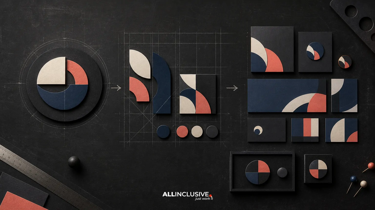
Rebranding and logo redesign are related, but they are not the same project. A logo redesign updates a primary identifier. Rebranding addresses the broader system behind the identifier: positioning, audience, messaging, visual language, customer experience, and the way the business is understood in the market.
The right choice depends on the business problem. If the company is still strategically relevant but its mark looks dated, a logo redesign or visual refresh may be enough. If the business has changed direction, serves a different audience, has merged with another organization, or is struggling with a confused market position, a broader rebrand may be necessary.
This distinction matters because changing too little can leave the underlying problem unresolved, while changing too much can discard useful recognition and create unnecessary implementation cost. The goal is not maximum change. It is the smallest effective change that supports the business objective.
Rebranding vs logo redesign: the essential difference
| Decision area | Logo redesign | Rebranding |
|---|---|---|
| Primary scope | The logo and related mark variations | The brand strategy and connected customer-facing system |
| Typical trigger | An outdated, unclear, inflexible, or poorly performing logo | A change in business direction, audience, offer, reputation, ownership, or market position |
| What may change | Symbol, wordmark, typography, color treatment, lockups, and usage rules | Positioning, messaging, identity, verbal tone, design system, digital experience, and rollout standards |
| Main risk | Improving the surface while leaving strategic confusion intact | Overcorrecting and losing valuable recognition or internal alignment |
| Best outcome | A clearer, more useful, and more adaptable visual identifier | A coherent brand that reflects the business and works consistently across touchpoints |
A logo is one component of a brand identity. It can signal change, but it cannot independently clarify a company’s positioning, repair a fragmented customer experience, or explain a new business model.
When a logo redesign is probably enough
A focused logo redesign is often appropriate when the business fundamentals remain stable. The company may have the same core audience, offer, and market role, but the existing mark no longer performs well.
Common indicators
- The logo is difficult to read at small sizes or on digital screens.
- It depends on outdated effects, intricate detail, or inconsistent artwork.
- Different teams use multiple unofficial versions.
- The mark does not reproduce well in one color, motion, print, or interface contexts.
- The business has matured, but the logo communicates an earlier stage of growth.
- The current identity is recognizable, yet its typography, proportions, or color system need refinement.
In these situations, the objective is usually to improve clarity and flexibility while preserving the recognition people already have. That may mean adjusting letterforms, simplifying a symbol, refining color, improving spacing, or creating a more complete set of responsive logo configurations.
A redesign should still begin with diagnosis. “Make it look more modern” is not a sufficient brief. A useful brief identifies which audiences struggle with the current mark, where it fails technically, what recognition should be retained, and what the revised design must enable.
When a broader rebrand is necessary
A rebrand becomes more appropriate when the problem extends beyond the logo. The organization may be communicating an outdated promise, attracting the wrong audience, or presenting different versions of itself across sales, marketing, product, and customer support.
Typical business triggers
- A merger, acquisition, spinout, or ownership change has altered the organization.
- The company has expanded into new markets or moved upmarket.
- The product or service portfolio has changed substantially.
- The existing name or identity creates confusion about what the business does.
- The company’s public reputation no longer matches its current direction.
- Internal teams use conflicting messages, visuals, or audience definitions.
- A major strategic shift requires the brand to occupy a different position.
In these cases, a new logo alone may create a visible announcement without solving the underlying issue. A rebrand should connect strategy to execution: define the intended position, clarify the promise, establish a distinctive identity, and specify how the brand behaves across important touchpoints.
That does not mean every rebrand requires a completely unfamiliar logo. Preserving recognizable shapes, colors, or naming elements can be a deliberate way to retain equity while making the system more relevant.
How to diagnose the right scope
Before choosing a project label, separate the symptoms from the causes. A weak-looking logo may be the visible symptom of a deeper positioning problem, but it may also simply be an execution problem in an otherwise healthy identity.
Ask these diagnostic questions
- Has the business strategy changed? If the audience, offer, market, or competitive position has shifted, examine the brand beyond the logo.
- Can the company clearly state who it serves and why it matters? If not, visual work should not begin in isolation.
- Is recognition valuable today? Identify existing associations worth protecting before considering major visual change.
- Where does the current experience break down? Review sales materials, website pages, product interfaces, packaging, social profiles, presentations, and physical environments.
- Is the issue strategic, visual, operational, or technical? Each requires a different remedy.
- What must be true after the project? Define observable outcomes, such as clearer audience understanding, consistent application, improved legibility, or a unified portfolio architecture.
This diagnosis can reveal a middle path: a brand refresh that updates the identity and its applications without changing the company’s fundamental position. For a closer comparison of that option, see rebrand vs. brand refresh.
Preserving brand equity during change
Brand equity is not limited to a logo file. It can include distinctive colors, shapes, naming conventions, visual patterns, tone of voice, category associations, and accumulated familiarity. A controlled project identifies which assets help people recognize and trust the business, then decides whether to retain, evolve, or retire them.
A practical equity inventory
- Recognition: Which elements do customers and partners identify quickly?
- Meaning: Which elements communicate useful associations, and which communicate outdated ones?
- Distinctiveness: Which assets help the business stand apart in its category?
- Function: Which elements work across responsive digital, print, motion, accessibility, and production requirements?
- Ownership: Are files, type licenses, photography, illustrations, and other assets documented and usable?
Preservation does not mean avoiding change. It means changing intentionally. A revised identity can maintain a recognizable core while improving hierarchy, accessibility, consistency, and relevance.
What each project should include
Typical logo redesign deliverables
- Creative brief and design criteria
- Logo concepts and rationale
- Primary, secondary, stacked, horizontal, and compact configurations where needed
- Color and one-color versions
- Clear-space and minimum-size guidance
- Basic file package for common digital and print uses
- Usage examples for priority applications
The exact package should reflect actual use cases rather than a generic list. A company that operates primarily in software products may need interface-ready assets and responsive behavior. A company with physical locations may need environmental, vehicle, or signage considerations.
Typical rebrand deliverables
- Current-state audit and stakeholder alignment
- Audience, positioning, promise, and messaging decisions
- Brand architecture or naming considerations, when relevant
- Logo and visual identity system
- Typography, color, imagery, illustration, iconography, and layout principles
- Voice and messaging guidance
- Priority customer and internal touchpoint designs
- Brand guidelines and implementation standards
- Launch, migration, and governance plan
The difference is not simply the number of deliverables. It is the level of coordination required to make the organization present one coherent brand.
Planning a controlled rollout
Even a well-designed identity can fail during implementation. The rollout should be treated as an operational change, not only a launch moment.
- Set a transition policy. Decide when old and new assets may coexist, which materials are replaced first, and who approves exceptions.
- Prioritize high-impact touchpoints. Start with the website, sales materials, customer communications, product surfaces, signage, and other places where inconsistency would be most visible.
- Prepare production-ready assets. Supply correct formats, color modes, responsive variants, templates, and naming conventions.
- Align internal teams. Explain what changed, why it changed, and how teams should apply the system.
- Assign governance. Identify an owner for questions, approvals, asset management, and future updates.
- Monitor the transition. Review live applications and correct recurring issues instead of assuming the guidelines will enforce themselves.
For a detailed planning aid, use the rebranding checklist. If the initiative involves a company-wide change, the company rebranding process provides a useful framework for sequencing strategy, identity, and implementation.
Common mistakes in the decision
- Starting with aesthetics: A visual preference should not substitute for a business diagnosis.
- Assuming a new logo equals a new brand: The surrounding experience may still send the old message.
- Changing everything without an equity review: Familiarity and distinctiveness can be valuable assets.
- Ignoring applications: A mark that looks good in a presentation may fail in a favicon, proposal, garment, interface, or sign.
- Underestimating internal adoption: Employees need usable tools, examples, and decision rules.
- Launching without migration planning: Mixed assets can make the change appear accidental rather than intentional.
- Writing guidelines no one can use: Standards should be clear enough for everyday teams and vendors to apply.
A simple decision framework
Choose a logo redesign when the strategy, audience, and core offer remain sound, but the primary visual identifier needs better clarity, flexibility, or relevance.
Choose a broader rebrand when the business needs to change how it is positioned, understood, or experienced, and the logo is only one part of that problem.
Choose a brand refresh when the identity has useful equity and the organization needs meaningful improvement without abandoning its fundamental market position.
In every case, document the decision before design begins. State the business problem, the assets to preserve, the changes required, the touchpoints affected, and the evidence that will indicate progress.
Where to go next
If the diagnosis points to a coordinated change across strategy, identity, and implementation, review the rebranding services page for the appropriate engagement scope. For a narrower visual identity need, compare the resources on brand identity and logo design. More broadly, the design resource can help place the decision within the organization’s wider communication system.


