
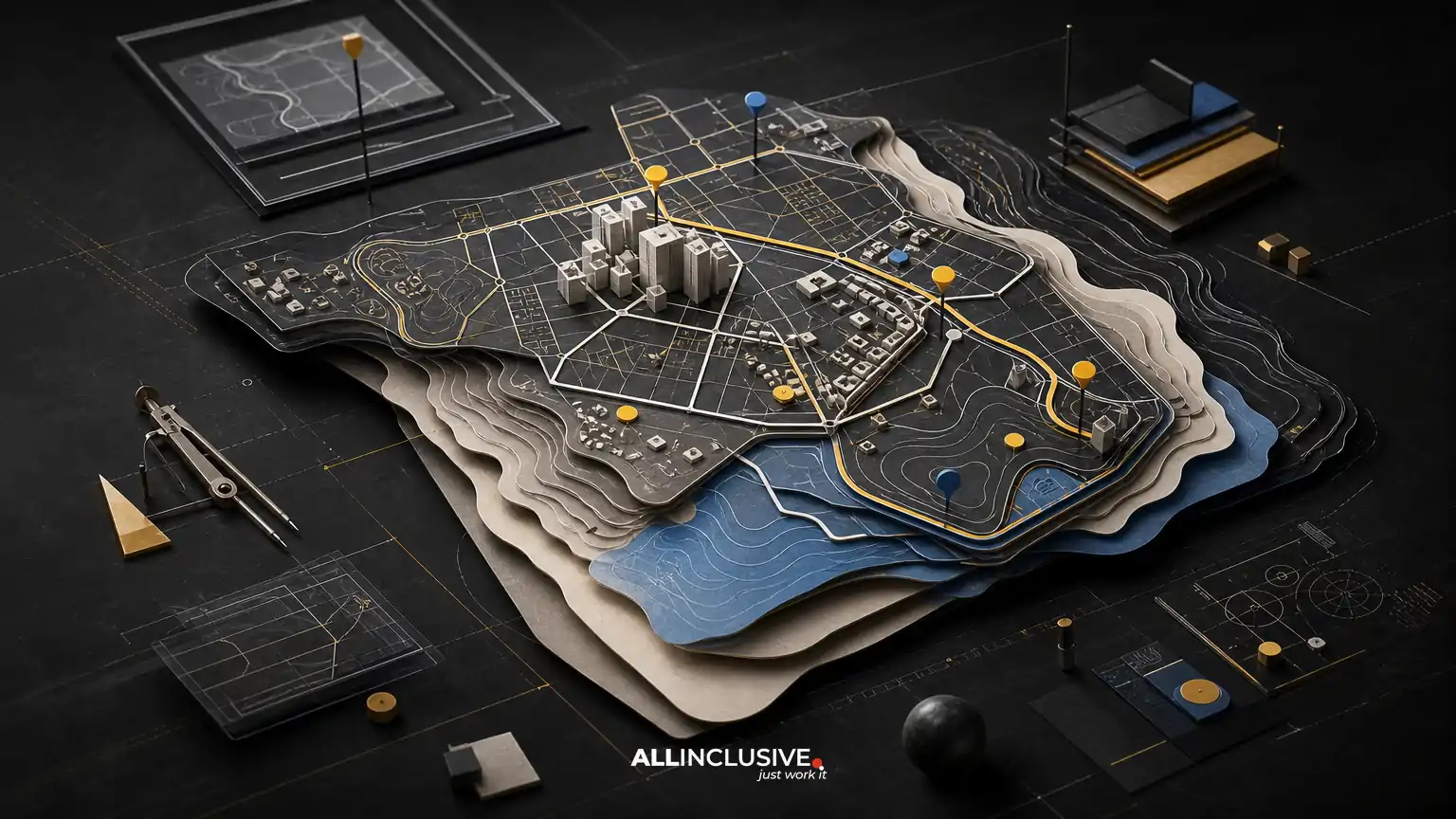
Real estate development map design has to do more than show where a project sits. A useful development map helps prospective buyers understand access, amenities, destinations, phases and relationships that may be difficult to grasp from a parcel plan, satellite image or standard street map.
The strongest maps balance three jobs: sales communication, visitor orientation and place identity. They simplify geography without making misleading promises, establish a visual hierarchy that matches the audience’s decisions, and remain usable across brochures, websites, presentations, sales centers, signage and future project updates.
This guide explains the scope, trade-offs, workflow and evaluation criteria involved in planning a development map. It is intended for developers, destination marketers, brokers, architects, planners and project teams deciding what the map needs to accomplish before commissioning or approving the design.
What real estate development map design includes
A development map is a purpose-built visual explanation of a project and its context. It may combine accurate roads, parcels, buildings, transit, topography, natural features, amenities, districts and points of interest with selective illustration and branded graphic elements.
It is not necessarily a construction document, cadastral map or navigation system. Its level of geographic precision should be appropriate to the decision it supports. A prospective resident may need to understand proximity to a trail, school or town center. A broker may need a clear story about access and neighborhood connections. A visitor may need an intuitive path between parking, retail, lodging and public spaces.
The deliverable can include one map or a coordinated family of outputs:
- A regional context map for showing the development’s relationship to airports, highways, cities and major destinations.
- A neighborhood or district map for communicating local amenities, connections and nearby services.
- A site or campus map for orientation within the development itself.
- A phasing or growth map for explaining current, planned and future components.
- Digital map graphics for websites, interactive presentations, campaigns and sales tools.
- Print-ready versions for brochures, boards, signage, direct mail and sales-center materials.
Start with the audience and decision
Before selecting a visual style, define what the reader must understand or do after seeing the map. A map designed for land sales will prioritize different information from one designed for a mixed-use district opening to the public.
| Primary audience | Typical decision | Map emphasis |
|---|---|---|
| Prospective buyers | Whether the location fits their lifestyle or investment criteria | Access, amenities, neighborhood context, distances and future value narrative |
| Visitors and tenants | How to reach and move through the place | Entrances, paths, parking, landmarks, destinations and orientation cues |
| Brokers and sales teams | How to explain the project consistently | Clear hierarchy, talking points, flexible crops and presentation-ready detail |
| Municipal or community stakeholders | How the project relates to surrounding systems | Connections, infrastructure, public realm, phases and context |
If several audiences matter, do not force every message into a single crowded map. A coordinated map system can share a visual language while allowing each version to emphasize the information its audience needs.
Sales communication versus wayfinding accuracy
The central design trade-off is usually between persuasive simplification and geographic accuracy. A sales-oriented map may enlarge a nearby amenity, reduce visual clutter or use an illustrated treatment to make the experience feel more legible. A wayfinding map must give users enough spatial truth to choose a route and recognize where they are.
Neither objective is automatically better. The risk comes from using a sales map as if it were a navigation map, or using a highly technical map where a buyer needs a clear sense of place.
Use a sales-oriented map when
- The main question is how the development relates to lifestyle destinations, employment centers or regional access.
- The reader needs a memorable overview rather than turn-by-turn guidance.
- The map appears in advertising, a brochure, an investor presentation or a high-level website section.
- Illustration and selective emphasis can clarify the project’s positioning.
Use a wayfinding-oriented map when
- People must find entrances, buildings, parking, transit stops or public amenities.
- The map will be printed on-site or used on a mobile device during a visit.
- Accessible routes, arrival points, service areas or pedestrian connections matter.
- Users may rely on the map without a sales representative present.
When both functions are required, label the purpose of each version and keep their shared landmarks, names and core relationships consistent. This prevents a polished marketing illustration from being mistaken for operational guidance.
Build the information hierarchy before the artwork
A map becomes easier to understand when every element has a defined role. Start by sorting content into tiers rather than placing every available data point on the canvas.
- Primary message: the development, district or destination the reader should notice first.
- Orientation framework: major roads, transit, coastline, rivers, north, boundaries or other reference points.
- Decision-supporting context: schools, retail, parks, employment centers, cultural destinations and connections relevant to the audience.
- Operational detail: entrances, parking, paths, building identifiers, accessibility information and service routes.
- Supporting labels: names, legends, scale information, disclaimers and source notes where needed.
Hierarchy should be visible through scale, contrast, line weight, spacing, color and label treatment. If every road, amenity and building receives equal emphasis, the map may be technically complete but commercially ineffective.
Design for development phases and changing information
Real estate projects often change after the first map is approved. Roads are renamed, buildings shift, phases open, amenities are revised and surrounding development continues. A map system should anticipate those changes instead of treating the first composition as a one-time illustration.
Ask these questions early:
- Which features are existing, under construction, approved, proposed or conceptual?
- How will future elements be distinguished without overwhelming current information?
- Which names and boundaries are legally or commercially sensitive?
- Will the map need regional, district and site-level versions?
- Can labels, icons and color assignments be updated without redrawing the entire map?
- What approval process will confirm that each phase is represented accurately?
Use clear visual conventions for status, but avoid implying certainty where plans remain subject to change. A restrained note such as “illustrative plan; subject to change” may be appropriate when the map communicates future conditions. The exact wording should be reviewed by the project’s legal and development teams.
Choose the right visual language
Illustration can make a development map more welcoming and memorable, while a restrained diagram can improve speed of comprehension. The best style depends on the place, audience, output and amount of information.
Common approaches
- Clean diagrammatic: strong for websites, presentations and information-dense district maps. It uses simplified geometry, restrained color and clear labels.
- Illustrated destination map: useful for resort, lifestyle and mixed-use environments where atmosphere and identity are important.
- Architectural site plan: appropriate when buildings, plazas, circulation and landscape relationships need to be understood at a more detailed scale.
- Hybrid context map: combines accurate base geography with selective illustration, highlights and branded emphasis.
Style should support the map’s job, not obscure it. Decorative textures, perspective effects or oversized landmarks can be effective in a promotional composition but may reduce clarity in a map intended for actual orientation.
Plan a flexible output system
A development map rarely lives in one format. Before production, define the required dimensions, resolutions, crops and technical specifications for each channel.
| Output | Planning considerations |
|---|---|
| Sales brochure | Readable labels at print size, intentional fold placement and a clear legend or caption. |
| Sales-center display | Viewing distance, large-format legibility, durable production and the ability to explain phases. |
| Website | Responsive crops, fast-loading assets, mobile readability and accessible supporting text. |
| Presentation deck | Simple composition, screen contrast and versions that work at different slide sizes. |
| On-site signage | Quick recognition, route clarity, viewing angles, contrast and maintenance requirements. |
| Social or campaign graphics | Focused crops that retain orientation and do not imply the crop is the complete map. |
Keep a master source organized into editable layers and reusable components. Separate geographic base information, labels, icons, highlights, legends and phase treatments where possible. This makes future corrections and derivative outputs more manageable.
Coordinate map design with the broader brand
A map should feel like part of the development’s communication system without becoming difficult to read. Brand colors can establish identity, but they should not be assigned to roads, water, buildings or status categories without checking contrast and meaning.
Define a small, functional visual system covering:
- Primary and secondary colors, including accessible contrast combinations.
- Type sizes and label rules for regional, district and site scales.
- Icon style and minimum size for print and digital use.
- Line weights that remain distinct when reproduced.
- Rules for highlighting the project without making surrounding context disappear.
- Conventions for existing, planned, private, public, pedestrian and vehicular elements.
For broader collateral decisions, a map may need to align with the project’s graphic design system or wider design strategy. That alignment should improve recognition and consistency, not force every map to behave like an advertisement.
A practical review checklist
Review the map in stages. Early review should focus on purpose and structure; late review should focus on production and accuracy.
Content and accuracy
- Are roads, destinations, boundaries and project components current?
- Are planned elements clearly distinguished from existing ones?
- Are names, directions, entrances and relationships verified by the appropriate project stakeholders?
- Does the map avoid implying a route, amenity or completion date that is not confirmed?
Comprehension
- Can a first-time reader identify the project and its context quickly?
- Is the most important information visually dominant?
- Can the map be understood without a verbal explanation?
- Are labels readable at the actual size and viewing distance?
Usability and production
- Does each output retain the necessary orientation cues?
- Do icons, lines and colors reproduce consistently across print and screens?
- Are crops and responsive versions composed intentionally?
- Are accessible alternatives or supporting descriptions needed for digital use?
- Is there an owner and process for future updates?
How development maps differ by place type
The surrounding use case changes the balance between identity, context and navigation. A neighborhood map may need to communicate walkability and relationships to everyday services. A shopping-center map may prioritize entrances, parking and tenant zones. A festival or event map may focus on temporary routes, facilities and crowd movement.
For related planning considerations, see the guidance on neighborhood map design and shopping center map design. An event-led project may also benefit from the distinct constraints covered in festival map design.
These comparisons are useful because they reveal which map elements are transferable and which are not. A permanent residential development may need durable place identity and phased updates, while a temporary event map may need rapid comprehension and operational changes. Treat the use case as a design input, not merely a stylistic reference.
When to commission custom map design
Custom work is most valuable when the project has a complex relationship to its surroundings, multiple audiences, several output formats or a need to communicate future conditions clearly. It can also help when an off-the-shelf map contains too much irrelevant detail, lacks the project’s identity or cannot support the required print and digital applications.
Before commissioning, prepare a concise brief with the project boundary, audience, primary decisions, verified source data, known phases, required formats, approval stakeholders and examples of maps that are clear or unclear to your team. This shifts the conversation from “make it look premium” to measurable communication requirements.
For an overview of map-specific capabilities and deliverable planning, visit map design. The article’s purpose is not to replace that service information, but to help your team define the right scope and evaluate the resulting work.
Conclusion
Effective real estate development map design connects accurate geography with a clear story about how a place works and feels. Begin with the audience’s decision, separate sales communication from operational wayfinding when necessary, establish an information hierarchy, plan for changing phases and design a flexible system for every required output.
The best result is not the map with the most detail. It is the map that gives each reader the right context, confidence and orientation at the moment they need it.


