
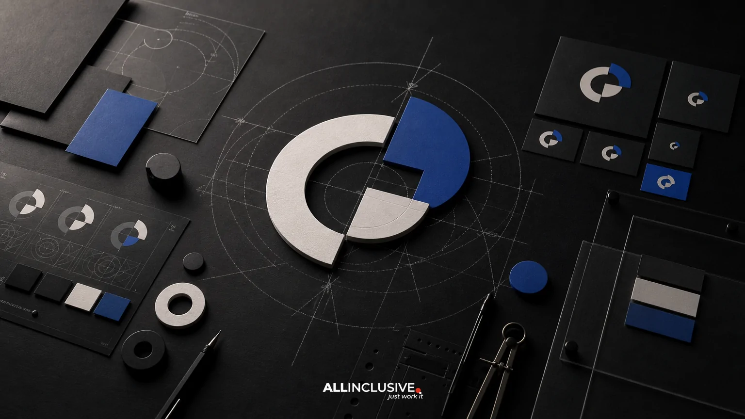
B2B logo design is not simply the creation of a polished symbol or wordmark. It is the design of a recognizable identity component that must work across sales presentations, websites, proposals, software interfaces, trade-show materials, social profiles and internal documents. The strongest B2B logos balance two qualities that can appear to conflict: credibility, which reduces perceived risk, and distinction, which helps a company remain memorable.
That balance is easier to evaluate when a logo is treated as a system rather than a single deliverable. A practical scope includes discovery, concept development, responsive variants, cross-surface testing, production files, usage guidance and clear ownership. The goal is not to make a B2B company look unusual at any cost. The goal is to create an identity that feels appropriate to its market while giving buyers a reason to remember it.
What makes B2B logo design different?
B2B buyers often encounter a company in situations where trust and clarity matter. A logo may appear beside technical claims, security information, pricing, legal details, case studies or a sales representative’s name. It must therefore support a broader credibility system.
That does not mean every B2B logo should be conservative. A highly familiar category can make sameness a competitive problem. A cybersecurity, logistics or professional-services firm may need a visual signal that is dependable without looking interchangeable with every competitor. The right design response depends on the company’s audience, buying process, category conventions and growth plans.
Before reviewing concepts, clarify three questions:
- Who needs to trust the company? The economic buyer, technical evaluator, procurement team and end user may have different expectations.
- Where will the logo be encountered? List websites, product interfaces, documents, presentations, events, partner channels and small digital placements.
- What should be remembered? This could be a distinctive shape, a name treatment, a color relationship or a broader visual behavior.
Credibility and distinction are design trade-offs
Credibility usually comes from signals such as legibility, consistency, visual restraint, appropriate typography and a clear relationship between the company name and its offering. Distinction can come from a memorable silhouette, a well-resolved typographic detail, an ownable color combination or a flexible graphic idea.
Problems arise when one objective overwhelms the other. A logo designed only for credibility may look generic, particularly when it relies on familiar industry symbols. A logo designed only for distinction may create confusion, appear disconnected from the company’s actual role or become difficult to use in formal contexts.
Use the following questions to evaluate the balance:
- Can a first-time viewer read the company name without effort?
- Does the concept feel suitable for the company’s buying environment?
- Is there at least one memorable feature that does not depend on visual novelty alone?
- Does the mark remain credible when separated from a presentation mockup?
- Can the identity evolve if the company adds products, markets or business units?
Build the project around discovery, not decoration
A useful discovery phase turns subjective preferences into design criteria. It should examine the company’s positioning, customer groups, competitors, sales context, existing recognition and operational requirements.
For a B2B organization, discovery may also need to account for complex naming structures. A parent company, product family and software platform may each require different levels of emphasis. The logo system should make those relationships clear rather than forcing every name into one crowded lockup.
Useful discovery inputs
- Current and planned company names, product names and descriptors
- Primary customer segments and buying roles
- Competitive references, including visual patterns to avoid
- Typical document, presentation and interface environments
- Geographic, accessibility and production considerations
- Internal approval requirements and likely decision-makers
- Future needs such as acquisitions, sub-brands or international expansion
The output should be a concise creative brief or evaluation framework. It does not need to predict every future application, but it should establish what the logo must communicate, where it must work and what a successful result will avoid.
Evaluate the logo as a responsive system
A single master logo rarely performs equally well at every size. B2B teams commonly need a full lockup, a compact lockup, a symbol or monogram, and one-color versions. These are not arbitrary variations; they are responses to different spatial and technical conditions.
| Application | Likely requirement | Evaluation question |
|---|---|---|
| Website header | Horizontal or compact lockup | Does it remain clear beside navigation and calls to action? |
| Software interface | Small symbol or compact mark | Is the silhouette recognizable at limited dimensions? |
| Sales presentation | Full-color or light-background version | Does it retain authority without dominating the slide? |
| Proposal or contract | One-color or grayscale version | Does it reproduce cleanly in common office workflows? |
| Social profile | Square or circular crop | Can the identity survive a constrained frame? |
Responsive versions should feel related, not like unrelated logos. Establish which elements are essential at each scale and which details can be removed. A compact mark may emphasize a symbol while the full lockup carries the complete company name. The system should also define minimum sizes, clear space and background behavior where those decisions affect legibility.
Test across real B2B surfaces
Mockups are useful for context, but they can hide practical weaknesses. A logo should be tested in the environments where the organization actually operates. Include both prominent and unglamorous applications: a crowded presentation title slide, a proposal footer, a spreadsheet header, a browser tab, a conference badge, a partner listing and a dark software interface.
Cross-surface testing should examine more than appearance. Review:
- Scale: Does the logo remain readable when reduced, not just when enlarged?
- Contrast: Does it work on light, dark, photographic and neutral backgrounds?
- Reproduction: Does it survive office printers, embroidery, signage and common exports?
- Spacing: Can teams place it consistently without crowding nearby content?
- Hierarchy: Does the logo support the message, or compete with the information buyers need?
- Accessibility: Are color-dependent distinctions supported by sufficient contrast and clear text?
For a deeper look at how context changes logo requirements, compare the considerations in SaaS logo design and professional services logo design. The point is not to copy an industry pattern, but to understand how business model and buying environment influence the system.
Choose typography and color with operational use in mind
Typography carries a large share of a B2B logo’s tone. A typeface may feel precise, technical, established or approachable, but it must also remain legible in the company name and in reduced applications. Closely spaced letters, delicate strokes and unusual forms can create problems when a logo is used in documents or low-resolution digital environments.
Color decisions should be evaluated as a system rather than a single swatch. Define primary and secondary options, background relationships and one-color behavior. Consider how the palette interacts with product screens, charts, photography and the colors already used by sales and marketing teams.
A distinctive color can help recognition, but color alone is not a reliable identity strategy. The form, wordmark and layout behavior should still carry meaning when the logo appears in grayscale, on a restricted print budget or in a partner’s monochrome directory.
Clarify deliverables, ownership and handoff
A logo project is incomplete if the organization cannot use the approved identity confidently after launch. Before approval, document the expected deliverables and the rights associated with them. Exact requirements vary by project, but a practical handoff often includes:
- Vector master files for professional production
- Common digital formats for web, presentations and documents
- Color, reversed and one-color versions
- Responsive lockups or compact marks where required
- Color specifications and typographic information
- Clear-space, minimum-size and background guidance
- Source files and a documented file structure, when included in the agreement
- Written confirmation of usage rights, ownership and any third-party licensing conditions
Ownership should not be assumed from receiving a folder of exports. The agreement should state what is being transferred, when rights transfer, whether source files are included and whether fonts, stock elements or other licensed assets have separate terms. Legal review may be appropriate when the logo will be registered as a trademark or used across multiple corporate entities.
For organizations building beyond the logo, a broader brand identity engagement may address the visual relationships that the logo alone cannot solve. A practical brand guidelines document can then turn approved decisions into repeatable team behavior.
Common B2B logo design mistakes
Designing for the category instead of the company
Industry symbols can communicate relevance quickly, but overused metaphors make companies difficult to distinguish. Treat category conventions as context, not a mandatory visual vocabulary.
Approving from a presentation mockup alone
A logo can look impressive on a large office wall and fail in a proposal footer. Require realistic small-scale and production tests before approval.
Creating too many variants without a rule
A folder full of options does not create a system. Define which version is used where, who can alter it and how teams handle exceptions.
Ignoring the name structure
Long company names, descriptors and product relationships can overwhelm a lockup. Resolve hierarchy early rather than shrinking every element until it becomes unreadable.
Confusing originality with complexity
Distinctiveness does not require intricate geometry or a hidden explanation. A simple, well-resolved feature is often easier to recognize and deploy.
A practical approval checklist
Before final approval, ask the project team and internal stakeholders to review the system against the same criteria:
- Does the logo support the company’s positioning without making unsupported promises?
- Is the company name readable in the primary lockup?
- Is the distinctive element visible without a verbal explanation?
- Are responsive versions appropriate for small and constrained placements?
- Has the system been tested on real digital, document and physical surfaces?
- Are color, contrast and one-color behaviors documented?
- Can internal teams find and use the correct files?
- Are usage rights, source files and third-party assets clearly addressed?
- Will the system accommodate likely changes in products, markets or organizational structure?
Teams comparing logo work with broader creative needs can also use the resources in ecommerce logo design and the wider design collection to distinguish identity decisions from downstream marketing production.
Conclusion
The best B2B logo design is credible enough to support a considered buying decision and distinctive enough to remain recognizable after the meeting, proposal or product visit ends. Evaluate it as a working system: start with discovery, define responsive behavior, test real surfaces, and finish with usable files, documented rules and clear ownership.
If you are evaluating the scope of professional logo work, the logo design service page can help you understand where strategy, design development and production handoff fit into a broader engagement.


