
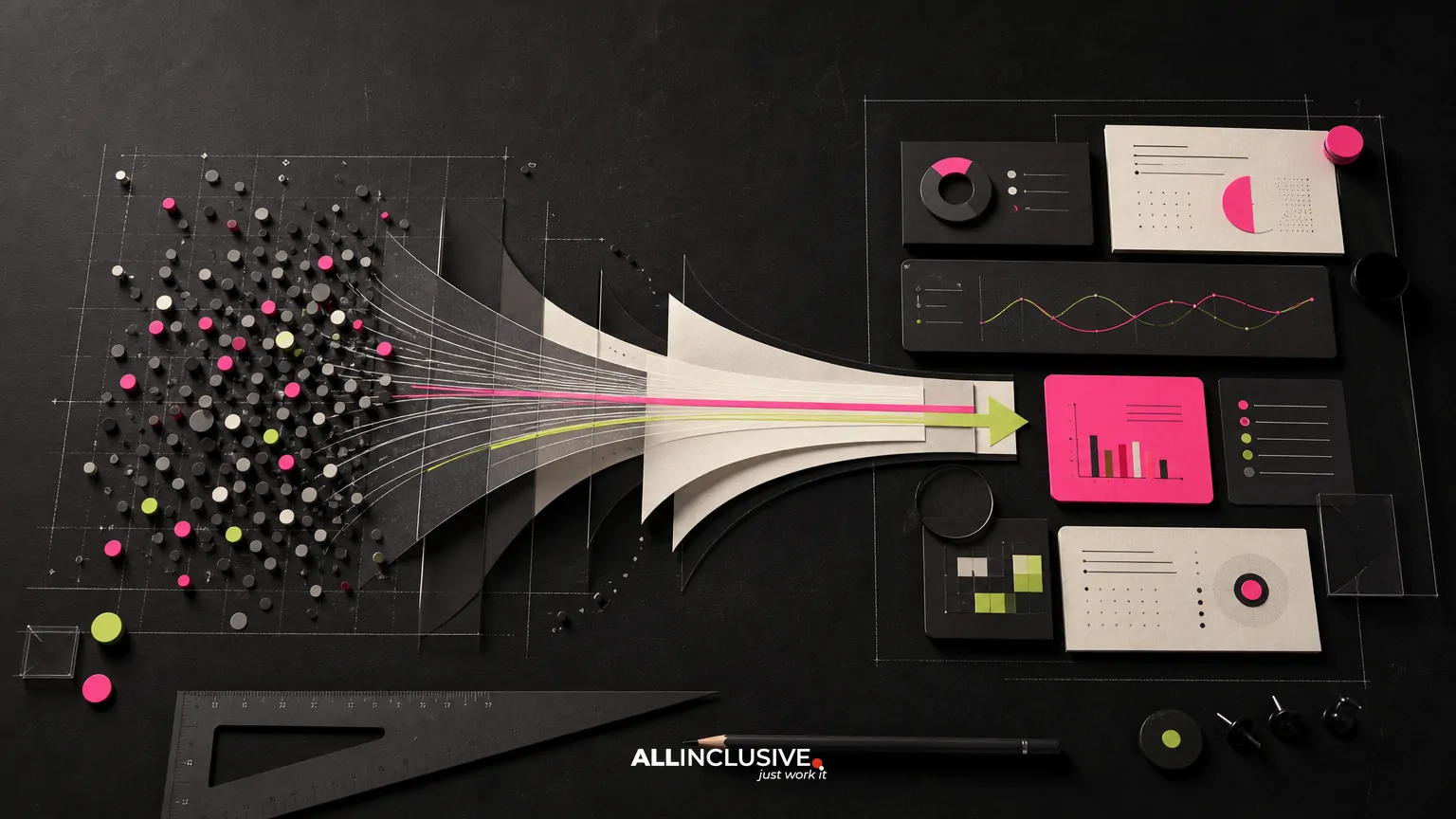
Infographic design services help organizations explain complex information through structured combinations of data, typography, illustration, charts, icons, and layout. They are useful when a report, process, product, or point of view is accurate but difficult to understand in plain paragraphs.
The best infographic is not simply a decorated list of facts. It gives information a visual hierarchy, makes relationships easier to see, and guides the audience toward a clear takeaway. This guide explains what these services typically include, where the trade-offs are, and how to evaluate a provider before starting a project.
What infographic design services include
Infographic projects can range from a single one-page visual to a coordinated series for a campaign, report, sales process, or ongoing content program. Scope often includes:
- Content and information review: identifying the central message, audience, supporting evidence, and any gaps or ambiguities.
- Information architecture: organizing facts into a sequence, comparison, process, hierarchy, timeline, or other visual structure.
- Concept development: exploring an appropriate visual metaphor, composition, tone, and level of explanation.
- Data visualization: designing charts, diagrams, maps, or statistical displays that match the underlying information.
- Visual design: applying typography, color, icons, illustration, spacing, and brand standards.
- Production and adaptation: preparing files for web, social, presentations, print, email, or other distribution formats.
- Revision and handoff: incorporating agreed feedback and delivering final assets in usable formats.
Some providers focus primarily on visual execution. Others contribute more heavily to editorial structure and message development. Clarifying this distinction early prevents a project from being treated as either a copywriting assignment or a simple formatting exercise.
When an infographic is the right format
Infographics are most effective when the audience needs help understanding relationships between pieces of information. They can be a strong choice for:
- Explaining a multi-step process or customer journey
- Comparing options, features, or outcomes
- Summarizing research, survey findings, or an industry report
- Showing a timeline, system, workflow, or operating model
- Making a technical subject more accessible to a nontechnical audience
- Giving sales teams a compact visual aid for a recurring explanation
- Turning a long-form report into a scannable campaign asset
An infographic may be the wrong choice when the subject requires detailed qualifications, legal context, or sustained argument. In those cases, a report, article, presentation, or interactive experience may provide better control. A useful approach is to decide first what the audience must understand or do, then select the format that supports that outcome.
Common infographic formats and their trade-offs
| Format | Best for | Primary trade-off |
|---|---|---|
| Statistical infographic | Highlighting a small set of research findings or performance indicators | Can oversimplify context if charts are too compressed |
| Process infographic | Showing steps, stages, or decision paths | Complex branching logic may become difficult to scan |
| Comparison infographic | Clarifying differences between products, approaches, or options | Needs carefully balanced criteria to avoid misleading emphasis |
| Timeline infographic | Presenting milestones, history, or project phases | Dense timelines may require a larger format or multiple views |
| Systems or ecosystem infographic | Showing connections among people, tools, inputs, and outcomes | Visual complexity can overwhelm the main message |
| Geographic infographic | Explaining location-based patterns, routes, or coverage | Requires accurate geographic representation and labeling |
These categories are not mutually exclusive. A report summary might combine a statistical view with a process diagram, while a product explainer could use comparison and systems thinking together.
The infographic design process
1. Define the communication objective
Start with a sentence that describes the intended change in understanding or behavior. For example: “After viewing this asset, a prospective buyer should understand how the implementation process works.” This is more useful than a vague request to “make the data engaging.”
2. Audit the source material
Designers need to know which information is final, which claims require review, and which figures are explanatory rather than essential. Source material might include research, spreadsheets, interviews, product documentation, approved messaging, or an existing report.
This stage is also where inconsistencies should be surfaced. A designer can create a polished visual, but cannot resolve conflicting totals, unclear definitions, or unsupported conclusions without input from the subject-matter owner.
3. Build the information structure
Before detailed styling, the content should be arranged into a logical path. A useful structure may be a headline and key finding, followed by evidence, explanation, and implication. For process visuals, it may be a start point, sequence, decision points, and outcome.
Wireframes or rough content maps are valuable because they let stakeholders review logic before time is spent on illustration and production.
4. Develop the visual concept
The visual concept should serve the content rather than compete with it. Choices about metaphor, illustration, chart style, and color should reflect the audience, subject matter, brand, and distribution context. A financial services audience may need a restrained and highly legible system, while a public-facing educational campaign may support more expressive illustration.
5. Design and validate
During detailed design, the team establishes hierarchy, spacing, type scale, annotation, color contrast, icon consistency, and responsive or print behavior. Review should cover both visual quality and factual accuracy. Stakeholders should be able to identify the main takeaway quickly and verify that the visual does not imply a conclusion the data cannot support.
6. Prepare final assets
Final delivery may require multiple versions: a high-resolution print file, a web-optimized image, a presentation slide, a social crop, or an accessible supporting document. Confirm dimensions, file formats, color requirements, font licensing, and ownership of editable source files before production is complete.
How to evaluate an infographic design provider
Portfolio quality matters, but it should not be the only criterion. Review a prospective provider against the following questions:
- Can they simplify without distorting? Look for examples that make difficult subjects clearer, not merely more decorative.
- Do they show range? A useful portfolio may include charts, diagrams, editorial visuals, process maps, and branded campaign assets.
- Do they explain their process? Strong answers should cover content review, concept approval, feedback rounds, and production handoff.
- Can they work with your source material? Ask how they handle spreadsheets, long reports, technical documentation, or incomplete inputs.
- Do they understand distribution? A visual intended for a mobile feed has different requirements from a conference poster or printed report.
- How is accuracy reviewed? Confirm who owns fact-checking and how data changes are handled.
- Can the system scale? If you expect a series, ask whether the team can establish reusable visual rules for future assets.
For broader collateral needs, it can also help to understand how infographic work fits within a larger graphic design services program. This is especially relevant when the same campaign includes reports, sales sheets, presentations, ads, or social assets.
What to include in an infographic design brief
A focused brief reduces avoidable revisions. Include:
- The audience and their level of subject knowledge
- The single most important takeaway
- The intended action, if any
- Approved source data and definitions
- Required claims, disclaimers, citations, or legal language
- Brand guidelines and examples of related assets
- Primary and secondary distribution channels
- Required dimensions, file formats, and accessibility considerations
- Reviewers, decision-makers, and the approval deadline
- Whether editable source files and future adaptations are needed
If your content is part of a larger visual communication system, review the broader principles in design services and production planning before finalizing the brief. This can help align the infographic with adjacent campaign materials rather than treating it as an isolated asset.
Quality checks before publication
A final review should test more than spelling and alignment. Use this checklist:
- Is the main message understandable without a presenter?
- Does the reading order work from the expected viewing direction?
- Are charts proportional to the values they represent?
- Are labels, units, dates, and definitions complete?
- Does color carry meaning that may be lost for some viewers?
- Is text large enough for the actual viewing environment?
- Are decorative elements clearly separated from evidence?
- Does the design remain usable when cropped or viewed on a smaller screen?
- Are claims, sources, and required disclosures included?
- Do exported files preserve sharpness, contrast, and correct dimensions?
Accessibility should be considered at the planning stage. Depending on the channel, that may include meaningful alternative text, a nearby text summary, sufficient contrast, readable type, and a format that does not require color alone to communicate a distinction.
Infographics as part of a broader content system
A single infographic often performs better when it is designed as a source asset rather than a one-time image. A long report can yield a summary graphic, presentation slides, social crops, sales enablement visuals, and web components. The challenge is to adapt the hierarchy thoughtfully instead of shrinking one crowded composition into every channel.
Infographics may also work alongside supporting visual elements. For example, a consistent icon system can improve recognition across a series; see the discussion of icon design services for related considerations. If the asset will be reused across campaigns or departments, ongoing design support may be a more practical operating model than commissioning disconnected one-off projects.
For location-based information, distinguish between an infographic map and a purpose-built map or wayfinding solution. The latter may require different decisions about scale, navigation, labeling, and production. Likewise, if a visual will be installed in a physical environment, the requirements may overlap with signage design rather than standard editorial graphics.
Key decisions before you request a proposal
Before contacting a provider, decide whether you need help with content structure, visual design, production, or all three. Identify the audience, publication channel, review authority, and source-data owner. Also determine whether the project is a single explanatory asset or the beginning of a repeatable visual system.
These decisions make proposals easier to compare because providers can respond to a defined scope instead of guessing at the complexity. They also help prevent a common failure mode: approving an attractive concept before confirming that it can accommodate the required facts, formats, and review process.
Conclusion
Infographic design services are most valuable when they combine editorial judgment with visual craft. The goal is not to put every fact on one canvas; it is to decide what matters, show how the information connects, and make the result usable in its real distribution environment. If you need a broader marketing production partner for infographic work and related collateral, compare the scope and capabilities outlined on the graphic design services page.


