
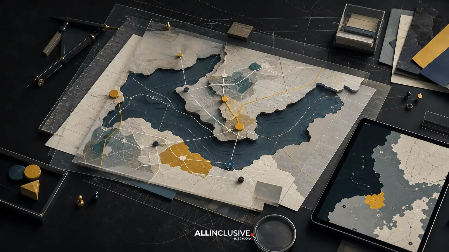
A strong map design brief does more than request “a map that looks good.” It gives the designer enough information to make decisions about geographic accuracy, hierarchy, navigation, illustration, production, and place marketing without guessing at the project’s real purpose.
The most useful brief defines five things early: who will use the map, what they need to do, which geographic information is authoritative, what must be shown or omitted, and where the finished map will appear. A visitor map for a tourism district, a campus wayfinding system, an event map, and a foldout print map may share data but require very different design solutions.
This guide explains how to write a map design brief that is specific enough for implementation while leaving room for professional design judgment. It is intended for destination marketers, property and campus teams, event organizers, municipalities, developers, and organizations commissioning a custom map.
Start with the map’s job
Open the brief with a plain-language statement of the map’s primary job. Avoid starting with visual preferences such as “modern,” “playful,” or “minimal.” Those qualities matter, but they should follow the map’s use case.
Useful opening statements might include:
- Help first-time visitors find entrances, restrooms, stages, food vendors, and accessible routes at a large event.
- Encourage tourists to explore a downtown district and recognize participating businesses and attractions.
- Help students and visitors navigate a campus between buildings, parking areas, transit stops, and services.
- Show a real estate development’s surrounding amenities while clearly distinguishing existing infrastructure from planned features.
If the map has multiple jobs, rank them. A map cannot give equal emphasis to every possible destination, route, label, and landmark. Prioritization helps the designer resolve conflicts later.
Define the audience and context of use
Describe who will use the map, what they already know, and the conditions in which they will read it. A map viewed on a phone while walking has different requirements from one studied at a visitor center or carried as a printed brochure.
Include these audience details
- Primary users: visitors, residents, employees, students, guests, drivers, pedestrians, or event attendees.
- Familiarity: first-time visitors, local users, or a mixed audience.
- Mobility needs: walking, driving, cycling, transit, wheelchair use, strollers, or service access.
- Reading conditions: bright outdoor light, low light, crowded venues, desktop planning, or mobile use.
- Decision moments: finding an entrance, choosing a route, locating an amenity, or understanding a larger area.
- Language requirements: English only, multilingual labeling, translated legends, or icon-supported navigation.
Also state where the map will be encountered. A printed rack card, wall sign, event program, website module, downloadable PDF, and mobile interface each impose different scale, resolution, orientation, and interaction constraints.
Set the geographic scope and boundaries
Boundary decisions determine what the map can communicate. A map that covers too little may omit an important access route; one that covers too much may make the useful details unreadable.
Specify the geographic extent in practical terms. Name the district, campus, venue, property, trail network, neighborhood, or service area, and identify the intended edge of the composition. If the boundary is flexible, explain what should control it: a walking radius, municipal boundary, venue perimeter, transit catchment, or recognizable geographic feature.
Clarify boundary questions
- Should the map show the full property or only the visitor-facing zone?
- Should adjacent streets, neighborhoods, transit connections, or parking areas be included?
- Are water, parks, highways, rail lines, or jurisdictional borders important orientation elements?
- Which areas are out of scope even if they appear in source data?
- Are future construction phases or planned roads part of the assignment?
Ask the project owner to identify the authoritative source for each boundary. Property lines, event footprints, campus limits, district boundaries, and trail alignments can change or conflict across files. A brief should distinguish confirmed boundaries from approximate context.
Inventory the source data
Designers need to know not only what data exists, but also how reliable, current, and usable it is. Include a source inventory rather than attaching an unstructured folder of files.
Relevant inputs may include:
- GIS exports, shapefiles, GeoJSON, KML, CAD files, or georeferenced PDFs.
- Street, path, trail, building, parcel, water, and transit data.
- Property surveys, site plans, aerial imagery, or architectural drawings.
- Existing brand maps, signage standards, icon sets, and typography guidance.
- Address lists, business directories, venue schedules, or event operations documents.
- Approved logos or symbols for destinations that must be represented.
For every source, note the owner, date, coordinate system if known, expected accuracy, and whether the designer may simplify or edit it. If the source data is incomplete, say so. A designer can often create a useful visual system around imperfect data, but hidden uncertainty creates avoidable rework.
Separate authoritative data from reference material
Reference imagery can help with visual orientation, but it should not automatically be treated as a factual source. Label files as authoritative, reference only, or pending approval. This is especially important when using aerial imagery, construction plans, public mapping data, or user-supplied spreadsheets.
Build a point-of-interest and label list
Points of interest, or POIs, are often where map briefs become vague. “Show key attractions” is not enough. The brief should provide a controlled list of destinations and explain how they should be grouped and prioritized.
For each POI, consider including:
- Official name and preferred short label.
- Exact or approximate location.
- Category, such as attraction, entrance, retail, lodging, restroom, parking, transit, food, or service.
- Priority level: essential, useful, or optional.
- Whether an icon, number, color, or text label is required.
- Whether the destination is accessible, seasonal, temporary, private, or staff-only.
- Any naming, capitalization, or legal approval requirements.
A useful prioritization method is to divide content into three tiers:
- Navigation-critical: entrances, exits, paths, crossings, parking, restrooms, accessible routes, emergency points, and major destinations.
- Experience-critical: attractions, businesses, amenities, landmarks, gathering areas, and visitor services.
- Contextual: surrounding streets, neighborhoods, landmarks, geographic features, and orientation references.
This structure helps prevent the map from becoming a directory. The goal is not to display every available fact; it is to support the decisions users need to make.
Describe routes, access, and wayfinding behavior
Maps intended for navigation need more than destinations. Explain how people move through the environment and which route distinctions matter.
Identify pedestrian paths, vehicle roads, bike routes, transit lines, service roads, stairs, elevators, bridges, gates, crossings, one-way restrictions, and accessible alternatives. If a route is recommended but not the shortest, explain why. For example, a route may avoid stairs, cross a controlled entrance, or provide better lighting.
For complex environments, provide a route matrix that states where users start, where they need to go, and which constraints apply. This is often more useful than a long narrative.
| Origin | Destination | Preferred route | Important constraint |
|---|---|---|---|
| Main parking area | Visitor center | Signed pedestrian path | Show accessible alternative |
| Transit stop | Event entrance | Primary sidewalk | Mark crossing location |
| Service gate | Operations area | Restricted road | Do not present as public access |
When a map will support physical signage, coordinate the brief with the wider wayfinding system. The article Wayfinding, Signage and Map Systems covers how maps relate to signs, decision points, and environmental navigation.
Specify the visual role of the map
State whether the map should be primarily navigational, illustrative, promotional, analytical, or a combination. This distinction affects geometry, labeling, detail, color, and the amount of visual interpretation that is appropriate.
- Navigation-led: favors legibility, route clarity, orientation, and consistent scale cues.
- Illustration-led: may use expressive landmarks, texture, perspective, or selective exaggeration to create character.
- Place-marketing-led: emphasizes memorable destinations and the identity of a district, destination, or development.
- Analytical: prioritizes data categories, comparison, measurement, and explanatory legends.
Most public-facing maps combine these roles. The brief should identify the dominant role and explain which compromises are acceptable. If the map may simplify geography for clarity, say whether the simplification can alter angles, distances, building footprints, or relative scale.
For visual direction, provide references that demonstrate desired qualities rather than asking for an imitation. You can also review Map Illustration Styles when deciding whether the project needs a technical, editorial, pictorial, isometric, hand-drawn, or highly minimal approach.
Define scale, orientation, and geographic conventions
Scale and orientation should be explicit, even when the map is not strictly to scale. State whether the map must preserve geographic relationships, use a fixed north-up orientation, align to a site or street frontage, or rotate for the user’s viewpoint.
Include requirements for:
- Scale bar or distance references.
- North arrow, directional cues, or a “you are here” marker.
- Inset maps for regional context or detailed zones.
- Perspective views, 3D landmarks, or diagrammatic geometry.
- Consistent distances and angles versus selective distortion for legibility.
- Coordinate references or grid systems where operational teams need them.
If exact scale is not required, avoid implying precision through unnecessary measurement language. Conversely, if the map will support emergency response, construction coordination, regulated access, or operational planning, identify the required level of geographic accuracy and the person responsible for approving it.
Plan accessibility and inclusive use
Accessibility should be part of the brief, not a late-stage check. Define the needs of people who may have low vision, color-vision deficiencies, mobility limitations, cognitive disabilities, or limited familiarity with the environment.
Practical requirements may include:
- Readable type at the final physical size, not only on an enlarged proof.
- Sufficient contrast between labels, routes, symbols, and backgrounds.
- Patterns, shapes, or labels in addition to color coding.
- Clear accessible-route notation and avoidance of ambiguous symbols.
- Plain-language directions and consistent terminology.
- Alternative text or a text-based location list for digital publication.
- Large-format or simplified versions for specific audiences.
Do not promise that a single map can solve every access need. Some projects require a companion directory, tactile resource, audio description, accessible digital interface, or staff-assisted navigation plan.
List the required output formats
Output requirements influence design from the beginning. A map that works as a large wall graphic may fail as a mobile image, and a detailed print map may require a different hierarchy from an interactive web version.
Specify each required output and its production conditions:
| Output | Briefing details to provide |
|---|---|
| Trim size, folds, bleed, paper or signage method, color profile, resolution, and printer requirements. | |
| Web or digital PDF | Canvas dimensions, responsive behavior, file size, links, zoom expectations, and accessibility needs. |
| Mobile or interactive | Screen states, tap targets, layers, search, route behavior, and platform constraints. |
| Environmental signage | Viewing distance, mounting height, lighting, material, weather exposure, and fabrication limits. |
| Internal operations | Editable source format, data handoff, update process, permissions, and version control. |
For projects that need both physical and digital versions, decide whether they should be visually identical or share a design system while adapting content and interaction. The comparison in Printed Map vs. Digital Map can help frame that decision.
Set brand and content rules
Attach brand guidelines, but also explain how the brand should behave on the map. A map needs its own hierarchy; applying brand colors everywhere can reduce contrast or make routes and categories difficult to distinguish.
Clarify approved fonts, colors, icon styles, illustration references, naming conventions, logo use, and tone. Identify content that requires legal, municipal, tenant, sponsor, or operations approval. Include a review owner and decision process so feedback does not arrive from multiple stakeholders without a clear resolution path.
If the map is part of a broader communication system, coordinate it with the organization’s overall design standards while allowing the map’s functional requirements to lead.
Define revisions, approvals, and maintenance
A map is rarely finished when the first artwork is delivered. Roads open, tenants change, event zones move, construction phases advance, and digital destinations are updated. The brief should cover the expected review process and future maintenance.
Specify:
- Who approves geographic accuracy, content, brand, accessibility, and production files.
- How many review rounds are expected and what each round should address.
- Which changes count as normal revisions versus a new scope.
- Whether source files and linked assets must be delivered.
- How updates will be requested, tracked, and archived.
- Whether a version date, revision code, or “last updated” field is required.
For maps tied to recurring events or changing districts, ask for a maintainable system rather than a one-off graphic. Consistent layers, naming rules, symbols, and source organization can reduce future update effort.
A practical map design brief checklist
Before sending the brief, confirm that it answers the following questions:
- What is the map’s primary job?
- Who will use it, and in what setting?
- What area is included and excluded?
- Which boundaries and routes are authoritative?
- What source data is available, and how current is it?
- Which POIs are essential, useful, or optional?
- What access, mobility, language, and accessibility needs apply?
- Should the map be navigation-led, illustrative, promotional, analytical, or blended?
- What geographic distortions or simplifications are acceptable?
- Which print, digital, mobile, and signage outputs are required?
- What brand and content rules must be followed?
- Who approves data, design, accessibility, and production?
- How will the map be maintained after launch?
What a good brief enables
A complete map design brief gives the project team a shared basis for deciding what to show, what to simplify, and what to leave out. It also separates factual responsibility from visual responsibility: stakeholders validate the geography and content, while the designer develops hierarchy, symbols, composition, and a usable visual language.
When the requirements involve multiple audiences, map types, physical applications, or connected wayfinding materials, review the broader map design service context. The goal is not to over-specify every visual detail before design begins. It is to provide the constraints and decisions that make good design possible.


