
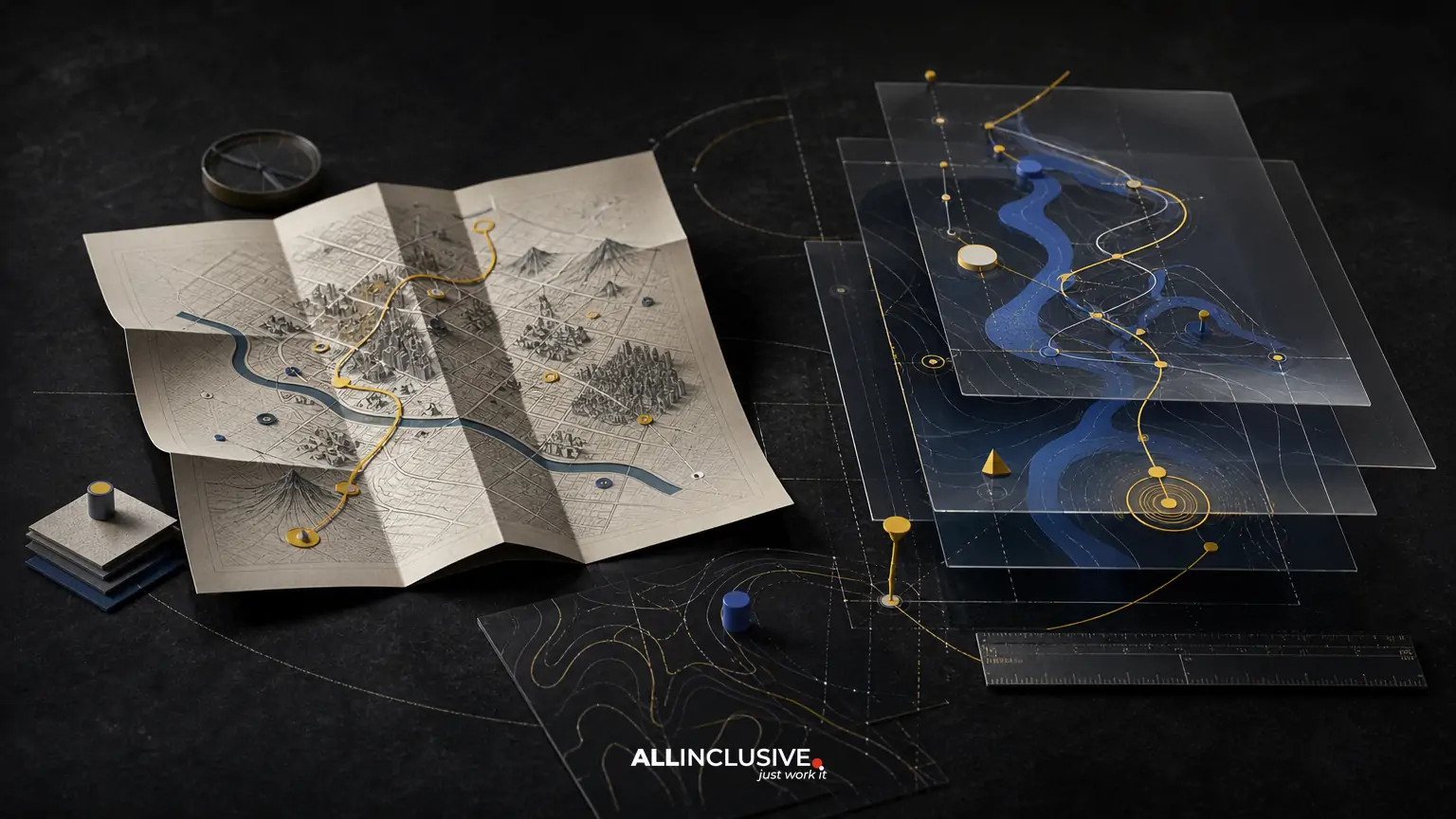
Choosing between a printed map and a digital map is rarely an either-or decision. The right format depends on how visitors arrive, what they need to find, how often information changes, and whether the map must work in low-connectivity or high-traffic environments.
In practical terms, printed maps are dependable, glanceable, and easy to distribute. Digital maps are interactive, updateable, and better suited to dynamic information such as live directions, schedules, accessibility routes, or temporary closures. For many destinations, campuses, districts, venues, and events, the strongest visitor experience combines a carefully designed printed overview with a digital layer.
The key is to design both formats from the same verified information architecture rather than treating one as an afterthought. A map should help people understand where they are, where they need to go, and what matters along the way.
Printed map vs digital map: the essential differences
| Decision factor | Printed map | Digital map |
|---|---|---|
| Availability | Works without a battery, signal, or device | Requires a compatible device and appropriate access |
| Navigation | Supports quick orientation and route overview | Can provide interactive directions and location services |
| Updates | Requires reprinting and redistribution | Can be updated centrally, depending on the platform |
| Visitor behavior | Encourages broad exploration and shared viewing | Supports personalized, on-demand searches |
| Brand and place marketing | Offers a tactile, highly controlled editorial artifact | Can connect places to additional content and actions |
| Accessibility | Can support large-format, high-contrast, and multilingual versions | Can support zoom, assistive technology, audio, and route filters when implemented well |
Neither format is automatically more useful. A digital map with poor location data can frustrate visitors, while a beautiful printed map with an unclear “you are here” marker can create confusion. Information hierarchy, labeling, scale, and testing matter more than the medium alone.
When a printed map is the better choice
Visitors need immediate orientation
Printed maps are effective at entrances, welcome desks, parking areas, hotel lobbies, visitor centers, and event check-in points. A person can unfold or scan the map without downloading an app, accepting permissions, or learning a new interface. This makes print especially useful during arrival, when visitors are still building a mental model of the place.
Connectivity or battery life is uncertain
Large campuses, parks, historic districts, outdoor festivals, and rural destinations may include areas with inconsistent service. A printed map provides a dependable backup when a phone cannot load a map or a visitor is conserving battery power.
Shared decision-making matters
Print works well when groups are planning together. Families, tour groups, coworkers, and event attendees can hold one map, compare destinations, and agree on a route without passing a phone around. It also gives staff a simple object to mark, point to, or annotate during conversations.
The map is part of the visitor experience
A printed map can do more than show roads and buildings. It can introduce landmarks, districts, amenities, walking loops, cultural details, and recommended stops. Illustration, color, and composition can make the destination feel legible and memorable while still preserving accurate wayfinding.
For visual approaches and examples of how style can change the role of a map, see map illustration styles.
When a digital map is the better choice
Information changes frequently
Digital maps are advantageous when routes, hours, tenants, room assignments, parking availability, or event schedules change often. Updates can be made without discarding a printed inventory, although the underlying system still needs governance and quality control.
Visitors need personalized directions
A digital experience can help users search for a specific destination, select a starting point, filter by category, calculate a route, or identify accessible paths. These functions are valuable in complex environments where a single static overview cannot answer every question.
The destination is large or multi-layered
Hospitals, universities, mixed-use districts, airports, convention centers, and major attractions may require several levels of information. Digital maps can reveal detail progressively, allowing users to move from a district overview to a building, floor, room, or facility without placing every label on one crowded canvas.
Engagement continues beyond navigation
Digital mapping can connect a place to hours, reservations, tickets, menus, event details, accessibility information, or other visitor resources. The advantage is not simply interactivity; it is the ability to place relevant information closer to the moment of need.
Why a combined map system often works best
Printed and digital maps serve different moments in the visitor journey. Print is strongest for orientation, reassurance, and shared planning. Digital is strongest for detail, search, live changes, and individualized routes.
A combined system might use:
- A printed overview at arrival points and high-traffic decision areas.
- Directional signs that use the same names, colors, symbols, and destination categories as the map.
- A mobile-friendly digital map for searches, detailed routes, and changing information.
- QR codes or short URLs where they add convenience without making digital access mandatory.
- A consistent “you are here” system across print, screens, signs, and staff materials.
The most important requirement is consistency. If a printed map calls a destination “North Pavilion” while the digital system uses “Pavilion North,” visitors must translate between systems. Shared naming and visual conventions reduce that mental effort.
Decision criteria for choosing the right format
1. Visitor context
Define when and where people use the map. Are they arriving for the first time, moving between familiar buildings, looking for a specific tenant, or navigating a temporary event? A first-time visitor usually needs context before detailed directions.
2. Environmental conditions
Consider weather, lighting, crowd density, noise, walking speed, and whether visitors can comfortably use a phone. Outdoor environments may require weather-resistant print, larger labels, and map panels that can be read while standing. Digital interfaces should account for glare, connectivity, and one-handed use.
3. Information volatility
Separate stable information from changeable information. Property boundaries, major buildings, and primary paths may remain stable for years. Tenant listings, construction zones, event spaces, and temporary closures may change weekly or daily. Use print for durable context and digital tools for information that needs frequent revision.
4. Scale and complexity
A printed map must balance geographic coverage with legibility. If showing the entire site makes labels too small, consider an overview plus focused detail panels. Digital mapping can provide multiple scales, but users still need a clear starting view and understandable transitions.
5. Accessibility
Accessibility should be designed into both formats. For print, evaluate type size, contrast, symbol clarity, color dependence, tactile or large-format alternatives, and the placement of the map for wheelchair users. For digital, consider keyboard access, screen-reader compatibility, zoom behavior, contrast, alternative route information, and plain-language labels.
6. Operational ownership
Identify who verifies changes, approves revisions, maintains the digital data, and removes outdated printed materials. A map is an operational tool as well as a design artifact. Without ownership, even a polished system will become unreliable.
Common mistakes in printed map design
- Showing too much. Every feature does not deserve equal visual weight. Prioritize destinations, routes, entrances, amenities, and landmarks that support visitor decisions.
- Using decorative geography that undermines accuracy. Illustration can make a map engaging, but distortions must not create false relationships or misleading distances.
- Weak orientation cues. Include a clear north reference where useful, recognizable landmarks, major entrances, and a prominent location marker.
- Inconsistent naming. Match map labels to signs, directories, websites, and staff language.
- Ignoring the physical format. A map designed on a screen may fail when folded, trimmed, displayed behind a counter, or viewed outdoors.
- Relying on color alone. Use labels, patterns, line styles, and symbols so information remains understandable for people with color-vision differences or in poor lighting.
For a venue-specific example of planning map content and visitor flow, review the considerations in shopping center map design.
Common mistakes in digital map design
- Launching an attractive interface with incomplete data. Missing entrances, inaccessible paths, or incorrect hours damage trust quickly.
- Making the user search before explaining the place. Start with a useful overview and obvious categories, then allow deeper exploration.
- Overloading the map with pins. Clustering, filtering, and progressive disclosure can preserve clarity.
- Assuming everyone has location services enabled. Provide manual starting-point selection and clear landmarks.
- Ignoring temporary conditions. Construction, event closures, and route changes need visible status and timely updates.
- Separating the digital map from the physical wayfinding system. The same place should not have different names, icons, or destination logic across channels.
A practical evaluation checklist
Before selecting a format or approving a redesign, ask:
- What are the three most common visitor questions?
- Where do visitors first need orientation?
- Which information is stable, and which information changes regularly?
- Will people have reliable connectivity and sufficient battery life?
- Does the system support visitors with different mobility, vision, language, or technology needs?
- Can visitors identify their current location and a realistic next step?
- Do map labels match signs, directories, websites, and staff terminology?
- Who owns data verification and version control?
- How will the map be tested with first-time visitors rather than only internal stakeholders?
Testing should focus on tasks, not opinions. Ask representative users to find an entrance, locate a restroom, plan a route, or identify an accessible path. Observe where they hesitate, backtrack, misread symbols, or ask for help. Those moments reveal whether the map supports real decisions.
How map design connects navigation and place marketing
A visitor map has two jobs that can conflict if they are not planned together: it must be accurate enough to guide movement, and expressive enough to communicate the character of a place. The solution is not to choose between utility and personality. It is to establish a clear information hierarchy first, then use illustration, color, typography, and composition to reinforce it.
That approach applies across tourism destinations, events, campuses, retail districts, cultural sites, and signage programs. A broader design system can help align the map with related visitor touchpoints, while the map itself should remain focused on orientation and decision-making.
For event environments, route capacity, temporary entrances, program zones, and crowd movement may matter more than permanent geography. The principles in festival map design are useful when planning maps for short-duration, high-density experiences.
Making the final choice
Choose a printed map when visitors need dependable, shared, immediate orientation or when the environment cannot guarantee device access. Choose a digital map when information changes frequently, the site is complex, or visitors need search, filtering, live updates, and personalized routes. Choose both when the destination has multiple visitor moments and the cost of confusion is high.
The best outcome is not a map that looks impressive in isolation. It is a coordinated wayfinding system that helps people understand a place, make confident decisions, and reach the next destination with less friction. For broader guidance on planning a visitor-focused mapping system, see map design services and wayfinding map design.


