
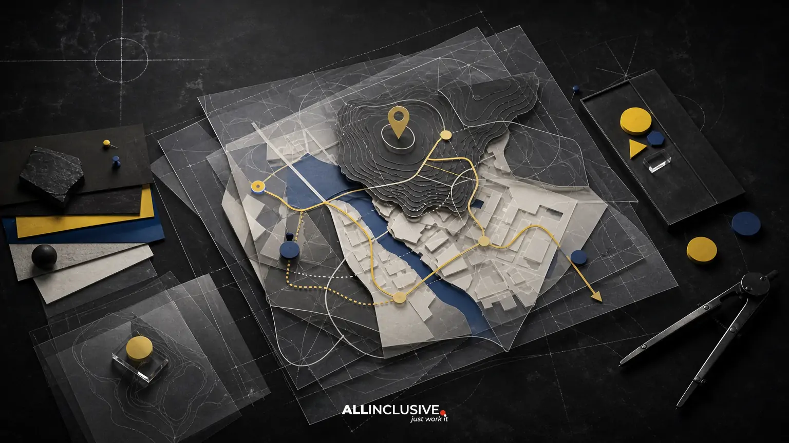
Choosing a map designer is not only a question of finding someone who can draw an attractive map. The right partner must translate real places, routes, boundaries, entrances, landmarks, and visitor priorities into a clear tool that works in its final environment.
For a destination, venue, campus, district, or event, compare candidates across five areas: navigation accuracy, information hierarchy, visual style, production capability, and project process. A specialist who excels at illustrated maps may not be the best fit for a complex wayfinding system, while a technical mapping provider may not deliver the place marketing or visual character your audience expects.
Start by defining how people will use the map, where it will appear, and what decisions it must help them make. Then ask each designer to explain how they will collect information, resolve ambiguity, prepare files, and maintain accuracy over time.
1. Define the map’s job before comparing designers
The same location can require very different map solutions. A visitor map for a tourism district, a wayfinding map for a university, and an event map for a temporary site may all show streets and points of interest, but their audiences, constraints, and success criteria differ.
Write a short project brief that answers:
- Who will use the map, and what are they trying to find?
- Will the map be printed, displayed on signage, embedded online, shared as a PDF, or used in several formats?
- Which routes, entrances, accessible paths, transit connections, parking areas, or service points must be clear?
- Which locations are permanent, temporary, seasonal, or subject to change?
- Does the map need to support navigation, promotion, orientation, storytelling, or all four?
- What physical sizes, screen dimensions, languages, and accessibility requirements apply?
This scope prevents a common mistake: choosing a designer based on portfolio appearance before confirming whether the underlying information problem matches their experience.
2. Evaluate navigation accuracy and information handling
A map can look polished and still fail if visitors cannot trust it. Accuracy should therefore be evaluated as a process, not merely as a visual outcome.
Ask how the designer will establish the base information
A strong candidate should be able to explain what source material they need, such as site plans, architectural drawings, geographic data, aerial references, approved street information, accessibility routes, or stakeholder-provided location lists. They should also identify which information requires on-site verification or client confirmation.
Ask how the designer will handle:
- Multiple entrances and exits
- One-way paths, restricted areas, and dead ends
- Elevation, stairs, ramps, and accessible routes
- Temporary event infrastructure
- Construction, closures, or seasonal changes
- Conflicting information from different stakeholders
- Points of interest that are close together or visually crowded
The goal is not to demand survey-grade data for every project. It is to make sure the designer understands the difference between decorative simplification and a misleading change to the user’s route.
Look for a clear review and approval system
Ask whether the project includes a labeled draft, a fact-checking phase, and a final sign-off process. A practical map workflow separates visual feedback from factual corrections so that both can be reviewed efficiently. It should also identify who has authority to approve streets, buildings, paths, names, icons, and locations.
3. Match the designer’s specialization to the map type
Map design is a broad category. Review the portfolio for work that resembles your actual situation rather than relying on a general illustration reel.
| Project type | Capabilities to prioritize |
|---|---|
| Tourism destination | Place storytelling, landmark selection, visitor orientation, illustration, multilingual planning, and print or digital adaptation |
| Venue or event | Fast-changing information, crowd flow, entrances, amenities, accessibility, temporary structures, and rapid production |
| Campus | Building identification, pedestrian routes, accessibility, parking, transit, future updates, and consistency across signs and digital channels |
| District or development | Street hierarchy, boundaries, destinations, development phases, public-realm features, and stakeholder alignment |
| Signage system | Distance legibility, viewing angles, scale, contrast, fabrication constraints, icon systems, and installation context |
For a closer look at event-specific requirements, see event map design considerations. Campus projects benefit from a different planning lens; the campus map design guide addresses routes, buildings, accessibility, and long-term use.
4. Separate cartographic clarity from illustration style
Visual style matters, but it should support comprehension. When reviewing samples, look beyond whether the work feels modern, detailed, playful, or premium. Examine how effectively it communicates location and priority.
Check whether the map has:
- A clear visual hierarchy between primary routes, secondary paths, landmarks, services, and background context
- Labels that remain readable at the intended physical or digital size
- Consistent icons with understandable meanings
- Enough negative space around important destinations
- A useful relationship between geographic truth and visual simplification
- A legend, orientation cue, scale indication, or other supporting information where needed
- Color choices that remain distinguishable for users with color-vision differences
An illustrated map can make a destination memorable, but excessive detail can hide the information visitors need first. Conversely, a highly reduced diagram can be easy to scan but may omit context that helps people understand where they are. Ask the designer to explain these trade-offs rather than assuming one visual approach is universally better.
5. Confirm output and production expertise
A map is not finished when the artwork looks correct on a designer’s screen. It must be prepared for the environments in which people will encounter it.
For print and signage
Confirm that the designer understands final dimensions, viewing distance, materials, color conversion, bleed, mounting, panel divisions, and production specifications. A map designed for a letter-size handout may need a different hierarchy and labeling system from one printed on a large outdoor sign.
For digital use
Ask about responsive layouts, export formats, file size, interaction requirements, and how the map will behave on smaller screens. A static PDF, a web image, an embedded interactive map, and a touchscreen interface involve different design decisions. If development is outside the designer’s scope, establish who will translate the visual system into the digital experience.
For multiple applications
If the map will appear in brochures, signage, websites, visitor centers, presentations, or social media, ask whether the designer will create a flexible master system. Confirm which editable source files, vector assets, icon libraries, fonts, and export versions will be delivered.
6. Assess accessibility and inclusive wayfinding
Accessibility should be part of the brief, not a final polish step. The appropriate requirements depend on the setting, audience, format, and applicable standards, so ask the designer to identify the project’s accessibility considerations early.
Useful questions include:
- How will accessible entrances and routes be represented?
- Can labels and symbols be distinguished without relying on color alone?
- Will type remain legible at the expected viewing distance and screen size?
- How will the map handle language needs or translated versions?
- Can the design accommodate tactile, large-print, or alternate-format applications where required?
- How will ambiguous symbols or unfamiliar landmarks be tested with users or stakeholders?
Accessibility is not identical to adding an accessibility icon. It involves helping a broader range of people understand, navigate, and act on the information.
7. Review the project process, not just the portfolio
Map projects often involve more factual dependencies than ordinary illustration work. A designer’s process should make those dependencies visible.
Ask candidates to describe:
- Discovery: how they learn the site, audience, goals, constraints, and source data.
- Content planning: how they decide what to include, omit, group, or prioritize.
- Base-map development: how geography, architecture, routes, and landmarks are organized.
- Concept exploration: how they test visual direction, orientation, icons, and hierarchy.
- Review: how many review rounds are included and how factual corrections are managed.
- Production: how final files are prepared for each channel.
- Maintenance: how future changes, versioning, and updates will be handled.
Be cautious of proposals that jump straight from a vague brief to a final illustration. A credible process should show how the designer will reduce uncertainty before investing heavily in detail.
8. Compare proposals on scope and trade-offs
Map design proposals are easier to compare when the deliverables are written in specific terms. Look for clarity about:
- Included map area and number of versions
- Research, site visits, data preparation, and stakeholder interviews
- Number and timing of concept and revision rounds
- Illustration, icon, labeling, and language requirements
- Print, signage, digital, and source-file deliverables
- Accessibility review and production coordination
- Ownership, licensing, and permitted future uses
- Update arrangements after launch
- Dependencies, exclusions, and client responsibilities
The lowest initial quote may not be the lowest total cost if it excludes data cleanup, additional formats, production preparation, or future updates. At the same time, a highly elaborate illustrated approach may be unnecessary for a simple internal orientation map. Compare the proposed solution to the actual user problem.
9. Use a practical shortlist scorecard
A simple scorecard can make subjective comparisons more transparent. Rate each candidate from one to five against criteria such as:
| Criterion | What to look for |
|---|---|
| Relevant experience | Comparable destination, venue, campus, district, signage, or digital work |
| Accuracy process | Reliable source handling, verification, review, and version control |
| Wayfinding clarity | Strong hierarchy, labels, routes, icons, and orientation cues |
| Visual fit | A style appropriate to the place, audience, and brand context |
| Production readiness | Print, signage, digital, and multi-format knowledge |
| Accessibility thinking | Early attention to legibility, contrast, routes, and alternate needs |
| Collaboration | Clear communication with owners, facilities, marketing, events, or operations teams |
| Maintenance plan | A realistic approach to changes and future versions |
Use the scorecard to structure discussion, not to create false precision. A candidate with a slightly different style may still be stronger if they demonstrate better information architecture and production judgment.
10. Red flags to investigate
Several warning signs deserve follow-up:
- The portfolio shows attractive maps but no explanation of audience, format, or use case.
- The proposal treats all map projects as the same type of illustration.
- The designer cannot explain how location data or factual corrections will be managed.
- Accessibility, signage scale, or digital behavior is left until the end.
- The quote does not distinguish concepts, revisions, final formats, or future updates.
- The candidate promises a precise result without requesting source information or stakeholder input.
- There is no clear owner for final factual approval.
None of these automatically disqualifies a designer, but each should be resolved before the project begins.
How to choose with confidence
The best map designer for your project is the person or team that can balance place knowledge, navigation logic, visual communication, and production realities. Begin with the decisions the map must support, then test candidates against the audience, site complexity, output formats, accessibility needs, review process, and update requirements.
If the project also needs a broader visual system for related collateral, consider how the map will fit into your overall design strategy. For tourism-focused work, tourism map design considerations can help clarify the balance between orientation and place promotion. When you are ready to define the scope of a map project, review the related map design services page.


