SaaS UX design is the practice of making subscription software easier to understand, adopt, and use repeatedly. It covers the experience around sign-up, onboarding, navigation, core workflows, collaboration, billing, permissions, support, and account management—not only the appearance of individual screens.
The most effective approach reduces friction at moments that affect activation, task completion, retention, and customer confidence. That usually requires product research, information architecture, interaction design, prototyping, usability testing, and an ongoing design system. The goal is not to add more interface features. It is to help users reach value with fewer questions, errors, and unnecessary decisions.
This article explains how to evaluate SaaS UX design work, where trade-offs appear, and how teams can improve onboarding and core workflows without treating every issue as a visual redesign.
What SaaS UX design includes
SaaS products are experienced over time. A user may encounter a marketing promise, create an account, import data, invite colleagues, configure settings, complete a recurring task, and return weeks later. Each step creates an expectation that the next step will be clear.
As a result, SaaS UX design typically includes:
- Discovery and research: interviews, workflow observation, support-ticket analysis, product analytics review, and stakeholder alignment.
- Information architecture: organizing features, objects, settings, navigation, permissions, and terminology.
- Interaction design: defining flows, states, feedback, error handling, bulk actions, and recovery paths.
- Interface design: creating understandable layouts, controls, hierarchy, visual states, and responsive behavior.
- Prototyping and validation: testing proposed workflows before engineering effort is committed.
- Design systems: establishing reusable components and interaction patterns that support consistency and speed.
- Measurement and iteration: connecting design decisions to behavioral and operational outcomes.
This broader scope distinguishes SaaS UX from a screen-by-screen styling exercise. A polished dashboard can still create friction if users cannot determine what to do next, understand unfamiliar terminology, or recover from an error.
Where SaaS products commonly lose users
Onboarding that explains instead of enabling
Onboarding often becomes a tour of every feature. That can overwhelm new users before they understand the product’s primary value. A stronger onboarding experience identifies the user’s first meaningful outcome and guides them toward it.
Useful questions include:
- What does a new user need to accomplish in the first session?
- Which information is required before that task can begin?
- Can the product provide sensible defaults or sample data?
- Which steps belong in the initial flow, and which can wait?
- What happens if the user leaves and returns later?
Progressive disclosure is often more effective than presenting every option upfront. Ask for information when it becomes relevant, explain why it matters, and provide a visible way to continue or return.
Navigation built around the company, not the user
Internal product terminology and organizational structures do not always match how customers think about their work. Navigation should reflect user goals, object relationships, and task frequency rather than simply mirroring the company’s departments or database model.
Before changing navigation, map the product’s major objects and workflows. For example, a user may think in terms of projects, approvals, and deliverables while the product is organized around workspaces, records, and modules. The interface can support the underlying system without requiring users to learn its architecture first.
Core workflows with hidden dependencies
A workflow feels difficult when users must remember information, move between unrelated areas, or interpret system behavior without feedback. Common examples include creating a record that requires prior setup, assigning work without clear permission rules, or exporting data from a location users cannot find.
Workflow mapping exposes these dependencies. Document the trigger, user goal, steps, decisions, system responses, exceptions, and desired end state. Then look for opportunities to remove steps, combine related decisions, provide inline context, or make status visible.
Unclear system status and error recovery
SaaS products often perform asynchronous actions such as syncing data, processing files, sending invitations, or generating reports. Users need to know whether an action succeeded, is still running, or needs attention.
Design meaningful loading, success, empty, warning, and error states. An error message should explain what happened, identify what the user can do next, and preserve work whenever possible. Recovery is part of the workflow—not an afterthought.
A practical SaaS UX design process
1. Define the business and user problem
Start with a specific problem statement rather than a request such as “make the dashboard cleaner.” A useful brief might describe a user segment, a task, a point of friction, and the business consequence. For example: new administrators understand the product’s promise but struggle to configure their first workspace, delaying team invitations.
Align on constraints early, including technical dependencies, compliance requirements, permissions, device contexts, release timing, and available evidence. This prevents the design process from optimizing an experience that cannot be implemented or measured.
2. Research the current experience
Use multiple sources of evidence. Customer interviews can reveal language and expectations; support conversations can surface recurring confusion; analytics can show where users abandon or repeat steps; session review can expose navigation and interaction problems.
Research should not be limited to successful users. Include people who are new, inactive, highly experienced, or responsible for evaluating the product. Different roles often encounter different friction in the same workflow.
3. Model information architecture and journeys
Translate findings into journey maps, task flows, object models, and navigation concepts. This is the stage to resolve competing structures before visual polish makes a weak model harder to change.
For complex products, distinguish between:
- high-frequency actions users need immediately;
- configuration tasks that happen occasionally;
- administrative controls that require careful access management;
- secondary information that should remain available without dominating the primary path.
4. Explore flows with wireframes and prototypes
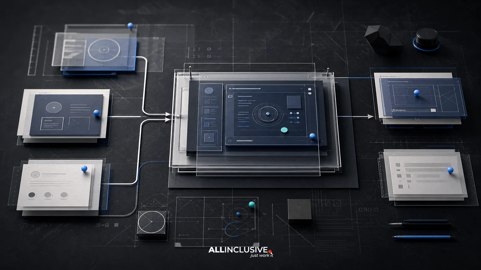
Wireframes help teams discuss hierarchy, sequence, content, and interaction before investing in final visual design. Prototypes then make important flows tangible enough to evaluate.
Prototype the moments where assumptions are riskiest: first-time setup, permissions, bulk actions, complex forms, empty states, upgrades, imports, and failure recovery. A prototype does not need to cover the whole product to answer a high-value question.
5. Test with representative users
Usability testing should focus on whether people can understand and complete realistic tasks. Ask participants to explain what they expect to happen, observe where they hesitate, and avoid rescuing them too early.
Evaluate both task success and the quality of the experience. A user may complete a flow while relying on guesses, workarounds, or excessive effort. Record confusing terminology, missed feedback, unnecessary backtracking, and points where users ask for help.
6. Translate validated patterns into a system
Once key patterns are validated, document reusable components, content rules, states, accessibility requirements, and usage guidance. A design system should support product decisions, not merely provide a library of visual assets.
Pay particular attention to tables, filters, forms, notifications, modals, navigation, permissions, and empty states. These patterns often carry more workflow complexity than decorative components.
7. Measure after release
Set a baseline before implementation where possible. Depending on the workflow, relevant measures may include completion rate, time to complete, setup progression, search refinement, error frequency, support contacts, invitation acceptance, or successful return visits.
Quantitative signals show where behavior changes. Qualitative follow-up helps explain why. Treat measurement as a feedback loop rather than a final verdict: a higher completion rate may still conceal confusion if users are taking inefficient workarounds.
How to prioritize friction
Not every usability issue deserves the same response. A practical prioritization model considers four dimensions:
| Dimension | Question |
|---|---|
| Frequency | How often do users encounter the issue? |
| Impact | Does it block value, create errors, or merely slow a minor task? |
| Audience | Does it affect new users, paying administrators, occasional users, or a narrow edge case? |
| Effort and risk | Can the issue be resolved through content or interaction changes, or does it require architectural work? |
High-frequency, high-impact friction in a primary workflow usually deserves attention before low-frequency visual inconsistencies. However, critical accessibility, security, privacy, and data-loss risks should be escalated regardless of frequency.
Key trade-offs in SaaS UX
Flexibility versus clarity
Advanced users may want configuration and control, while new users need a clear path. Progressive disclosure, sensible defaults, saved views, and role-aware settings can support both groups without presenting every option at once.
Speed versus confidence
Removing confirmation steps can make a workflow faster, but irreversible or high-impact actions may require confirmation, preview, or undo. The right choice depends on the consequence of an error and the ease of recovery.
Consistency versus context
Reusable patterns reduce learning effort, but identical-looking controls can be misleading when their consequences differ. Preserve familiar structures while adapting labels, explanations, and feedback to the context.
Product goals versus user trust
Activation and expansion goals should not turn onboarding into pressure. Explain why information is requested, distinguish required from optional steps, and make billing, permissions, data use, and cancellation understandable. Trust is part of the product experience.
A SaaS UX evaluation checklist
Use this checklist during a product review, redesign kickoff, or release readiness discussion:
- Can a first-time user identify the next useful action?
- Does onboarding lead to a meaningful outcome rather than a feature tour?
- Are navigation labels based on user language and task goals?
- Can users understand what is required, optional, complete, or still processing?
- Do forms prevent avoidable errors and preserve entered information?
- Are empty states helpful without becoming promotional interruptions?
- Can users undo, edit, or recover from consequential actions?
- Do permissions and role differences appear at the right time?
- Do tables, filters, search, and bulk actions support real working patterns?
- Does the experience remain usable across relevant screen sizes and input methods?
- Have representative users tested the highest-risk workflows?
- Are success measures defined before the change is released?
How to choose a SaaS UX design partner
When evaluating outside support, ask for a clear explanation of the proposed process rather than only a portfolio of polished screens. A capable partner should be able to show how it will learn the product context, identify workflow problems, test assumptions, collaborate with engineering, and define measurable outcomes.
Useful evaluation questions include:
- How will you prioritize research when access to users is limited?
- How do you connect user needs to product and operational goals?
- What deliverables will help engineering implement the recommendations?
- How will you address permissions, edge cases, accessibility, and error states?
- Which assumptions should be tested before high-fidelity design?
- How will the team measure whether the released experience improved?
For a broader view of the discipline and related deliverables, see UI/UX design services. If the engagement spans brand, marketing, or product touchpoints, the wider design practice may also provide useful context.
Related workflow perspectives
SaaS products often include data-dense reporting areas, so a closer look at dashboard UX design can help teams evaluate hierarchy, scanning, filters, and decision support. For customer-facing product surfaces, compare the principles with website UX design, where discovery and conversion shape the experience differently.
Teams designing responsive SaaS experiences may also benefit from the considerations in mobile web UX design. When implementation constraints are central to the project, collaboration with web development can help connect validated design patterns to a maintainable product.
Final takeaway
SaaS UX design is an ongoing effort to make product value easier to reach and repeat. Start with the highest-impact user workflows, investigate the causes of friction, test structural decisions before visual polish, and measure what changes after release. The strongest outcomes come from treating research, information architecture, interaction design, prototyping, usability testing, and design systems as connected parts of product improvement.