
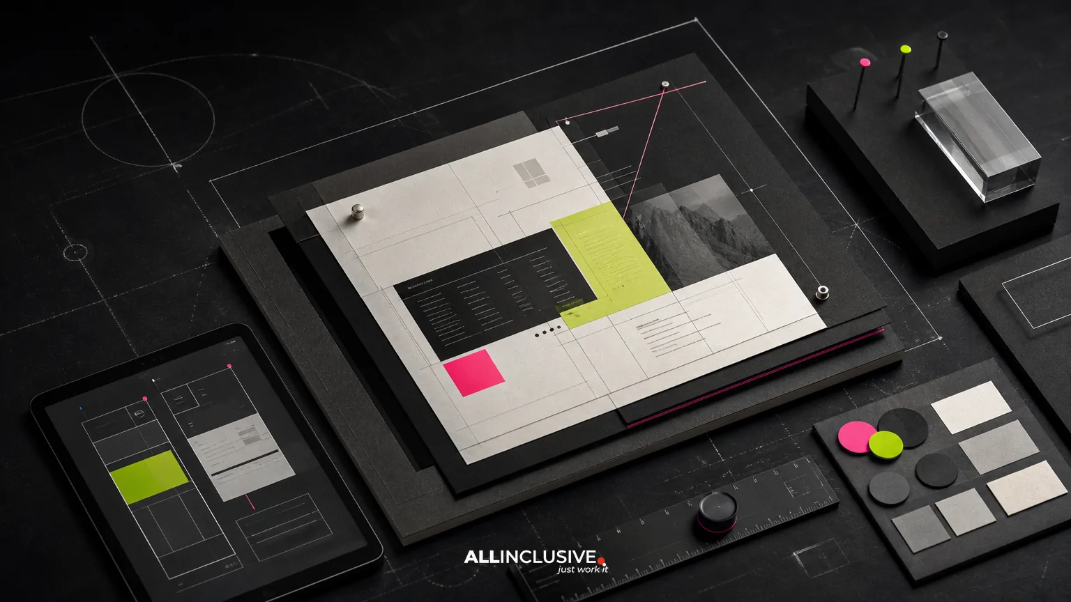
A strong sales sheet helps a buyer understand an offer without requiring a presentation, long email, or product tour. The best one-pagers are not simply condensed brochures. They are decision-support tools: easy to scan, specific enough to build confidence, and structured so a salesperson can use them at the right moment.
Sales sheet design should therefore begin with the buying decision, not the decoration. Define what the reader needs to know, what action should follow, and which details deserve visual emphasis. Then build a clear information hierarchy around those needs.
What a sales sheet should do
A sales sheet typically supports one focused commercial task. It may explain a solution, compare an offering, summarize a product, clarify an implementation model, or give a buyer a concise reason to continue the conversation.
Before designing, answer four questions:
- Who is reading it? Identify the role, level of familiarity, and likely concern.
- What decision is being supported? For example, whether to request a demo, approve a pilot, shortlist a vendor, or share the offer internally.
- What must the reader remember? Limit the core message to a small number of meaningful points.
- What should happen next? Make the next step clear without turning the page into a collection of competing calls to action.
This scope separates a sales sheet from broader collateral. A company profile may establish credibility across an organization, while a catalog may organize many products or services. A sales sheet should usually make one offer or use case easier to understand. Related planning considerations appear in company profile design and catalog design services.
Start with a message hierarchy
Readers rarely consume a one-pager from top to bottom. They scan headings, highlighted phrases, numbers, captions, and visual groupings first. A useful hierarchy lets someone identify the offer and its relevance in seconds, then provides supporting detail for a closer read.
A practical hierarchy often includes:
- Primary promise: State what the offer helps the customer accomplish.
- Audience or use case: Make the intended fit obvious.
- Three to five proof points: Explain the most valuable capabilities, outcomes, or differentiators.
- Evidence: Use a relevant example, process detail, specification, testimonial, or credential when available and supportable.
- Next step: Tell the reader how to continue the conversation.
Do not give every message equal visual weight. If the headline, subhead, feature list, testimonial, and call to action all look equally prominent, the page has no clear entry point. Typography, spacing, scale, position, and grouping should work together to show what matters first, second, and third.
Choose the right information for a one-pager
Space is limited, but brevity alone is not the objective. The objective is useful compression: removing information that does not help the reader evaluate the offer while retaining the context needed to interpret what remains.
Prioritize decision-relevant detail
Include information that answers likely buyer questions. Depending on the offer, that may include:
- the problem or operating context addressed;
- the primary deliverables or capabilities;
- important specifications, requirements, or inclusions;
- implementation steps or expected engagement structure;
- compatibility, service, or support information;
- credible proof that reduces perceived risk; and
- a specific next action.
Remove internal language, repeated claims, generic adjectives, and technical detail that has no decision-making role. If an important caveat changes how the offer should be evaluated, do not hide it merely to preserve visual simplicity.
Use plain language and concrete labels
Replace vague headings such as “Our Advantage” with labels that tell readers what they will learn, such as “What is included,” “How implementation works,” or “Built for multi-location teams.” Concrete headings improve both scanning and internal sharing.
Design the page for scanning
Most sales sheets work best when the layout creates a predictable reading path. A strong structure may use a prominent top section for the offer, a middle section for benefits or proof, and a lower section for details and the next step. The exact arrangement can vary, but the relationships should remain clear.
Use grid logic
A grid helps align headings, text blocks, images, icons, and supporting details. It also makes revisions easier because new content can be placed within an established system rather than forcing a complete redesign.
Useful grid decisions include:
- consistent outer margins and column widths;
- repeatable alignment edges;
- clear spacing between content groups;
- enough room for long headings and realistic copy; and
- a layout that can adapt to the final format and production method.
Control density
A page can feel crowded even when the word count is modest. Dense paragraphs, narrow columns, excessive labels, and too many visual elements increase the effort required to find meaning. Use short blocks, descriptive subheads, bullets where they improve comparison, and whitespace that separates ideas rather than merely filling unused areas.
Whitespace is not wasted space when it clarifies hierarchy. It can establish a pause before a key claim, separate features from proof, or make a call to action easier to locate.
Make visuals carry information
Images should clarify the offer, show context, demonstrate a result, or create a useful emotional frame. Decorative imagery that does none of these may compete with the message.
Diagrams, annotated product views, process flows, comparison structures, and restrained icon systems can be more useful than a generic stock image. Use visual conventions consistently, and add captions when the meaning would otherwise be ambiguous.
Balance benefits, features, and proof
Feature lists describe what an offer contains. Benefits explain why that matters. Proof helps the reader judge whether the claim is credible. A sales sheet needs all three, but they should not be confused.
| Content type | Question it answers | Example treatment |
|---|---|---|
| Feature | What does the offer include? | Capability, component, specification, or deliverable |
| Benefit | Why should the buyer care? | Faster review, simpler coordination, lower operational friction |
| Proof | Why should the buyer believe it? | Specific process, documented result, customer quote, or relevant evidence |
Connect the layers instead of presenting a disconnected list. For example, a capability can be paired with the business effect it enables, followed by a short explanation of how the work is delivered. Avoid turning unsupported outcomes into guarantees. If evidence is not available, use precise process information rather than inflated claims.
Design for real sales use
A sales sheet may be emailed, printed, attached to a proposal, presented during a call, or forwarded internally by someone who was not in the original conversation. Design decisions should account for each context.
Support forwarding
The page should make sense without a salesperson narrating every section. Include enough context to identify the offer, audience, and next step. Avoid references such as “as discussed” or unexplained acronyms that make the document difficult to reuse.
Plan for print and screen
Digital and printed versions may require different checks. On screen, small type, low contrast, and complex visual details can be difficult to read at common zoom levels. In print, colors, fine rules, image resolution, trim, bleed, and paper choice can affect the result.
If the sheet will be used in both channels, establish production requirements before finalizing the layout. A design that looks balanced on a large monitor may become cramped when printed or viewed on a phone.
Make the call to action operational
A call to action should state the next step and provide a usable path to it. Depending on the context, that might be a sales contact, scheduling route, product page, response instruction, or scannable code. Test every destination and confirm that the action remains understandable when the sheet is forwarded outside the original email thread.
Accessibility and usability checks
Accessibility is part of effective communication, not a final cosmetic pass. Check whether the document remains understandable when color, image detail, or reading conditions are less than ideal.
- Use sufficient contrast between text and background.
- Do not communicate essential meaning through color alone.
- Choose legible type sizes and line lengths.
- Use descriptive headings and a logical reading order.
- Provide meaningful alternative text when the digital format supports it.
- Check links, buttons, codes, and contact details for accuracy.
- Review the page at realistic screen sizes and in a printed proof when relevant.
These checks are especially important when a sales sheet is distributed as a PDF. File naming, metadata, selectable text, and document structure can also affect how easily the asset is found, shared, and reused.
Common sales sheet design mistakes
Trying to serve every audience
A single page that addresses executives, technical evaluators, procurement, and end users equally often becomes vague and overloaded. Choose a primary reader. Create additional versions only when the decision context genuinely requires different information.
Leading with the company instead of the buyer
Company history and credentials may support trust, but they rarely provide the strongest opening. Start with the buyer’s situation and the value of the offer. Move organizational background lower on the page unless it is central to the decision.
Using visual variety without a system
Multiple fonts, icon styles, colors, borders, and image treatments can make a one-pager look busy rather than persuasive. Establish a small set of repeatable rules and apply them consistently.
Hiding important limitations
Omitting requirements, exclusions, timelines, or conditions may create short-term interest but weakens trust when the buyer investigates further. Concise transparency is usually more useful than an over-optimistic summary.
Leaving version control until the end
Sales sheets often change as pricing, features, contacts, regulations, or positioning change. Include an owner, revision date, file naming convention, and approval process. Keep source files organized so updates do not depend on recreating the page from a flattened export.
A practical review checklist
Before approving a sales sheet, review it from both a communication and production perspective:
- Can the reader identify the offer and intended audience immediately?
- Is the main promise specific and supported by the content that follows?
- Does the layout create a clear scanning path?
- Are the most important benefits more prominent than secondary details?
- Can a reader understand the sheet without a live explanation?
- Are claims accurate, supportable, and appropriately qualified?
- Does every image, diagram, and icon have a communication role?
- Is the next action clear, functional, and easy to find?
- Has the file been checked for screen use, print use, accessibility, and technical accuracy?
- Is there a process for future revisions and retirement of outdated versions?
When to use a design partner
Internal teams can often produce a sales sheet when the offer, message, and brand system are already clear. Outside design support becomes more useful when the information is complex, the document must work across print and digital channels, multiple stakeholders need alignment, or the asset is part of a larger campaign system.
Evaluate the work by asking how well the designer translates commercial information into hierarchy, how carefully production requirements are handled, and whether the resulting file can be maintained after launch. Sales sheet design is one part of a broader collateral system; related needs may include flyer design services, campaign assets, presentations, or recurring marketing production.
For teams planning a connected set of collateral rather than a single document, review the broader graphic design services offering. You can also explore the wider design scope when the project includes multiple formats, brand applications, or ongoing production needs.
Conclusion
Effective sales sheet design makes the next decision easier. Define one audience and one commercial job, build a clear hierarchy, use proof responsibly, and test the document in the conditions where it will actually be shared. The result should feel concise without being vague, visually polished without being ornamental, and useful whether a salesperson presents it or a buyer forwards it independently.


