
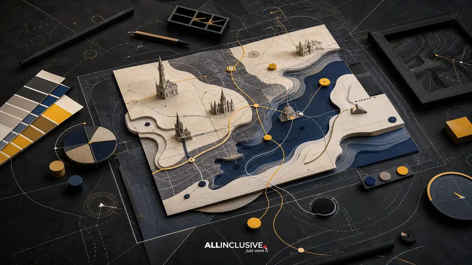
Destination map design sits between wayfinding, editorial illustration, information design, and place marketing. Its job is not simply to show where things are. A strong destination map helps people understand a place, choose what to visit, navigate with confidence, and remember the experience afterward.
That combination makes destination maps different from ordinary location maps and different from purely promotional artwork. They must communicate geographic relationships accurately while presenting the destination with a clear visual point of view. The best approach depends on the audience, the environment in which the map will be used, the amount of information required, and the formats that need to be produced.
This guide explains the main decisions involved so tourism organizations, visitor bureaus, resorts, event teams, campuses, districts, and place marketers can evaluate a map project before production begins.
What is destination map design?
Destination map design is the planning and visual development of a map that represents a place as an experience. The destination may be a city, neighborhood, resort, attraction, campus, waterfront, event site, cultural district, or group of connected destinations.
Unlike a reference map built primarily for geographic accuracy, a destination map usually combines several layers of communication:
- Orientation: showing the overall shape, boundaries, entrances, and major connections.
- Navigation: helping people find routes, facilities, landmarks, services, and points of interest.
- Interpretation: explaining what makes the destination distinctive.
- Promotion: encouraging visitors to explore places or experiences they might otherwise miss.
- Brand expression: making the map feel consistent with the destination’s identity.
These goals can conflict. A highly illustrated map may be memorable but difficult to use. A technically precise map may be easy to follow but fail to communicate character. Destination map design is the process of resolving those trade-offs deliberately.
How destination maps differ from standard maps
A standard reference map generally prioritizes scale, positional accuracy, and consistent geographic notation. A destination map may simplify geography, enlarge important places, remove low-value details, or adjust visual emphasis to support visitor decisions.
That does not mean accuracy is optional. It means accuracy is evaluated according to use. A map displayed at a visitor center, printed in a walking guide, embedded in a mobile experience, or installed on a sign may each require a different level of geographic detail and orientation.
| Map type | Primary objective | Typical design emphasis |
|---|---|---|
| Reference map | Locate places accurately | Scale, coordinates, consistent symbols |
| Wayfinding map | Support movement and decisions | Routes, entrances, landmarks, accessibility |
| Illustrated destination map | Communicate character and discovery | Landmarks, visual hierarchy, storytelling |
| Marketing map | Inspire visits or promote an itinerary | Experiences, categories, calls to action |
Many real projects combine two or more of these types. Defining the dominant use case early prevents the map from becoming an attractive but overloaded collection of information.
Start with the visitor decision, not the visual style
Before selecting an illustration style, identify what the audience needs to do. A map for first-time visitors may need clear orientation and a simple overview. A map for returning guests may focus on hidden features, themed routes, or seasonal programming. A map for an event may prioritize entrances, schedules, accessibility, and crowd movement.
Questions to answer during discovery
- Who will use the map, and what do they already know about the destination?
- Will users be walking, driving, cycling, using transit, or planning from home?
- What decisions should the map make easier?
- Where will the map appear: print, signage, web, mobile, presentations, or multiple channels?
- What geographic information must remain precise?
- Which attractions, amenities, or districts need visual priority?
- What accessibility requirements affect routes, labels, contrast, and symbols?
- Who owns the source data, approvals, updates, and final publishing?
These answers create a useful brief. They also help separate essential content from requests that merely sound useful. If every restaurant, building, trail, parking area, sponsor, and event is treated as equally important, the visitor has no reliable visual hierarchy.
Build a clear information hierarchy
A destination map usually contains more information than can be given equal visual weight. Establishing hierarchy is therefore one of the most important design tasks.
A practical hierarchy often includes:
- Orientation anchors: the destination name, boundaries, major roads, waterfronts, transit connections, or recognizable geographic features.
- Primary routes: the paths, streets, trails, or corridors visitors are most likely to use.
- Major destinations: attractions, districts, venues, hotels, gateways, and visitor services.
- Supporting context: secondary streets, nearby neighborhoods, terrain, parking, and landmarks.
- Detail layers: individual businesses, amenities, event zones, and optional points of interest.
Hierarchy can be expressed through scale, line weight, color, icon size, label placement, spacing, and repetition. It should work even when the map is viewed quickly or from a distance.
Use categories that reflect visitor behavior
Categories should help people scan and compare. Useful groupings might include lodging, food and drink, culture, recreation, shopping, transportation, family activities, accessible facilities, or scenic viewpoints. Avoid creating categories solely because they match an internal organizational chart.
A legend should explain the system without forcing users to decode a dense technical key. If a symbol is unfamiliar, pair it with a label or use a recognizable pictogram. Consistency matters more than novelty.
Choose the right relationship between accuracy and illustration
Illustration can make a destination map distinctive, but visual personality should support comprehension rather than compete with it. There are several workable approaches:
- Geographic base with branded styling: accurate streets, paths, and boundaries are enhanced with a controlled color palette, typography, and icon system.
- Simplified diagram: geography is edited to emphasize routes, districts, and relationships over exact scale.
- Pictorial map: landmarks and experiences are represented with illustrated forms to create a sense of place.
- Hybrid map: a precise navigation layer is combined with illustrated landmarks, terrain, or contextual vignettes.
The more a map departs from geographic scale, the more carefully it must communicate that departure. A simplified map should still preserve meaningful relationships, identify orientation clearly, and avoid implying routes that do not exist.
When illustration is used, establish rules for perspective, level of detail, color, shadows, icon construction, and label integration. A small set of repeatable rules produces a more coherent result than individually decorated locations.
Plan for print, digital, and signage from the beginning
Destination maps often fail in production because a single master file is expected to work everywhere. A folded visitor map, a large outdoor sign, a website image, and a mobile screen have different viewing distances, aspect ratios, interaction models, and accessibility needs.
Define the output family early. Common outputs include:
- Printed visitor guides, rack cards, brochures, and foldouts.
- Large-format orientation signs and directory panels.
- Web pages, downloadable PDFs, and digital visitor guides.
- Mobile-friendly maps or map components within a broader experience.
- Presentation graphics for travel trade, partners, or public meetings.
- Seasonal or event-specific versions that reuse the core map system.
A scalable source file, organized layers, reusable symbols, and documented type and color settings make future adaptations easier. If the map will be maintained by an internal team, the handoff should include clear naming, data references, export guidance, and rules for approved edits.
Accessibility is part of map design
Accessibility should be considered during content and layout decisions, not added after the visual design is complete. A destination map may need to support users with low vision, color-vision differences, mobility constraints, cognitive disabilities, or limited familiarity with the location.
Useful practices include:
- Use sufficient contrast between text, routes, backgrounds, and symbols.
- Do not rely on color alone to distinguish categories or route types.
- Use readable type sizes and avoid placing labels over busy textures.
- Mark accessible entrances, routes, restrooms, parking, and services where relevant.
- Provide plain-language directions or supporting text for complex areas.
- Keep symbols consistent across print, digital, and signage versions.
- Consider whether the map is understandable when viewed in low light, glare, or motion.
Accessibility decisions should be reviewed against the actual conditions in which the map will be used. A map that works on a bright monitor may not work on reflective outdoor signage or a small folded brochure.
Common destination map design mistakes
Trying to show everything
Completeness can reduce usefulness. A map needs a defined audience and purpose. Secondary information can move to a companion directory, digital layer, or detailed inset.
Making the map look like the brand but not behave like a map
Brand colors and distinctive illustration are valuable, but they should not weaken contrast, obscure routes, or make symbols inconsistent. A map is a functional touchpoint as well as a branded asset.
Skipping real-world testing
Reviewing a map on a design screen is not enough. Test printed sizes, viewing distances, folds, mounting locations, mobile screens, and typical user routes. Ask people unfamiliar with the destination to complete realistic tasks and observe where they hesitate.
Using outdated source information
Road changes, construction, renamed venues, seasonal closures, parking rules, and accessibility conditions can quickly make a map unreliable. Establish an owner and review schedule before launch.
Separating content approval from design decisions
Late changes to names, categories, routes, or required disclosures can create avoidable layout problems. Content owners should review the information structure before illustration and final production are locked.
A practical evaluation checklist
Use this checklist when reviewing a destination map concept or vendor proposal:
- Does the map clearly identify the place and its geographic context?
- Can a first-time visitor find the main entrance, route, destination, or service?
- Is the visual hierarchy obvious at the intended viewing distance?
- Are route lines, symbols, labels, and boundaries consistent?
- Does the illustration style support rather than obscure navigation?
- Are important accessibility features represented accurately?
- Can the system adapt to print, web, mobile, and signage?
- Is there a practical method for corrections and future updates?
- Have the map and its exports been reviewed by people who will use them?
- Does the final design represent the destination without making unsupported claims?
How to scope a destination map project
A clear scope usually identifies the geographic area, intended audiences, required data, content categories, output formats, illustration level, accessibility requirements, approval stages, and maintenance expectations. It should also distinguish between information supplied by the client and information that needs to be researched, verified, or redrawn.
For a broader view of how mapping work fits within a larger visual communication system, see Allinclusive’s map design overview and its guide to design services and disciplines. For visitor-focused planning questions, the visitor map design guide offers a more specific companion perspective.
Projects involving external designers should also clarify who supplies geographic data, who verifies points of interest, how many revision rounds are included, and which party owns the editable source files. The guide on how to choose a map designer can help structure that evaluation.
Conclusion
Effective destination map design balances three responsibilities: it must be dependable enough to guide people, expressive enough to communicate the character of a place, and flexible enough to work across real visitor touchpoints. The strongest projects begin with audience decisions and information hierarchy, then use illustration, branding, and production systems to make the map easier to understand and more memorable.
When the project requires a coordinated map system for tourism, events, campuses, districts, signage, print, or digital use, review the capabilities and scope outlined on the map design page.


