
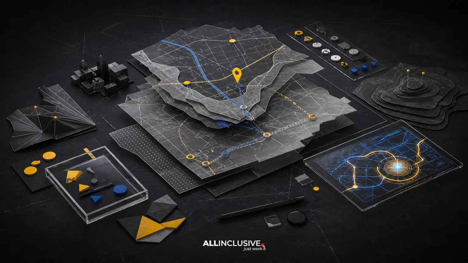
Wayfinding map design helps people understand where they are, where they need to go, and which route makes the most sense. It is more than drawing streets, buildings, or trails. A successful map turns complex spatial information into a confident decision: continue straight, take the next entrance, follow a landmark, or choose a different route.
For campuses, districts, tourism destinations, events, healthcare environments, and mixed-use developments, the map must balance navigation accuracy with readability and place identity. The most effective systems also work across multiple touchpoints, including signs, visitor guides, brochures, websites, mobile screens, and printed handouts.
This guide explains the main decisions behind wayfinding map design so teams can evaluate scope, trade-offs, and deliverables before commissioning a map.
What wayfinding map design includes
Wayfinding map design is the planning and visual organization of geographic or site information to help a defined audience navigate a place. Depending on the project, it can include:
- Site, campus, district, neighborhood, park, trail, or destination maps
- Pedestrian, vehicle, bicycle, transit, or accessible routes
- Entrances, exits, parking, elevators, restrooms, buildings, venues, and services
- Landmarks and points of interest that help people orient themselves
- Directional signs, map panels, visitor guides, event maps, and digital map assets
- Illustration, labeling, iconography, color coding, and brand integration
The scope should be defined by user decisions rather than by the amount of geography shown. A small site can require extensive work if visitors need to distinguish several entrances, elevations, buildings, or route types. Conversely, a large regional map may be simple if users only need a broad overview.
Why accurate geography is not enough
A technically accurate map can still be difficult to use. Conventional geographic maps often prioritize scale, road networks, property boundaries, or topographic detail. Wayfinding maps prioritize the sequence of decisions a person makes while moving through a place.
That difference creates several design trade-offs:
| Decision | What it improves | What can go wrong |
|---|---|---|
| Preserve geographic scale | Spatial accuracy and planning confidence | Important destinations may become too small or visually distant |
| Simplify geometry | Recognition and quick scanning | Users may misread turns or relative locations |
| Emphasize landmarks | Orientation and memorability | Decorative elements can compete with directions |
| Use strong color coding | Route and zone differentiation | Meaning may depend too heavily on color alone |
| Include more points of interest | Discovery and completeness | Labels and symbols can create visual clutter |
The right balance depends on the audience, environment, and viewing distance. A map mounted at a parking entrance has different requirements from a mobile map used while walking or a printed overview used during trip planning.
Start with user journeys, not visual style
Before choosing illustration styles or colors, document the journeys the map must support. A useful way to do this is to list common starting points, destinations, decisions, and barriers.
Questions to define
- Where do users typically begin: a parking area, transit stop, welcome center, hotel, gate, or building entrance?
- What are the most important destinations?
- Which decisions cause confusion or delays?
- Do visitors need to navigate one zone or move between several zones?
- Are there separate routes for pedestrians, vehicles, bicycles, deliveries, or emergency access?
- Are accessible routes different from the most direct routes?
- Will users look at the map before arrival, while moving, or both?
- What information must remain current as the place changes?
These answers help determine whether the project needs a single overview map, a family of coordinated maps, a directional sign system, or an illustrated destination map supported by more detailed navigation tools.
Core components of an effective wayfinding map
Orientation
Users need a clear sense of direction and position. North orientation may be appropriate for some audiences, while a “heads-up” view or a map rotated toward the user’s approach may be easier in an on-site environment. Whatever approach is selected, the orientation should be consistent within each user experience and clearly communicated.
Landmarks
People often navigate by recognizable features rather than by coordinates. Major buildings, entrances, plazas, landscape features, artwork, and distinctive structures can provide useful anchors. Landmarks should be selected for recognition and decision value, not simply because they are visually interesting.
Hierarchy
Not every street, path, building, and service deserves equal visual weight. A hierarchy might distinguish primary routes, secondary paths, restricted access, destinations, amenities, and contextual information. Strong hierarchy lets users find the next relevant decision without reading every label.
Labels and symbols
Labels should be short, legible, consistently placed, and written for the audience. Symbols should have predictable meanings and remain distinguishable at the smallest required size. If an icon is unfamiliar, pair it with a label rather than relying on interpretation alone.
Legends and orientation aids
A legend is useful when symbols or route categories are not self-explanatory. It should support the map rather than become a separate decoding task. Include only items that appear on the map and organize them by user need.
Designing for signage, print, and digital outputs
One of the most important early decisions is whether the map will be designed for one format or a coordinated system. Reusing the same artwork everywhere can create problems because each medium has different viewing conditions.
Signage
Signage maps must work at a distance, under changing light, and often while people are standing or walking. They need high contrast, large enough labels, clear “you are here” markers, and routes that can be understood quickly. Physical placement matters as much as the artwork: a well-designed map can fail if it faces the wrong direction or is installed after the decision point.
Printed maps may support trip planning, event schedules, visitor guides, or take-home reference. They can include more detail than a sign, but folding, paper size, reproduction quality, and grayscale or low-ink conditions should be considered. A map that looks clear on a large proof may become crowded when reduced into a brochure.
Digital
Digital maps may need responsive layouts, zoom behavior, touch-friendly controls, alternative content, and updates when routes or destinations change. A static illustrated map can be useful for orientation and marketing, but it may not replace live navigation when users need real-time routing or frequent data updates.
For a broader overview of how visual decisions are coordinated across deliverables, see the design services overview. For map-specific project scope and capabilities, the map design page provides the appropriate commercial starting point.
Accessibility and inclusive navigation
Accessibility should be built into the map brief rather than added after the visual system is complete. Consider the needs of people with low vision, color-vision deficiencies, mobility limitations, cognitive differences, and varying levels of language familiarity.
- Do not use color as the only way to distinguish routes, zones, or categories.
- Provide sufficient contrast between important information and its background.
- Use type sizes appropriate to the viewing distance and output format.
- Represent accessible routes accurately, including slopes, stairs, elevators, and temporary closures where relevant.
- Use plain, consistent language for destinations and instructions.
- Consider tactile, raised, large-print, audio, or digital alternatives when the environment requires them.
- Test the map with people who are not familiar with the place.
Accessibility requirements vary by project and environment. A designer should coordinate with facility, code, accessibility, and operations stakeholders rather than treating a visual map as a standalone compliance exercise.
Illustration versus strict diagramming
Wayfinding maps can range from highly literal diagrams to expressive illustrated maps. Neither approach is automatically better.
A diagrammatic map is useful when users need fast route comparison, consistent geometry, and strong system-level clarity. An illustrated map can improve recognition, communicate character, and help a destination feel memorable. It may be especially effective for tourism, cultural districts, campuses, attractions, and event environments where place marketing is part of the experience.
The risk of illustration is that visual charm can overpower navigational structure. The risk of strict diagramming is that the result may be accurate but difficult to recognize in the real environment. A considered system uses illustration selectively, keeping route logic, labels, entrances, and decision points unmistakable.
Information needed for a reliable project brief
Gathering the right source material reduces revision cycles and helps identify risks early. A useful brief may include:
- Current base maps, surveys, architectural plans, GIS exports, or aerial references
- Verified names for buildings, facilities, roads, trails, and destinations
- Entrance, exit, parking, transit, loading, and service information
- Known accessibility routes and constraints
- Sign locations, mounting conditions, dimensions, and viewing distances
- Required print sizes, digital breakpoints, file formats, and production specifications
- Brand guidelines, approved colors, typography, icon standards, and imagery
- Seasonal, construction, event, or operational changes that may affect accuracy
- Stakeholders responsible for approving names, routes, and future updates
Source accuracy is a shared responsibility. Design can organize and clarify information, but it should not be expected to infer operational facts that have not been verified.
How to evaluate a wayfinding map concept
Reviewing a map only on a presentation screen can hide practical problems. Use a structured evaluation that reflects real use.
- Test orientation: Can a first-time visitor identify their current location and the direction of travel?
- Test destination finding: Can users locate the most important destinations without studying every detail?
- Test route decisions: Are turns, entrances, crossings, and route changes visually unambiguous?
- Test scale and distance: Does the map communicate approximate effort and relationship between destinations?
- Test accessibility: Are accessible routes and relevant barriers represented clearly?
- Test viewing conditions: Does the design work at the intended size, distance, lighting, and device width?
- Test maintenance: Can names, routes, and symbols be updated without rebuilding the entire system?
Short task-based tests are often more revealing than general opinions. Ask someone unfamiliar with the place to complete specific tasks, such as finding a building from an entrance or identifying the accessible route to a destination. Record hesitation, misinterpretation, and questions.
Common wayfinding map design mistakes
Showing everything
Completeness is not the same as usefulness. Excessive detail can bury the information needed for the next decision. Create a priority list and use different map levels when one view cannot serve every need.
Designing from a clean aerial image
Aerial imagery can be a valuable reference, but it may include visual noise, outdated conditions, or details that do not help navigation. Treat it as source material, not as the finished information hierarchy.
Ignoring the “you are here” condition
A map is much harder to use if people cannot match it to their physical position. Mark the viewer’s location clearly and ensure the map’s orientation matches the surrounding environment.
Using brand colors without checking contrast
Brand consistency matters, but navigation takes priority. Colors must remain distinguishable in context, in print, on screens, and for people with color-vision differences.
Separating design from installation
Viewing distance, mounting height, glare, sightlines, and nearby signs affect comprehension. Review the map in its intended physical context whenever possible.
Failing to plan for change
Campuses, districts, venues, and construction sites evolve. A file structure, data source, naming system, and approval process should support future updates instead of treating every revision as a new creative project.
Related planning resources
If you are comparing approaches, the guide to custom illustrated map design explores how illustration can support place identity without sacrificing clarity. For budgeting questions, review map design cost and consider the number of outputs, source complexity, research needs, and revision requirements. Teams evaluating vendors can also use the custom map design services guide to structure their brief and compare deliverables.
Making the next decision
Begin by documenting the audiences, journeys, destinations, constraints, and outputs the map must support. Then decide whether the project needs a single illustrated map, a coordinated wayfinding system, or multiple levels of information across physical and digital formats. The strongest solution is not necessarily the most detailed or decorative; it is the one that helps the intended audience make the right decision at the right moment.
When the scope is defined, use the map design resource to continue evaluating a map project without losing sight of accuracy, usability, and place identity.


