
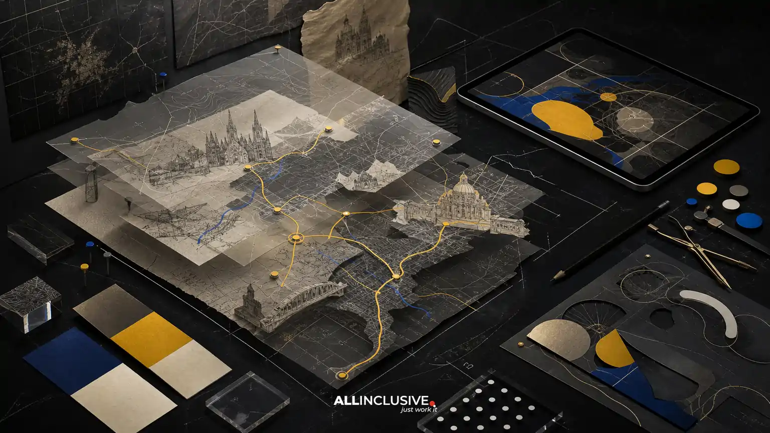
Custom illustrated map design combines two disciplines that are often treated separately: geographic communication and visual storytelling. The finished map must help people understand where places are, how they relate to one another and what deserves attention—while also expressing the character of a destination, event, campus or district.
The strongest projects begin with reliable source data, a defined audience and a clear hierarchy of information. Illustration is then used selectively to make the map more memorable, approachable and place-specific. This article explains the process from source material to final artwork, including the trade-offs that affect accuracy, production and cost.
What custom illustrated map design includes
A custom illustrated map is not simply a standard map with decorative icons added. It is a purpose-built visual system that may combine:
- Base geography, boundaries, routes and landmarks
- Custom buildings, terrain, vegetation or streetscape illustrations
- Wayfinding cues, labels, legends and directional information
- Brand colors, typography and visual motifs
- Print, signage, web, mobile or presentation-ready outputs
The appropriate level of detail depends on the map’s job. A tourism map may emphasize attractions and neighborhoods. An event map may prioritize entrances, stages, amenities and accessible routes. A campus map may require precise building names, paths and service locations. A district map may balance navigation with a broader sense of identity.
For an overview of how map projects fit within a wider visual communication system, see map design services and planning considerations.
Start with the map’s primary decision
Before selecting an illustration style, define what the user needs to decide. A map can support several goals, but one should lead the information hierarchy.
| Primary user need | Information to prioritize | Typical visual emphasis |
|---|---|---|
| Find a destination | Routes, entrances, labels and landmarks | High contrast paths and restrained decoration |
| Explore a place | Attractions, districts, stories and recommendations | Illustrated landmarks and editorial callouts |
| Navigate an event | Zones, schedules, amenities and access points | Clear symbols, numbered locations and fast scanning |
| Understand a campus or property | Buildings, circulation, services and boundaries | Consistent building footprints and functional categories |
| Promote a destination | Identity, character and memorable locations | Distinctive illustration supported by useful geography |
This decision prevents a common problem: a visually impressive map that is difficult to use. If navigation is the priority, illustration should clarify the route rather than compete with it. If place marketing is the priority, decorative detail can play a larger role—but essential orientation still needs to remain obvious.
Collect and evaluate source data
Source data is the foundation of accuracy. It may include GIS exports, CAD files, satellite references, existing maps, site plans, address lists, brand assets, photography and stakeholder annotations. No single source is always complete, so the design process should identify conflicts before artwork begins.
Useful source materials
- Current road, path and boundary data
- Property, building or campus plans
- Verified locations for attractions, services and amenities
- Accessibility information, including ramps, elevators and accessible entrances
- Official names, addresses and category groupings
- Existing signage or map standards
- Output dimensions and production specifications
Ask who owns each source and when it was last updated. A beautiful illustration built on outdated information can create operational problems, especially when it is printed in large quantities or installed as permanent signage.
It is also useful to separate confirmed information from requested information. Stakeholders may ask for a proposed route, future building or informal landmark. Those items should be clearly identified so they do not appear to have the same status as verified geography.
Choose the right level of geographic accuracy
Illustrated maps often simplify geography. Simplification is not automatically a flaw; it is a way to improve comprehension at a particular scale. The important question is whether the simplification preserves the relationships users need.
Consider these accuracy dimensions:
- Position: Are important places located correctly relative to one another?
- Connectivity: Do roads, paths and entrances connect in the way users expect?
- Hierarchy: Are major routes more prominent than minor ones?
- Scale: Is distance represented consistently enough for the intended use?
- Orientation: Is north-up appropriate, or would another orientation improve comprehension?
- Accessibility: Are accessible routes and facilities represented accurately?
A stylized map can bend scale to make a cluster of attractions legible, but the decision should be intentional. For operational wayfinding, excessive distortion may cause confusion. For a visitor guide, a more editorial composition may be acceptable if it is supported by clear labels, a legend and recognizable anchors.
Develop the visual language
Illustration style should follow the audience, environment and output—not the other way around. A hand-drawn style may feel appropriate for a cultural district or destination guide, while a geometric system may better suit a corporate campus or public-facing transportation map.
Key style decisions
- Line quality: Fine lines can feel refined but may disappear at small sizes. Heavier lines usually perform better for outdoor signage and quick scanning.
- Color system: A broad palette can separate categories, while a restrained palette may feel more premium and reproduce more reliably.
- Landmark treatment: Buildings can be shown as simplified footprints, illustrated elevations, pictograms or recognizable silhouettes.
- Texture: Paper grain, shading and organic marks can add warmth, but excessive texture may reduce clarity or create production issues.
- Typography: Labels need enough contrast, spacing and size for the final viewing distance.
- Iconography: Symbols should be consistent in scale, stroke weight and meaning.
For broader decisions about how map artwork should align with collateral, brand identity and campaigns, the principles discussed in strategic design planning can provide useful context.
Build a hierarchy before adding detail
Information hierarchy is what turns a collection of locations into a usable map. Start with the elements users must understand immediately, then add secondary and tertiary information.
- Define the geographic frame and primary orientation.
- Place major routes, boundaries and access points.
- Add essential destinations and landmarks.
- Establish category colors or symbol groups.
- Add labels, legends, directional cues and notes.
- Introduce illustration, texture and decorative detail.
At this stage, create a low-detail wireframe or rough composition. Review it at the intended size rather than only on a large monitor. If the map does not communicate its main message in a simplified state, additional illustration will rarely solve the problem.
Plan outputs before final artwork
The same map may need to work as a folded brochure, wall sign, website graphic, downloadable PDF, social image or mobile interface. These formats impose different requirements.
| Output | Important considerations |
|---|---|
| Print brochure | Bleed, color conversion, folding, minimum type size and paper stock |
| Large-format signage | Viewing distance, panel divisions, mounting conditions and contrast |
| Website or digital guide | Responsive crops, screen resolution, file size and accessible labeling |
| Mobile interface | Zoom behavior, touch targets, simplified layers and alternate states |
| Presentation or marketing graphic | Visual emphasis, annotation space and compatibility with surrounding content |
A vector-first workflow is often valuable because it supports scale changes and controlled revisions. However, the final production method should reflect the selected medium. Raster imagery, texture and 3D elements may be appropriate in some cases, provided they are prepared at suitable resolution and do not undermine legibility.
Use an approval process that reduces rework
Map projects involve many factual details, so approvals should happen in stages. A practical sequence is:
- Brief approval: Confirm audience, purpose, geographic scope and outputs.
- Data approval: Confirm the source files, naming conventions and known exceptions.
- Composition approval: Review orientation, hierarchy, route logic and overall density.
- Style approval: Select the illustration approach, color direction, typography and icon system.
- Detailed review: Check labels, locations, symbols, accessibility information and copy.
- Production proof: Review the final files in their intended physical or digital context.
Assign one person to consolidate feedback when possible. Separate factual corrections from subjective preferences, and maintain a change log for major revisions. This makes it easier to determine whether a request affects geography, hierarchy, illustration or production.
Common trade-offs in illustrated map projects
Detail versus speed
More landmarks, textures and custom drawings increase the time needed for illustration and review. Detail is worthwhile when it helps recognition or storytelling; it is less useful when it simply fills empty space.
Accuracy versus visual composition
A map may need slight spacing adjustments to keep labels readable or landmarks visible. Make these changes deliberately and communicate them through hierarchy, annotation or a clear legend when needed.
Brand expression versus neutrality
Brand colors and illustration can make a map feel distinctive, but overly branded geography may reduce accessibility or make future updates difficult. A durable system uses brand expression where it helps orientation and identity without sacrificing basic map conventions.
One master file versus multiple versions
A single artwork file may not be sufficient for every output. Consider whether the project needs a detailed print version, a simplified digital version, a signage version or seasonal updates. Planning variants early is usually more efficient than forcing one file to serve incompatible purposes.
Quality-control checklist
Before release, review the map from both a geographic and production perspective:
- Are all essential locations present and correctly named?
- Do routes connect to the correct entrances, intersections and destinations?
- Are accessible routes and facilities represented accurately?
- Can users distinguish primary routes from secondary paths?
- Are labels readable at the intended size and viewing distance?
- Does the legend explain every important symbol and category?
- Are colors distinguishable in print and on screen?
- Are north arrow, scale or orientation cues appropriate?
- Are trim, bleed, safe areas and panel divisions correct?
- Have all future, temporary or approximate features been identified?
- Are final files supplied in the formats required by vendors and digital platforms?
For a deeper look at the questions that affect scope and investment, review map design cost factors. If the project is primarily focused on movement through a space, wayfinding map design considerations may also help define the brief.
When custom illustration is the right choice
Custom illustrated map design is a strong option when a standard map cannot express the place, audience or experience adequately. It can help a destination feel recognizable, make a visitor guide more engaging, or combine practical navigation with a memorable sense of place.
A simpler map may be better when the project has a short deadline, frequent data changes, strict operational requirements or a very limited viewing size. The right choice is not the most elaborate map; it is the map that communicates the required information reliably in its real context.
Once the audience, data, hierarchy, illustration style and output requirements are clear, the next step is to define the project scope and production plan. For that service-level evaluation, visit Allinclusive’s map design page rather than treating this editorial guide as a substitute for a project brief.


