
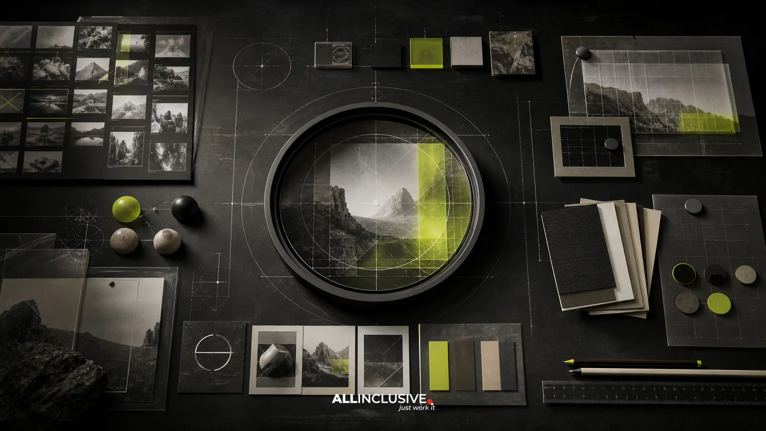
Brand photography guidelines define how a company should look when it uses photographs across its website, campaigns, presentations, social channels, sales materials, and internal communications. They translate broad brand attributes—such as confident, human, precise, or approachable—into repeatable decisions about subjects, settings, lighting, composition, color, editing, and image use.
The goal is not to make every image identical. A strong system creates enough consistency for the brand to be recognizable while leaving room for real people, changing environments, and different content needs. This makes photography guidance an operational part of a broader brand guidelines system, not merely a mood board.
What brand photography guidelines should cover
A useful guide answers the questions a photographer, marketer, designer, or content producer is likely to ask before selecting or commissioning an image. At minimum, document these areas:
- Purpose: what photography needs to communicate and where it will appear.
- Subjects: who or what can be shown, including customers, employees, products, spaces, and details.
- Environment: preferred locations, backgrounds, context, and visual complexity.
- Composition: framing, crop flexibility, focal point, perspective, and negative space.
- Light and color: lighting character, contrast, temperature, saturation, and retouching boundaries.
- People and representation: casting principles, behavior, wardrobe, accessibility, and authenticity.
- Technical delivery: aspect ratios, resolutions, file formats, naming, and asset storage.
- Usage: licensing, permissions, model releases, restrictions, and expiration dates.
These decisions should connect to the larger visual identity rather than operate independently. For context, compare the photography section with related guidance for brand typography and brand illustration.
Start with a photography role and audience map
Before choosing a visual style, identify what photography must help the organization do. A corporate recruiting image, product detail, customer story, and executive portrait may all belong to one brand, but they serve different communication jobs.
Create a simple matrix with the content type, audience, message, channel, and required image format. For example, a customer story may need candid interaction and horizontal crops for a web page, while a product detail may require controlled lighting and precise color reproduction for a sales sheet. This prevents one aesthetic rule from being applied where it does not fit.
Also distinguish between brand signals and content requirements. A warm color grade may be a brand signal. Showing a product feature clearly is a content requirement. When the two conflict, the guide should state which takes priority.
Define the visual principles
Most photography guidelines become easier to use when they begin with three to five short principles. Each principle should describe observable behavior rather than an abstract aspiration.
| Vague direction | More usable direction |
|---|---|
| Be authentic | Show people engaged in a real task, with natural posture and visible context. |
| Keep it modern | Use uncluttered compositions, purposeful details, and contemporary spaces without relying on trend effects. |
| Make it welcoming | Favor open body language, eye-level viewpoints, and balanced light with moderate contrast. |
| Be premium | Use deliberate framing, controlled backgrounds, accurate materials, and restrained retouching. |
These principles become evaluation criteria. Someone reviewing an image should be able to explain which principle it supports and where it falls short.
Set rules for subjects and scenes
People
Specify whether the brand favors posed portraits, documentary moments, environmental portraits, or a combination. Describe the desired level of interaction. Should people look at the camera, focus on each other, or remain absorbed in an activity? Give guidance on wardrobe without making the result feel uniform. For example, you might recommend coordinated neutrals and brand-compatible accent colors while avoiding visible competitor marks, distracting patterns, or costumes that feel artificial.
Representation guidance should be practical and respectful. Consider age, ability, race, gender expression, body diversity, workplace roles, and cultural context. Avoid treating representation as a casting checklist alone; show people with agency and relevance to the story.
Products and objects
Product photography often needs stricter controls than lifestyle photography. Define acceptable angles, surface treatments, reflections, background tones, scale references, and color accuracy requirements. State when compositing or generated backgrounds are allowed, and identify cases where the product must be shown exactly as delivered.
Places and environments
Describe preferred settings such as real workplaces, homes, streets, studios, or abstract surfaces. Include guidance on environmental clues: signage, architecture, technology, clutter, and weather. A location can communicate industry and credibility, but too much contextual detail may date an image or limit its use across markets.
Give composition and crop guidance
Photography is frequently reused in layouts that were not known at the time of capture. Guidelines should therefore explain not only the ideal composition but also how much flexibility is needed.
- Define preferred viewpoints, such as eye-level, overhead, close-up, or wide environmental perspectives.
- Specify whether the subject should be centered, offset, or placed along an implied grid.
- Show how negative space supports headlines, buttons, or other interface elements.
- Provide examples of safe crops for common placements, including landscape, square, portrait, and full-bleed formats.
- Explain what must remain visible when an image is cropped.
When digital channels are important, capture or select images with responsive cropping in mind. A technically beautiful image can fail if the subject is too close to one edge or if the focal point disappears in a mobile crop.
Document lighting, color, and editing
Lighting has a strong effect on perceived brand character. Describe whether images should feel soft or directional, bright or moody, warm or neutral, polished or spontaneous. Avoid relying only on adjectives; show paired examples or explain the visual consequences.
Editing guidance should cover exposure, contrast, skin tones, saturation, shadows, highlights, grain, sharpening, and background cleanup. It should also set boundaries for retouching. Removing temporary distractions may be acceptable, while changing a person’s body, altering product color, or creating a misleading scene may undermine trust.
If the brand uses color intentionally, define how photography interacts with the broader palette. This might mean reserving strong brand colors for environments or props, using a restrained grade so interface colors remain prominent, or allowing natural colors when accuracy matters. Photography should support the identity system without forcing every image through the same filter.
Separate image categories when one style is not enough
Many organizations need a small photography architecture rather than one universal look. Common categories include:
- People: portraits, teamwork, customer interaction, and culture.
- Products: controlled views, details, demonstrations, and packaging.
- Places: facilities, environments, neighborhoods, and destinations.
- Processes: making, shipping, researching, servicing, or collaborating.
- Details: materials, textures, tools, interfaces, and supporting visual moments.
For each category, define the job, preferred visual treatment, suitable channels, and examples to avoid. This creates variety within a coherent system and helps teams choose an image type based on communication needs rather than personal taste.
Build do-and-don’t examples that explain the reason
Examples are usually more useful than a long list of rules. Include approved and rejected examples with short annotations. A “do” example might show a subject in relevant context with enough negative space for a headline. A “don’t” example might be technically attractive but too generic, heavily staged, tightly cropped, or difficult to use in common layouts.
Explain the decision, not just the verdict. Teams can apply a principle to new situations when they understand why an image works. Include edge cases such as stock photography, screenshots, user-generated content, archival images, and images supplied by partners.
Plan the operational layer
Photography guidelines only work when people can find and apply the right assets. Pair the document with an organized library that includes:
- Clear folders or collections by image category, campaign, market, or status.
- Preview images and searchable metadata.
- File names that identify subject, date, orientation, and usage where relevant.
- Original files separated from approved exports.
- License information, model releases, property releases, and expiration dates.
- Crop variants or focal-point notes for important responsive placements.
- An owner responsible for approvals, updates, and archive decisions.
Decide which version is authoritative. A PDF can be useful for onboarding and review, while a web-based or design-tool reference is easier to update. The asset library should remain the source for usable files; the guideline document should explain how to select and use them.
Account for licensing, consent, and accessibility
Technical quality does not resolve rights issues. Record what the organization is permitted to do with each image, including territory, duration, media, exclusivity, and modification rights. Stock licenses, model releases, property permissions, and user-generated content may carry different conditions.
Build accessibility into selection and production. Maintain meaningful alt text for informative images, avoid placing essential information only inside a photograph, and check contrast when text overlays are planned. Do not use a decorative treatment that makes an important subject difficult to understand.
Test the system with real use cases
Before publishing the guide, test it against actual requests from marketing, sales, recruiting, product, and communications teams. Ask each person to select or brief an image using the draft guidance. Look for unanswered questions:
- Can a non-designer tell which category an image belongs to?
- Can a photographer understand the desired behavior without guessing?
- Can a designer find images that survive common crops?
- Can a marketer confirm rights and approval status?
- Can a vendor use the system without a separate verbal explanation?
Revise rules that repeatedly produce ambiguity. A shorter guide with clear examples is more likely to be used than a comprehensive document that requires interpretation.
Brand photography guidelines checklist
- Define the communication role of photography and its primary audiences.
- Write three to five observable visual principles.
- Document subjects, settings, wardrobe, behavior, and representation considerations.
- Specify composition, focal points, negative space, and responsive crops.
- Describe lighting, color, editing, retouching, and authenticity boundaries.
- Separate photography categories where different rules are necessary.
- Include annotated examples and edge cases.
- Connect the guide to an asset library with ownership and metadata.
- Document licensing, releases, accessibility, and expiration requirements.
- Test the system with real internal teams and external vendors.
How photography fits into the broader brand system
Photography guidelines should reinforce the relationships among identity elements rather than compete with them. Typography affects how much negative space an image needs. Illustration and iconography may fill communication needs that photography cannot. Layout rules determine viable crops, while voice and messaging influence whether an image should feel explanatory, aspirational, or documentary.
For a wider view of how these pieces are coordinated, explore the brand identity framework and related brand iconography guidance. If you are mapping the full design system across channels, the broader design resource provides additional context.
The practical measure of success is not whether every image looks the same. It is whether different teams and vendors can make compatible image decisions quickly, confidently, and responsibly. When the rules, examples, library, and review process work together, brand photography becomes a dependable system rather than a matter of individual preference. For the broader structure and deliverables of a complete brand standards system, see brand guidelines.


