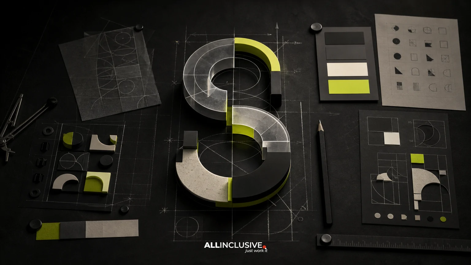
Brand typography guidelines define how an organization uses type consistently across every customer and internal touchpoint. They should do more than name a primary font: a useful system explains hierarchy, pairing, spacing, sizing, accessibility, licensing, and fallback behavior.
The goal is operational clarity. A designer, marketer, developer, sales representative, or outside vendor should be able to make a sound typographic decision without guessing. That makes typography guidelines one working component of a broader brand guidelines system, not an isolated list of font names.
What brand typography guidelines should cover
A practical typography section usually contains seven connected parts:
- Type roles: the jobs assigned to display, heading, body, utility, and specialized styles.
- Font families: approved primary, secondary, and fallback fonts.
- Hierarchy: how size, weight, spacing, and placement signal importance.
- Pairing rules: which families or styles may appear together and why.
- Composition: rules for line length, leading, alignment, casing, and whitespace.
- Technical usage: web formats, licensing, file access, and implementation guidance.
- Examples: real applications showing correct and incorrect decisions.
These elements should be documented together. A font choice without usage rules creates ambiguity; a hierarchy without implementation guidance creates production errors.
Start with roles, not font names
Typography becomes easier to manage when each style has a defined role. Avoid organizing the system only around labels such as “Font A” and “Font B.” Those labels describe assets, not decisions.
| Role | Typical use | Key decisions |
|---|---|---|
| Display | Campaign headlines, covers, hero statements | Scale, expressive range, short-line behavior |
| Heading | Page titles, section headings, card titles | Weight, hierarchy, responsive behavior |
| Body | Paragraphs, product information, long-form reading | Legibility, line length, leading, language support |
| Utility | Labels, metadata, navigation, buttons | Compactness, contrast, uppercase or casing rules |
| Data or technical | Tables, figures, code, specifications | Numeral design, alignment, character distinction |
Not every brand needs five roles. A small organization may need one family with several weights and a carefully defined display treatment. The right number depends on the brand’s communication needs, not on the number of fonts available.
Define a usable typographic hierarchy
Hierarchy tells readers what to notice first, what to scan next, and what to read in sequence. It should be recognizable even when color, imagery, or layout changes.
Specify the variables that create hierarchy
- Size: define relative relationships rather than relying only on isolated point values.
- Weight: state which weights are approved for emphasis and which are reserved for specific roles.
- Leading: set line-height ranges for headings, body copy, captions, and dense interface content.
- Tracking: document letter-spacing adjustments, particularly for uppercase labels and large display text.
- Case: clarify whether headings use sentence case, title case, uppercase, or mixed treatment.
- Placement: show how typography interacts with margins, grids, imagery, and adjacent components.
Use a type scale or token system when the brand appears across websites, applications, presentations, and templates. Tokens such as “display-large,” “heading-medium,” and “body-default” are easier to implement consistently than informal descriptions such as “big headline” or “small text.”
Document responsive behavior
A desktop headline may need a smaller size, tighter spacing, or a different line break on mobile. Guidelines should show at least a large-screen and small-screen example for important styles. Specify whether text scales fluidly, steps down at breakpoints, or uses a fixed range.
Also define what happens when copy is longer than expected. A heading that works in a two-line marketing example may become four lines in a product interface. Explain whether teams should reduce size, adjust measure, rewrite the copy, or use an approved alternate style.
Choose type pairings with a clear purpose
Font pairing is not simply the search for two fonts that look different. A successful pairing gives each family a distinct job while preserving a coherent brand voice.
Evaluate functional contrast
Consider contrast in structure, not novelty. A geometric sans paired with a humanist sans may create enough distinction through proportions and details. A serif display face paired with a neutral sans can separate expressive headlines from highly readable body copy. Two families with similar proportions and density may compete rather than clarify.
Assess pairings using these questions:
- Can readers distinguish the roles quickly?
- Do the fonts share a compatible tone?
- Do their x-heights, widths, and weights create balanced blocks?
- Do they include the characters, languages, symbols, and numerals the organization needs?
- Can they perform across print, web, presentation, and interface contexts?
- Are the licensing and file-delivery requirements manageable?
Limit the number of active families
More fonts do not automatically create more flexibility. Each additional family increases training, implementation, licensing, and quality-control demands. Many systems can remain expressive with one family, one complementary family, and a small set of approved weights.
If a decorative face is required for campaigns, treat it as a controlled exception. Define where it may appear, what sizes support legibility, and which channels should use the core system instead.
Write rules for readability and accessibility
Typography guidelines should protect reading quality, not only visual consistency. Brand expression must work for people scanning a page, reading on a small screen, using magnification, or encountering content in less-than-ideal conditions.
- Set a readable body-text size range for each major channel.
- Use line lengths that support comfortable scanning and sustained reading.
- Provide sufficient contrast between text and its background.
- Do not use color alone to communicate hierarchy or meaning.
- Keep links, controls, and focus states visibly distinguishable.
- Check thin weights at small sizes and on lower-quality displays.
- Test numerals, punctuation, quotation marks, and special characters in real content.
- Use meaningful heading structure in digital products rather than simulating hierarchy with visual styling alone.
Accessibility requirements vary by product, audience, and jurisdiction, so guidelines should identify the internal owner responsible for final digital validation. A visual specification is not a substitute for testing in the actual interface.
Separate channel rules from core principles
The core system should remain recognizable, but typography often needs channel-specific instructions.
Web and product interfaces
Define webfont formats, loading behavior, fallback stacks, variable-font settings if applicable, and rules for text that expands or wraps. Include guidance for navigation, forms, alerts, tables, and error messages—not only promotional pages.
Print and packaging
Document approved print files, minimum sizes, overprint considerations, paper-dependent adjustments, and how type behaves at different production scales. Small legal or regulatory copy may need a separate review path.
Presentations and documents
Office software may not support the preferred fonts reliably. Provide a practical substitute for common document environments and explain when users should distribute a PDF instead of an editable file.
Social and campaign content
Campaign templates should clarify how much typographic experimentation is permitted. Show examples for short headlines, longer statements, captions, and text over photography. Coordinate these rules with the broader brand photography guidelines so image treatment does not compromise legibility.
Include licensing and production requirements
Typography guidelines are incomplete if teams cannot legally or technically use the approved fonts. Record the license owner, permitted environments, renewal terms, and restrictions relevant to web, desktop, app, advertising, and vendor use.
Maintain an accessible font package or asset library with version-controlled files, installation instructions, webfont files where permitted, and a contact for access questions. If a vendor needs to produce work, state how fonts should be supplied and whether final files must be converted or accompanied by editable assets.
Also define fallback behavior. A fallback is not merely a substitute that looks similar; it should preserve approximate width, tone, and readability so layouts do not fail when the primary font is unavailable.
Show correct and incorrect applications
Examples make rules easier to interpret than prose alone. Include annotated samples such as:
- A headline and body pairing with role labels.
- A responsive page showing hierarchy at two viewport sizes.
- A presentation slide using an approved fallback.
- A dense table with aligned numerals and readable labels.
- A campaign image with safe text placement and sufficient contrast.
- A misuse example showing stretched type, unapproved weights, excessive tracking, or inconsistent casing.
Explain the reason behind each example. “Do not use this” is less useful than “this weakens hierarchy because the utility style is competing with the headline.”
Build an implementation-ready specification
A typography section should be usable in the tools where work is produced. Consider delivering the guidance in complementary formats:
- Reference document: principles, rationale, examples, and governance.
- Design-library documentation: styles, tokens, components, and responsive states.
- Web implementation notes: font loading, stacks, weights, and performance considerations.
- Template files: presentation, document, social, or campaign starting points.
- Asset library: approved font files, licenses, and version information.
Keep the single source of truth clear. If a PDF, design file, code library, and template disagree, teams will create their own interpretations. Assign ownership for updates and provide a change log for material revisions.
Brand typography guidelines checklist
Before publishing the system, confirm that it answers the following questions:
- What are the approved type roles and their intended jobs?
- Which families, weights, styles, and alternates are allowed?
- How are hierarchy and responsive changes defined?
- Which pairings are preferred, acceptable, or prohibited?
- Are body text, controls, numerals, and long-form reading tested?
- What accessibility checks are required before release?
- How are web, print, presentation, and vendor workflows handled?
- Where are licensing records and current font files stored?
- What fallback fonts should be used in common environments?
- Who approves exceptions and updates the system?
How typography fits into the wider brand system
Typography should reinforce the same positioning expressed through identity, color, imagery, illustration, layout, and voice. A bold display style may require restrained photography; a technical type system may need an equally precise icon and diagram language. Review the rules alongside the brand color guidelines and brand illustration guidelines to identify conflicts between emphasis, contrast, and visual density.
For teams defining the broader structure, the brand identity provides the strategic and visual context, while design covers the wider set of communication and experience decisions. The typography document should then turn those principles into repeatable choices.
Final takeaway
Effective brand typography guidelines combine a small, purposeful set of type choices with explicit rules for hierarchy, pairing, accessibility, licensing, channel behavior, and governance. The best test is practical: can an internal team or external vendor produce consistent work without asking the brand owner to resolve every typographic decision? If not, add roles, examples, fallback guidance, or implementation details before treating the system as complete. When the full brand system needs to be structured for adoption, explore the dedicated brand guidelines resource.