
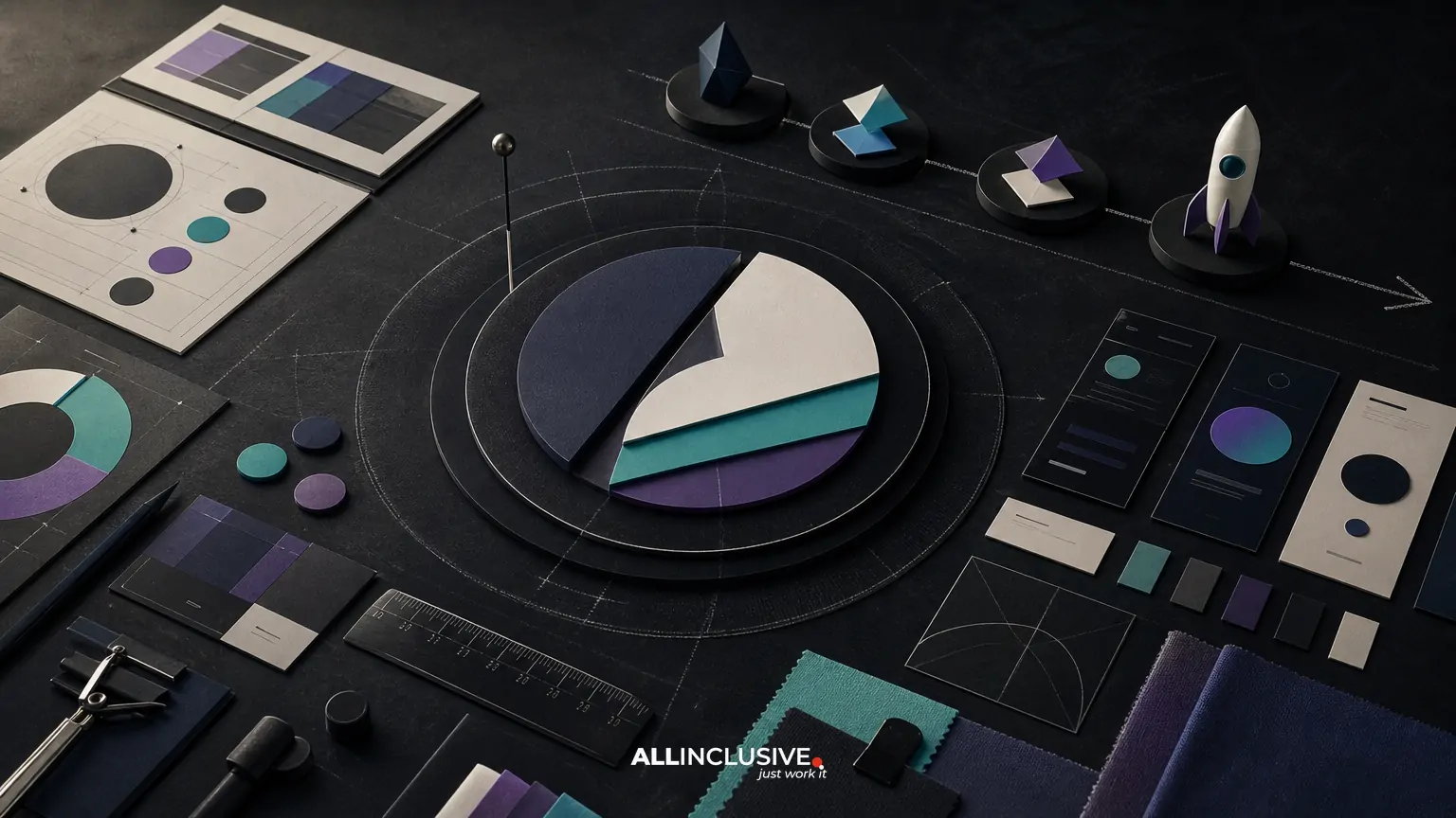
A startup brand identity is more than a logo created before launch. It is the connected system of decisions that makes a company recognizable, credible, and consistent across its website, product, sales materials, social channels, hiring touchpoints, and future campaigns.
Before launch, most startups do not need an enormous brand manual or every possible asset. They do need enough strategic and visual structure to make good decisions quickly. That usually means a clear positioning foundation, a flexible logo system, defined typography and color, an intentional image and icon direction, reusable templates, practical guidelines, and a rollout plan.
This guide explains what to build, what to prioritize, and where startups can make sensible trade-offs without reducing brand identity to logo-only work. For a broader view of identity strategy and execution, see the brand identity design overview.
What a startup brand identity should accomplish
A pre-launch identity should help the company answer five practical questions:
- Who are we for? The identity should reflect the audience’s expectations without becoming indistinguishable from competitors.
- What do we stand for? Visual choices should reinforce the company’s positioning, personality, and promise.
- How should we look and sound? Teams need repeatable rules for design and communication.
- Where will the identity appear? The system must work in the actual channels the startup will use first.
- How can it grow? The identity should support new products, campaigns, audiences, and team members.
The goal is not visual perfection in isolation. It is a usable system that helps a small team present one coherent company wherever prospects encounter it.
The essential parts of a pre-launch identity
1. A concise strategic foundation
Visual design becomes more effective when it is anchored in a few written decisions. Before designing assets, document the audience, category, problem, differentiator, value proposition, personality, and primary proof points. This does not need to become a lengthy brand strategy deck. A focused brief is often enough to keep design choices connected to business priorities.
Also identify the situations where trust must be established quickly. A B2B startup may need credibility in a sales deck and procurement review. A consumer product may need immediate recognition in a mobile interface, social feed, or retail context. Those priorities should influence the identity system.
2. A flexible logo system
The logo is an important identifier, but it is only one part of the system. A useful startup logo package normally includes a primary mark, a compact or responsive variation, a wordmark or symbol where appropriate, light and dark versions, and clear usage guidance.
Test the logo at the sizes and in the environments that matter at launch: website navigation, browser or app contexts, presentation covers, social profiles, email signatures, product screens, and printed materials. A mark that works in a large presentation but fails as a small digital identifier creates avoidable friction.
If the startup has a narrow need and limited resources, a carefully developed logo system can be a reasonable first step. However, the company should avoid treating logo production as the full identity. The logo design resource can help clarify that specific deliverable without confusing it with the broader system.
3. Typography with a clear hierarchy
Choose typefaces based on both character and operational reality. Consider legibility, licensing, web availability, language support, weights, and performance. A startup typically needs a display style, a text style, or one versatile family with a defined hierarchy.
Document how typography works in practice: headline levels, body copy, labels, captions, buttons, tables, and presentation content. A typeface choice without hierarchy leaves each contributor to make a new decision, which quickly produces inconsistency.
4. A purposeful color system
Define primary, secondary, neutral, and functional colors rather than selecting a few attractive swatches. Include usage ratios, contrast expectations, background combinations, and rules for emphasis. Product and digital teams should also consider accessible text contrast and states such as hover, focus, success, warning, and error.
Color should support recognition and communication. If every color is treated as an accent, none has a clear role. Conversely, a limited palette can become restrictive if it does not account for data visualization, editorial layouts, campaigns, or product states.
5. Imagery, illustration, and iconography
Decide what kinds of images belong to the brand and what should be avoided. The direction might involve documentary photography, controlled studio images, abstract compositions, product screenshots, illustration, diagrams, or a combination. Define qualities such as subject matter, composition, lighting, cropping, texture, and treatment.
Iconography deserves the same attention. Establish a consistent stroke or fill approach, corner treatment, scale behavior, and level of detail. If the startup sells a technical product, diagrams and interface imagery may carry more value than generic stock photography. If it is building a community-oriented brand, human context may be more important than abstract graphics.
6. Motion and interaction principles
Motion does not need to be elaborate at launch, but digital brands benefit from basic guidance. Define how elements enter, transition, respond, or provide feedback. A restrained motion language can make the product and marketing site feel related without requiring custom animation for every screen.
Document principles rather than a large library of effects: speed, easing, intensity, and when motion should be avoided. Consider reduced-motion preferences and performance on real devices.
7. Templates for high-frequency work
Templates turn identity decisions into daily behavior. Prioritize the materials the team will create repeatedly during the first six to twelve months, such as:
- Sales presentations and one-page company overviews
- Case study or customer proof layouts
- Social graphics and announcement formats
- Email signatures and internal documents
- Recruiting materials and job-posting graphics
- Event, webinar, or partner assets
- Product launch and campaign layouts
Templates should balance consistency with flexibility. A rigid file that only its creator can edit is not a useful system. Define editable components, spacing, image behavior, and examples of appropriate variation.
8. Guidelines that support decisions
Brand guidelines should explain how to use the identity, not merely display polished mockups. Include the core story, logo rules, typography, color, imagery, iconography, motion principles, layout behavior, accessibility considerations, and examples of correct application.
Keep guidance proportional to the team. A startup may need a concise digital guide with linked assets and practical examples rather than a large static document. Include a clear source of truth so people know which files are current.
For a deeper look at this operational layer, read the brand guidelines design resource.
How to prioritize when budget or time is limited
Not every startup can develop every brand component at the same depth before launch. Prioritize based on business risk and frequency of use.
| Priority | Build before launch | Why it matters |
|---|---|---|
| High | Positioning brief, logo system, typography, color, core messaging, website direction | These choices affect most early customer and investor touchpoints. |
| High | Sales or fundraising presentation template | Repeated use exposes inconsistency quickly and can affect credibility. |
| Medium | Imagery, iconography, social, recruiting, and campaign templates | These enable coordinated growth after the initial launch. |
| Later | Extensive motion library, broad illustration system, rare-use applications | These can be developed after real use reveals the highest-value needs. |
The right sequence depends on the business model. A product-led SaaS company may need interface and documentation patterns early. A services startup may need presentation, proposal, and case-study templates first. The identity should follow actual exposure points rather than a generic deliverables list.
Common startup brand identity trade-offs
Speed versus distinctiveness
Premade assets and familiar visual conventions can accelerate launch, but they may make the company difficult to recognize. A faster process is worthwhile when it preserves a few distinctive, reusable cues: a particular typographic relationship, compositional system, color behavior, illustration logic, or verbal pattern.
Flexibility versus control
A system with no rules becomes inconsistent. A system with too many rules becomes difficult to use. Define the decisions that must remain consistent and leave room for teams to adapt layouts, content, and imagery within those boundaries.
Polish versus proof
Early design should not hide an unclear offer. If the product, audience, or value proposition is still changing, avoid overcommitting to complex visual production. Establish a strong foundation, then allow the identity to mature as the business gathers customer and market evidence.
Custom work versus maintainability
Highly custom assets can create distinction, but they may require specialist support every time the team needs a new variation. Favor components that internal teams, contractors, and partners can understand and use correctly.
A practical pre-launch brand identity checklist
Use this checklist during planning, review, or handoff:
- Audience, category, positioning, personality, and proof points are documented.
- The identity has a clear relationship to the product or service experience.
- Primary, compact, light, and dark logo configurations have been tested.
- Typography works across web, presentation, and common office formats.
- Color roles and contrast expectations are documented.
- Imagery and iconography have defined selection and treatment rules.
- Core templates reflect the channels the startup will actually use.
- Guidelines include examples, not only abstract specifications.
- Assets are organized in a current, accessible source of truth.
- Product, marketing, sales, recruiting, and leadership stakeholders know how to use the system.
- The identity has been tested at small sizes, on real devices, and in realistic content.
- There is an owner responsible for future updates and exceptions.
How to test the identity before launch
Review the system in context rather than judging individual assets on a blank artboard. Create a small set of realistic applications: a homepage section, a sales slide, an email, a social post, a product screen, and a recruiting or partner document.
Look for recognition without relying on the logo. Ask whether the visual hierarchy is clear, whether the system works with imperfect real-world content, and whether a non-designer can apply the templates. Test light and dark backgrounds, long headlines, short labels, dense information, mobile widths, and common accessibility scenarios.
It is also useful to ask stakeholders to make a simple asset using the guidelines. Their questions will reveal where the system is underspecified. Fixing those gaps before launch is usually more valuable than adding another decorative asset.
What to avoid
- Starting with visual trends: A current style may not express the company’s position or remain useful as the business evolves.
- Designing in isolation from content: Identity should be tested with real headlines, product language, data, and customer examples.
- Creating templates without ownership: Someone must maintain source files, approve changes, and retire outdated assets.
- Writing rules nobody can apply: Guidance should answer practical questions for everyday users.
- Confusing consistency with repetition: A system can be coherent while allowing varied layouts, stories, and campaigns.
- Launching without a rollout plan: Decide which surfaces change first, who owns implementation, and how old assets will be replaced.
When to expand the identity after launch
Post-launch development should be guided by evidence. Review where teams create work most often, where customers encounter confusion, and where the identity fails to communicate the intended position. That may lead to a stronger presentation system, a more complete product language, refined illustration, event assets, packaging, or a clearer sub-brand architecture.
An identity audit can help organize that next phase. The brand identity audit guide offers a useful framework for identifying gaps and prioritizing improvements. Startups selling software can also compare their needs with the considerations in SaaS brand identity, while companies serving professional buyers may find the B2B brand identity guide relevant to their rollout decisions.
Final takeaway
The best startup brand identity is not the largest pre-launch package. It is a coherent, distinctive, and usable system that supports the company’s most important early interactions. Build the strategic foundation, then connect the logo to typography, color, imagery, iconography, motion, templates, guidelines, and rollout. Prioritize what the team will use repeatedly, test it in realistic contexts, and expand it as evidence accumulates.
When you are ready to evaluate the full scope, deliverables, and process for a startup identity system, use the brand identity service page as the next commercial reference point. For related design planning across the business, the broader design services overview provides additional context.


