
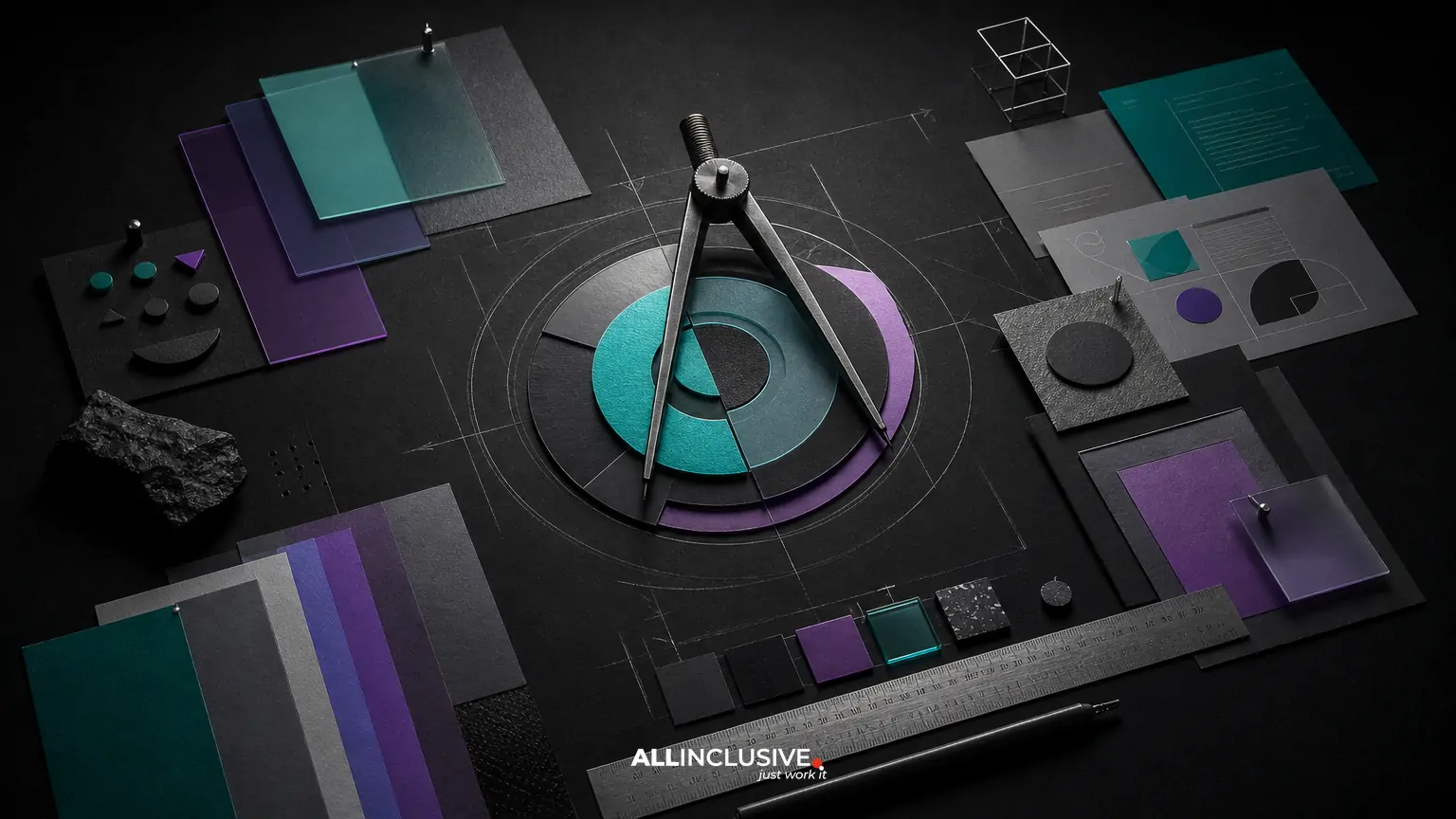
B2B brand identity is the coordinated system a company uses to look, sound and behave consistently across sales, marketing, product and customer communications. It is more than a logo: it can include typography, color, imagery, iconography, motion, templates, guidelines and the operating rules that connect them.
The central challenge is balance. A B2B identity must be recognizable enough to stand apart, but credible enough to support trust, procurement conversations and long-term relationships. The strongest systems do not choose between personality and professionalism. They define where each should appear, how strongly it should be expressed and how the system remains usable as the organization grows.
This article explains the scope of a B2B identity, the trade-offs involved and a practical way to evaluate the work before investing in a full rollout. For the broader service scope, see brand identity design.
What a B2B brand identity includes
A complete identity is a connected set of decisions rather than a collection of isolated assets. The exact scope varies by organization, but most effective systems address the following layers.
1. Strategic direction
Visual decisions should follow a clear understanding of the company’s audience, offer, category and competitive context. Useful inputs include positioning, differentiators, buying committee needs, brand personality and the moments where trust is won or lost.
2. Core visual identifiers
The logo, wordmark, symbol and supporting marks provide recognition. They should work across common B2B contexts, including proposals, presentations, websites, social profiles, product interfaces and small digital placements. A logo is important, but it is only one part of the identity system. When the logo carries all the recognition burden, the brand can become repetitive and difficult to scale.
A focused logo design process may be appropriate when the mark itself is the primary need. A broader identity project is more suitable when the company needs a coherent visual language around that mark.
3. Typography and color
Typography establishes hierarchy, tone and reading comfort. Color creates recognition, emphasis and contrast. In B2B environments, these choices also affect practical concerns such as accessibility, chart legibility, document reproduction and performance across light and dark interfaces.
4. Imagery, iconography and graphic elements
Photography, illustration, diagrams, icons, patterns, shapes and other graphic devices give the system range. A technology company may need a visual language for product screenshots and data. A professional services firm may need rules for portraits, research graphics and editorial layouts. Without guidance, teams often default to inconsistent stock imagery or decorative elements that do not support the positioning.
5. Motion and digital behavior
For brands with digital products, motion can define how the identity behaves rather than merely how it looks. Transitions, animation principles, interaction states and video treatments should be considered when they are relevant to the customer experience. Motion should clarify hierarchy and reinforce the brand, not add friction or distract from the message.
6. Templates and tools
Templates turn identity decisions into repeatable behavior. Common examples include presentation decks, proposal documents, social graphics, email assets, reports, event materials, sales sheets and campaign layouts. A system that looks excellent in a static presentation but is difficult for teams to use will lose consistency quickly.
7. Guidelines and rollout rules
Guidelines explain how the system works. They may cover logo usage, spacing, color formulas, type hierarchy, image selection, layout, accessibility, examples and production requirements. The best documentation is specific enough to prevent predictable errors without becoming so restrictive that teams stop using it. See brand guidelines design for the documentation layer.
Why credibility and distinction can conflict
Many B2B categories share visual conventions: restrained palettes, familiar sans-serif typefaces, formal photography and predictable layouts. These conventions can signal competence, but following them too closely makes brands difficult to recognize. At the other extreme, an identity built around novelty may attract attention while creating uncertainty about seriousness, reliability or fit.
The right balance depends on the buying situation. A cybersecurity provider may need to communicate rigor before expressiveness. A modern consulting firm may have more room for editorial character. A software company selling to enterprise teams may need a system that feels innovative in marketing but exceptionally clear inside product and sales materials.
Instead of asking whether an identity looks conservative or bold, evaluate four questions:
- Does it signal category competence? Prospects should understand what kind of organization they are evaluating.
- Does it create recognition? The system should have memorable elements beyond the logo.
- Does it support proof? Case studies, data, credentials and product demonstrations need an appropriate visual container.
- Does it remain usable? Internal teams and partners should be able to apply it without redesigning every asset from scratch.
A practical B2B brand identity process
1. Audit the current experience
Review the customer journey rather than only the brand assets. Gather website pages, sales decks, proposals, product screens, email templates, social content, events collateral and internal documents. Look for repeated problems: inconsistent type, weak hierarchy, low contrast, competing logo treatments, generic imagery or layouts that cannot accommodate real content.
2. Define the design criteria
Translate business and audience needs into criteria that can guide decisions. For example, the identity may need to feel precise, approachable and technically fluent; work for both enterprise buyers and practitioners; support complex data; and remain recognizable at small sizes.
3. Explore more than one visual direction
Concept development should test different ways to express the criteria. Directions may vary in typography, color temperature, image treatment, graphic structure or degree of expressiveness. The purpose is not to produce arbitrary options. It is to reveal meaningful trade-offs and create a basis for informed selection.
4. Build the system around real use cases
Test the identity on actual formats early. A homepage alone will not expose the constraints of a proposal cover, technical diagram, presentation slide, event booth, product interface or mobile view. Real content helps determine whether the system is flexible, legible and distinctive under pressure.
5. Create the minimum viable toolkit
Prioritize the assets that teams use most often and that create the greatest consistency risk. A practical first release may include the core identity, type and color rules, image direction, presentation and proposal templates, social or campaign components, and examples for common digital applications.
6. Document and enable adoption
Guidelines should be paired with accessible source files, clear ownership and a process for requesting new assets. Training or an internal launch can help teams understand not only what is allowed, but why the system is structured as it is.
How to evaluate a B2B identity before rollout
Use a test set that represents the company’s actual communication demands. The following checklist can expose weaknesses before they become expensive to fix.
| Evaluation area | Questions to ask |
|---|---|
| Recognition | Can people identify the brand through color, type, layout or imagery without relying on the logo? |
| Credibility | Does the system feel appropriate for the risk, complexity and buying cycle of the offer? |
| Clarity | Can users scan headings, proof points, diagrams and calls to action easily? |
| Flexibility | Does the system work for long-form content, short announcements, data-heavy pages and sales materials? |
| Accessibility | Are contrast, type sizes, focus states and information hierarchy considered across key applications? |
| Production | Can internal teams and vendors reproduce the work with available tools and specifications? |
| Governance | Is it clear who owns the system, approves exceptions and updates templates? |
Common mistakes in B2B brand identity projects
Designing only the logo
A polished mark cannot solve inconsistent layouts, generic imagery or unclear hierarchy. Logo work may be a valid project on its own, but it should not be presented as a complete identity system.
Confusing restraint with sameness
Professional does not have to mean visually anonymous. Distinction can come from a proprietary layout structure, a recognizable typographic relationship, a specific image treatment, a useful graphic device or a disciplined color accent.
Creating guidelines without operational tools
A document cannot compensate for missing templates or inaccessible assets. Teams need practical components that make the correct choice easier than improvisation.
Approving concepts without testing content
Identity systems often fail when they are judged only on idealized mockups. Test dense slides, long headlines, legal copy, charts, screenshots, partner logos and low-resolution placements before final approval.
Overusing novelty
Distinctive elements should serve recognition and meaning. Excessive visual experimentation can reduce comprehension, create production problems and make the brand appear less dependable in high-stakes contexts.
Adapting the system to different B2B models
The identity should reflect how customers encounter and evaluate the business. A SaaS company may need a strong relationship between brand, product UI and lifecycle communications. A professional services firm may depend more heavily on expertise-led content, proposals and people photography. An ecommerce organization may need a system that performs across product discovery, packaging, promotional campaigns and customer support.
These differences are useful when defining scope, not reasons to abandon system consistency. For more specific considerations, compare SaaS brand identity and professional services brand identity. An identity review can also sit within a broader design program when multiple customer touchpoints need coordinated improvement.
When to invest in a broader identity system
A broader project is worth considering when the organization is entering a new market, moving upmarket, launching a new category, integrating multiple business units, preparing for growth or experiencing visible inconsistency across teams. It may also be appropriate when the existing identity looks acceptable in isolation but fails across the full customer journey.
Before starting, identify the business decisions the system must support, the audiences that need to trust it, the channels that matter most and the internal capabilities available for rollout. This keeps the work focused on adoption and performance rather than visual novelty alone.
For an editorial overview of the commercial scope and deliverables involved, continue to the brand identity page. The goal is not simply to look different. It is to create a usable, recognizable system that helps every B2B interaction feel like part of the same credible organization.


