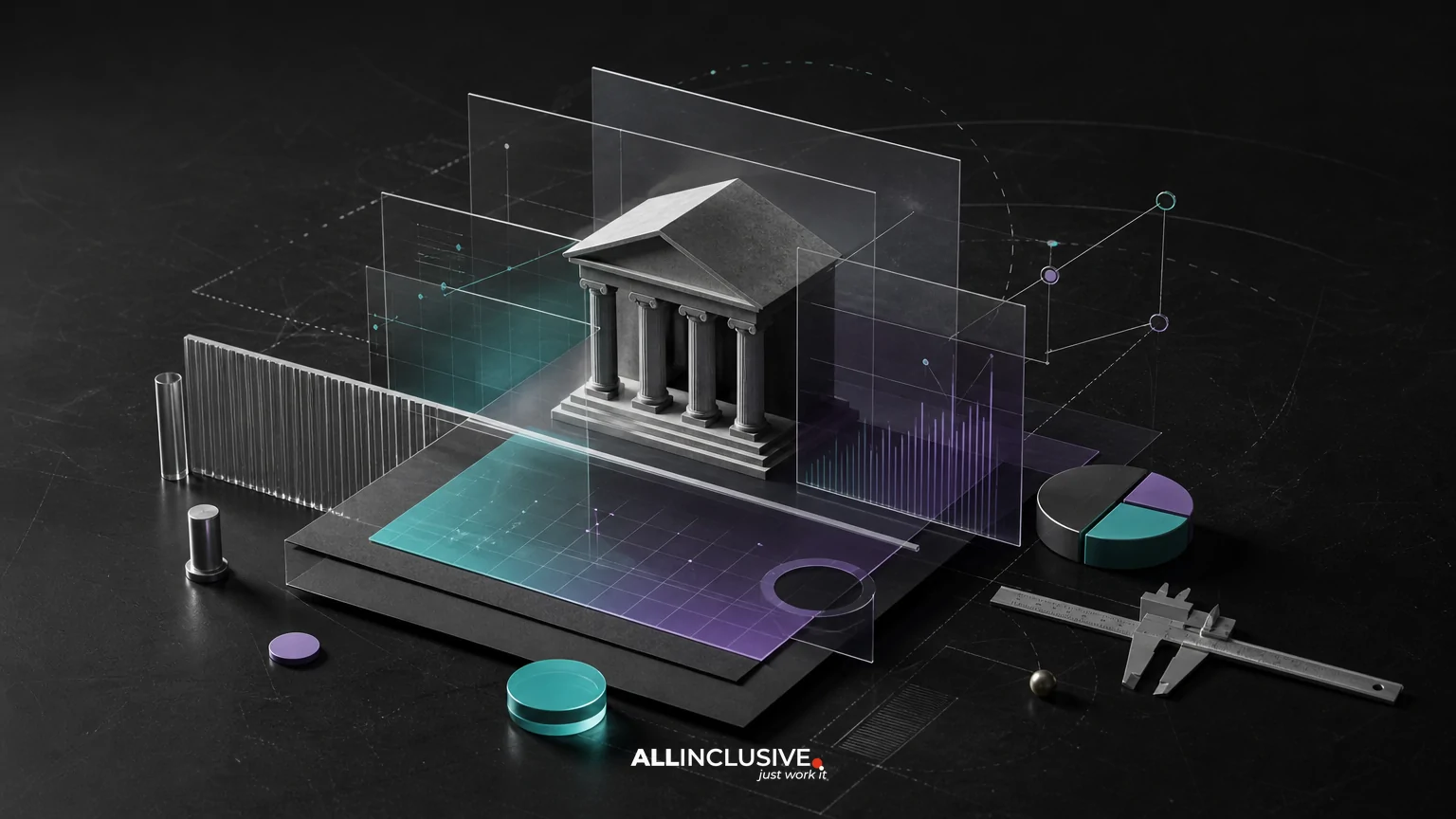
Fintech brand identity is more than a logo for a banking app, payments platform or financial software company. It is the connected visual system customers encounter across a website, product interface, pitch deck, email, support content, advertising and compliance materials.
The strongest systems balance three goals: making the business feel trustworthy, explaining complex products clearly and creating enough distinction to be remembered in a crowded category. That requires coordinated decisions about typography, color, imagery, iconography, motion, templates and governance—not just a mark.
This guide outlines what a fintech identity should include, the trade-offs teams need to resolve and a practical process for evaluating identity partners. For a broader view of how these elements fit together, see our brand identity design overview.
What makes fintech brand identity different?
Financial products are often high-consideration purchases. Customers may be entrusting a company with money, personal information, payroll, investments or business-critical transactions. At the same time, fintech brands frequently need to explain unfamiliar technology, regulatory concepts or pricing structures.
That creates a distinctive identity challenge. The brand must feel secure without becoming cold, modern without appearing experimental with customer funds and approachable without trivializing financial risk.
- Trust: Visual decisions should support perceptions of competence, stability and accountability.
- Clarity: The system should help people understand what the product does and what action to take next.
- Distinctiveness: The brand should avoid blending into a category full of generic blue palettes, abstract gradients and interchangeable technology imagery.
- Scalability: The identity must work across product screens, sales materials, partner channels and multiple audiences.
The core components of a fintech identity system
Logo and responsive mark architecture
A fintech logo needs to operate in contexts ranging from an app icon and browser tab to a conference backdrop and legal document. A complete system may include a primary wordmark, symbol, stacked arrangement, monochrome versions and small-size configurations.
The important question is not whether the logo looks impressive in a presentation. It is whether the mark remains recognizable at the size of a mobile notification, in a dense partner ecosystem or beside a long product name. Logo exploration should therefore be tested in realistic environments. A separate logo design process can support this component, but the logo should be developed as part of the larger identity system.
Typography for comprehension and confidence
Typography has an unusually practical role in fintech. Customers need to scan balances, rates, terms, alerts, transaction histories and calls to action. A type system should support hierarchy and readability across both marketing content and product-adjacent communications.
Consider the needs of large numbers, tabular figures, legal copy, multilingual expansion and accessibility. A distinctive display face may help the brand stand out, while a highly legible text face can carry product explanations and operational content. The goal is not novelty for its own sake; it is a reliable typographic structure that makes information easier to navigate.
Color with functional and emotional roles
Color can signal confidence, energy or approachability, but fintech palettes also need to carry functional meaning. Teams may use color to distinguish positive and negative movement, warnings, statuses, account categories or calls to action.
That makes color strategy more complex than selecting a primary brand color. Define how the palette behaves in light and dark environments, at different contrast levels and when color is unavailable. Do not rely on color alone to communicate account status or risk. Pair color with labels, icons, patterns or changes in position so information remains understandable.
Imagery and illustration
Generic stock photography often weakens fintech positioning because it can make a sophisticated product feel interchangeable. A stronger approach may use editorial photography, custom illustration, data-inspired compositions, physical textures or carefully art-directed scenes.
Imagery should reinforce the brand’s audience and promise. A consumer payments product may benefit from warmth and everyday context. An infrastructure platform may need a more precise visual language built around systems, connections and reliability. Whichever direction is chosen, establish rules for subject matter, cropping, composition, lighting and representation.
Iconography, data visualization and motion
Icons are useful when they clarify navigation, product concepts or educational content. They become confusing when every feature receives an ornamental symbol with no consistent logic. Define stroke, corner, proportion, optical weight and usage rules.
Fintech brands also need to consider data visualization. Charts, diagrams and dashboards should feel related to the identity while preserving legibility and accuracy. Motion can add feedback and personality in product demonstrations or marketing, but it should support understanding rather than distract from a financial decision.
Templates and guidelines
A brand that only works when a designer is present is not operationally complete. Build templates for the materials teams actually produce: sales presentations, investor updates, social graphics, email headers, reports, webinar slides, recruitment materials and partner toolkits.
Guidelines should explain the reasoning and constraints behind the system. Include logo use, typography, color roles, imagery, iconography, layout, accessibility considerations, examples of correct application and common failure modes. A dedicated brand guidelines system can turn identity decisions into repeatable behavior.
Trust versus differentiation: the central fintech trade-off
Many fintech teams begin with a familiar question: should the brand look conservative or disruptive? That framing is too narrow. Trust and differentiation are not opposite visual styles; they are outcomes created by a combination of credible behavior, clear communication and recognizable design choices.
A conservative identity may reduce perceived risk but disappear among established financial brands. A highly expressive identity may attract attention but raise questions about seriousness or operational maturity. The right balance depends on audience, product risk, buying cycle and category expectations.
| Decision | Lower-risk direction | More expressive direction | Evaluation question |
|---|---|---|---|
| Color | Restrained palette with familiar signals | Distinctive hues or unexpected combinations | Does the palette remain credible and accessible? |
| Typography | Neutral, highly legible type families | More characteristic display typography | Can customers still scan important information quickly? |
| Imagery | Documentary or institutional photography | Illustration, abstraction or editorial art direction | Does the imagery explain or reinforce the product? |
| Motion | Minimal transitions and functional feedback | More visible animation and branded movement | Does motion improve comprehension and respect user attention? |
A practical fintech brand identity process
1. Map audiences and trust moments
List the people who must believe in the brand: end users, finance leaders, compliance teams, developers, partners, investors and internal employees. Then identify moments when confidence matters most, such as onboarding, identity verification, pricing review, support escalation, payment confirmation or renewal.
This exercise prevents the identity from being designed only for launch materials. It also reveals where the visual system needs flexibility, reassurance or technical precision.
2. Audit the category and adjacent competitors
Review direct competitors, legacy institutions and brands from adjacent technology categories. Document recurring visual patterns, common claims and areas of sameness. The goal is not to reject every convention. Some conventions exist because they help users understand a product. The goal is to decide deliberately where to conform and where to create contrast.
3. Define the strategic design principles
Translate positioning into a small set of usable principles, such as “precise but human,” “clear before clever” or “infrastructure made understandable.” These principles should help teams choose between visual options later. Avoid vague adjectives that cannot guide production.
4. Build and test the system in context
Develop identity directions and place them into realistic applications: a product announcement, a pricing page, a presentation cover, an email, a mobile screen, a compliance notice and a partner lockup. Context testing exposes weaknesses that polished mood boards can hide.
5. Document, train and roll out
Prepare the necessary assets, templates and guidelines, then establish ownership. Decide who approves new applications, where files live, how vendors access assets and how the system will be maintained as products and markets change.
Fintech identity checklist
Use this checklist before approving a visual identity:
- Can the brand be recognized without relying on the full logo?
- Does the system work for both marketing content and operational communication?
- Are numbers, tables, legal language and small text easy to read?
- Does the color system include functional roles and accessible combinations?
- Can the identity distinguish products, audiences or tiers without fragmenting the brand?
- Are dark-mode, small-screen and low-bandwidth contexts considered where relevant?
- Are partner, co-branding and acquisition scenarios documented?
- Do templates help non-designers produce consistent work?
- Can the system express trust without copying traditional banks?
- Are guidelines specific enough to prevent common misuse?
Common mistakes to avoid
Designing the logo before defining the system
A logo-first process can produce a polished mark that has no supporting behavior. Establish the broader visual language early enough to understand how the mark interacts with type, color, layout and imagery.
Using “trust” as a substitute for strategy
Trust is not a color choice. It is supported by product experience, communication, transparency and consistent execution. The identity should make those qualities easier to perceive, not claim them without evidence.
Confusing complexity with sophistication
Layered gradients, elaborate illustrations and animated transitions may look advanced, but they can make a financial product harder to understand. Complexity should earn its place by improving explanation, recognition or usability.
Ignoring implementation ownership
Even a strong identity will decay if teams cannot find current assets or do not know which rules matter. Plan governance and rollout at the same time as the visual design.
Measuring attention without measuring comprehension
Distinctive work may attract notice, but fintech teams should also evaluate whether audiences understand the product, recognize key actions and feel confident moving forward. Qualitative feedback, usability review and internal application testing can reveal issues that surface-level visibility misses.
How fintech teams should evaluate identity partners
When reviewing studios or agencies, ask to see complete systems rather than isolated logo presentations. Look for evidence of responsive marks, typography, color behavior, imagery direction, templates, guidelines and real-world rollout thinking.
Useful questions include:
- How will the identity support product, marketing and sales teams at the same time?
- How will accessibility and information hierarchy influence visual decisions?
- How will the system work across customer, partner and investor communications?
- What applications will be tested before approval?
- What documentation and handoff materials are included?
- How will the identity evolve without losing recognition?
For additional industry context, compare the considerations in our guides to healthcare brand identity and ecommerce brand identity. The same system principles apply, but the trust moments, buying journeys and functional requirements differ.
Conclusion
A fintech brand identity succeeds when it makes a complex financial product feel understandable, credible and distinct across every meaningful touchpoint. The deliverable is not simply a logo package. It is a usable visual system with rules, assets, templates and governance.
If your team is ready to define or improve that broader system, review the design services overview and the dedicated brand identity page to determine the appropriate next step.