
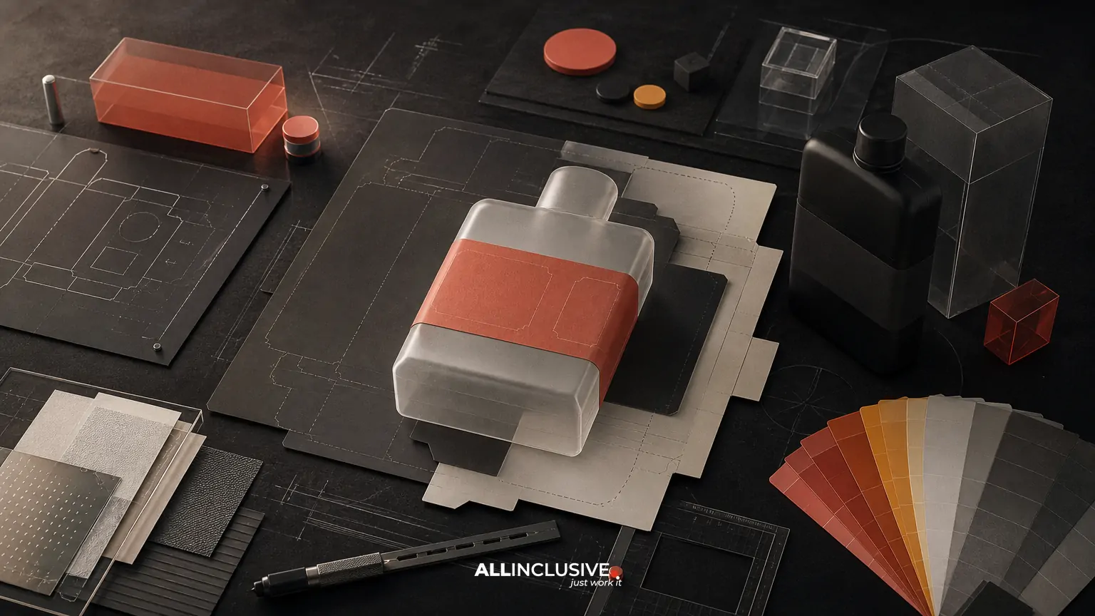
Label design services cover more than creating an attractive front panel. A useful engagement must translate brand strategy into a label that communicates quickly, accommodates required information, fits a physical package, survives production, and remains consistent across sizes or product variants.
For most teams, the right provider should be able to connect five disciplines: category and shelf research, information hierarchy, structural and material constraints, regulatory coordination, and print production. The goal is not simply a polished artwork file. It is a label system that can be approved, manufactured, applied, and extended without avoidable rework.
This guide explains what to evaluate, which decisions belong together, and where trade-offs commonly appear. For broader packaging scope, see packaging design services; a label project may be one component of a larger packaging system.
What label design services should include
Scope varies by provider, so define the deliverables before comparing proposals. A complete label engagement may include:
- Category, competitor, and shelf-context review
- Audience and purchase-occasion analysis
- Brand and product architecture recommendations
- Front-of-pack hierarchy and information flow
- Label dimensions, panel planning, and application constraints
- Material, finish, adhesive, and printing-process considerations
- Regulatory and required-copy placement coordination
- Artwork for multiple sizes, flavors, SKUs, or languages
- Digital mockups or 3D package renders for review
- Prepress checks and vendor-ready production files
These services are related but not interchangeable. A designer who excels at visual concepts may not handle dielines or prepress. A printer may understand production constraints but not develop a differentiated brand hierarchy. Ask which responsibilities are included, which are advisory, and which remain with your regulatory, packaging, or manufacturing team.
Start with the label’s job in the buying moment
Before selecting colors or typography, clarify what the label must accomplish. A beverage label may need to identify flavor and size in seconds. A supplement label may need to organize dense required information without making the product appear clinical or confusing. A specialty food label may need to balance origin, ingredients, claims, and premium cues.
Useful discovery questions include:
- Where will the product be seen: a physical shelf, e-commerce listing, subscription box, or multiple channels?
- What must a shopper understand first?
- Which elements are fixed by law, retailer requirements, brand standards, or production?
- Which variants need to feel related, and which need clear differentiation?
- What will change after launch, such as claims, ingredients, sizes, or seasonal editions?
This early framing prevents a common failure: designing a visually striking label that does not help shoppers identify the product, compare it with alternatives, or find critical information.
Hierarchy: make the label scannable before making it expressive
Label hierarchy is the order in which information is noticed and understood. It is shaped by scale, contrast, position, spacing, type, color, imagery, and repetition. A strong hierarchy usually answers these questions in sequence:
- What brand or product family is this?
- What is the product or primary benefit?
- What variant, flavor, size, or format is it?
- What supporting proof points matter?
- Where can the shopper find required or secondary information?
Hierarchy should be tested at realistic viewing sizes, not only on a large monitor. A label that works when enlarged may lose its product name or variant cue when viewed from several feet away. Review both a flat artwork file and a package mockup, because curvature, seams, glare, and application position can change perception.
Use a system for product families
When several SKUs share a brand, create rules rather than decorating each label independently. Define what remains constant, such as logo position, typographic structure, or a framing device, and what changes, such as color, illustration, flavor name, or ingredient cue. Consistent structure supports recognition; controlled variation supports selection.
System thinking also makes future updates more efficient. A new size or variant should be an application of a documented framework, not a fresh interpretation of the brand.
Compliance content is a design constraint, not an afterthought
Required label content can determine available space, panel order, minimum type size, contrast, and whitespace. The designer should not independently approve legal or regulatory language, but should build a layout that can accommodate confirmed requirements and revisions.
Establish an approved-copy workflow that identifies:
- Who supplies and approves ingredient, nutrition, warning, origin, certification, and claim language
- Which statements are mandatory, conditional, or optional
- Which copy is likely to change during review
- Where lot codes, dates, barcodes, and variable data will appear
- Which markets, languages, or retail channels require alternate versions
Do not treat small type as a universal solution for overcrowding. Reducing type too far can damage readability and create production or compliance problems. Better options may include simplifying nonessential copy, revising the panel allocation, changing the label format, or separating information across packaging components.
Regulatory review remains the responsibility of the appropriate client-side or specialist reviewers. Design production should preserve approved wording accurately and flag conflicts, not substitute for legal or regulatory advice.
Structural constraints shape the artwork
A label is applied to a physical object, so dimensions and geometry must be confirmed before final design. Request the current container specification, approved dieline, application area, seam location, bleed requirements, safe zones, and any restrictions around curves, shoulders, closures, or transparent windows.
Important questions include:
- Is the label flat, wraparound, front-and-back, pressure-sensitive, shrink-sleeve, or another format?
- Will the artwork cross a seam or overlap?
- Does the container taper or create distortion?
- Will the label be applied manually or by machine?
- Are there clear areas, knockout zones, or registration limits?
- Could condensation, refrigeration, oil, abrasion, or sunlight affect materials and finishes?
For unusual forms or high-visibility launches, a 3D render or physical mockup can reveal issues that a flat proof misses. Treat renders as review tools rather than production specifications; the printer’s dieline and technical guidance remain authoritative.
Materials, finishes, and sustainability involve trade-offs
Paper, film, adhesive, coating, ink, and finishing choices affect appearance, durability, recyclability, and cost. A glossy film may protect a refrigerated product but produce glare. Uncoated stock can create a tactile, natural impression but may be more vulnerable to moisture or scuffing. Metallic effects can attract attention but may complicate color matching or recycling considerations.
Sustainability should be evaluated as a system rather than reduced to a visual style. Consider the substrate, adhesive, inks, coatings, decoration method, package compatibility, manufacturing process, and end-of-life pathway together. Avoid unsupported environmental claims; ask suppliers and qualified reviewers for documentation where claims will appear on-pack.
For a broader discussion of material and environmental decisions, read sustainable packaging design considerations. The relevant answer may be a compromise between durability, production reliability, brand expression, and disposal infrastructure.
Prepress and print production determine whether the concept is usable
A finished label should be prepared for the actual printing process, not merely exported from a design application. The production brief should identify the printer, process, press limitations, color requirements, file format, and proofing method as early as possible.
Typical prepress checks include:
- Correct dimensions, orientation, bleed, and safe areas
- Accurate dieline use and clearly separated technical layers
- Embedded or outlined fonts according to the printer’s requirements
- Linked or embedded images at appropriate resolution
- Correct color spaces, spot colors, and overprint behavior
- Legible barcodes and adequate quiet zones
- Bleed, trapping, knockout, and fine-detail review
- Separation of variable data or printer-added information
- Final copy and version control
Color expectations should be agreed through an appropriate proof. A screen preview is not a reliable substitute for a calibrated proof or approved press standard. The final production workflow should also define who signs off on copy, color, dieline accuracy, and physical samples.
For more detail on handoff and vendor coordination, see packaging print production and file preparation.
How to compare label design providers
Compare proposals by decision coverage, not by the number of initial concepts. A lower-cost proposal may exclude production adaptations, additional SKUs, printer coordination, or revision rounds that become necessary later.
| Evaluation area | Questions to ask |
|---|---|
| Strategy | How will category context, audience, shelf competition, and product positioning inform the design? |
| Architecture | Can the provider create a repeatable system across variants, sizes, and future extensions? |
| Technical scope | Will they work from the approved dieline and review materials, finishes, application, and print constraints? |
| Compliance workflow | How will client-approved copy, changes, and regulatory review be managed? |
| Production | Are prepress, proof review, printer communication, and final packaged files included? |
| Handoff | What editable source files, print PDFs, specifications, and version records will be delivered? |
Request a sample deliverable list and ask how the provider handles late copy changes, new SKUs, printer substitutions, and artwork updates. These operational details often matter more than a presentation of concept images.
A practical label design review checklist
Before approving final artwork, review the label in four passes:
Brand and shelf review
- Is the product recognizable at realistic size and distance?
- Does the label stand apart without losing category clarity?
- Are brand, product, variant, and key proof points ordered correctly?
Content and compliance review
- Does the artwork use the latest approved copy?
- Are required statements, units, warnings, and variable fields present?
- Are claims supported and reviewed by the responsible specialists?
Physical and material review
- Does the design fit the approved dieline and application area?
- Will curves, seams, glare, texture, or finishing alter readability?
- Are material and sustainability decisions compatible with the package and market?
Production review
- Are dimensions, bleed, color, resolution, barcode, and technical layers correct?
- Has the appropriate proof or physical sample been reviewed?
- Are final files clearly named, versioned, and packaged for the printer?
Common mistakes that create avoidable rework
- Designing before confirming the container: Artwork is built around an assumed shape or outdated dieline.
- Leaving required copy until the end: A crowded back panel forces expensive restructuring.
- Creating each SKU as a one-off: The product family loses recognition and becomes difficult to maintain.
- Approving from a screen alone: Color, scale, curvature, and finish are misunderstood.
- Confusing a 3D render with production proof: A convincing visual may not reflect print behavior.
- Overpromising sustainability: A material choice or visual cue is presented as an environmental claim without substantiation.
- Under-scoping production: Printer coordination, adaptations, and prepress are assumed to be included but are not.
These mistakes are usually process problems rather than purely creative problems. A clear brief, decision owner, review sequence, and file checklist can prevent many of them.
Choosing the right engagement scope
A focused label project may be appropriate when the brand strategy, container, copy, and production method are already defined. A broader packaging engagement is more suitable when the product needs positioning work, a new package structure, multiple components, or a coordinated family system.
If the label must also express a substantially revised identity, coordinate the project with brand identity design. If the work is primarily a broader set of marketing and print assets, review the scope of graphic design services. Keeping these responsibilities distinct makes the brief clearer and reduces duplicated work.
When the requirements span strategy, label architecture, production coordination, and package applications, the packaging design pillar is the appropriate next step. For general project planning across design disciplines, the design services overview provides broader context.


