
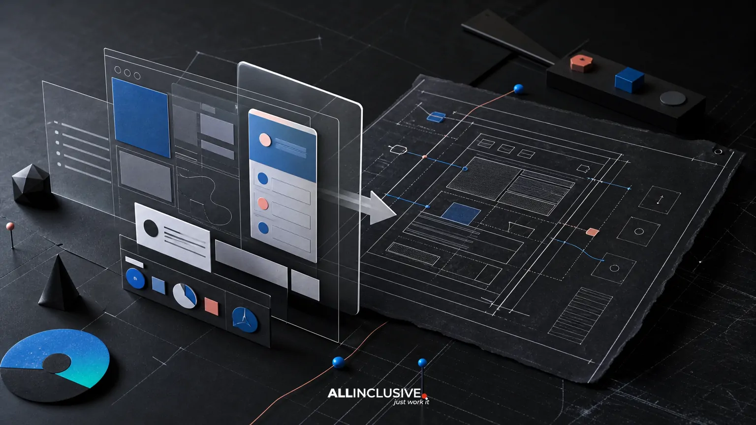
A strong Figma developer handoff is more than sharing a file and turning on inspect mode. It is a structured transfer of design decisions, interaction rules, component behavior, assets, and acceptance criteria so developers can build the intended experience without guessing.
The most reliable handoffs connect three things: a clean Figma source of truth, concise implementation guidance, and a review process that catches differences after development begins. This guide explains what to include, what to document in Figma, and where design and engineering teams need to make explicit trade-offs.
What a Figma developer handoff should accomplish
A handoff is ready when a developer can answer the practical questions required to implement a screen or flow:
- What are the dimensions, spacing rules, typography styles, colors, and assets?
- Which elements are reusable components, and which are page-specific?
- What happens in loading, empty, error, disabled, focused, hover, pressed, and success states?
- How does the layout change across supported viewport sizes?
- What behavior is required for keyboard users, screen readers, and touch input?
- Which details are fixed requirements, and which can be adapted to fit the technical system?
- How will the team verify that the implemented result matches the approved design?
The goal is not to specify every line of code. It is to remove ambiguity around decisions that affect product behavior, visual consistency, accessibility, and user outcomes.
1. Prepare the Figma file before sharing it
Developers work faster when the file is organized around implementation rather than presentation alone. Before handoff, remove abandoned explorations from the main working area, name frames consistently, and separate approved designs from drafts.
Recommended file structure
- Cover or readme: project name, file purpose, last updated date, owners, and links to relevant requirements.
- Foundations: color variables, typography, spacing, grids, elevation, radii, and icon rules.
- Components: shared controls and their documented variants.
- Flows or screens: approved product journeys in logical order.
- States: loading, empty, error, validation, success, permission, and edge-case views.
- Archive: older explorations retained for reference but clearly labeled as non-approved.
Use names that describe purpose and hierarchy. A frame called Checkout / Payment / Error is more useful than one called Final v7 new. Consistent naming also makes it easier to locate related screens during implementation and QA.
2. Document specifications without over-specifying
Figma exposes many measurements, but not every visible value needs a separate annotation. Prioritize specifications that influence layout, behavior, accessibility, or consistency across the product.
High-value specifications include
- Container widths, gutters, columns, and responsive breakpoints.
- Spacing between meaningful groups, not only individual layers.
- Text styles, line heights, maximum line lengths, and truncation behavior.
- Control dimensions, hit areas, alignment, and icon placement.
- Border, radius, shadow, and surface treatments where they communicate hierarchy or state.
- Image aspect ratios, cropping rules, focal-point behavior, and fallback treatment.
- Content constraints such as character limits, long labels, and localization considerations.
Prefer reusable variables and styles over isolated overrides. If five cards use the same spacing token, the handoff should communicate the shared rule rather than invite developers to copy five unrelated pixel values.
Specifications should also identify intentional flexibility. For example, a card may have a minimum height but grow with content. A navigation label may wrap on small screens rather than be truncated. These decisions are more useful than a single measurement taken from one static frame.
3. Define component anatomy and variants
Components translate visual patterns into reusable implementation units. A handoff should show which parts are structural, which are optional, and which change by variant or state.
For a button, document properties such as:
- Primary, secondary, tertiary, and destructive variants.
- Default, hover, focus-visible, pressed, disabled, and loading states.
- Text-only, leading-icon, trailing-icon, and icon-only configurations.
- Minimum width, padding, height, label behavior, and touch target.
- Rules for long labels and unavailable actions.
For a form field, show label, supporting text, input area, required indicator, error message, success message, disabled state, and focus treatment. Make clear whether validation occurs on blur, on submission, or while typing if that decision is known.
Use component properties and variants consistently in Figma. Avoid creating visually similar components with different naming conventions or hidden overrides. A developer should be able to tell whether two controls are intentionally different or merely inconsistent.
4. Show every meaningful state
Many implementation problems occur because the handoff shows only the ideal, populated state. Real products need designs for conditions that affect comprehension and task completion.
At minimum, review these state categories where they apply:
- Loading: skeleton, spinner, progressive content, or disabled interaction.
- Empty: first-use, no results, cleared data, and no-permission scenarios.
- Error: field-level validation, failed requests, unavailable services, and retry behavior.
- Success: confirmation, completion, saved changes, and next-step guidance.
- Interaction: hover, focus-visible, pressed, selected, expanded, collapsed, and dragged.
- Permission: read-only, restricted, expired, or approval-required views.
- Responsive: narrow, intermediate, and wide layouts where composition changes.
State documentation should explain what changes and why. A red border alone does not define an error experience. The handoff should identify the message, its relationship to the field, whether the user can proceed, and how the error is announced to assistive technology.
5. Explain responsive behavior as rules
Desktop and mobile screenshots are examples, not a complete responsive specification. Developers need to know how the interface behaves between the supplied frames.
For each major layout, describe:
- When columns stack or reorder.
- Which elements remain fixed, fluid, or disappear.
- How navigation changes from full menu to drawer, tabs, or another pattern.
- Whether cards stretch, wrap, or become a horizontal scroll region.
- How typography scales and where text may wrap.
- How tables, dense data, or multi-step controls adapt on small screens.
Use Figma Auto Layout, constraints, and realistic content to demonstrate intended behavior. A narrow frame with shortened placeholder copy can conceal overflow problems. Test long labels, multiple lines, missing images, and user-generated content before approval.
When there are competing options, record the trade-off. For example, preserving a two-column form may reduce vertical scrolling but create cramped fields on small screens. Stacking the fields improves readability but lengthens the task. The right choice depends on content, frequency, and user context.
6. Include accessibility and content guidance
Accessibility should be part of the handoff rather than a late visual audit. Design documentation should identify keyboard focus, reading order, target sizes, contrast-sensitive states, and meaningful labels.
Useful notes include:
- Expected heading hierarchy and landmark structure.
- Keyboard order and visible focus behavior.
- Whether an icon is decorative or conveys information.
- Accessible names for icon-only controls.
- Text alternatives or descriptions for meaningful images.
- How status messages, errors, and dynamic updates should be announced.
- Whether color is supplemental rather than the only signal of status.
Content is also an implementation dependency. Specify realistic button labels, field instructions, error copy, empty-state guidance, and limits on user-entered text. Placeholder content often produces a polished design that fails when actual language is longer or more specific.
7. Make assets and export rules unambiguous
Asset confusion can delay development even when the interface itself is well documented. Name files by function, provide the appropriate format, and state whether an asset is a source file, optimized production file, or temporary placeholder.
Clarify:
- Which icons should come from the product icon system rather than exported images.
- Whether illustrations require SVG, raster, or responsive variants.
- Image dimensions, aspect ratios, focal points, and cropping rules.
- Whether assets need light, dark, high-contrast, or localized versions.
- Which fonts and weights are approved and how fallback behavior should work.
Do not export every layer by default. A smaller, intentional asset package reduces duplicate files and makes ownership clearer.
8. Connect the handoff to the design system
A handoff is more scalable when it references shared design-system decisions rather than recreating them screen by screen. Link components to their source library, use consistent variables, and identify patterns that should be added to or corrected in the system.
This is especially important when a new feature introduces a slightly different card, input, or notification. The team should decide whether the difference is a legitimate variant, a one-off pattern, or a sign that the existing component needs improvement.
For a broader explanation of reusable UI foundations, see UI design system principles. If the work begins before visual detail is finalized, wireframes and prototypes can help separate structural decisions from styling decisions.
9. Establish a developer handoff meeting
Written documentation is necessary, but a short working session can resolve uncertainty faster than comments alone. The meeting should focus on decisions, dependencies, and open risks—not on reading every measurement aloud.
A useful agenda
- Confirm the approved user flow, supported platforms, and scope.
- Walk through the main path and important edge states.
- Review component variants, responsive rules, and content constraints.
- Identify technical dependencies, unavailable assets, and unresolved questions.
- Agree on acceptance criteria and the design QA process.
- Record owners and due dates for decisions that remain open.
Invite engineering, product, content, and accessibility stakeholders when their decisions affect implementation. A handoff should not conceal product requirements that the design file cannot answer.
10. Treat design QA as part of the handoff
Design QA compares the implemented experience with the approved intent. It is not limited to spotting small spacing differences. It should verify hierarchy, behavior, states, content, responsiveness, and accessibility assumptions.
Practical design QA checklist
- Compare key screens at agreed viewport sizes.
- Check typography, wrapping, spacing, alignment, and component dimensions.
- Test hover, focus-visible, pressed, disabled, loading, error, and success states.
- Use long, short, missing, and unexpected content.
- Verify keyboard navigation and visible focus.
- Check contrast and ensure status is not communicated by color alone.
- Review touch targets and behavior on real or representative devices.
- Confirm asset quality, cropping, alt text, and fallback behavior.
- Classify findings as blocker, high-priority, polish, or accepted deviation.
Use side-by-side comparisons or overlays carefully. A pixel difference may be acceptable if it results from a platform convention, dynamic content, or an agreed technical constraint. QA should preserve the user outcome rather than enforce visual sameness without context.
For research-driven validation of usability issues, see usability testing methods. Usability findings and visual QA findings are related, but they answer different questions: one examines whether people can complete tasks, while the other checks whether the implemented experience matches the intended design and behavior.
Common Figma handoff mistakes
Sharing an uncurated file
Too many abandoned frames make approved decisions difficult to find. Mark explorations clearly or move them to an archive.
Showing only the happy path
Missing empty, error, loading, and permission states forces developers to invent behavior under schedule pressure.
Relying on inspect mode as documentation
Measurements cannot communicate product rules, content logic, accessibility requirements, or interaction timing by themselves.
Using unrealistic content
Short placeholder labels conceal wrapping, overflow, and hierarchy problems. Test with content that resembles production conditions.
Annotating everything equally
Excessive notes bury important decisions. Highlight behavior, constraints, exceptions, and unresolved questions first.
Skipping post-build review
Even a well-prepared file cannot predict every implementation issue. Schedule review before release, not only at final sign-off.
When to improve the process instead of adding more documentation
If teams repeatedly ask the same questions, the answer may not be another annotation. The underlying issue could be inconsistent components, unclear product requirements, missing content ownership, or a design system that does not represent real product states.
Track recurring handoff defects by category. If most issues involve responsive behavior, improve layout examples and constraints. If they involve errors and permissions, bring product and engineering into state mapping earlier. If they involve inconsistent controls, strengthen the shared component library.
This turns handoff from a one-time delivery task into a feedback loop between design, product, and engineering.
Final checklist
- Approved frames are clearly separated from explorations.
- Foundations and component names are consistent.
- Specs explain rules, not just isolated pixel values.
- All meaningful states and variants are represented.
- Responsive behavior is defined between example widths.
- Accessibility, content, and asset requirements are documented.
- Open questions and technical trade-offs have owners.
- Developers know what is flexible and what is required.
- Design QA timing, scope, and acceptance criteria are agreed.
For organizations planning the broader product experience—from research and information architecture through interface design and validation—review UI/UX design services. For adjacent visual production needs, the design overview provides a wider editorial and service context.


