
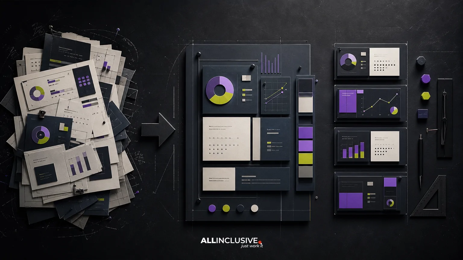
A corporate presentation redesign is more than replacing dated colors, adding new imagery, or applying a cleaner template. The strongest redesigns improve how the presentation works: what the audience understands first, how evidence is presented, how decisions are supported, and how future teams can build consistent slides without starting over.
For most organizations, the right scope combines narrative restructuring, visual hierarchy, data visualization, brand alignment, and reusable production assets. The result may be a sales deck, investor presentation, executive update, company overview, or a connected system of several deck types. The design challenge is to improve the immediate presentation while creating a foundation that remains useful after launch.
When does a corporate presentation need a redesign?
An outdated deck is not defined only by its age. It becomes a redesign candidate when its content, visual language, or production process prevents the business from communicating clearly.
- The story is difficult to follow: slides describe capabilities or facts without establishing a clear audience problem, point of view, or next step.
- Every slide competes for attention: dense copy, oversized headings, inconsistent emphasis, and crowded layouts make it unclear where to look.
- Data is technically accurate but hard to interpret: charts require narration because the intended comparison, trend, or implication is not visually apparent.
- Different teams use different versions: sales, leadership, recruiting, and investor-relations teams pull from disconnected files and outdated slides.
- The deck no longer reflects the brand: typography, color, imagery, diagrams, or tone conflict with current brand guidelines.
- Editing takes too long: common slide types have to be rebuilt manually, creating inconsistent results and unnecessary review cycles.
A redesign may also be worthwhile when the deck is visually polished but strategically weak. A beautiful presentation can still fail if it leads with internal language, buries proof points, or asks the audience to assemble the argument themselves.
What a corporate presentation redesign should include
The scope should be agreed before visual production begins. “Redesign the deck” can mean anything from a light visual refresh to a full communication-system overhaul. Defining the level of intervention protects the budget, timeline, and expected outcome.
| Scope level | Best for | Typical work | Trade-off |
|---|---|---|---|
| Visual refresh | A sound story with an outdated appearance | Typography, color, layouts, imagery, spacing, and chart styling | Fastest option, but it will not resolve weak content structure |
| Content and design redesign | A deck with unclear sequencing or inconsistent messaging | Story architecture, slide editing, visual system, diagrams, charts, and layouts | Requires more stakeholder alignment and content decisions |
| Presentation system | Organizations producing multiple decks repeatedly | Core narrative, master templates, slide library, data-visualization rules, guidance, and governance | Higher upfront effort, with greater reuse over time |
These levels can be combined. For example, an executive presentation may need a full narrative redesign while a broader corporate template system receives a lighter visual update. The important question is not whether every slide gets the same treatment, but whether the redesign addresses the underlying communication problem.
Start with an audit, not a blank canvas
Before designing new slides, inventory the existing presentation ecosystem. Collect current sales decks, investor materials, executive updates, company overviews, case-study slides, product pages, and frequently reused diagrams. Include files that may not be officially approved; informal versions often reveal what teams actually need.
Questions for the audit
- Who uses each deck, and in what setting?
- Who is the primary audience and what decision should the presentation support?
- Which slides are reused across teams or presentation types?
- Where do audiences typically ask for clarification?
- Which claims, metrics, or examples require regular updates?
- Which layouts are difficult for non-designers to edit?
- Which elements must follow existing brand or legal requirements?
Group the findings into four categories: keep, revise, rebuild, and retire. This prevents the common mistake of treating every existing slide as equally valuable. A redesign should preserve useful evidence and institutional knowledge while removing duplication, unsupported claims, and content that no longer serves the audience.
Rebuild the narrative before styling the slides
Corporate presentations often become overloaded because they try to serve several audiences at once. A sales presentation may include company history, product detail, technical architecture, customer proof, implementation information, and investor-style growth language. The result is comprehensive but not persuasive.
Define a primary use case for each deck. Then write a simple narrative brief:
- Audience: Who is in the room or receiving the file?
- Context: What do they already know, and why are they engaging now?
- Decision: What should they understand, approve, compare, or do?
- Evidence: Which facts, examples, or demonstrations support the argument?
- Action: What is the appropriate next step?
From there, organize the presentation around a sequence rather than a collection of topics. A common structure might move from situation and stakes to approach, proof, differentiation, implementation, and next step. The exact order depends on the audience. An investor presentation and an internal operating review should not use the same narrative simply because they share a corporate brand.
For sales-focused work, the principles in sales presentation design can help distinguish a persuasive buyer journey from a general company overview. For reusable systems, a presentation template design process can translate the approved story and visual language into practical layouts.
Design for hierarchy, not decoration
Once the narrative is clear, each slide should have one primary job. The title should communicate the slide’s conclusion or purpose, not merely identify its subject. Supporting text, visuals, and evidence should help the audience reach that conclusion quickly.
A useful slide hierarchy
- Message: the one idea the audience should remember.
- Evidence: the data, example, quotation, diagram, or image that supports the idea.
- Context: only the explanation needed to interpret the evidence.
- Action or transition: how the slide advances the larger argument.
Visual hierarchy comes from more than font size. Position, contrast, whitespace, grouping, alignment, shape, and repetition all help establish priority. If every element is bold, highlighted, or enclosed in a card, nothing is truly emphasized.
Use layouts as a controlled vocabulary. A limited set of flexible patterns is usually more useful than dozens of highly specific compositions. Common patterns may include a statement with proof, a two-column comparison, a process sequence, a metric overview, a case study, a timeline, and a closing decision slide.
Improve data visualization and diagrams
Corporate decks frequently contain charts that were copied from spreadsheets without being redesigned for presentation. A redesign should determine what comparison matters, remove unnecessary detail, and make the intended takeaway visible.
- Use a chart type that matches the question: comparison, trend, composition, distribution, or relationship.
- Write a descriptive title that states the takeaway instead of naming the chart.
- Reduce decorative elements that compete with the data.
- Label important values directly when doing so improves scanning.
- Use color selectively to distinguish the focus from the context.
- Show time periods, units, and sources clearly where relevant.
- Use diagrams to explain relationships, not merely to fill empty space.
Complex operating models, technical systems, and customer journeys may need diagrams rather than charts. The diagram should reveal structure: sequence, roles, inputs, outputs, dependencies, or decision points. If a viewer cannot explain what the arrows mean, the visual needs another round of simplification.
Build the reusable presentation system
A redesigned master deck is not automatically a reusable system. Reuse depends on whether teams can find the right slide, edit it safely, and understand when to use it.
Core components of a practical system
- Master templates: approved slide dimensions, margins, type styles, grids, and reusable components.
- Slide library: common layouts for introductions, proof points, metrics, comparisons, processes, case studies, and conclusions.
- Data-visualization rules: chart treatments, annotation conventions, color usage, and accessibility considerations.
- Content guidance: recommendations for headline writing, slide density, image selection, and evidence quality.
- Asset organization: logical file names, version control, approved imagery, icons, diagrams, and export formats.
- Governance: an owner, review process, update cadence, and method for retiring outdated material.
Templates should be flexible enough for real-world content. A template that looks perfect with short placeholder copy may fail when a team needs a long product name, a three-part comparison, or a chart with six categories. Test the system with realistic content before final approval.
The system should also reflect the broader visual identity rather than operate as a separate design language. When the deck needs to align with a wider brand architecture, review the relevant brand guidelines and related graphic design requirements.
How to evaluate redesign concepts
Stakeholders often review presentation concepts by asking whether they “like” the style. That response is understandable but incomplete. A stronger evaluation uses observable criteria.
| Criterion | Evaluation question |
|---|---|
| Clarity | Can a new reader identify the main point of each slide quickly? |
| Audience fit | Does the tone, detail, and sequencing match the presentation context? |
| Evidence | Are important claims supported by understandable proof? |
| Brand alignment | Does the visual system feel consistent with the current brand without becoming restrictive? |
| Usability | Can trained users adapt layouts without damaging hierarchy or consistency? |
| Maintainability | Can metrics, examples, and visuals be updated without rebuilding the deck? |
| Accessibility | Are contrast, type sizes, labels, and reading order appropriate for the audience and format? |
Run a content stress test before sign-off. Ask the system to handle a dense chart, a short statement, a long headline, a comparison with unequal text, and a slide with no photography. Weak systems usually reveal themselves under these conditions.
Common corporate presentation redesign mistakes
Redesigning every slide independently
Slide-by-slide improvement can create a collection of attractive pages without a coherent system. Establish the narrative and layout language first, then apply it consistently.
Confusing more content with more credibility
Detailed slides can signal preparation, but excessive detail shifts the burden of interpretation to the audience. Move supporting material to an appendix or separate leave-behind when it does not advance the live conversation.
Using templates as a substitute for judgment
A template is a starting point, not a guarantee of clarity. Users still need to choose the right layout, write a focused headline, and edit content for the audience.
Ignoring production and ownership
Without a clear owner and update process, approved decks quickly fragment into competing versions. Governance is part of the redesign, not an administrative detail added afterward.
Optimizing only for the live presentation
Many corporate decks are emailed, exported to PDF, or viewed asynchronously. Design for both spoken delivery and independent reading, with enough context to make the file useful after the meeting.
Corporate presentation redesign checklist
- Define the primary audience, use case, and desired action.
- Audit existing decks, source files, content, and informal versions.
- Separate material to keep, revise, rebuild, and retire.
- Approve the narrative sequence before detailed visual production.
- Give every slide one primary communication job.
- Redesign charts and diagrams around the intended takeaway.
- Test layouts with realistic, messy, and changing content.
- Document typography, color, spacing, imagery, and component rules.
- Organize the slide library and editable source files.
- Assign ownership for updates, approvals, and version control.
- Review the final system in both live and asynchronous formats.
Choosing the right redesign scope
The right investment depends on the business problem. A visual refresh may be enough when the story is current and the deck is used rarely. A full narrative and design redesign is more appropriate when the presentation affects sales conversations, executive decisions, investor communication, or other high-stakes moments. A reusable system becomes valuable when multiple teams repeatedly produce related materials.
Keep the decision grounded in use, not slide count. A short executive deck can require more strategic work than a long internal presentation if its audience, timing, and consequences are more demanding. The goal is a presentation that communicates clearly today and remains efficient to maintain tomorrow.
For organizations comparing approaches, deliverables, and production considerations, the presentation design overview provides a useful starting point. You can also place presentation work within a broader design system when the redesign must coordinate with brand, digital, or marketing materials.


